Documentary Photography
Contest & Research
Documentary Photography Research
Analyse x3 Photographers
Sir Donald McCullin MBE aka Don McCullin was born on the 9th October 1935, He grew up in Finsbury Park in London. From an early age he was called up for National Service in the RAF, after returning from his postings he bought home a twin reflex Rolleicord camera and began photographing a local gang named “The Guv’nors” they also happen to be his friends. More by accident then anything else, McCullin persuaded the “Observer” to show them the picture editor in 1959, this started his career off.
He has won various awards such as the “British Press Award” for his essay of the construction of the Berlin Wall in 1961. He also won the “World Press Photo Award” where he covered the armed eruption of the ethnic and nationalistic tension in Cyprus in 1964 and lastly he was awarded the “Commander of the Order of the British Empire” (CBE) award, he was the first photojournalist to be awarded this specific award in 1993.
Limassol, Cyprus in 1964 - The Cyprus Civil War
From having a look at the visual elements and analysing the image, from the start I can tell that rule of thirds is being used used here as two thirds of this image is empty compared the other third has the man walking out the door and the soldier run towards battle. The lighting techniques used are natural but with the way the sun is facing, it has cast a shadow on the wall. Frame within a frame is also being used with the man standing in the door way. The storytelling aspect of this image is telling us that as their is a war going on, other people are living their normal lives as you can see somebody is walking out of the door while the soldier is running into battle.
Londonderry, Northern Ireland in 1971
From having a look at the visual elements of this image, I can see that it it uses the leading of lines composition as when you look at the image your drawn to the curb and it leads you to where the soldier is. This also uses a rule of thirds because the young man is in the first three squares of the image and the soldier is in the last two squares at the bottom of the image. The lighting techniques are natural and as you can see their is no shadows being cast in this one - so the light must be shining from above these two subjects. The storytelling aspect of this image is telling us that it feels like a normal day to a few in Northern Ireland even when their is a war being fought, you can see this by the young man is walking with a parcel in his hand and the soldier on the floor is holding a gun aiming/shooting.
Gang of Boys Escaping CS Gas, Londonderry, N.Ireland in 1971
From having a look at the visual elements of image, I can see that it is using leading of lines because when you look at the image the kids are jumping off this huge concrete wall and your eyes are lead to following them down the wall and where their running to. This image also uses rule of thirds with the last 2 segments of the third is showing the kids on the wall and then the first third is showing them running on the floor. The lighting techniques seem very generic and natural. The smoke that is in the air sets the atmosphere and creates a special effect which suggests poisoners gas has been set off and this shows the storytelling of the image because all the kids are running away and getting to safety.
Hue, Vietnam in 1968
To start with this image shows frame within a frame because the image is shot between two posts. Rule of thirds is also being used in this shot as well because most of the action is using the middle three boxes of the image. What makes this photograph really interesting is the fact that you can see the soldier is throwing a grenade in the battle field and at the same time he has lost his balance when throwing. The lighting techniques used in this image is generic and is using the natural daylight to generate the image.
The Christian Youth Celebrating the Death of a Young Palestinian Girl, Beirut in 1976
From a storytelling point of view I can see that these 6 people are celebrating the death of a Palestinian Girl, but from the facial expressions and actions I can see one of them is holding a gun pointing it towards the dead body suggesting that he could of killed her and the other kids seem to be laughing and joking about death and thinking it is a normal event when really it isn’t. The visual effects shown in the image where their is plenty of smoke being show, this suggests that this is residue from a grenade or gas. The lighting techniques used is generic and relaying on natural light. Rule of thirds is being shown in this video with the middle third of the image is where the young kids are and the bottom middle third is showing the dead Palestinian Girl.
Sebastiao Riberio Salgado Junior was born 8th February 1944, he grew up in Aimores, Minas Gerais, Brazil. By trade Salagardo is a Economist after earning a “BA Degree” from UFES and a “Master’s Degree” from University of Sao Paulo. He also earned a PhD from the University of Paris. As a first job as an economist, he worked in Africa at the “International Coffee Organisation” - He would often be travelling on missions for the World Bank.
On his travels around Africa he started getting into taking photographs, He eventually abandoned his career as an economist and became a photographer in 1973. Sebastiao has worked for many photography firms; most notably “Sygma, Gamma and Magnum Photos”. After working for many firms he started his own Agency in Paris called “Amazonas Images” to help represent his own work a lot more. He has won many awards - to name a few, in 1992 he one a “Centenary Medal” from the “Royal Photographic Society” and the “Crystal Award” from the “World Economic Forum”
Serra Pelada, Gold Mine, Brazil in 1986
From the storytelling point of view I can see that these people are climbing up a big hill using wooden ladders out of a gold mine and of course as you can tell by the clothes they are wearing, they are old and worn out. On one side of the image you can see their carrying a bag of gold from the mine and the other side they are carrying nothing. From a composition point of view it uses leading of lines because your eyes are focused up to the top of hill. The lighting techniques used in the this image are very generic a relays on natural light to generate the image.
Serra Pelada, Gold Mine, Brazil in 1986
From a storytelling point of view I can see that these people are climbing up a big hill using wooden ladders, but in this image it is more of wide shot of the hill, but with a close up of somebodies back and it is looking very sweaty and muddy as it all seems really hard work. The wide shot of the image above shows the vast scale of the gold mine and the whole complex. As you can see all the climbers are carrying up bags of gold and it seems they are leaving a few behind as they can’t carry them all up. From the composition side, the image uses leading of lines because your eyes are following towards the ladder and up it. Lighting techniques used are very generic and is relaying on natural light to generate the image.
Refugee Camp, Benako, Tanzania in 1994
From a storytelling point of view, this is showing a very depressing and poor atmosphere. One of the saddest parts is where their is a baby and its mother on the floor, but the baby’s expression is suggesting that the comfort they are receiving from their mother seems good, but in a very depressing situation. Apart from that the image suggests poverty and everyone seems to be struggling. The lighting techniques used are are very generic and relaying on natural lighting. The composition used in this image is rule of thirds because every third has something happening in it, for example the middle bottom third has the mother and baby.
Yanomami Indigenous Territory, State of Amazonas, Brazil in 2014
From a storytelling stand point, this image is so ambiguous; meaning it could be open to interpretation by anyone who looks at it, but from what I can tell he is either surrendering or he is saying stop. I think the guys behind him and presumably surrendering as they are not fighting. From a composition point of view it is almost as if it is using frame within a frame with all the branches overshadowing the images. Lighting techniques which are being used are very generic and relaying on natural light to generate the image shown.
The Oil Fields, Kuwait in 1991.
From a storytelling point of view, you can see that this is showing a firefighter trying to put out the flames in the oil fields, I believe it took them nine months to put it all out properly. From a composition point of view I can see the contrast has been cranked up really high to showcase the fire in its best light. Rule of thirds has been used as each third has something happening in it. So far most of the images have been shot in the daytime, but with this one, It has been shot at night time and rather then relaying on the daylight, he is depending on the light from the fire to bring out the image.
Practical Skills
Pre-Production
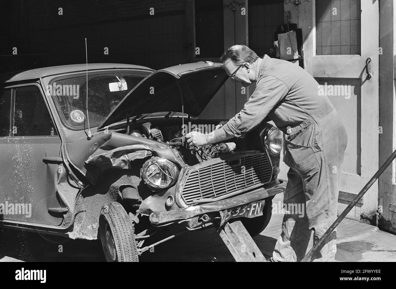
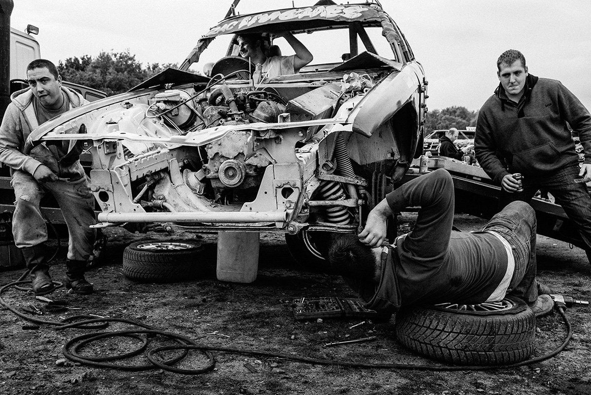
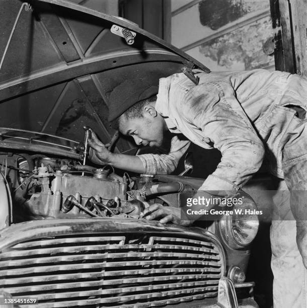
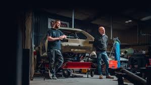
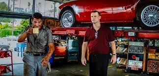
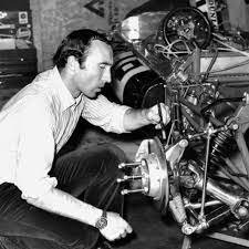
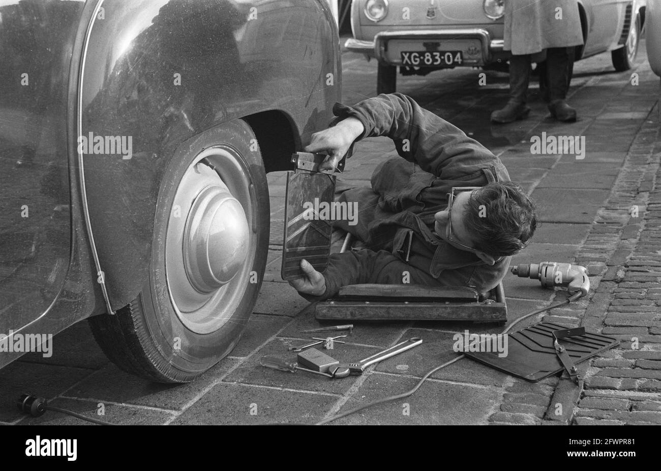
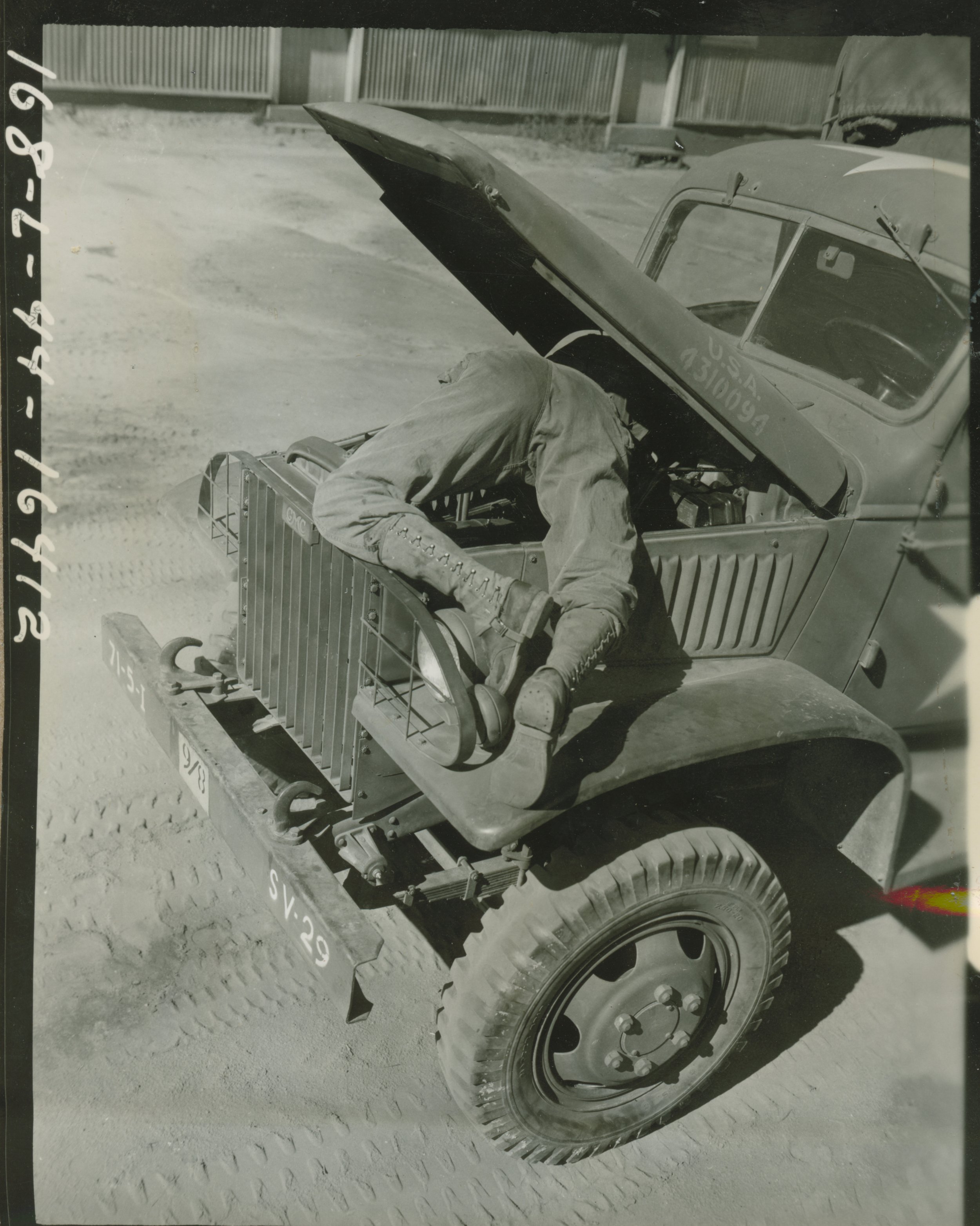
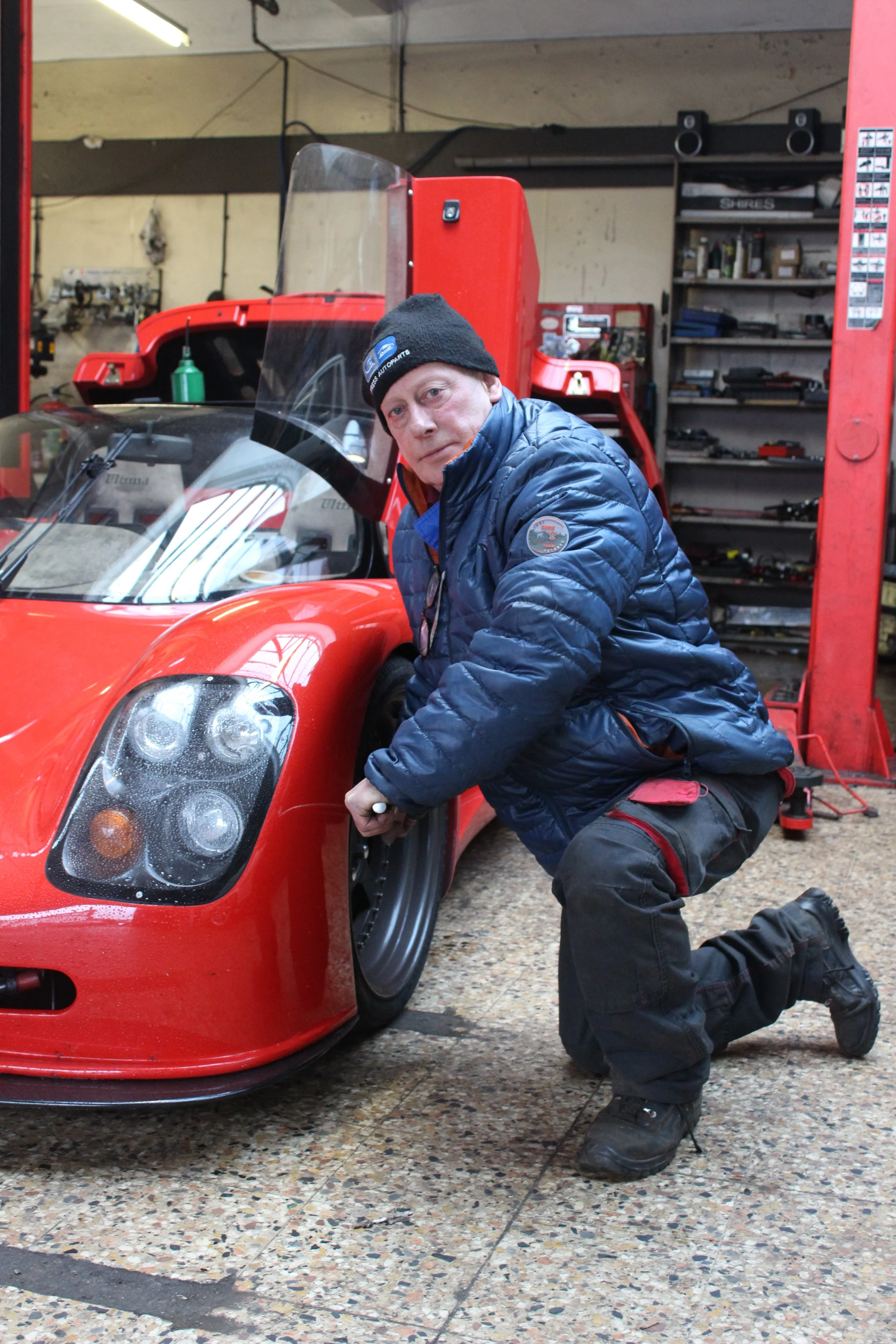
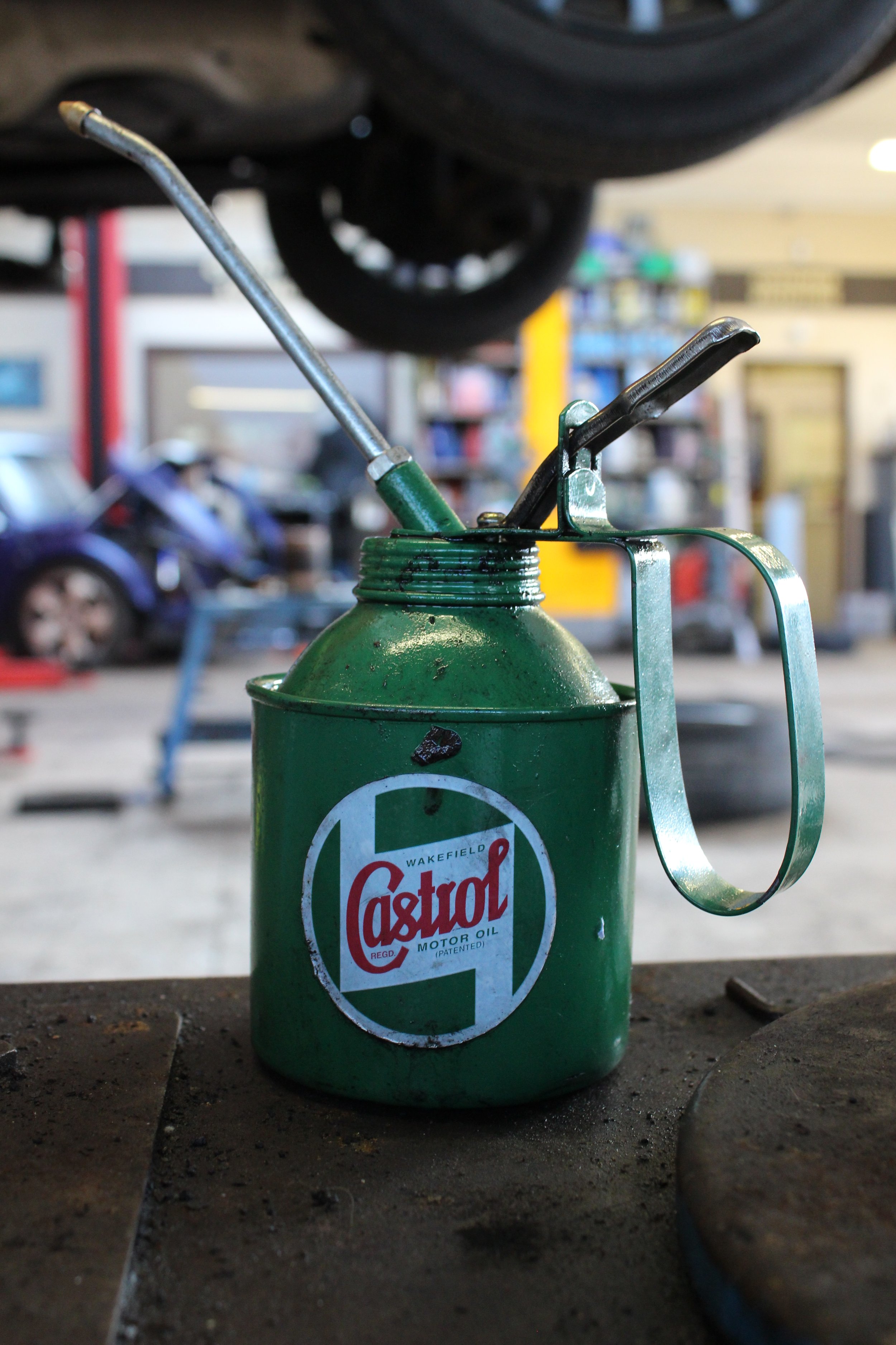
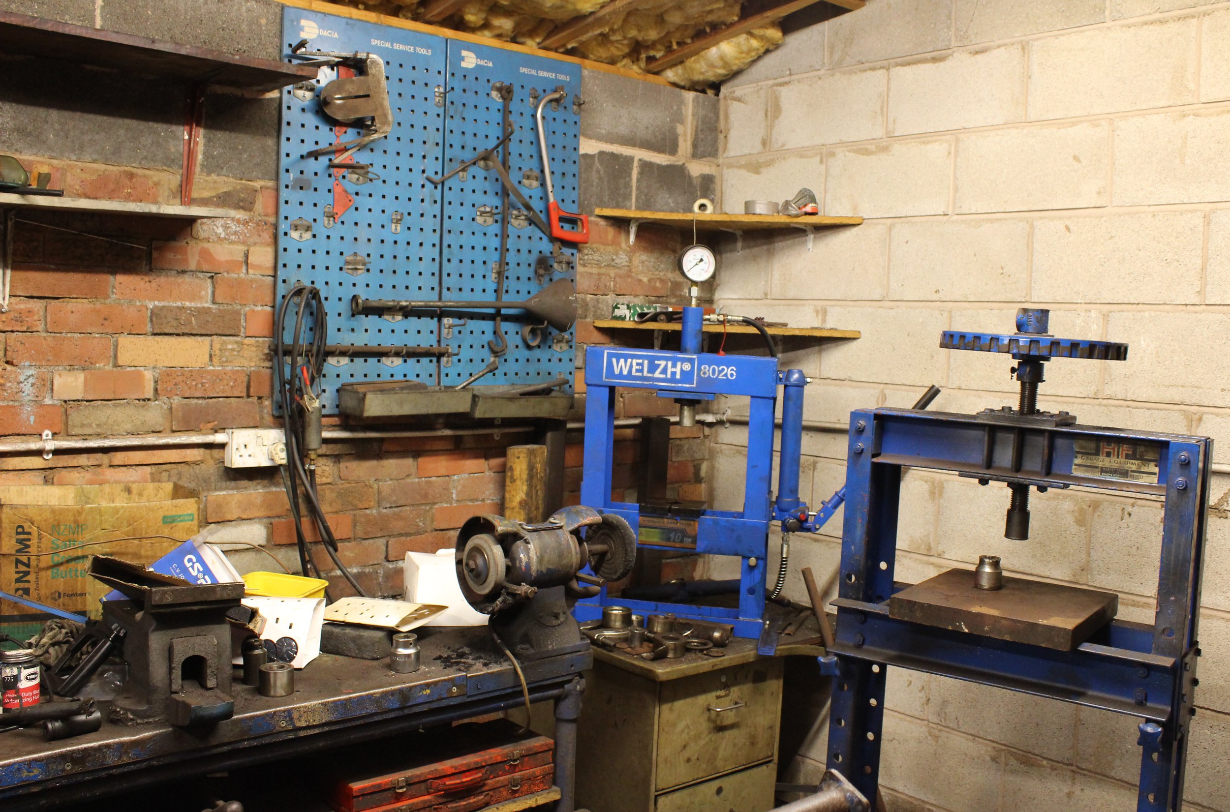
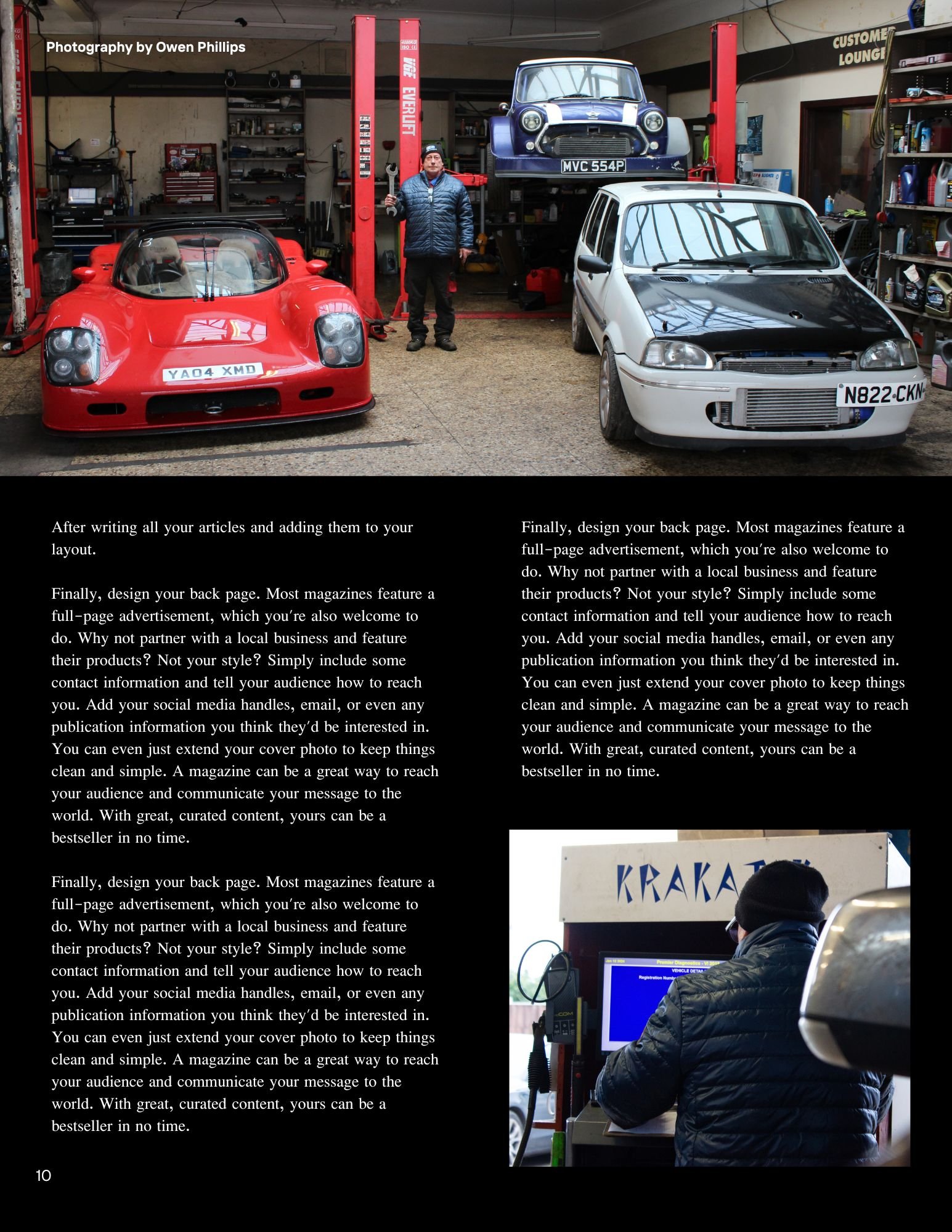
The main idea for this documentary photography unit is I am going to photograph a day in a life of my Dad in his work environment in a garage as he is a motor mechanic. My mood board of ideas below features shots that I would like you to emulate and take for my project. I will also create a magazine layout with a front cover, back cover and pages inside with a minimum of 15 images to be placed inside. As the brief suggests this is a good way to feature the photographs taken and as human beings we seem to be more curious about other peoples lives and by creating a zine it makes people feel more connected to the people were are reading about whether it is a magazine, newspaper or even generally an online news article/blog about them specifically.
Production
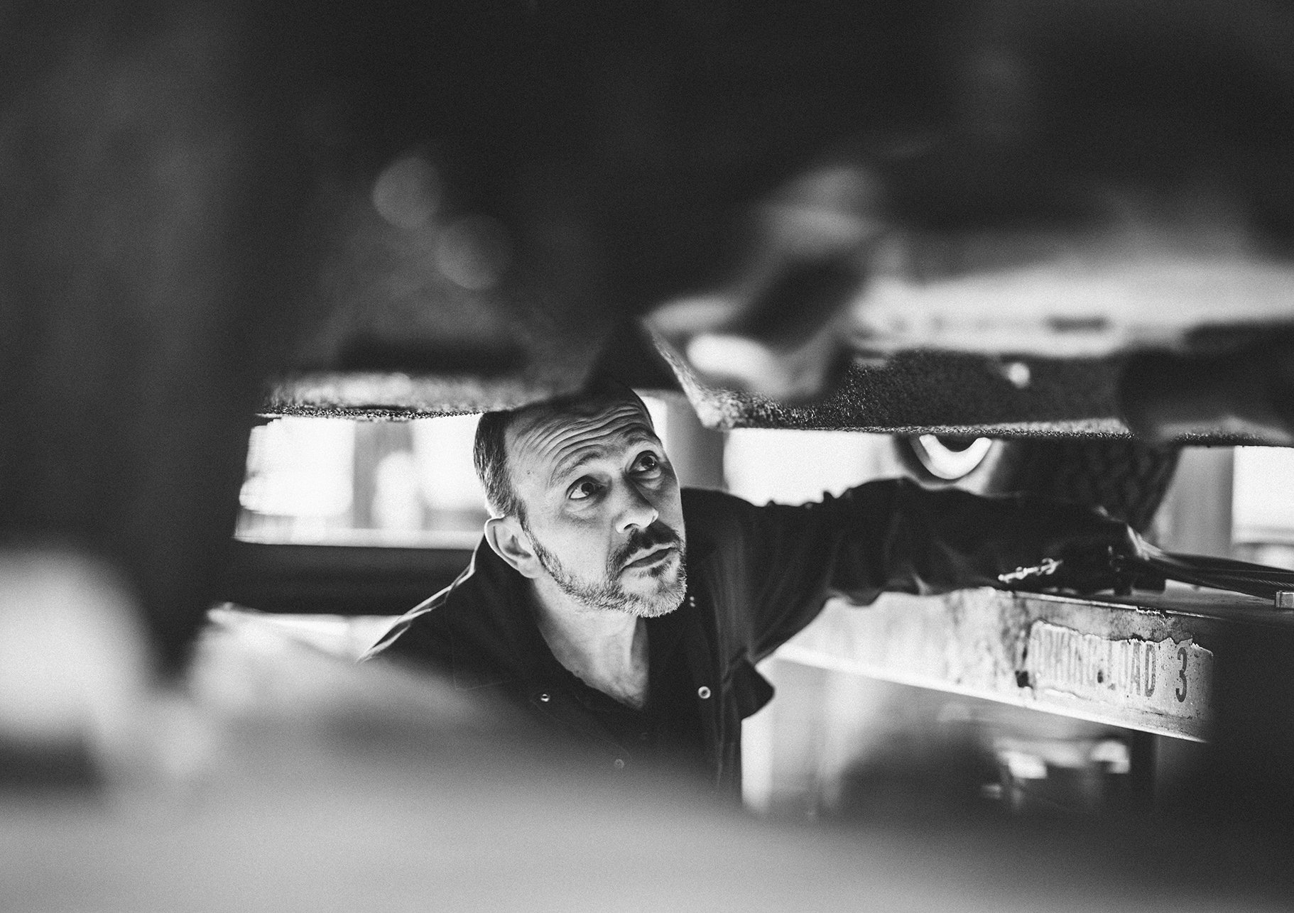
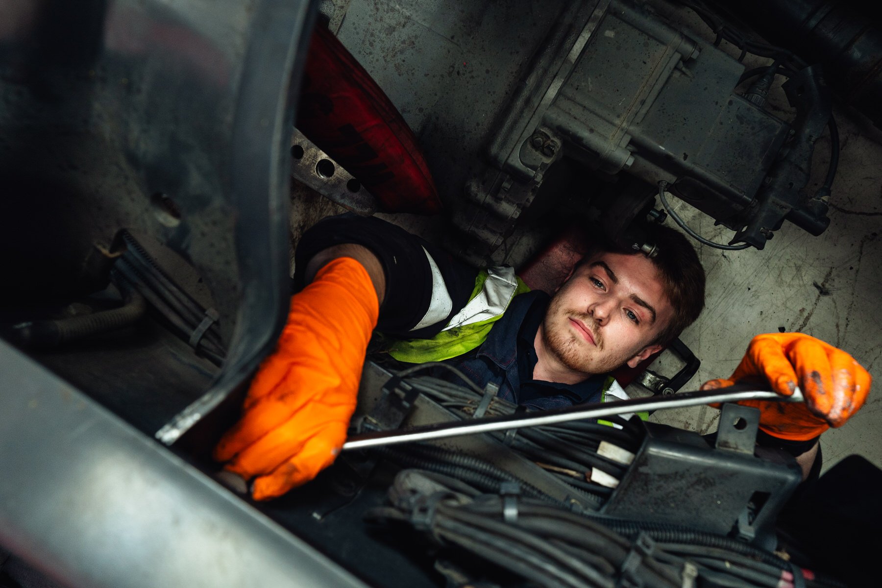
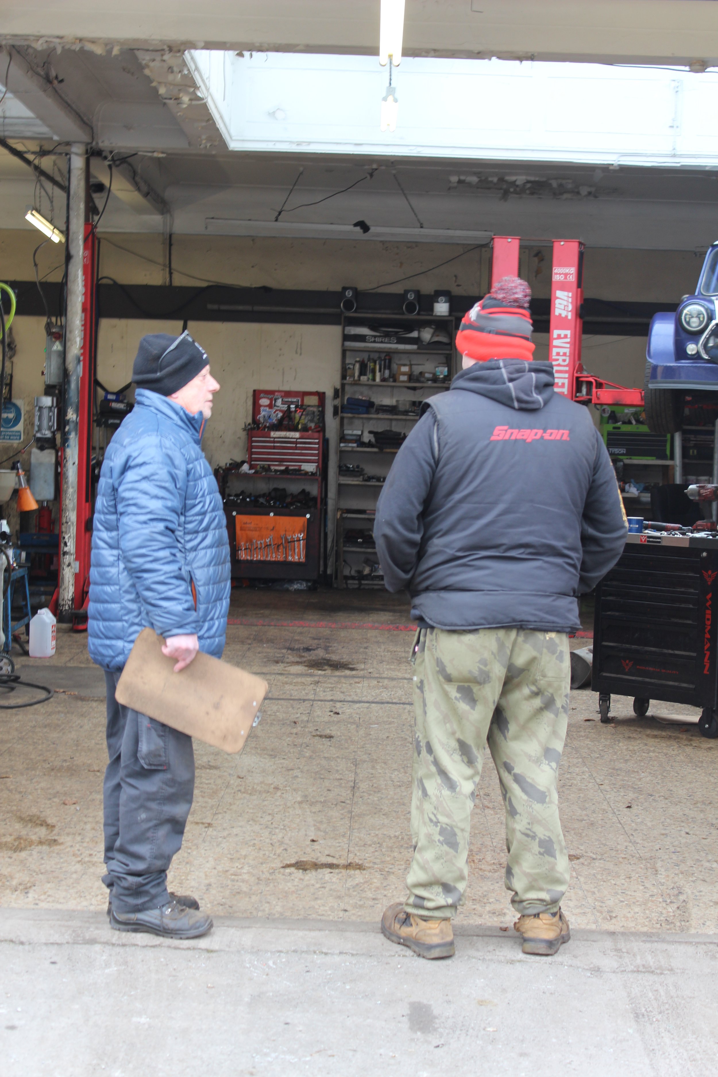
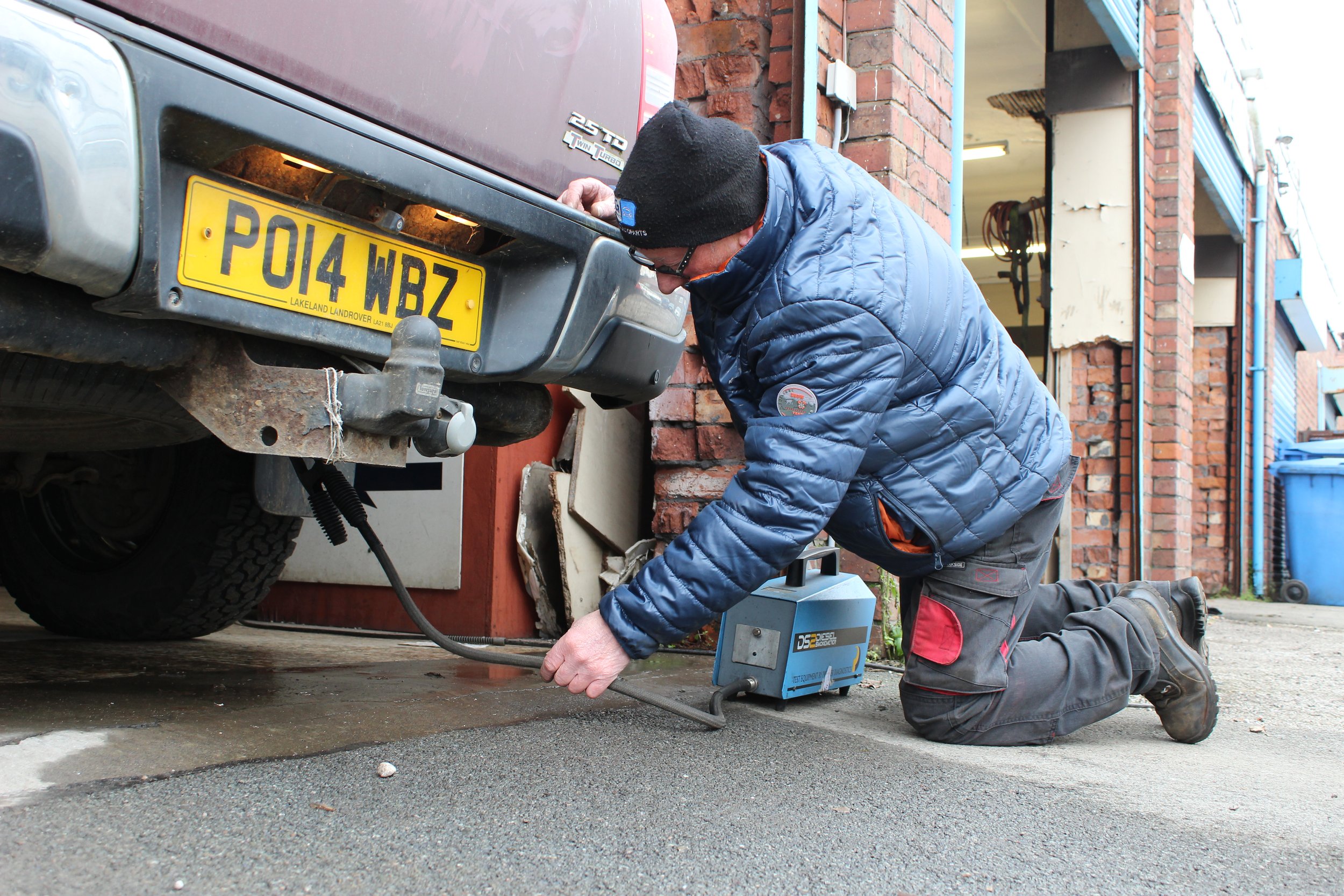
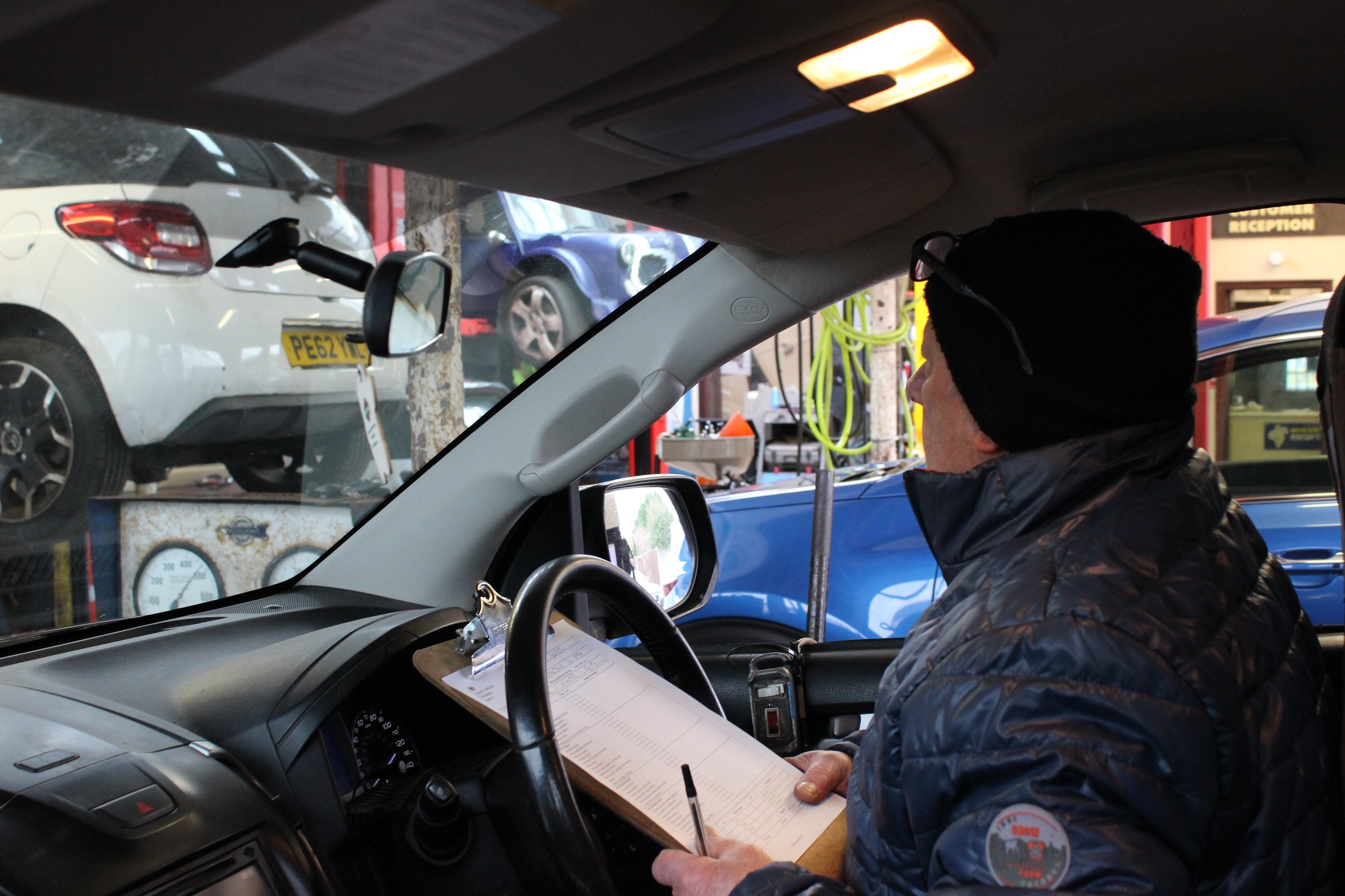
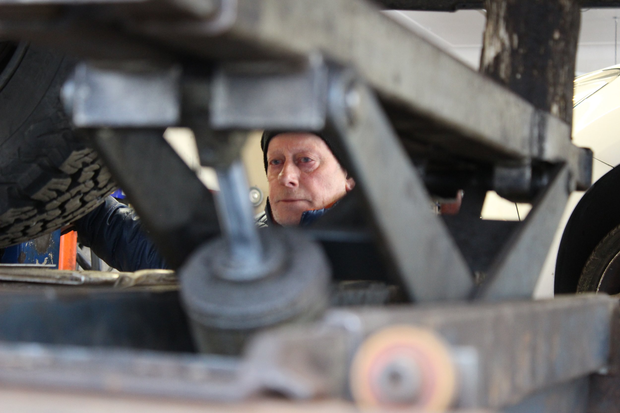
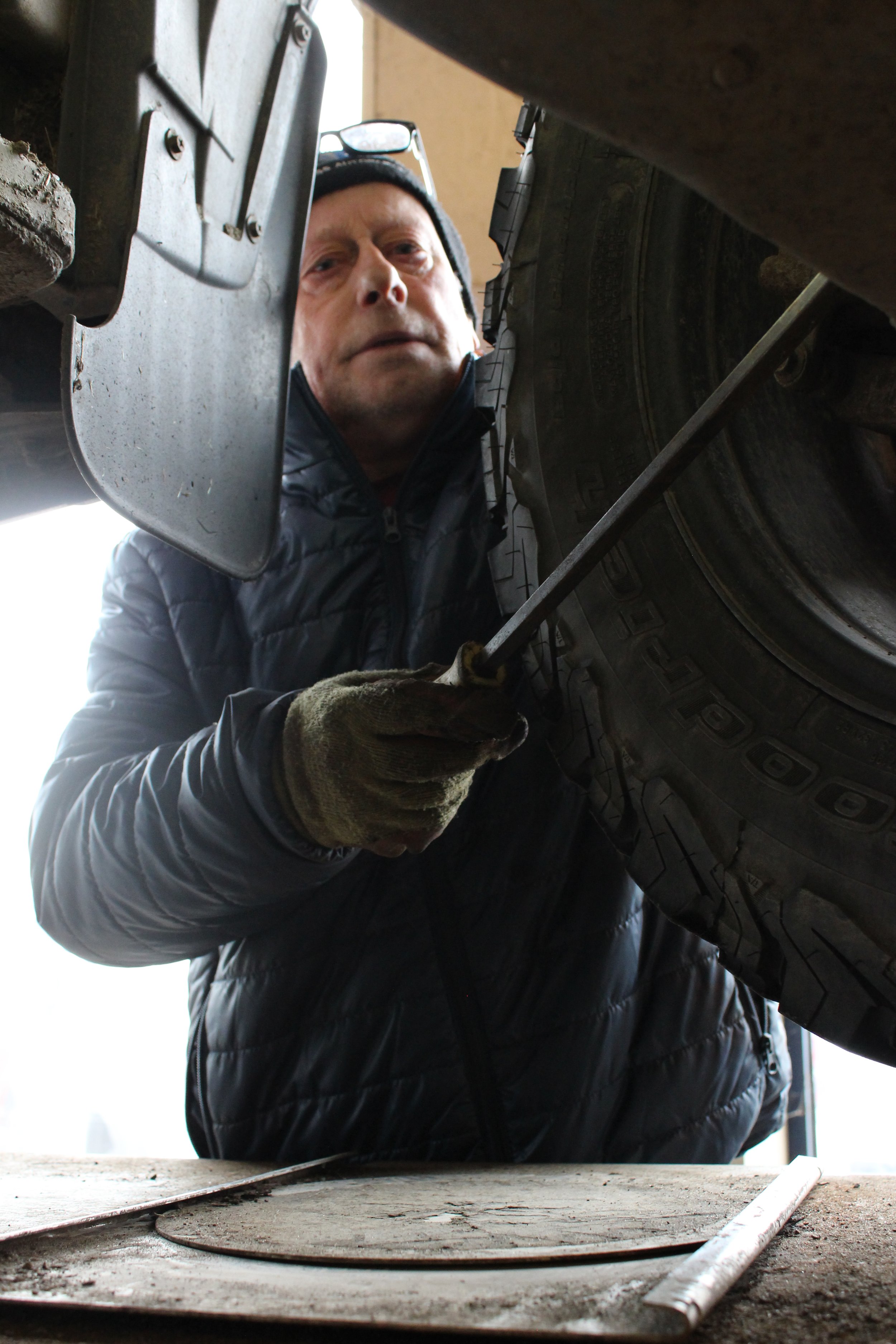
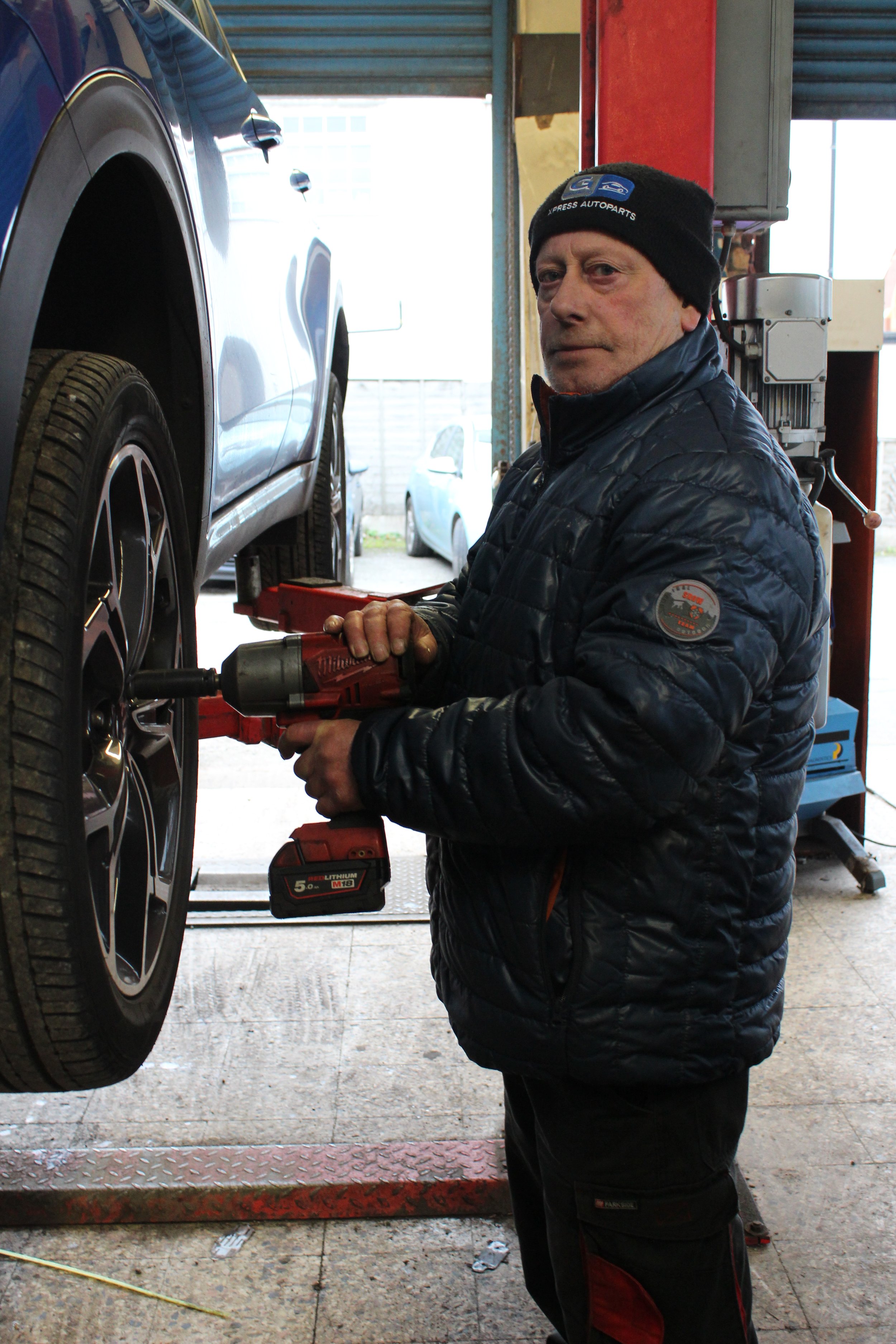
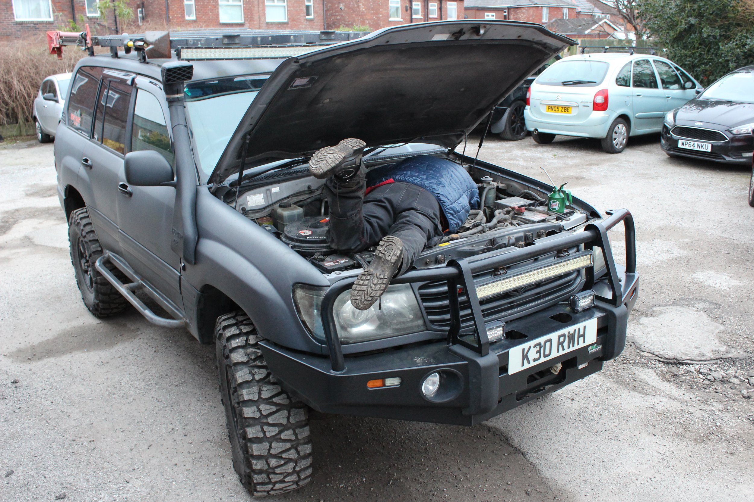
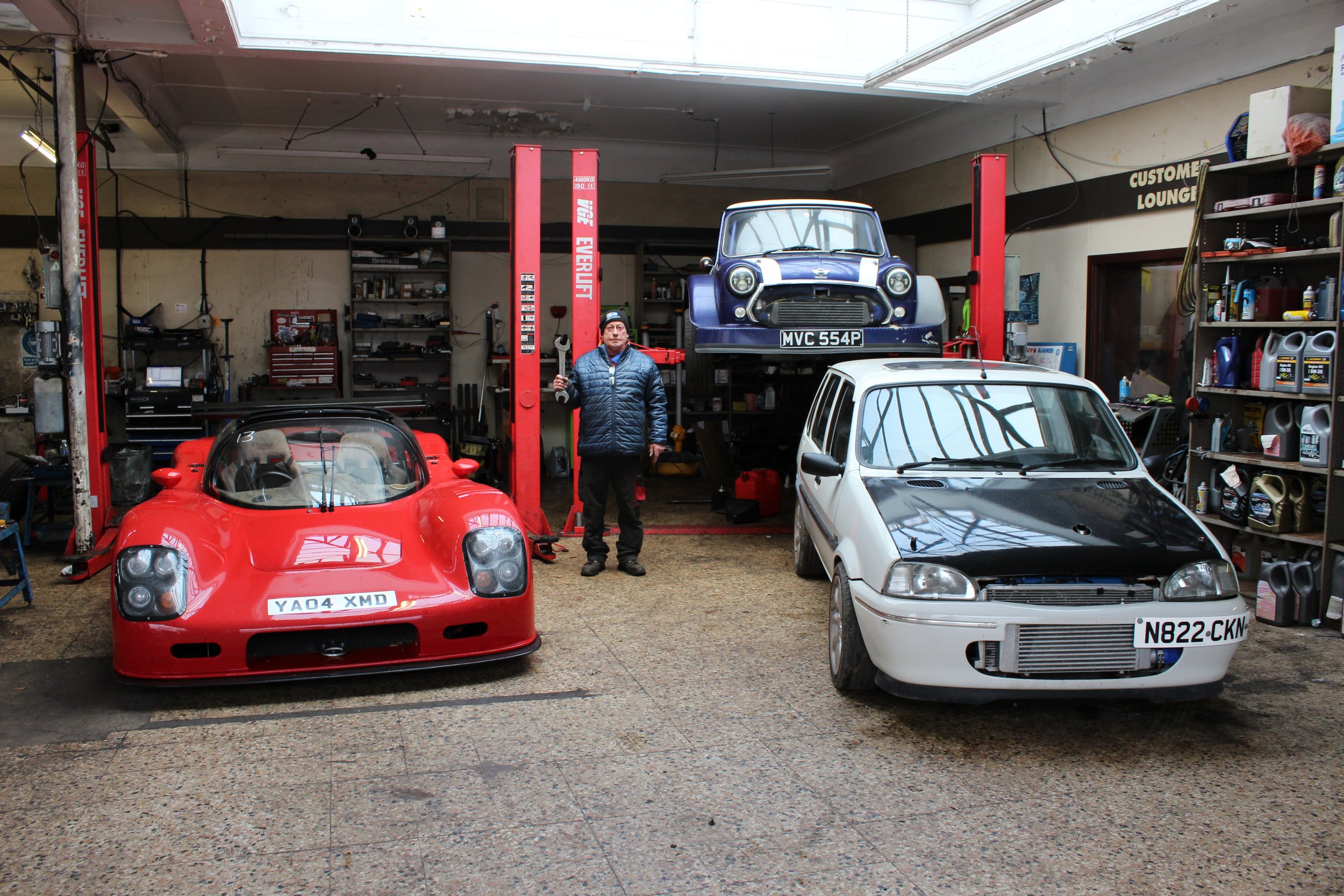
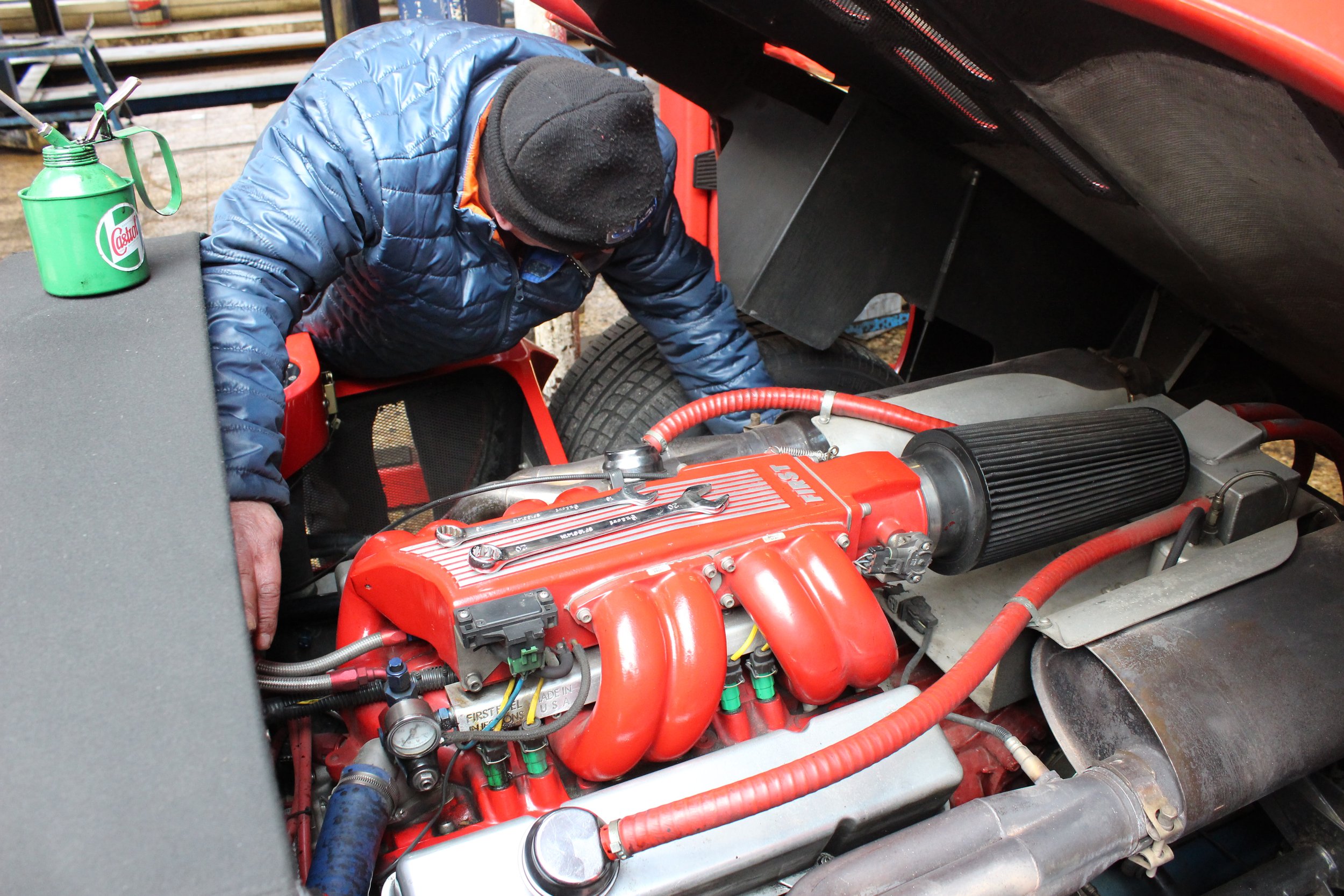
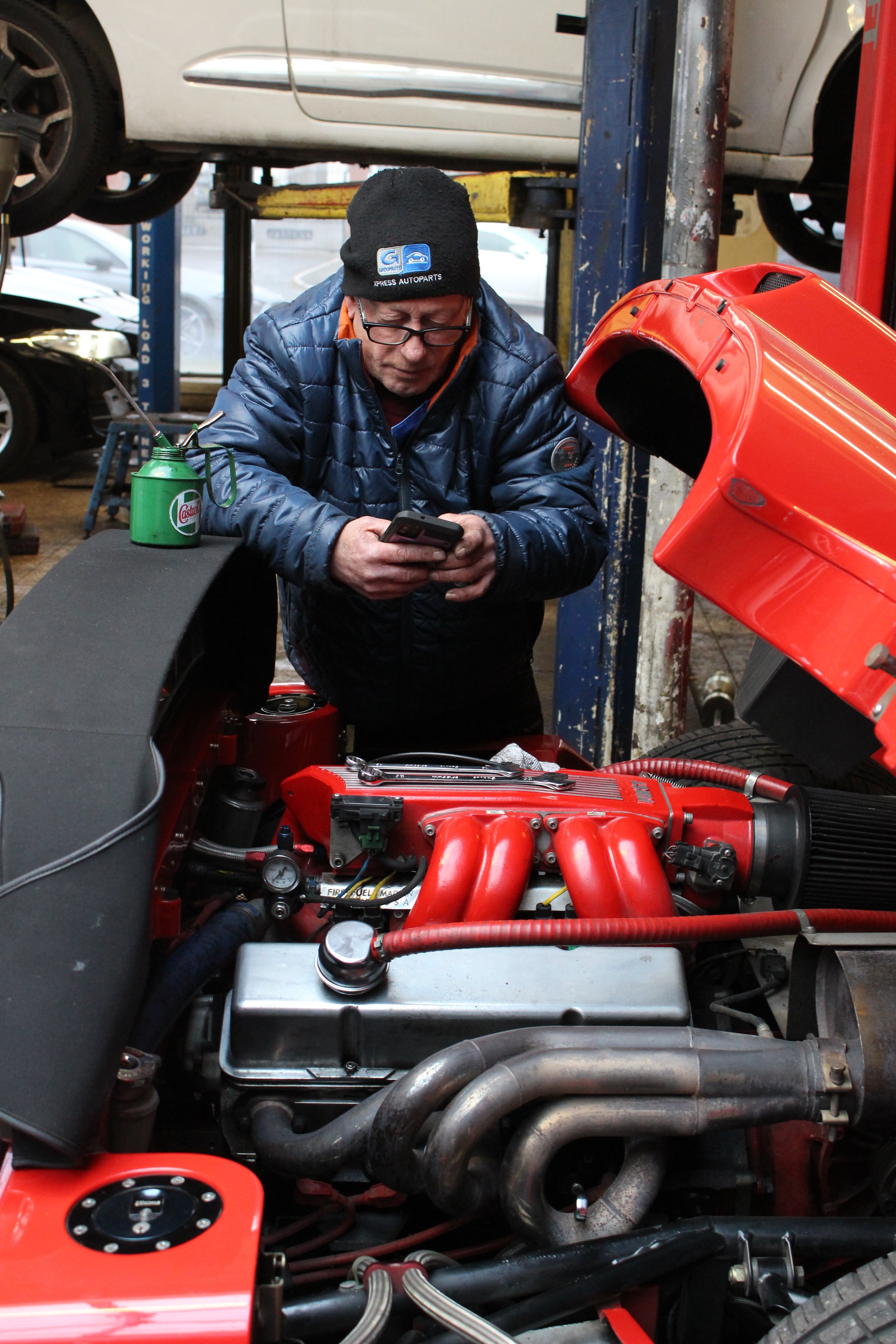
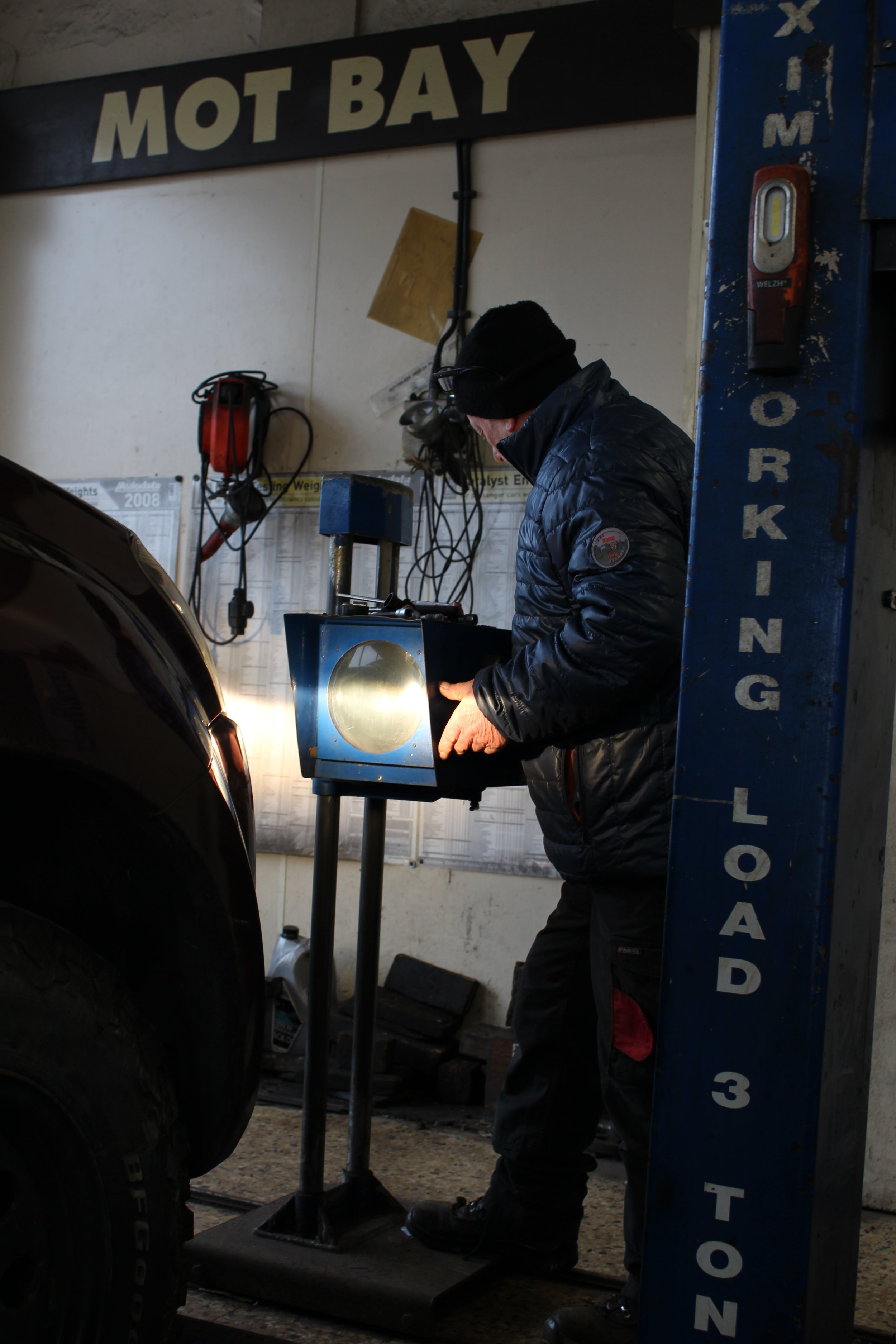
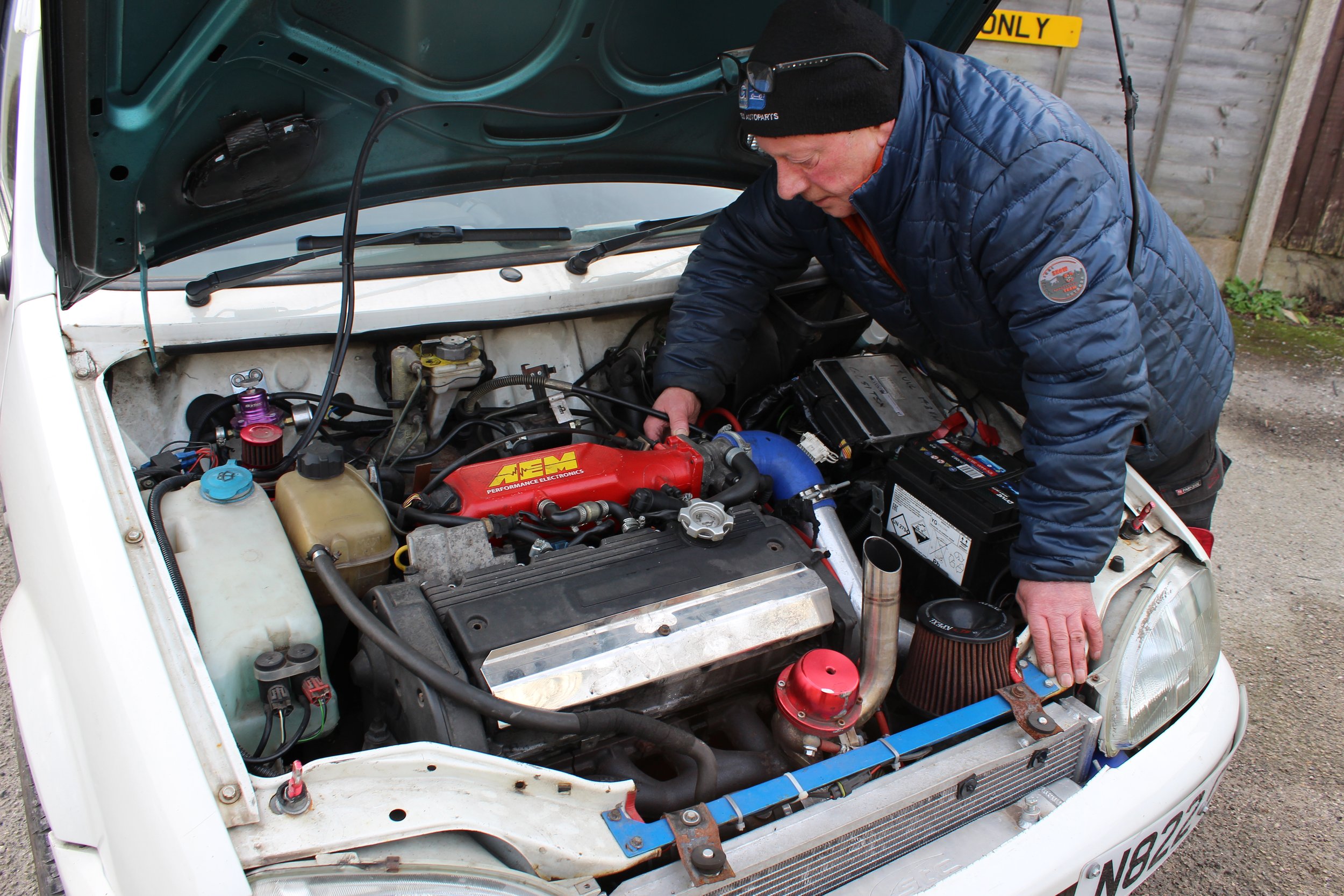
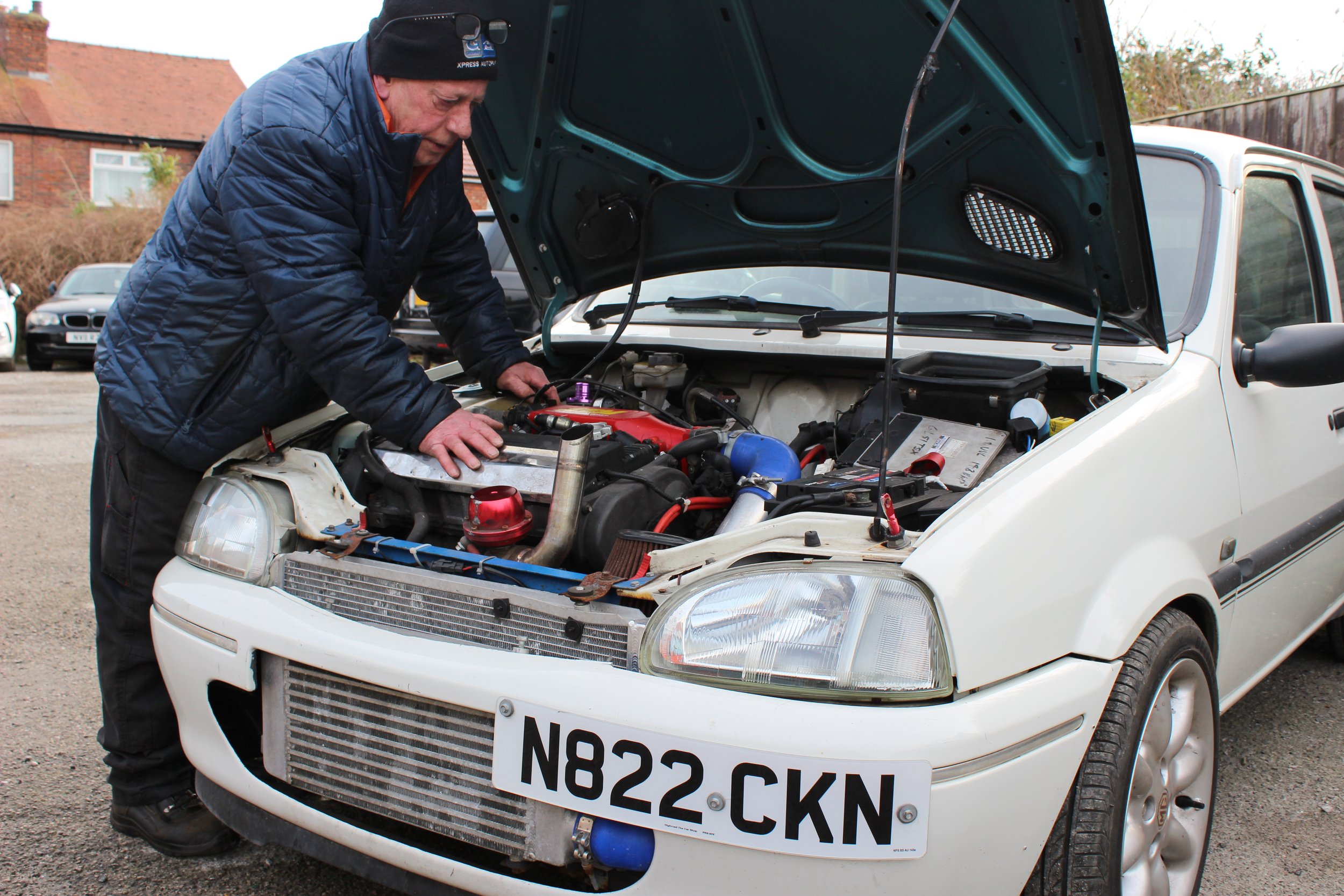
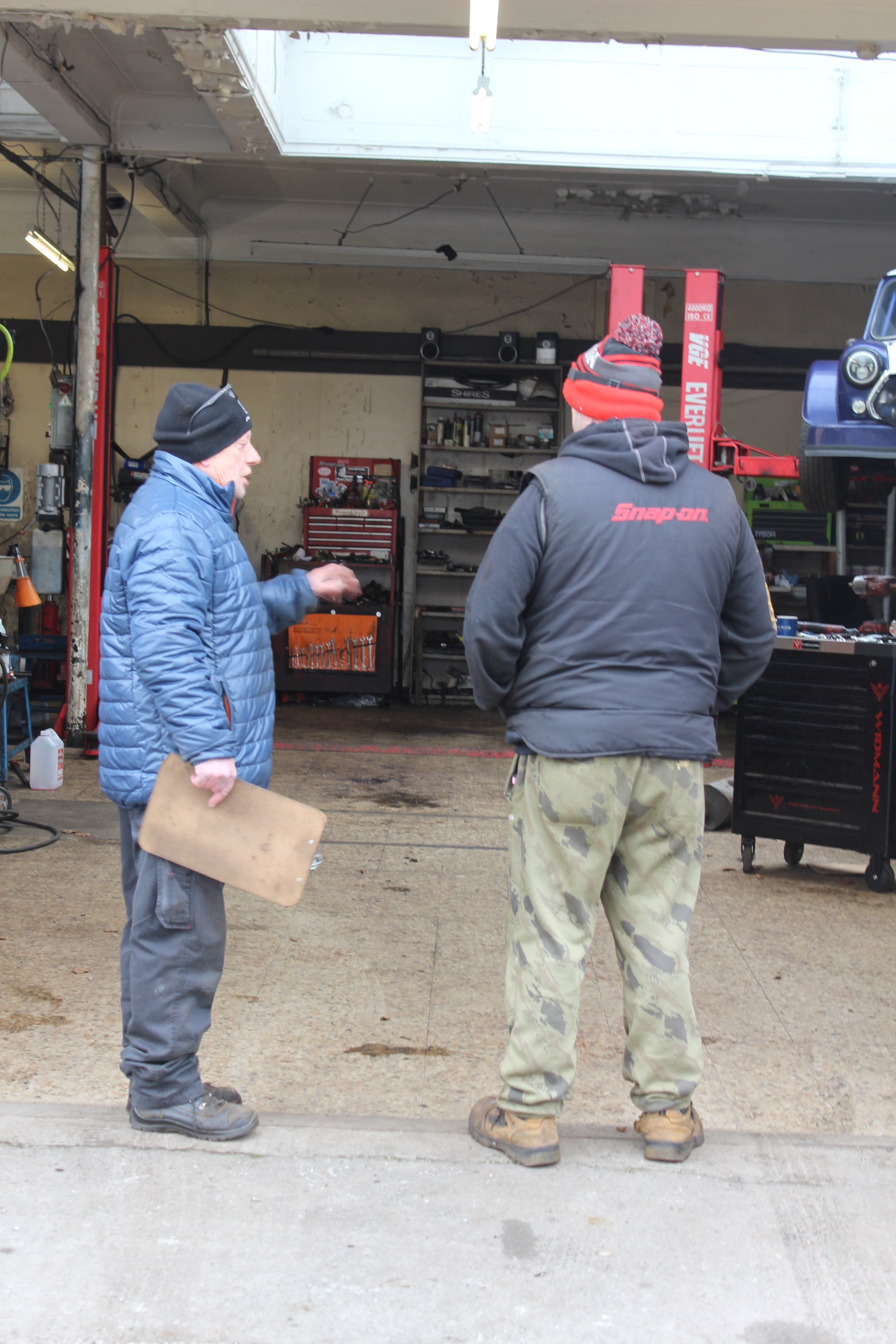
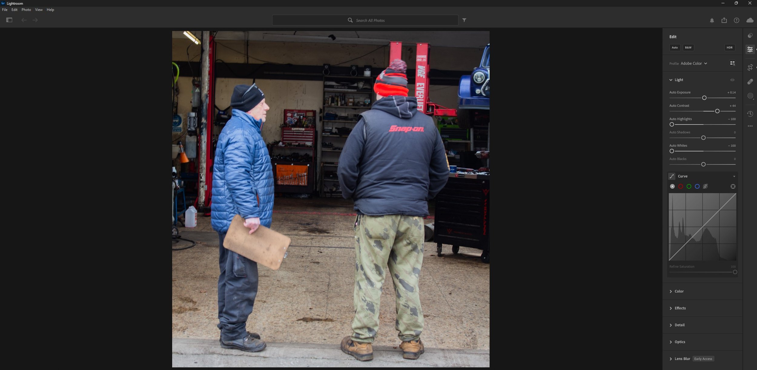
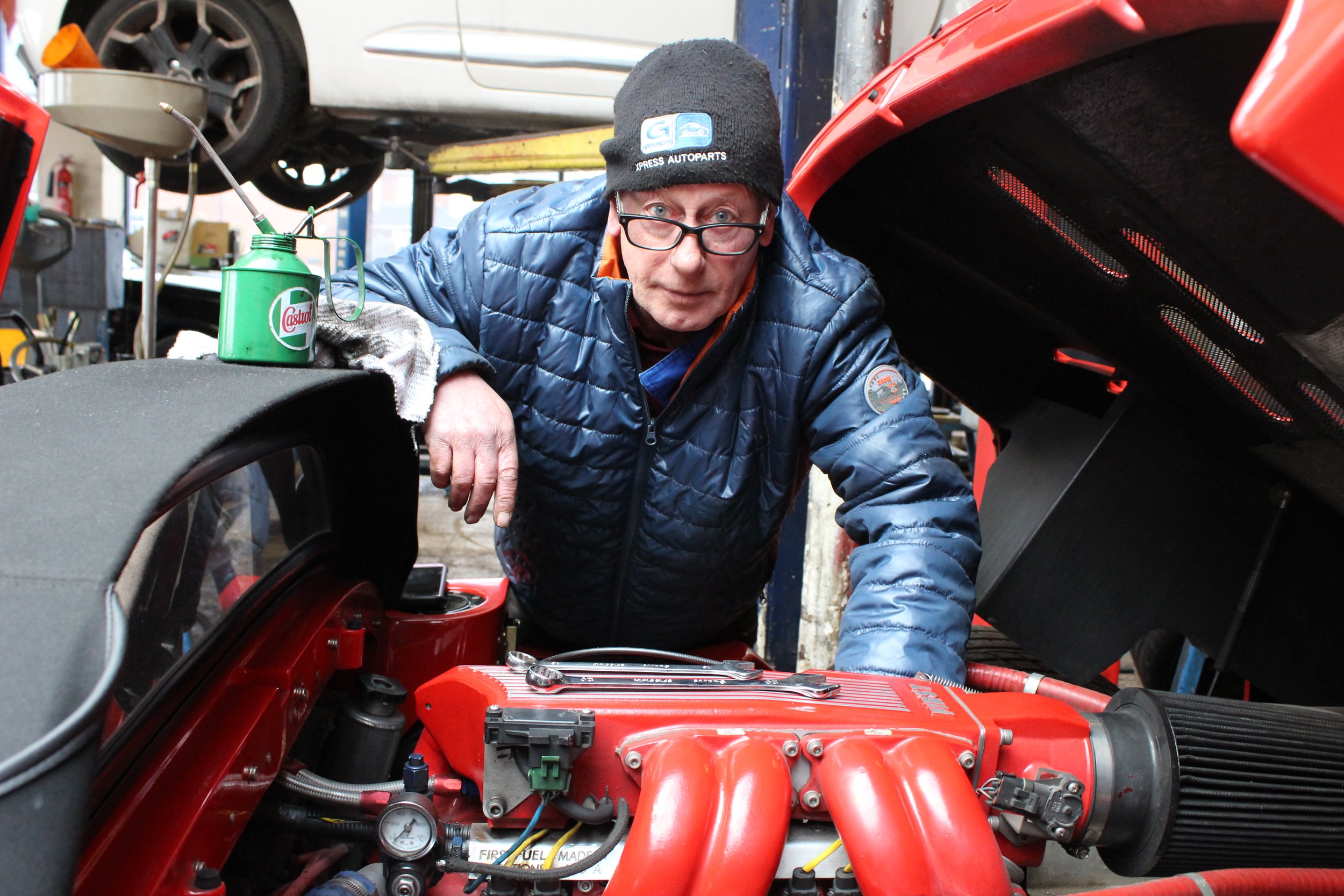
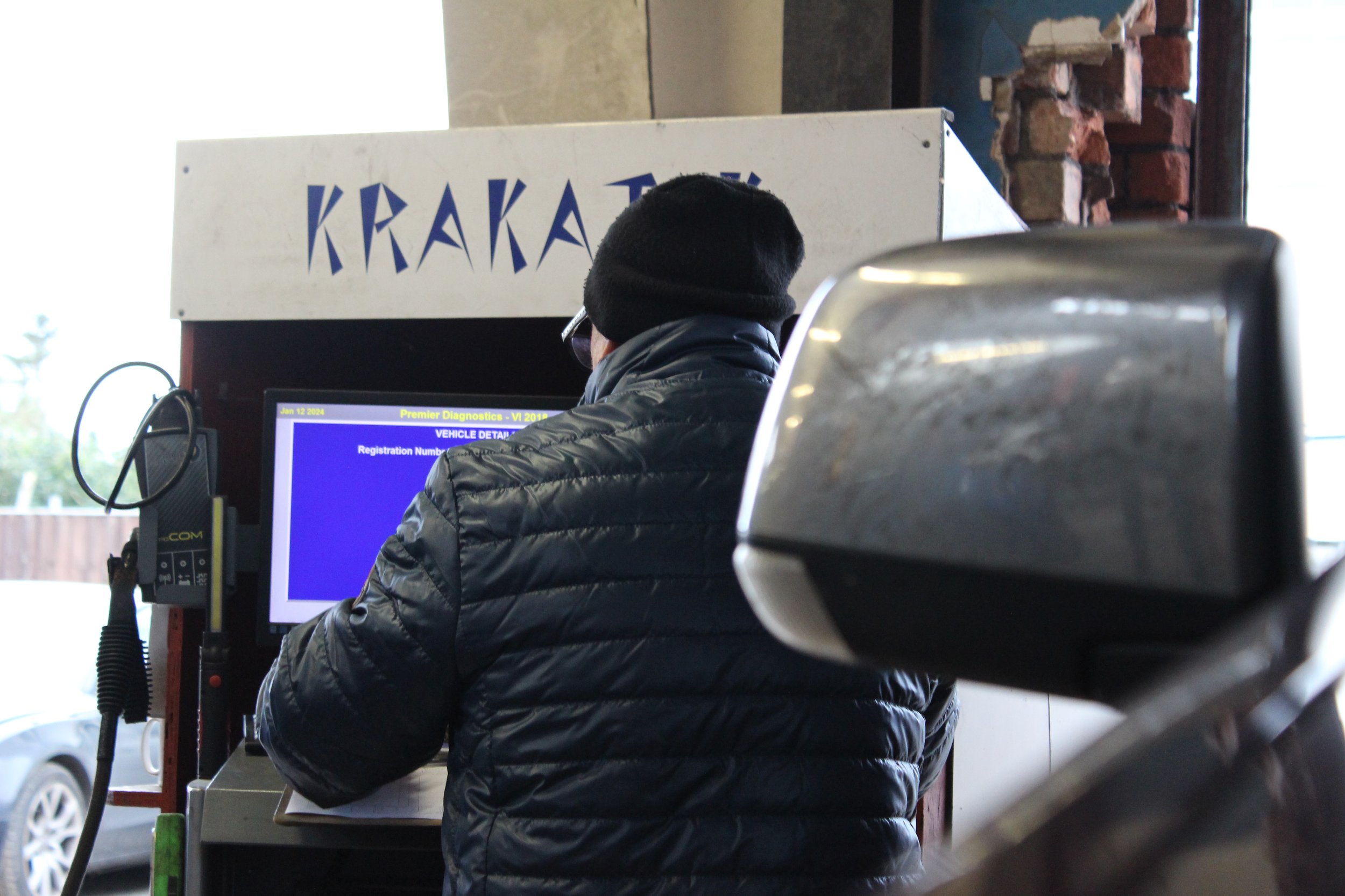
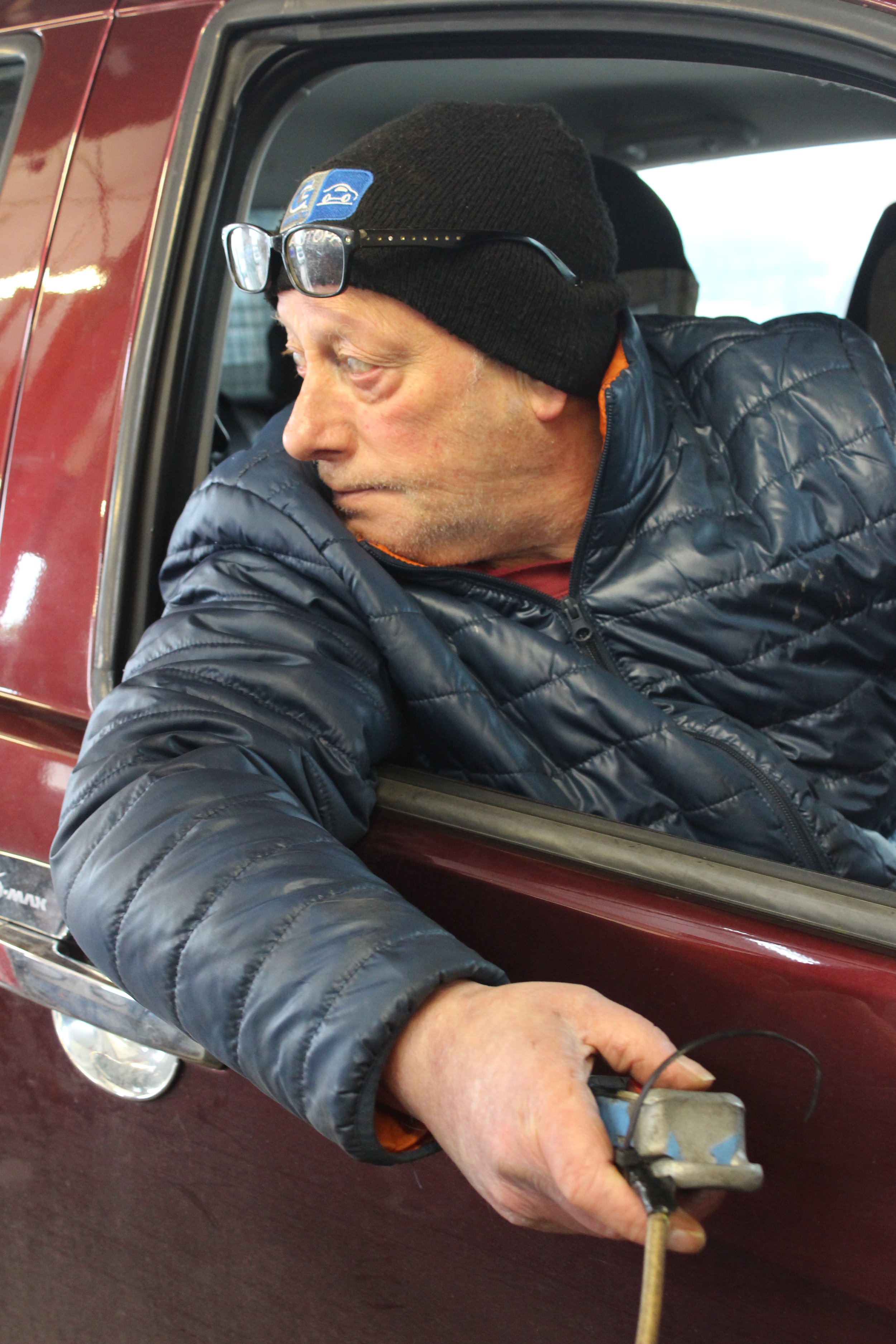
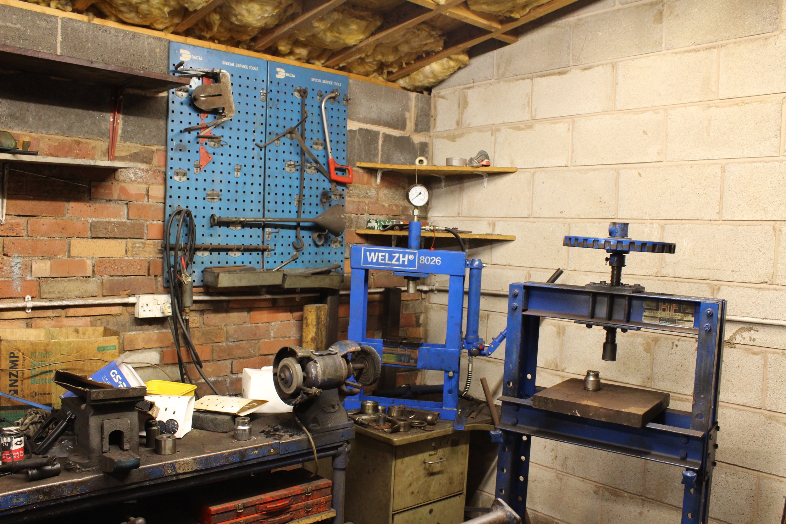
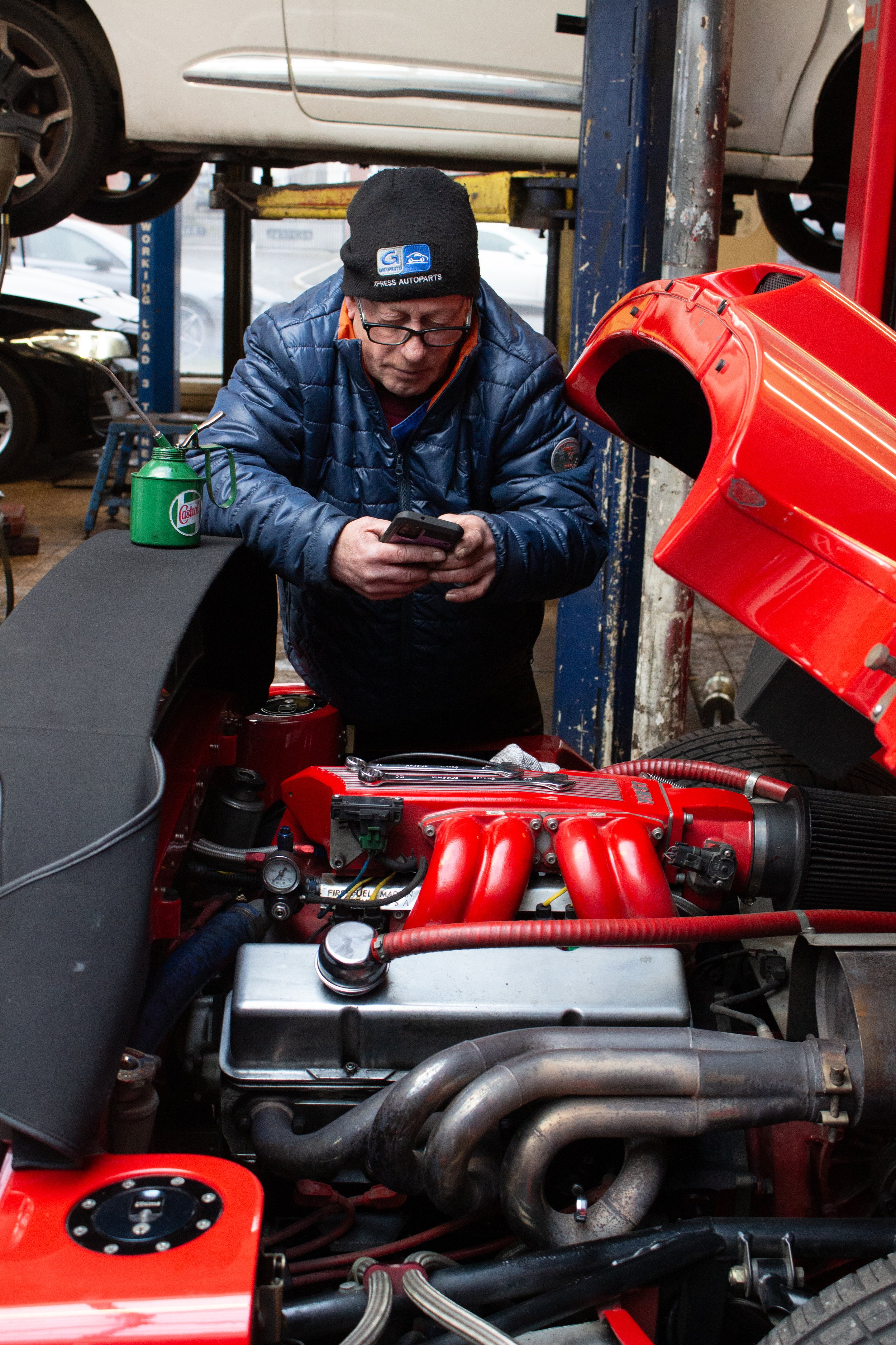
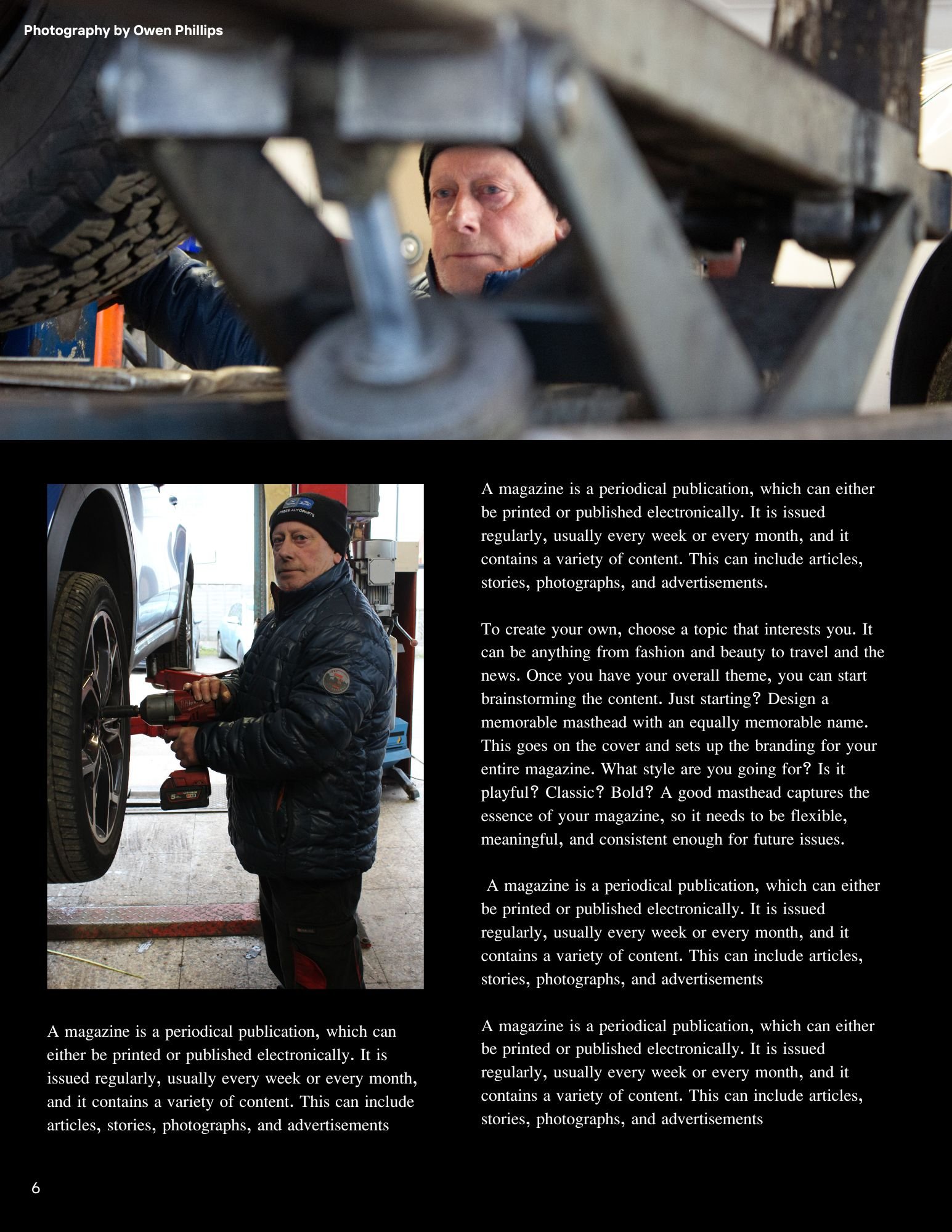
These photographs above are the non-edited images of the ones I used in the magazine mock-up. There is a minimum of 15 images for the zine and I have chosen 19 out of 181 images. As you will be able to tell above, I did my best to make sure the exposure settings are correct so I did little to no hue and saturation editing. There was only one image that I altered the levels due to poor lighting in the premises, but for all the other ones - the lighting is really good. I will only need to crop the image to delete some of the unnecessary parts of the image.
Post-Production
Edited Images For The Magazine
For this image, I altered the light levels as to me it seemed to bright. The contrast, the highlights and the white levels were mostly altered. This made the colours look more vibrant in the places I wanted to be able to be seen rather then looking somewhat white washed.
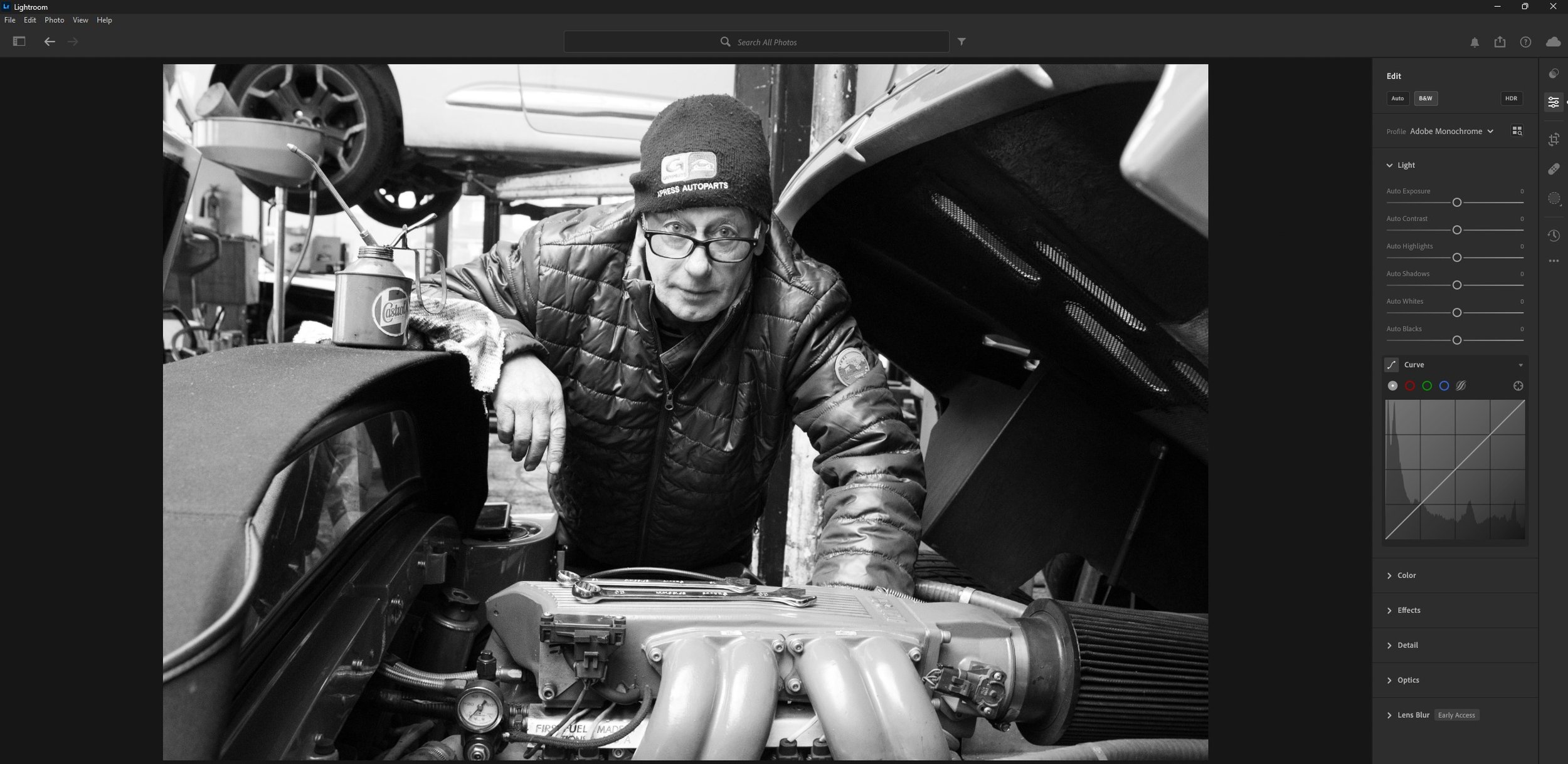
For this image I changed the image from colour to Black and White by clicking onto the B&W button inside Lightroom.
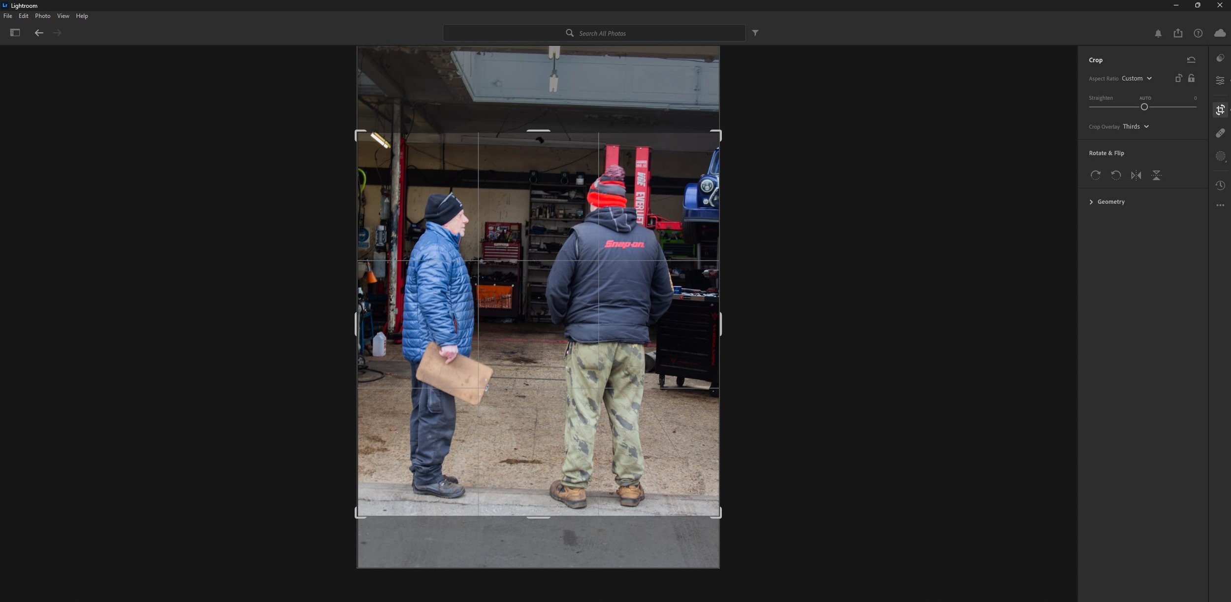
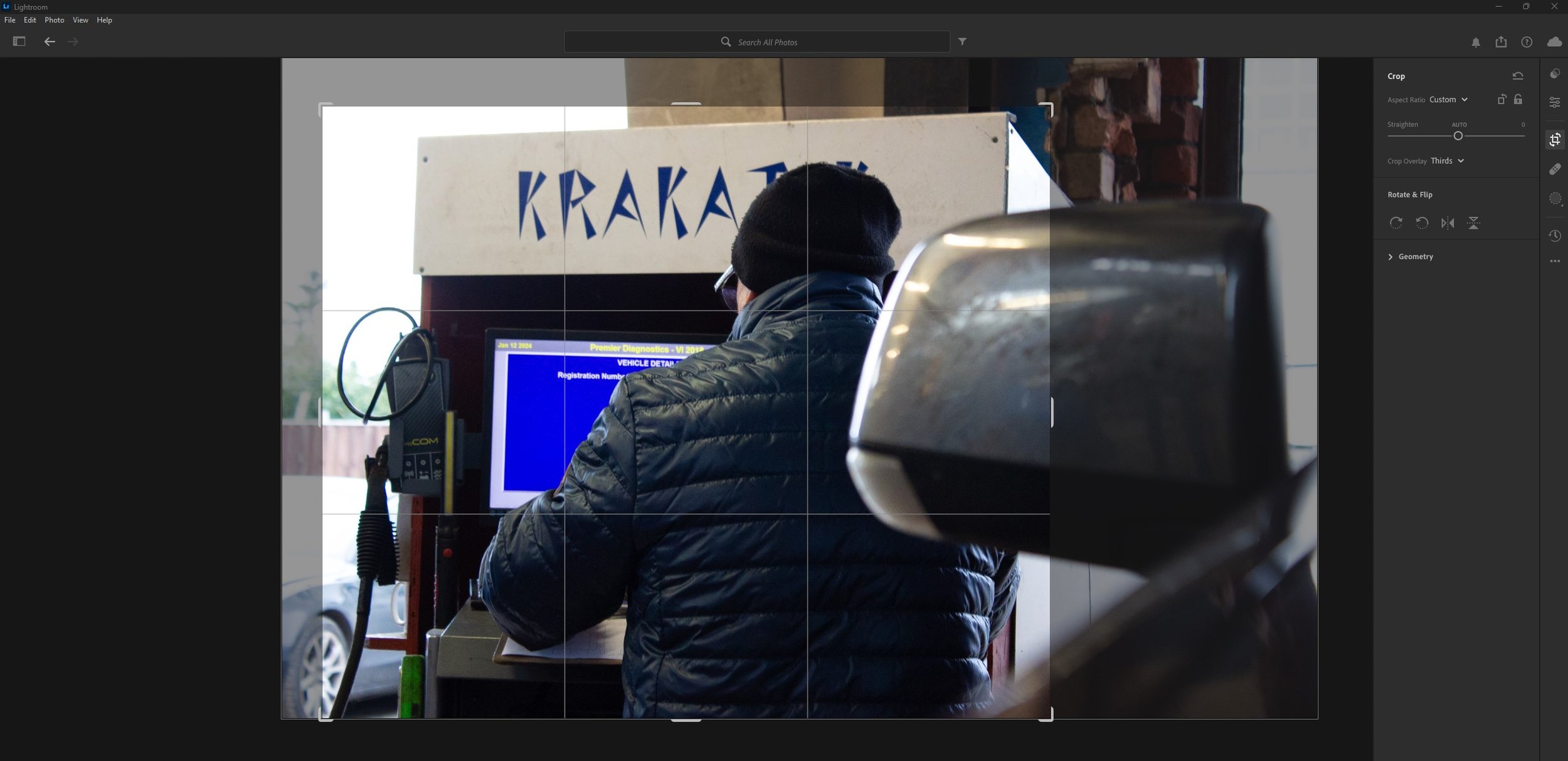
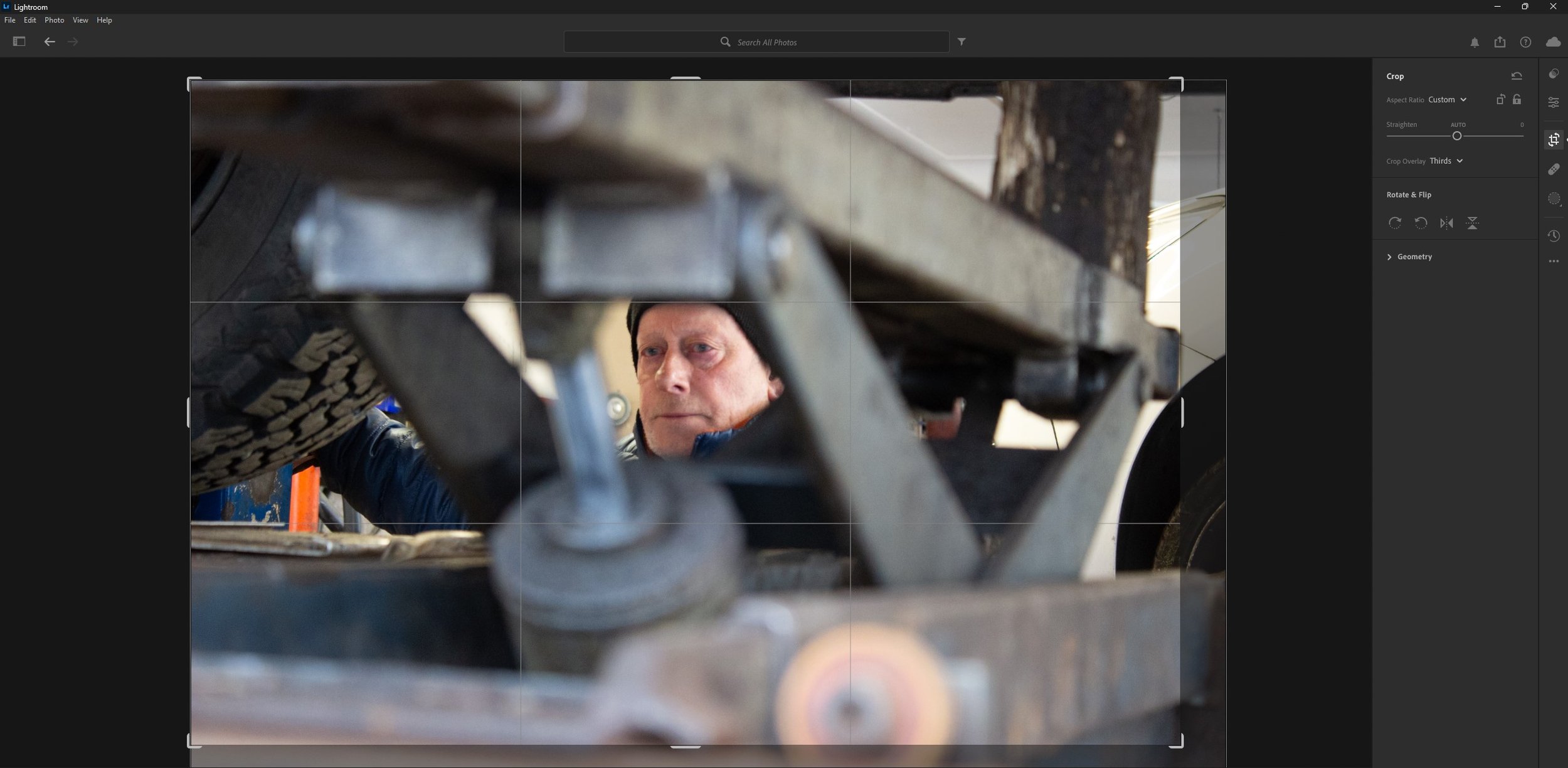
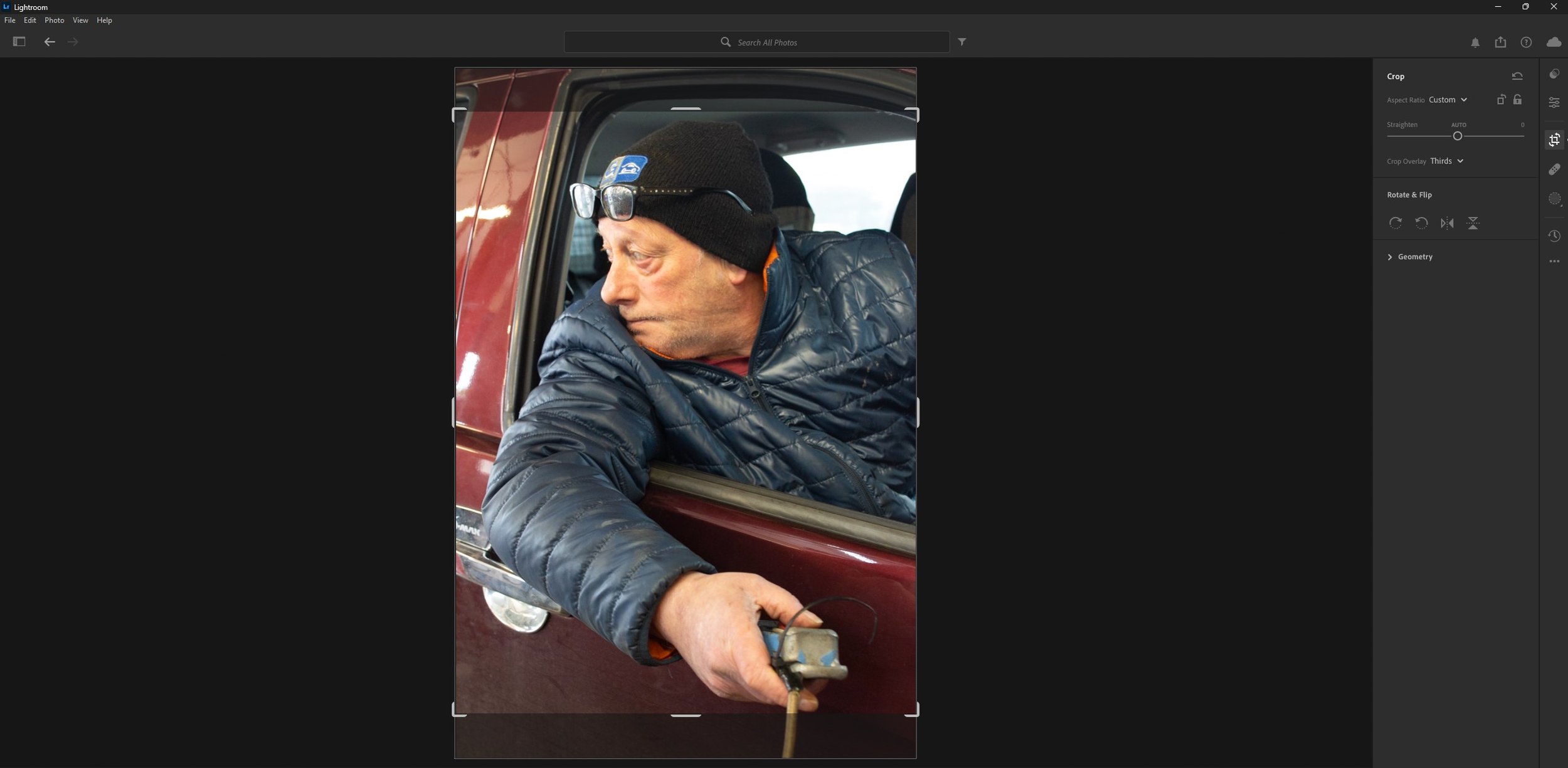
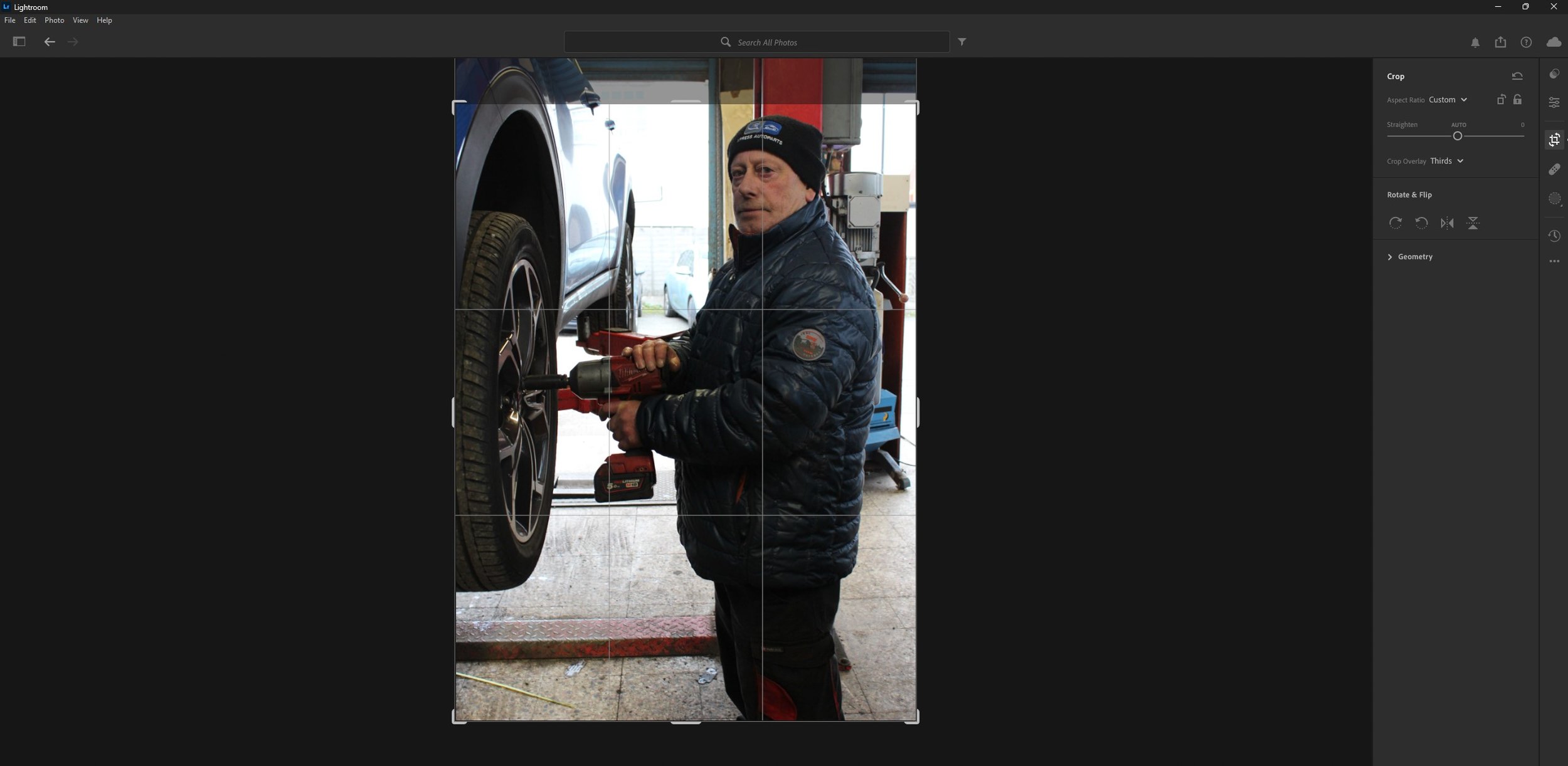
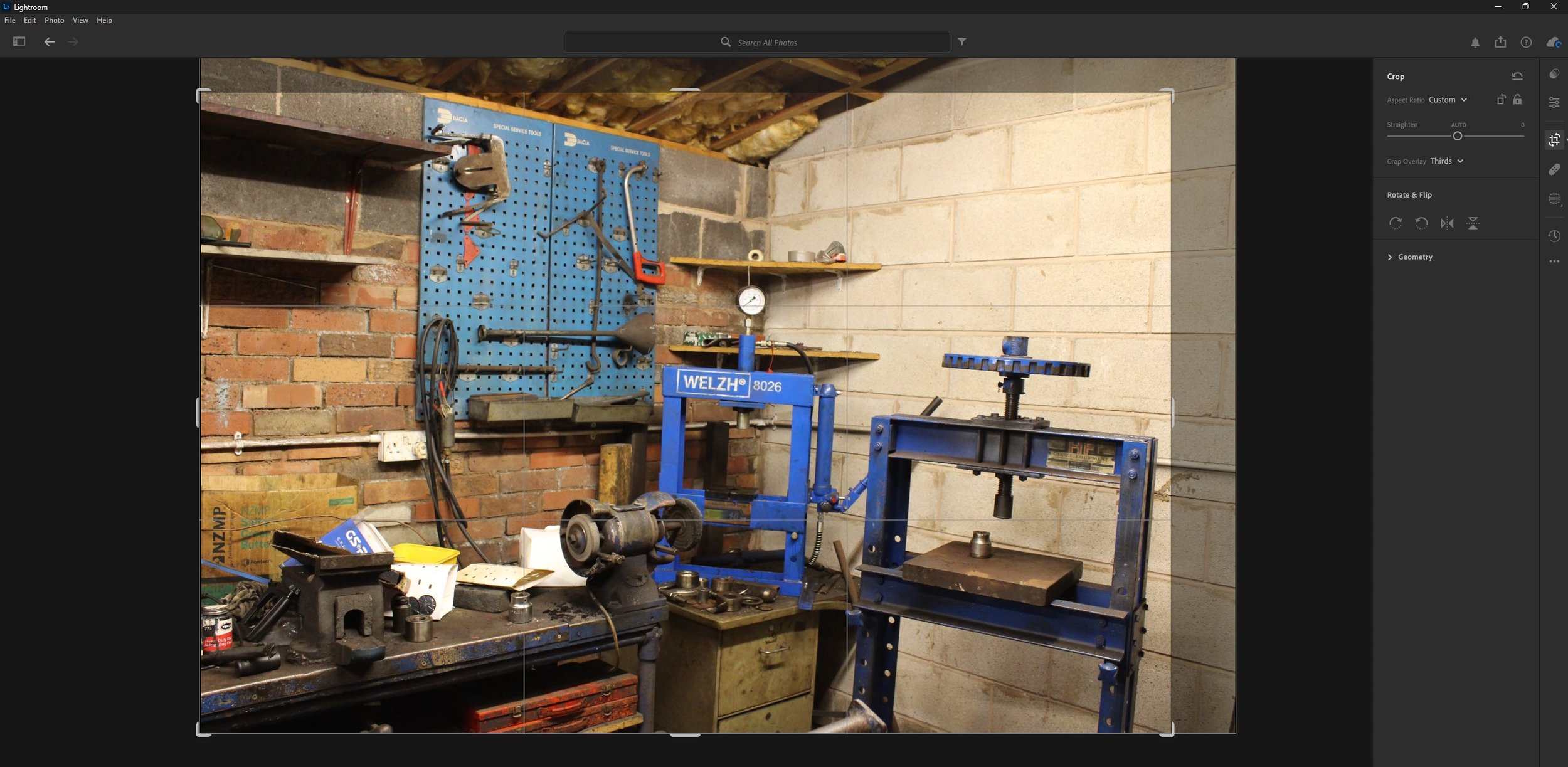
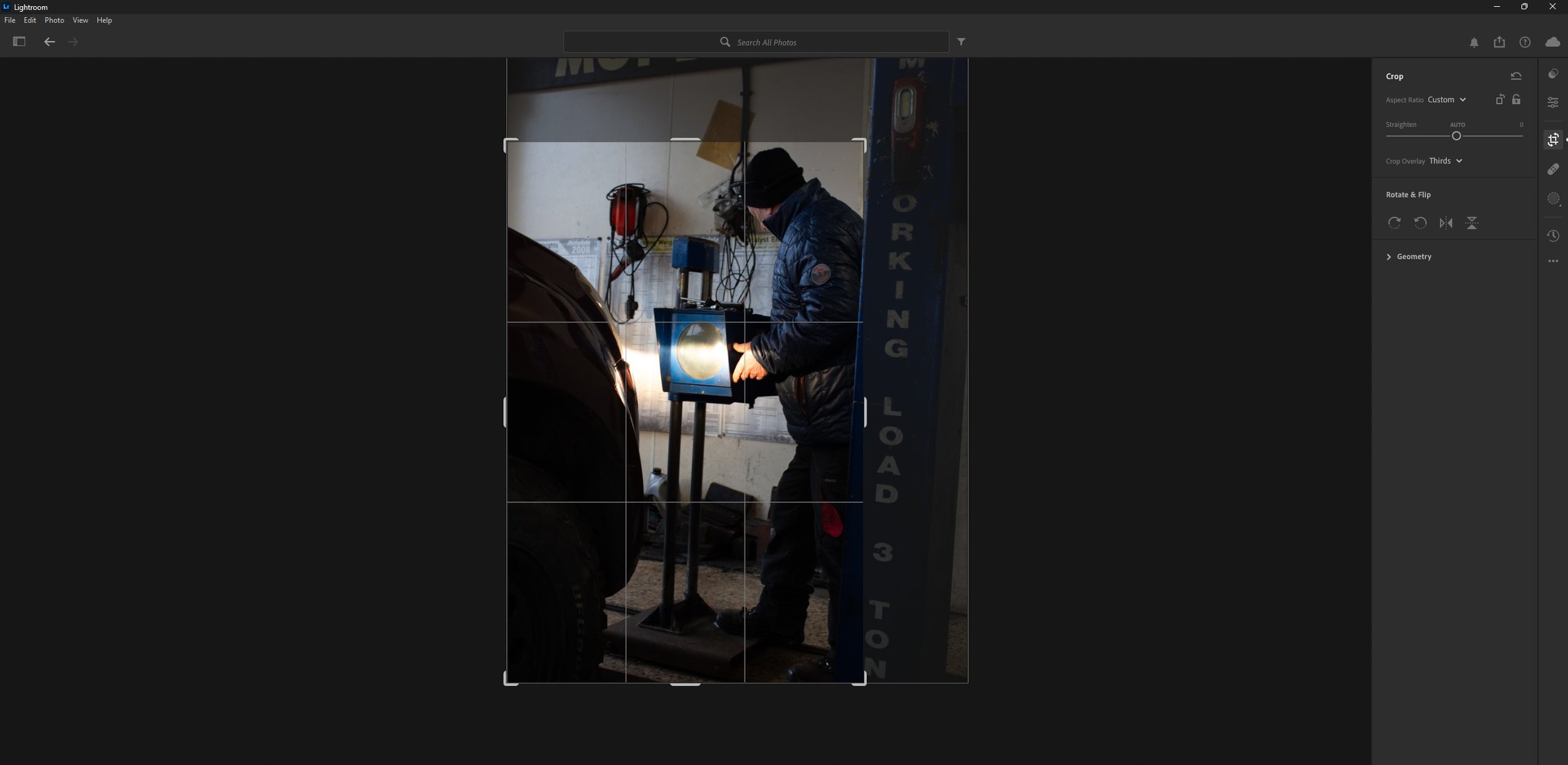
As you can see above, I have cropped the images to cut out the unnecessary parts such as some of the background to keep in focus the subject in the foreground.
The Magazine Layout
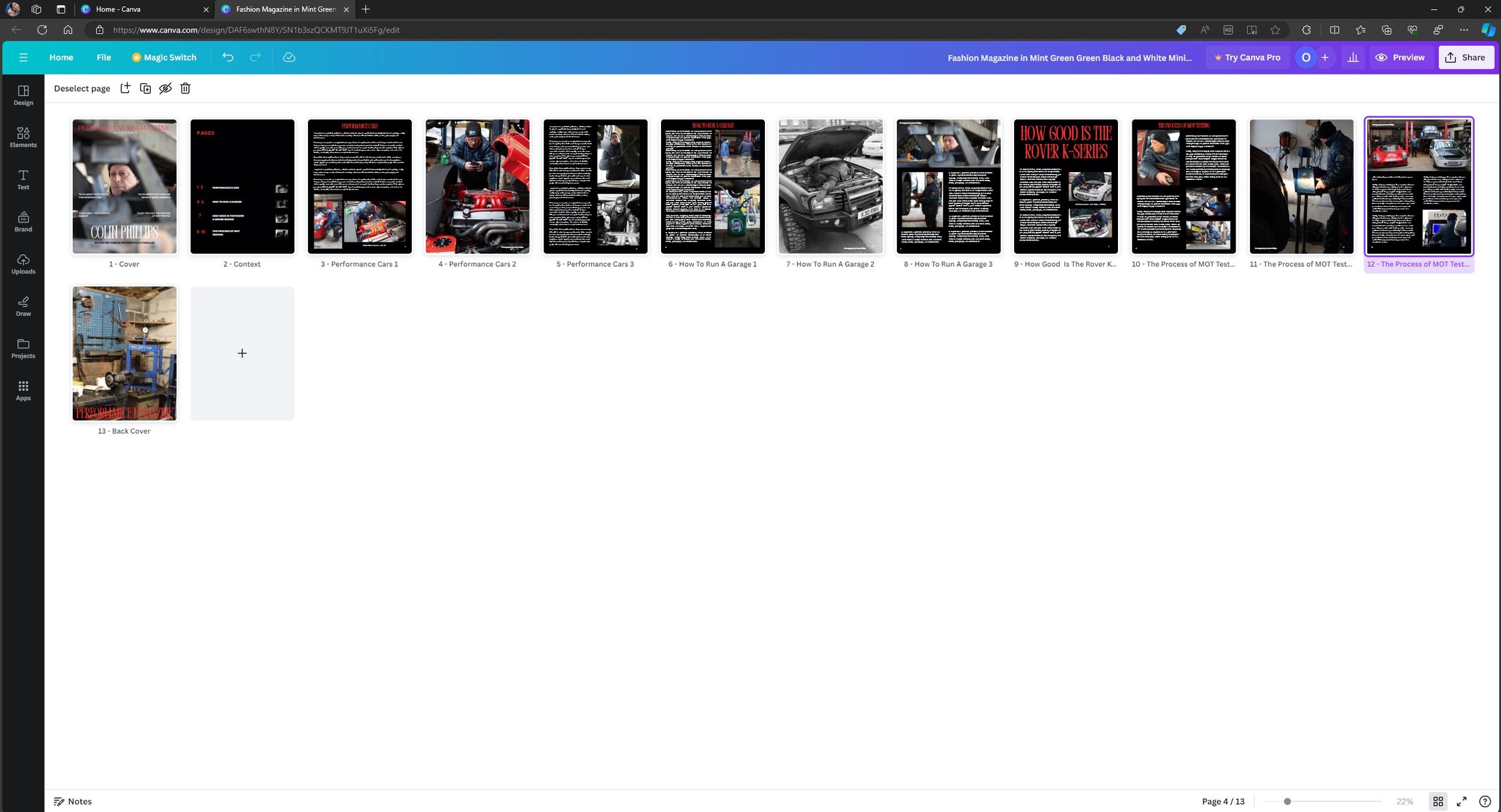
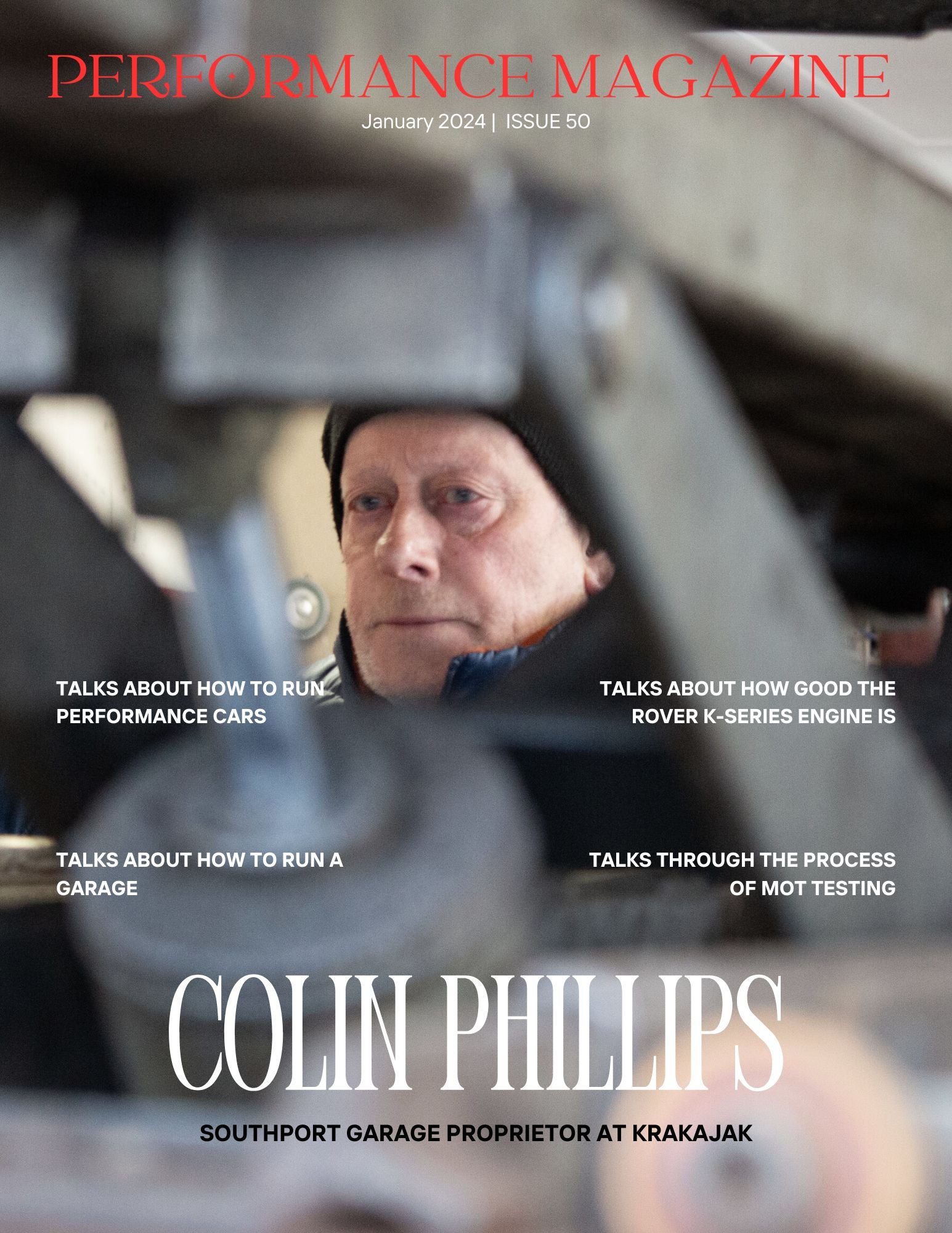
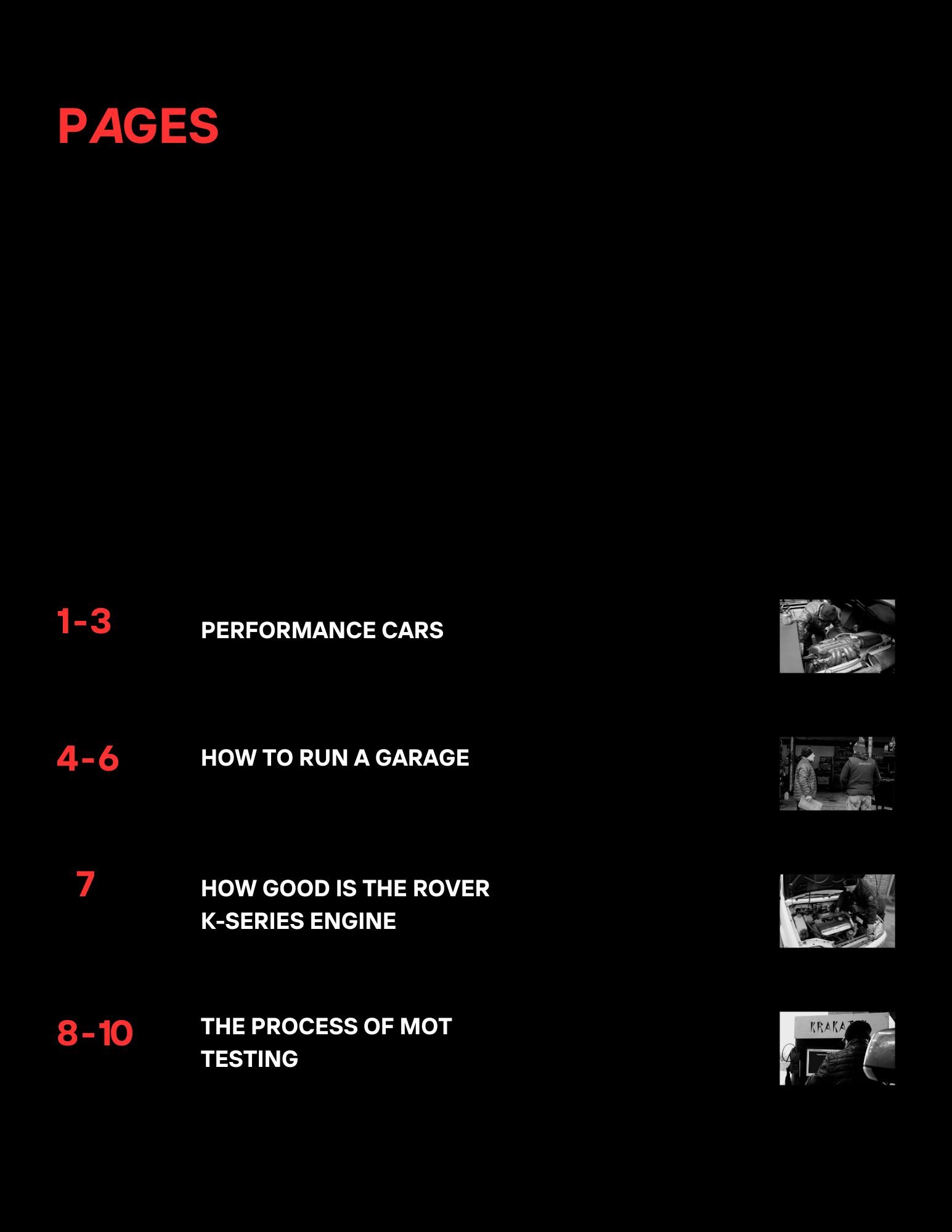
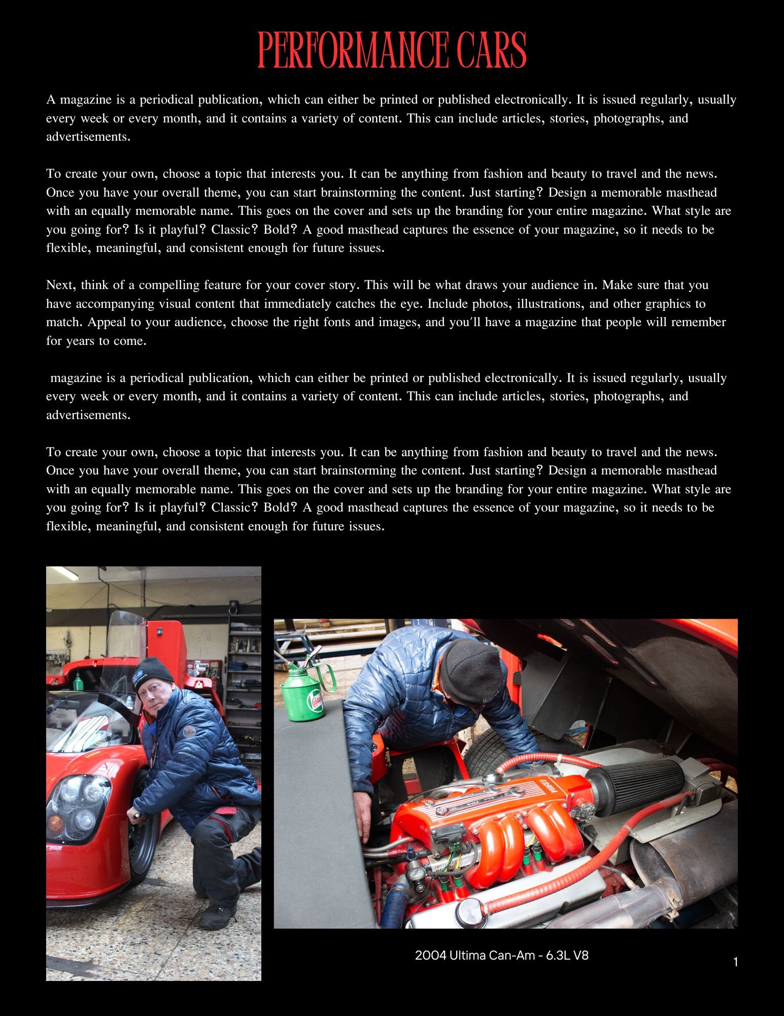
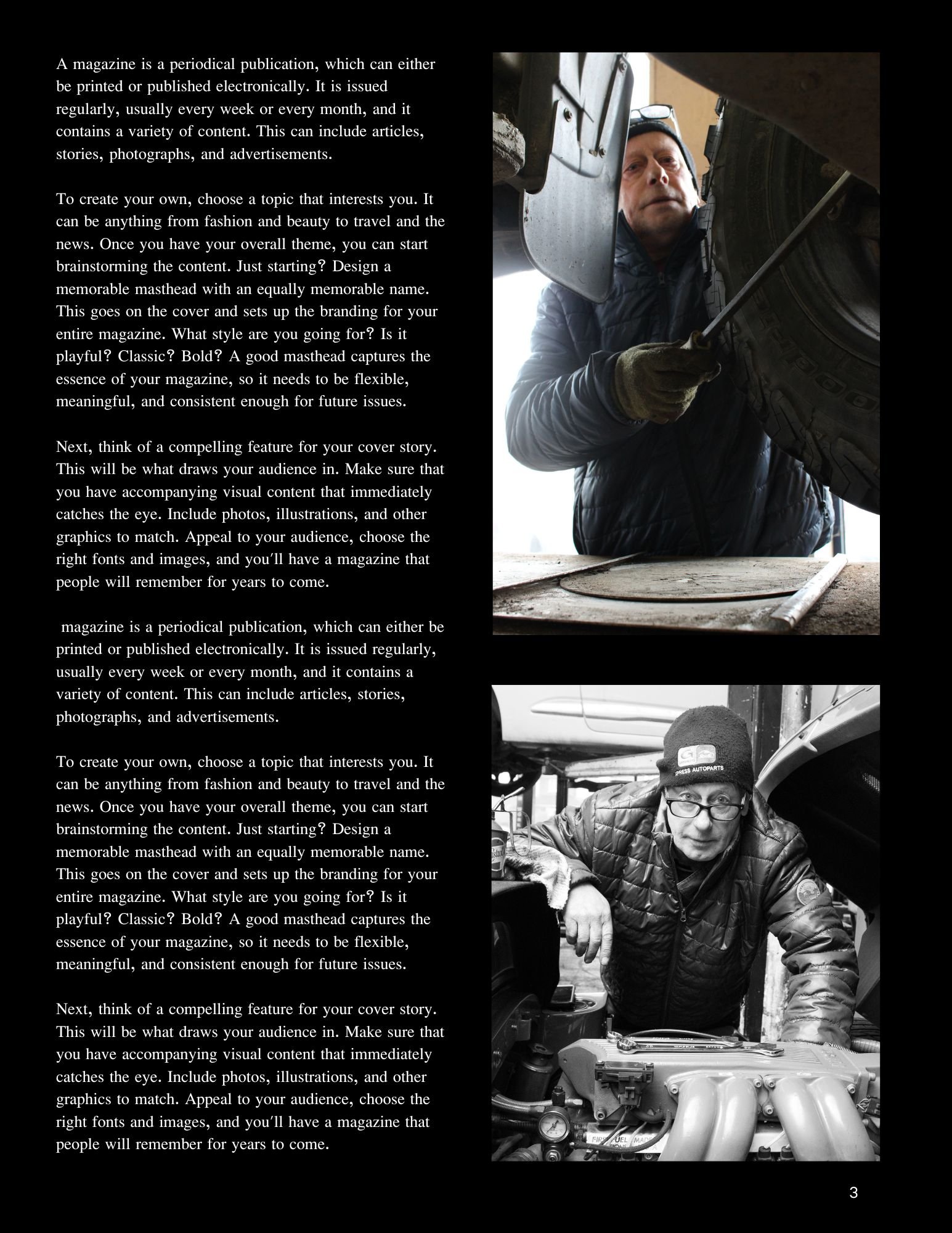
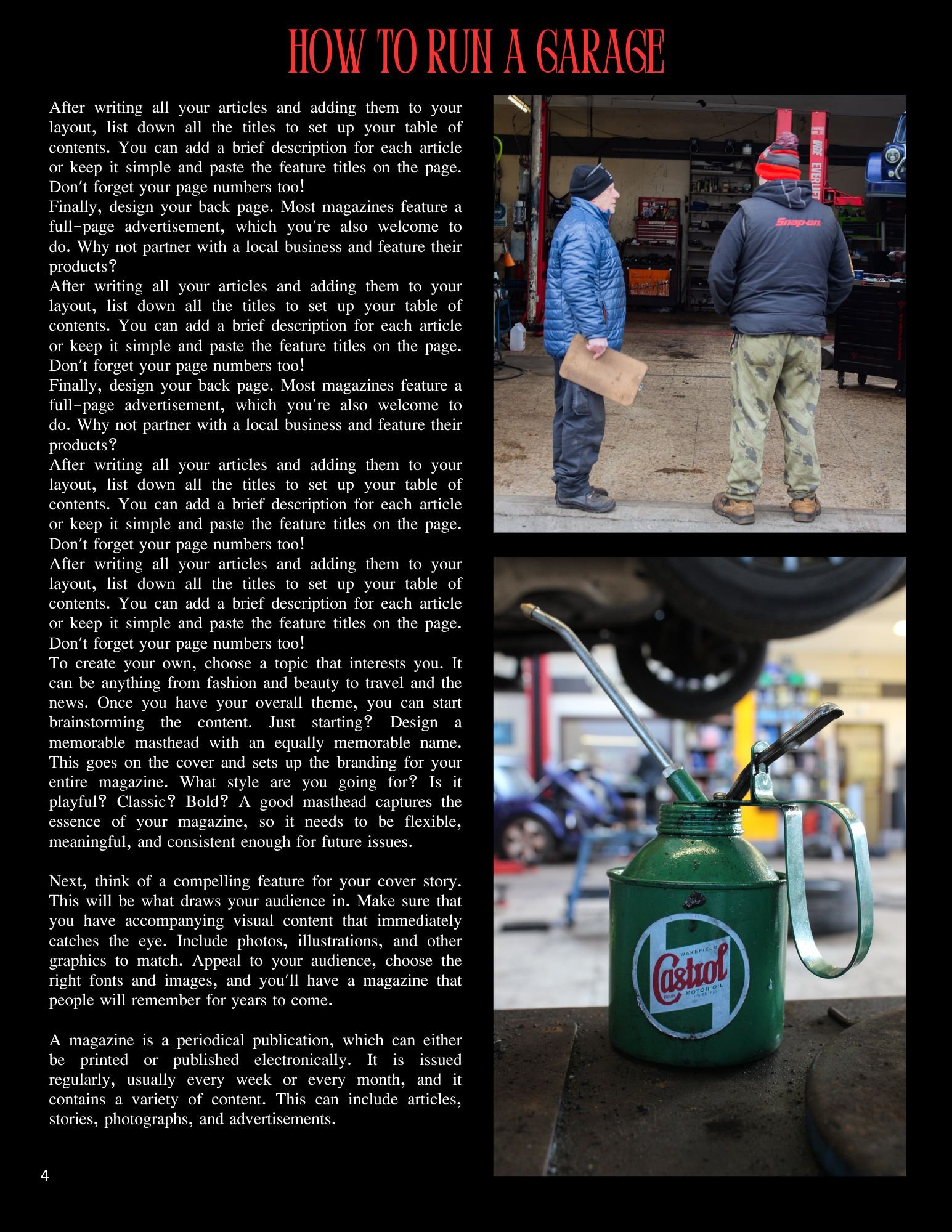
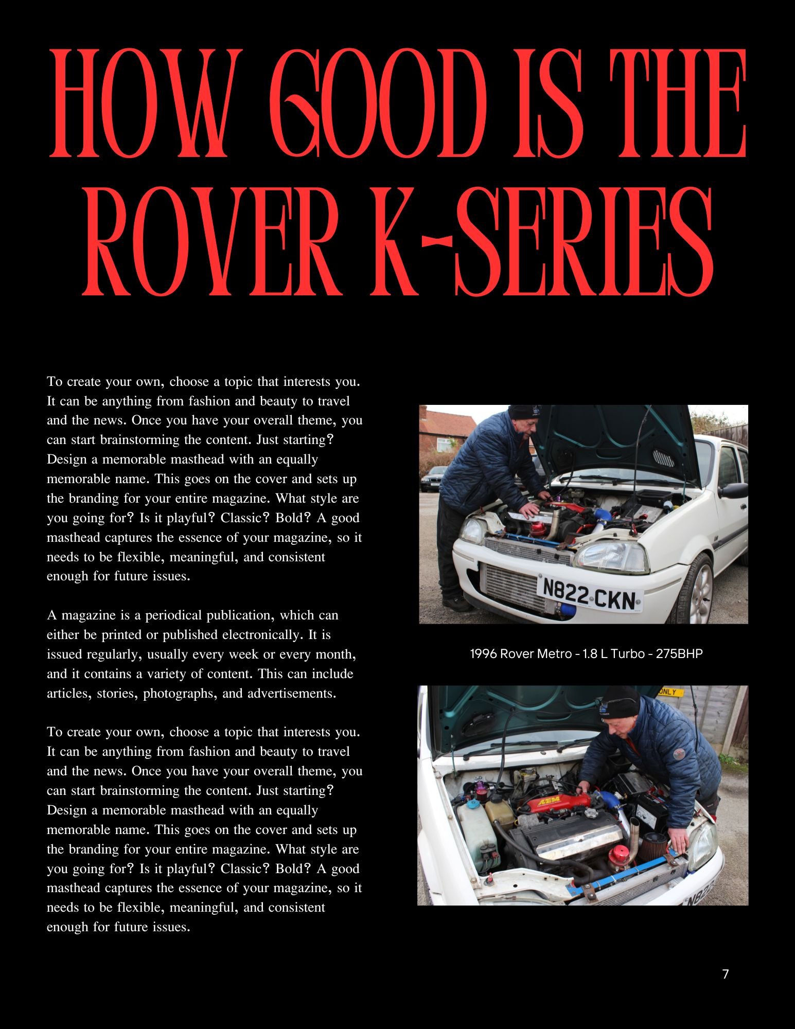
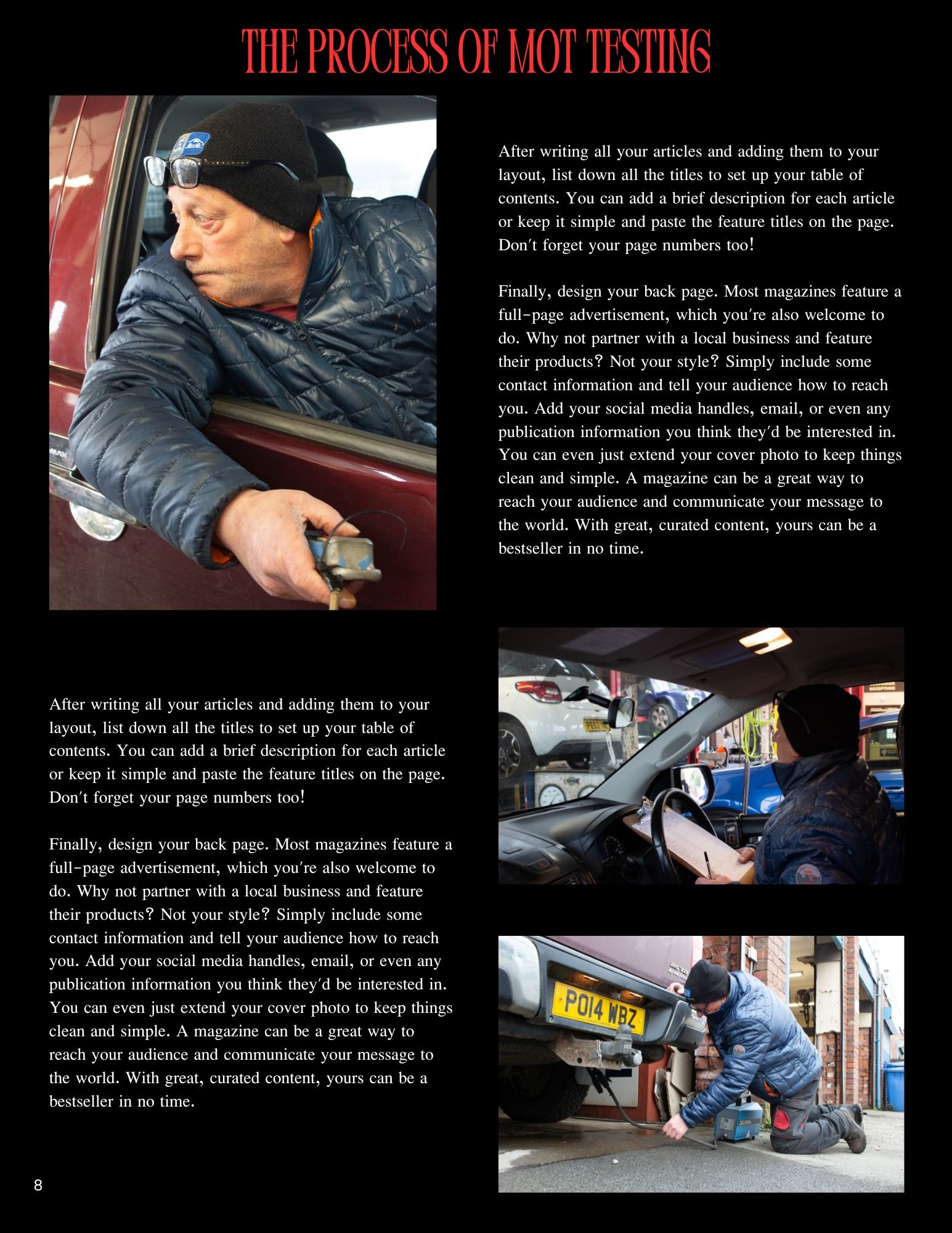
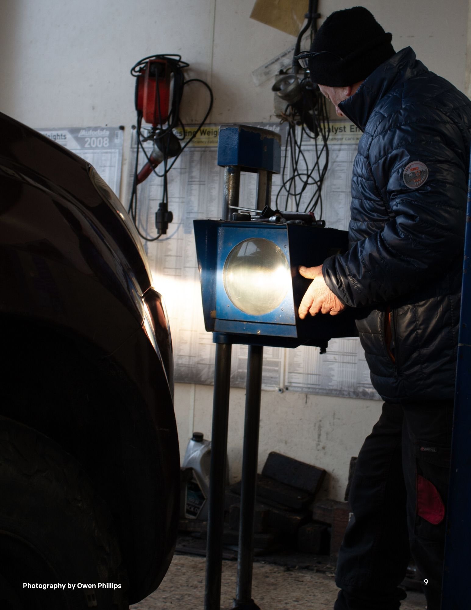
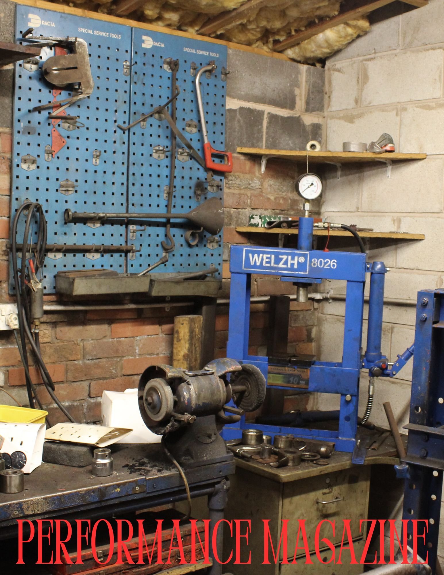
As you can see above this is the magazine layout, I used a template originally and I customised it to the way I wanted it. The graphic design suite I used is called Canva.
Presentation
Evaluation & Reflection
Annotate three strengths & three Weaknesses of the final Documentary Photography Images?
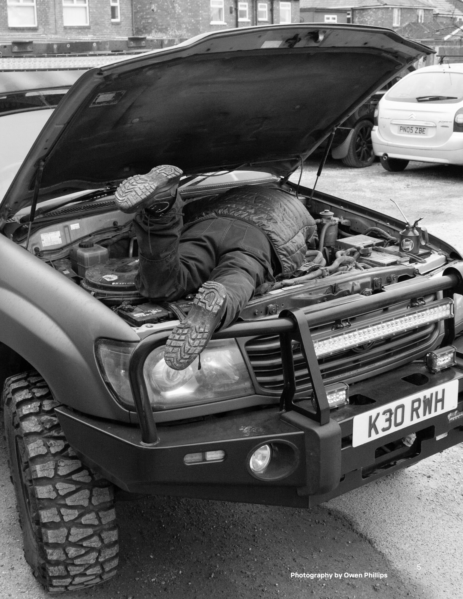
To start with – the pre-production planning for this project was good as I knew exactly what I was going to shoot and how I was going to do it for example, the Land Cruiser image was inspired from a 60s image using an old WW2 Jeep and someone small under the bonnet working on something. (All this is evidenced in the ideas section under pre-production) Secondly, the camera exposure settings used were very good as I didn’t need to alter the levels in Lightroom, there was only one image that I needed to alter, but that was mainly down to the poor lighting in the building which made it dark. Lastly the magazine layout which I picked from Canva looks good and after putting in my 19 images in, everything came together exactly how I wanted it too.Moving onto my weaknesses, I could have photographed more of my Dads spare time and what he does outside of work rather than dedicating it to his work in a garage, but with the time against me on this project I couldn’t do everything, Secondly I could of shot a more variety images of machinery or miscellaneous items then sticking to the image of my Dad working in a garage. Lastly I could of added my own text into the magazine layout so it looks more realistic, for example when he talks about performance cars, I could of written in about that specifically like an interview – (now this is me being a perfectionist)
Who was your intended target audience for your “Day in the Life Zine”?
The intended target audience for my magazine is to the car industry or even somebody interested in cars generally interested to hear an actual mechanics take on things for example “the process of MOT Testing” or even attracted to a particular article such as “How Actually Good is the Rover K-Series engine” when back in the 80s and 90s it was known for its fragility and head gasket problems – what I am trying to say is that it is attracting people to read the article with their existing knowledge on such topics, but with their minds open to learn more about why this person thinks or how he thinks that way.
What were your key areas of development during this unit work?
The main area of development for me throughout this unit work is the photography techniques have improved significantly, as I am tailored towards more the film making side – I can transfer some of my skills from that field and put them into practice when taking photographs. The hardest part was making sure that the camera exposure settings were perfect before taking pictures as I didn’t want to alter levels in Lightroom. From that point of view, I am a perfectionist because it needs to be right otherwise it is not worth bothering with. It took a few days to practice and experiment with different angles and shot types to get the right one I wanted. I would go as far as going back on location again if I wasn’t happy with the pictures I’d got and reshoot.
Authentication Document


