Self Promotion
Showreel
Career Action Plan
|
|
My Profile |
Personal
characteristics
|
My current
skills and abilities (Things that I can do well, e.g., time
management, teamwork, problem-solving) |
Teamwork – Problem Solving –
Articulate |
|
My values (Things that are important to me, e.g., honest,
hard-working) |
Determined - hard-working –
honesty |
|
My interests |
Keen interest in the local
area and it’s politics, Cars & Motorbikes. |
Educational
background
|
Current course details |
UAL (University of Arts
London) Level 3 Extended Diploma in
Creative Media Production |
|
List of units studied on the course |
U1
Introduction to Media Processes & Technical Skills U2
Introduction to Design & Research Skills in Creative Media Production U3 Introduction
to Professional Practice in Creative Media Production U4
Critical & Contextual Awareness in Creative Media Production U5
Investigating Audio Production U6
Investigating Visual Production & Technology U7
Investigating Interactive Media Production & Technology U8
Extended Project in Creative Media Production U9
Characteristics & Contexts in Media & Communication U10
Engaging with an Audience U11
Preparing for Progression U12
Specialist Study U13
Extended project in Creative Media Production |
|
Completed certificates/statements of attainment (GCSE) |
Subject Grade Maths U English Language 4 English Literature 3 Creative Imedia P2 Enterprise M1 Geography 2 Computer Science 2 Combined Science 2 |
Employment achievements
|
Employer/Organisation
name |
Type of tasks undertaken |
|
Krakajak – Liverpool Road,
Southport, UK |
Motor Mechanic Assistant |
|
|
|
Community Volunteer involvement
|
Organisation
name |
Type of tasks undertaken |
|
Sefton Council |
The helping of the creation
of the Southport Town Deal schools’ video in 2020 |
|
Sefton Council |
Launching the Southport
Town Deal in 2020. |
|
My Future |
My Career Choice
|
University or Employment |
University |
|
Personal Qualities required |
Punctual - determination – commitment |
|
Skills required |
Teamwork – Collaboration – Time
management & Planning |
|
University Choices and Course requirements and prerequisites |
1. SAE Institute Liverpool 2. University of Central
Lancashire 3. Edge Hill University |
|
University only - Provider open days and important dates for
progression courses |
UCLAN in May 2023 SAE Institute Liverpool on
16th January 2024 |
|
Potential Employers |
1. Freelance /
Self-Employed 2. Working for a company or
organisation 3. Apprenticeship 4. Teaching in a College |
1.
My Personal Statement Outline
From a young age I have always been into
creating films and videos, this started off in high school when I got my first
gaming computer with a capture card to record gameplay off an Xbox. Then, I
would use Windows Movie Maker to drag and cut clips together to make a simple
video which would gather probably about 40 to 50 views per video, at the time I
thought that was amazing. This was where I first found my passion in the
creative media process.
During my time in high school, I dipped my toe into many things but most notably local politics. At the age of 15, I wrote an article for Stand Up for Southport talking about what the town could spend the £25 million government grant on. This sparked huge debate in Sefton Council, Southport Town Deal, and the Southport BID. As a result, this put me front and centre of the Town Deal with some help from my Headmaster at Meols Cop High School. During this time, I had to utilise and develop my leadership skills in order to create change within my community.
To promote the Town Deal the Council funded a video to introduce the Town Deal and during the creation of the video; this made me fall back in love with video editing and filming. There was a video that was sent around local schools with me at the forefront encouraging younger people to submit ideas into the Town Deal. All the campaigning and promoting caused a landslide of ideas, and this also gave me the opportunity to influence the younger generations which was inspiring.
As a result of falling back in love with Creative Media, I enrolled on a course at Southport College to start studying whether it was photography or film making in 2021. My interests tailored towards film making and this became apparent when working on other projects. As I started to focus more on filmmaking, I’d always push myself to improve every time whether it was on the editing side using Premier Pro or using a dedicated DSLR video camera with a gimbal. I would also self-reflect on my work and talk about the mistakes and having good time management for hitting deadlines is very important as there will be many in the future and adapting to this early on is very vital and important to me.
I feel as though going to university would be massively beneficial decision for myself since realising that I could extend my educational career and I can develop as a person as well as my knowledge. I also want to learn a lot more things part of the film making world but on a bigger scale. There are many units I have enjoyed at college, but the one I mostly enjoyed was the TV Commercial Production where I photographed my car from different angles and then put it together in a moving image format using post-production lighting techniques.
Throughout the past couple of years whether it is at college studying Creative Media or local politics; the passion for each of these things have been high, the willingness to learn is always a key factor.
|
My Plan |
Goals
I achieved last year
|
1.
Completed the first year of my course (UAL Level 3 Creative Media Production
& Technology) 2. Leant
how to use and assemble a DSLR video camera gimbal. 3. Leant
how to use a dedicated film camera ie. Lumix GH5 4. Learnt
how to use post-production lighting techniques in Premier Pro. |
New Education and Training
Goals
|
What is my goal? |
How will I do it? |
Why is it important? |
When will I do it by? |
|
1.To start my FMP |
Plan and Film it as early
as possible. |
It is important because I
learned that being prepared will give me more chance of submitting my best
work. |
12th June 2024 |
|
2.To complete all the
assignments in the second year. |
Stay focused with the work
being set. |
It is important because I
want to get a decent grade at the end – Better then a pass. |
12th June 2024 |
New
Employment Goals
|
What is my goal? |
How will I do it? |
Why is it important? |
When will I do it by? |
|
1.To find another part time
job. |
Indeed or any job searching
website or app. |
To help with finance. |
Ongoing |
Areas I need to develop to
achieve my career choice
|
|
|
Achievement Date |
|
Attributes* (e.g., personal characteristics such as personal
presentation and motivation) |
1.Convidence. |
Ongoing |
|
2.Self-Belief. |
Ongoing |
|
|
Skills* (e.g., academic skills and employability skills
such as organising, learning and teamwork) |
1. The knowledge and the use
of equipment. |
Ongoing |
|
2.Interview skills. |
Ongoing |
Updated Canva CV
Mock Interview
Can you describe a project where you had to work under tight deadlines? How did you manage your time and still deliver quality work? I jointly made a video for schools for the consultation process of the Southport Town Deal in 2020 and back then we had a quick turn around time for Sefton Council; having a well thought out plan before hand helps us meet the tight deadlines. With that thought out plan, this helps us deliver good quality work in the time scale set.
What video editing software are you most comfortable using, and can you provide examples of projects where you utilised it effectively? Most of my projects I have done I have edited with Adobe Premier Pro, for example when I did my TV Commercial for my College course, I knew where the specific menus are to use post-production lighting techniques and how the time stamps work. Even right down to which type of technique to use for that specific part of that video; it all takes practice to learn it, but when you know you don’t forget it.
How do you handle constructive criticism, and what steps do you take to improve your skills based on feedback? I wouldn’t’ say I have steps I’d take, but all I would do is take it as a pinch of salt and then check back at my own work to see where I could improve on from the feedback given. Their isn’t a mental process I’d take because I don’t get offended easily by other peoples criticism.
Cover Letter
Owen Phillips
42 Scarisbrick New Road
SOUTHPORT, Lancashire
PR8 6QE
07486 684852
26th
February 2024
Dear
Sir/Madam
Photographer
& Videographer for Cleartwo in Stockport, SK1 3GB
I would
appreciate it if you would consider me for this role as a photographer and
videographer for your company.
Ever since I
was a student at Southport College, I have garnered experience in editing using
Premier Pro and have extensive knowledge into the program. I also have good
experience in using Lightroom for photo editing. I gained a lot of experience
when campaigning through the Youth Southport Town Deal board where I was
involved with the campaign for the new Multi-Conventional Events Centre.
I have good public speaking and communication
skills for speaking in-front of the camera or to people and all this comes with
the ability of using strong English skills. I would value collaborative working
and new learning opportunities and I believe that your company can help me to
achieve this.
If you
require further information, please get in touch.
Evaluation & Reflection
Reviewing the Showreel - What are the strengths of what you did but also how can this be improved?
The main strengths of the showreel were how the footage from all the videos that I have created were in sync with the music. From the past few projects, I have worked hard on trying to keep everything in time with the bass or the precautions. It’s easier said then done. The next strength is how the music is very tense and has an element of suspense, the soundtrack gives you the time to take in what you’re watching and analyse the type of videos that I have created and recorded.
One of the few things I could have done to improve this showreel is making more of an effort to incorporate my photographic images into the reel as it seems as if they have been thrown in without any care to how they fit in with the rest of the videography. I also think some of the transitions on the video were out of place.
Authentication Document
Television Commercial Production
The brief has asked us to create a 20 second TV Commercial / advert for either the TV or the Internet. It says it can either be shot in the studio or on location.
Before the internet commercials were mainly showcased on the televisions as that was really the only medium that it could be presented on.
Context & Research
Analyse x3 TV Commercials: -
With 20 seconds being the minimum for our own TV Commercial, I have picked adverts which have the duration of 20 seconds which will make it easier for me to analyse and also it is the same length as my final product.
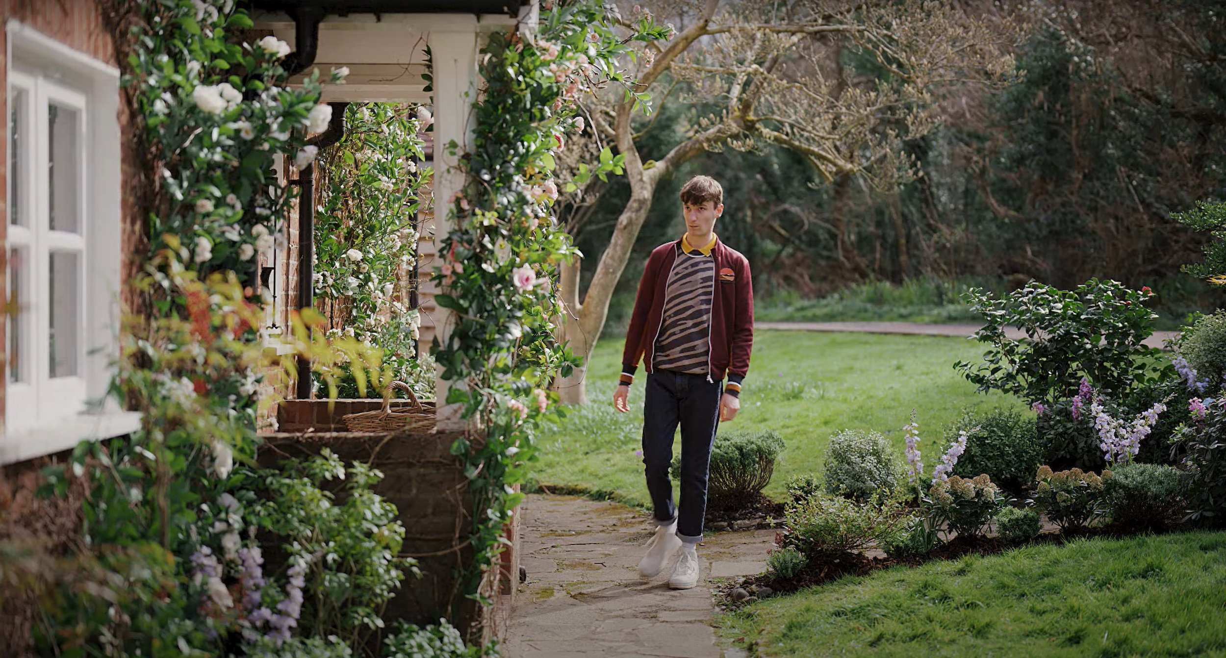
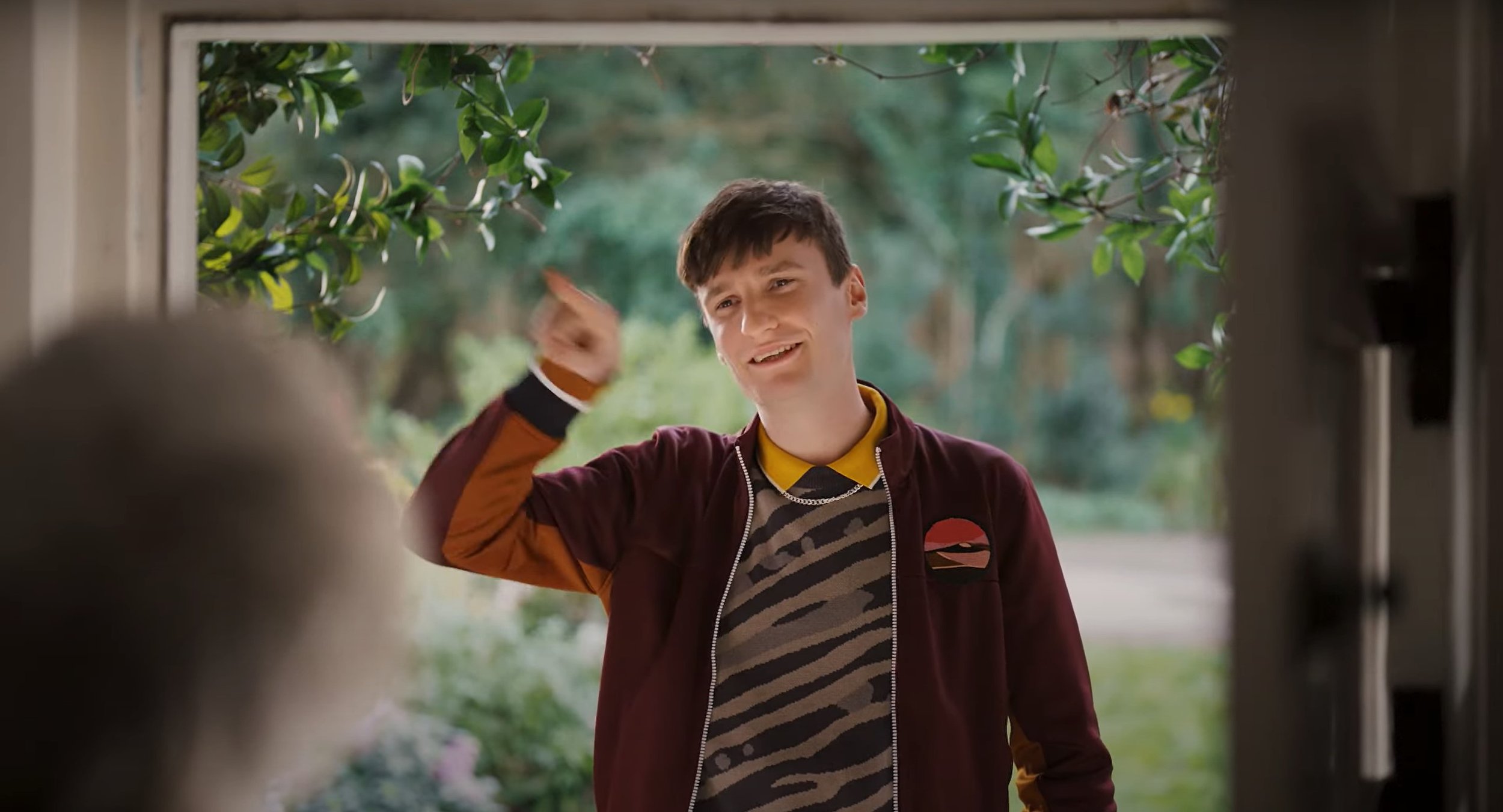
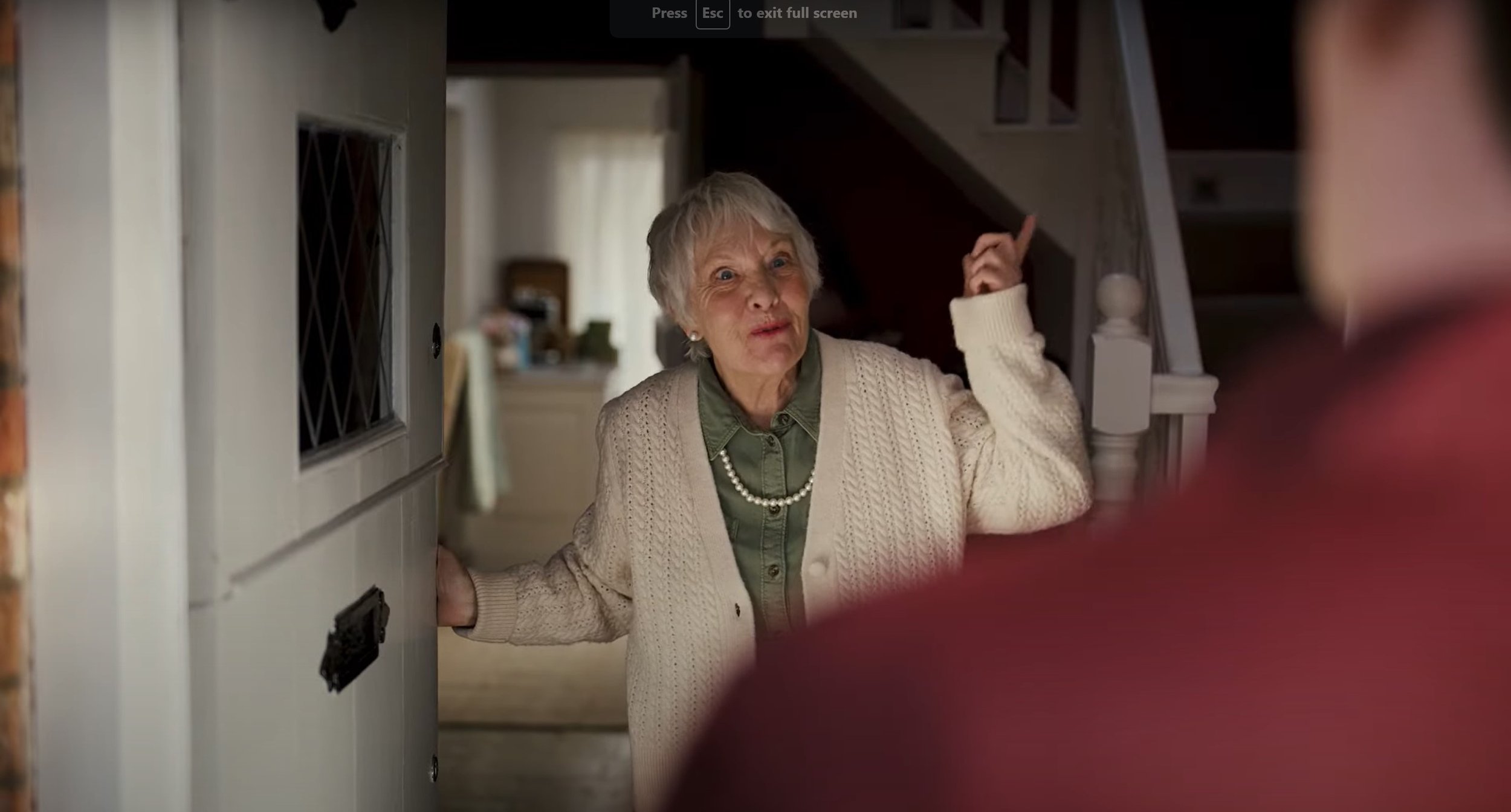
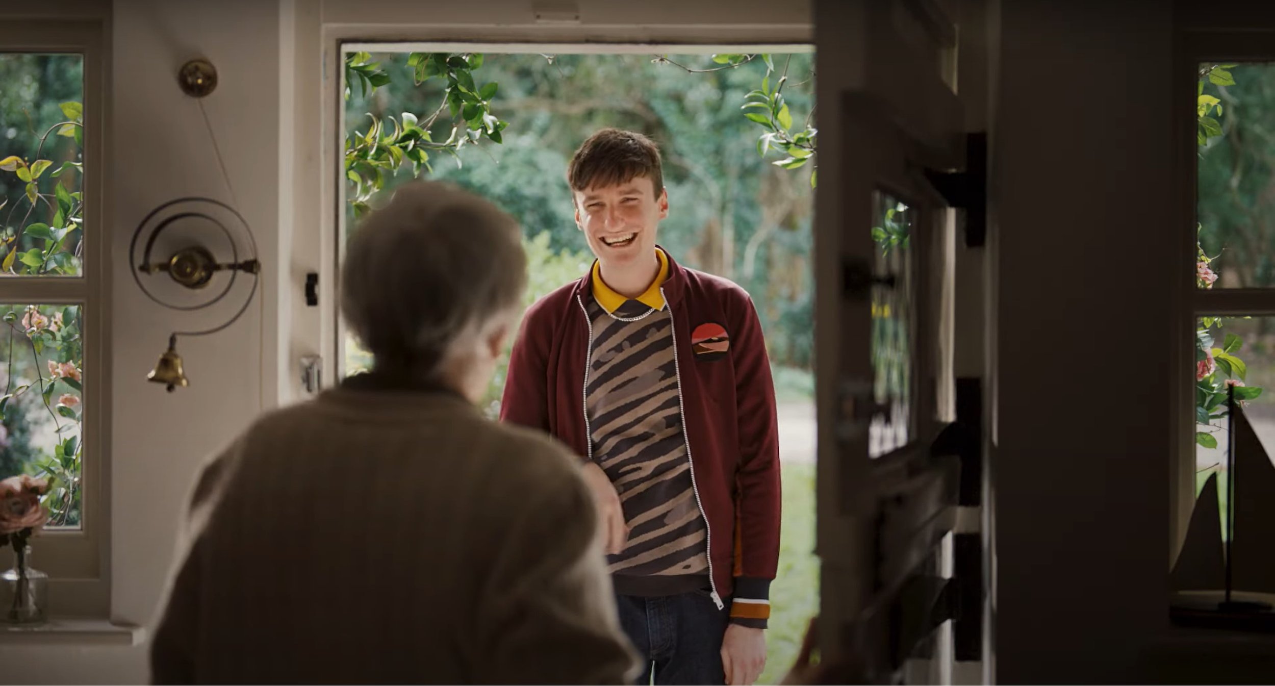
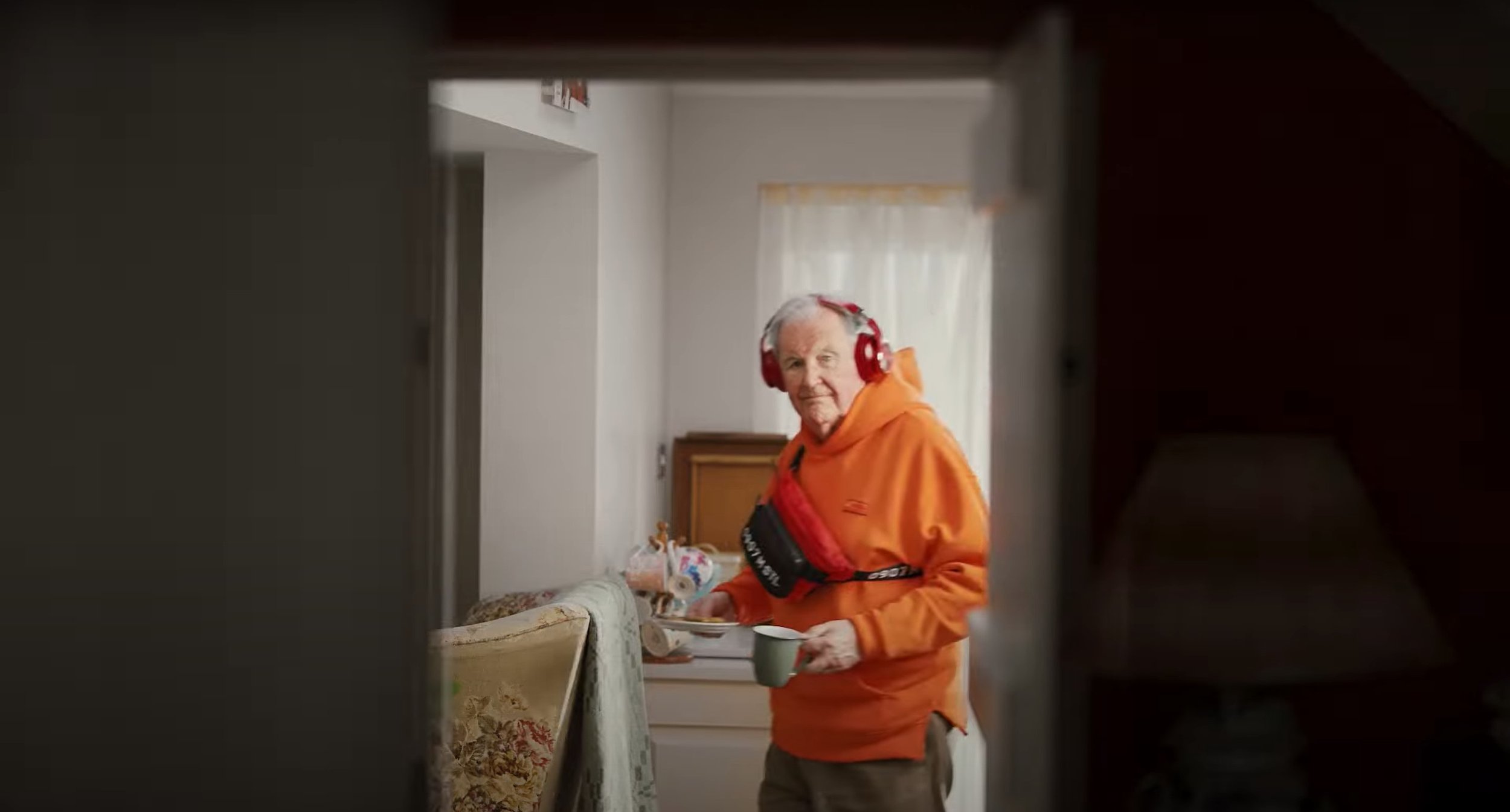
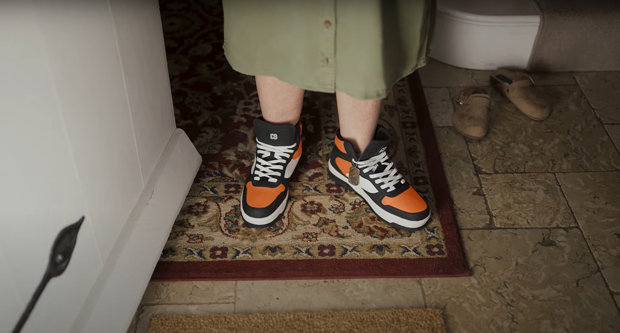
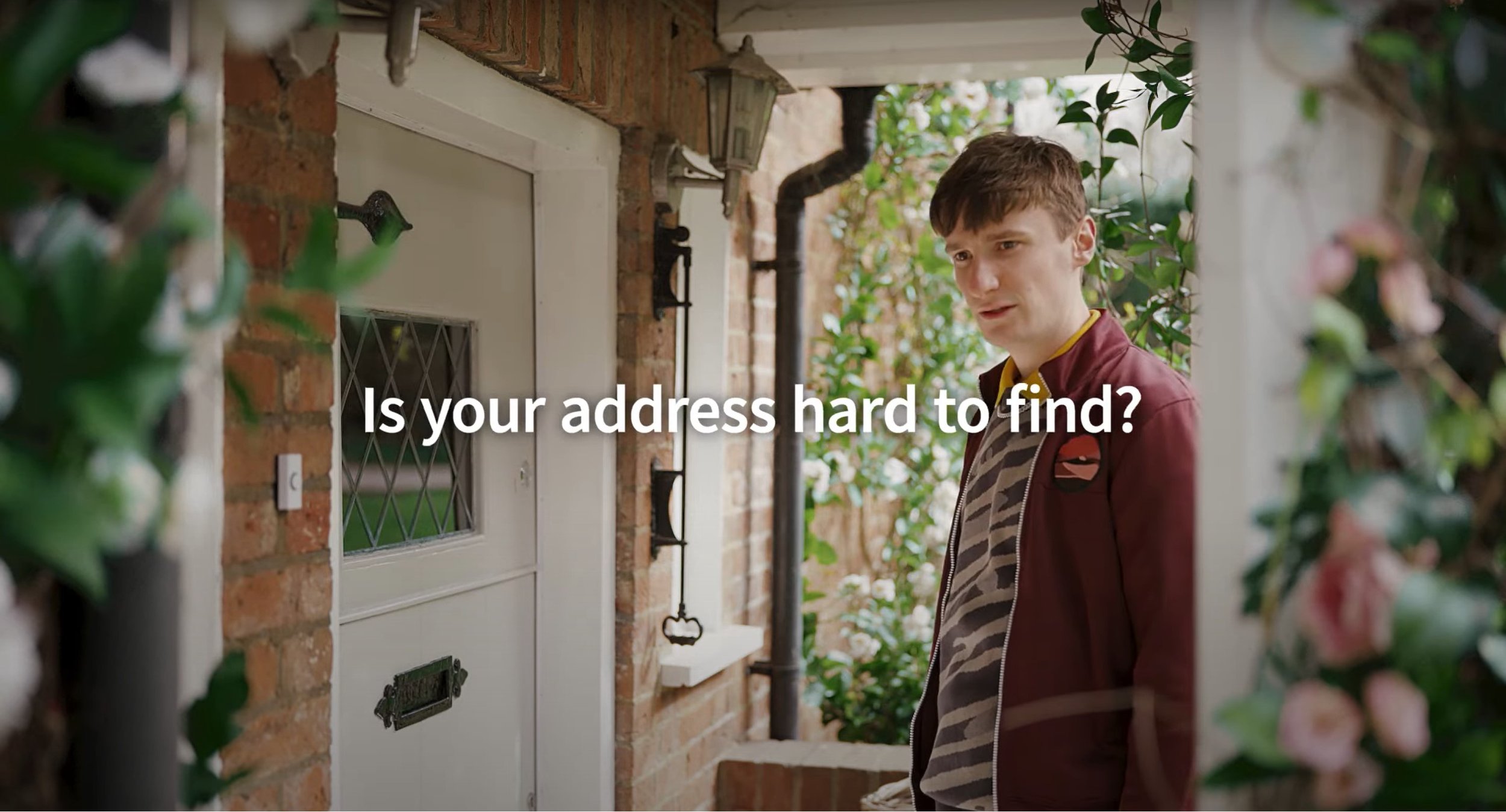
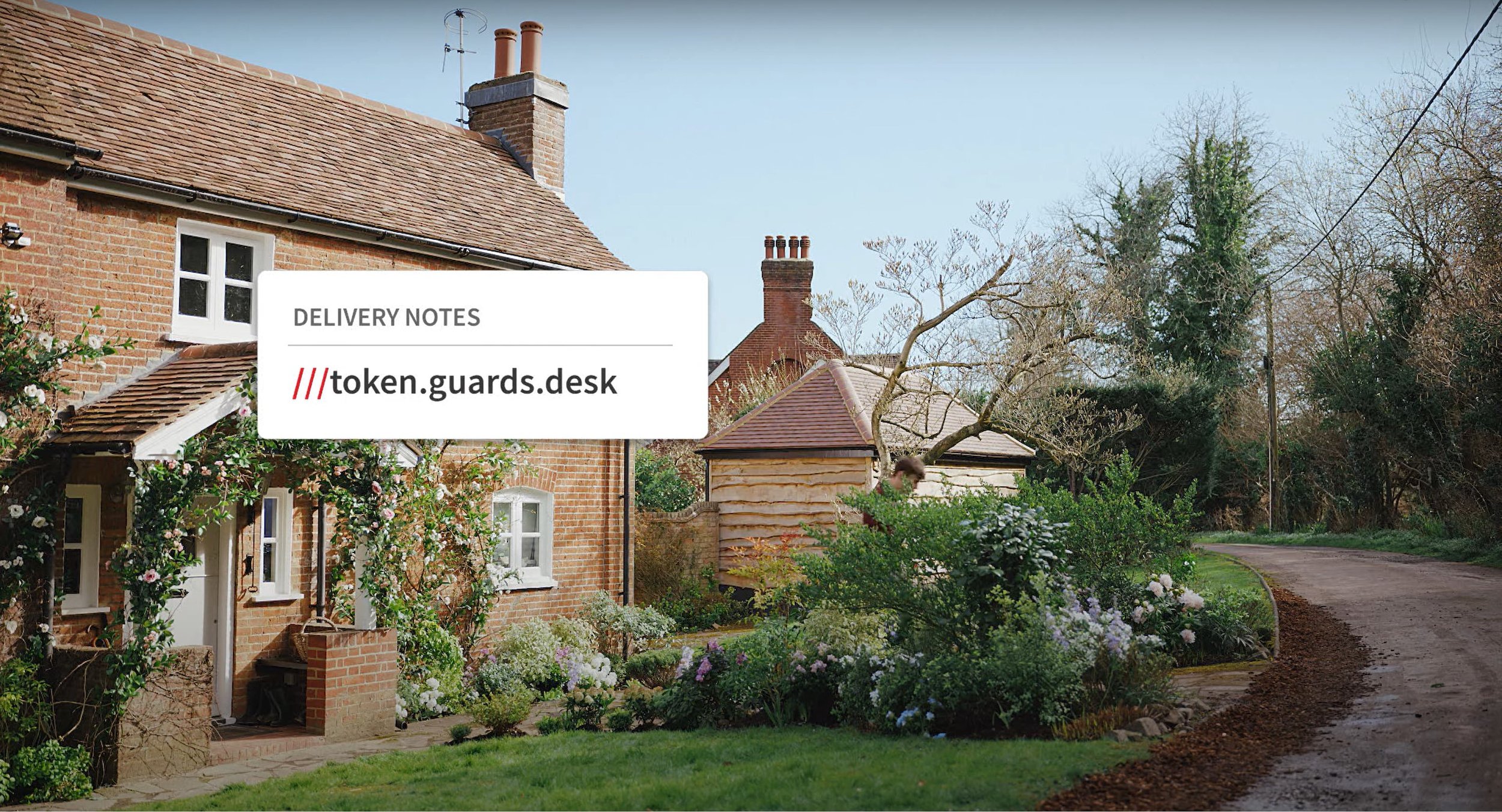
After watching this video a few times I can analysis this video, the ad uses basic shot types and angles through out, A medium shot is used at the beginning as the young man walks up to the old folks house, their is also a few close up shots focusing on the people walking around in the background with the man wearing the lad’s clothes, their is even a close up shot of the old lady wearing the lad’s footwear. Over the shoulder shots are heavily used as their is a conversation happening in this video and their is a wide shot at the end of the video as he walks away from the house. The lighting used is very generic, it heavily relies on the daylight to make the video bright enough. The target audience for this video is demographically 14 and above as the advert is on about using the right delivery service and stereotypically, people under the age of 14 nobody would be buying things online and having them delivered to your house. Their is also text used at the end of the ad which says “Is your address hard to find?” and then after that it comes up with delivery note with a bit of dialog of coding. Their is also screen grabs shown below to show what I am talking about above.
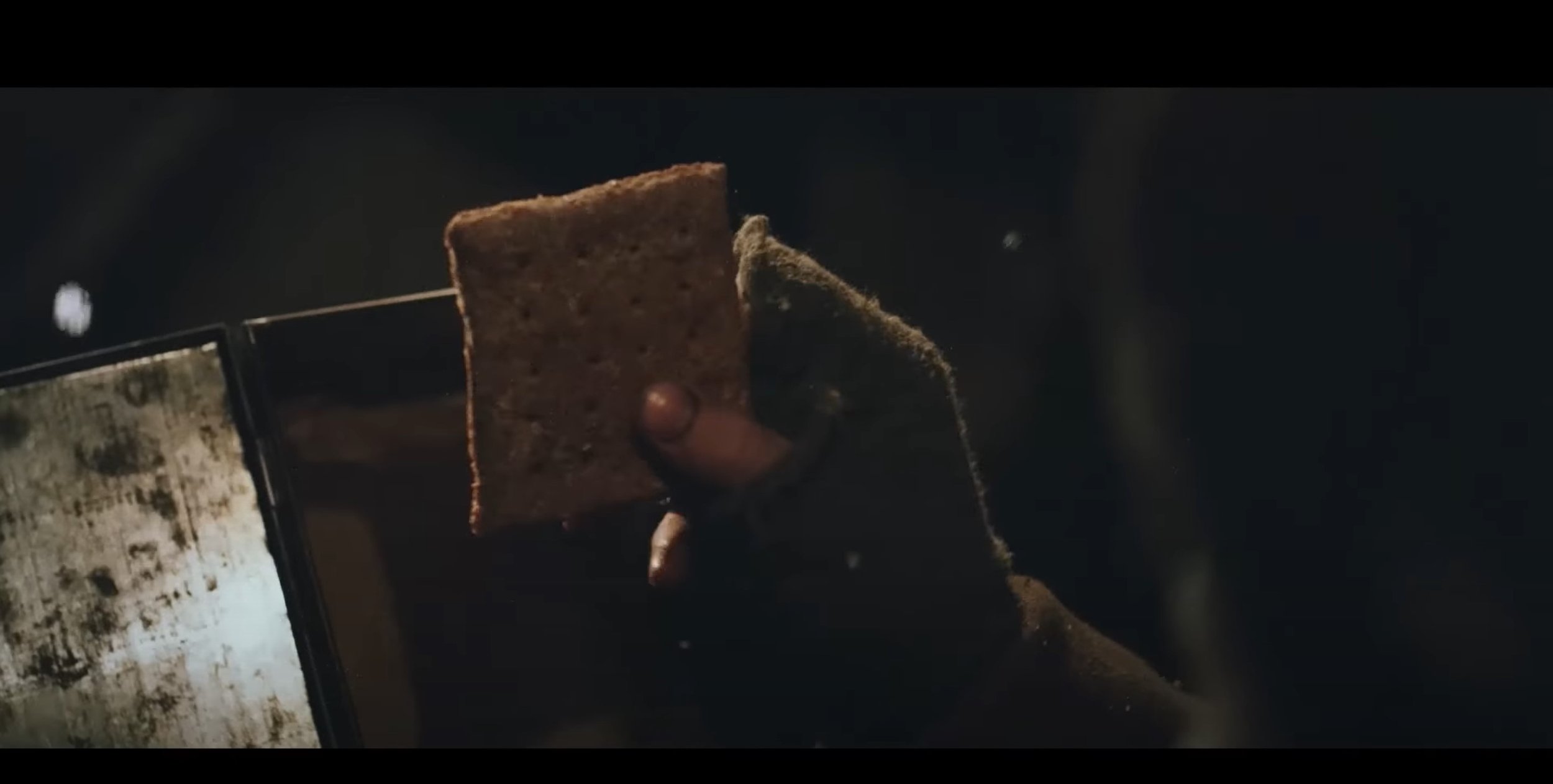
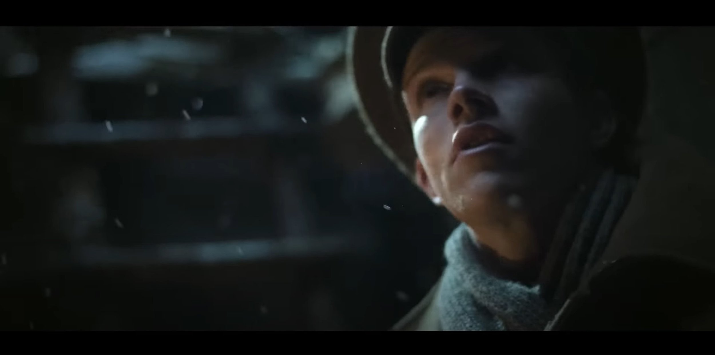
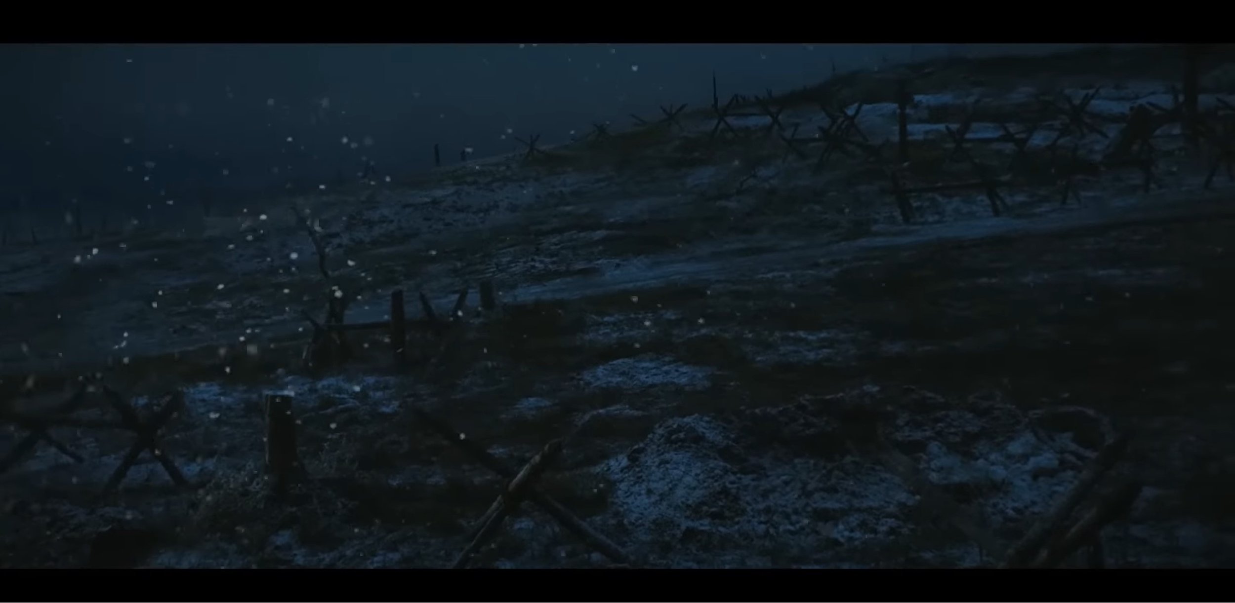
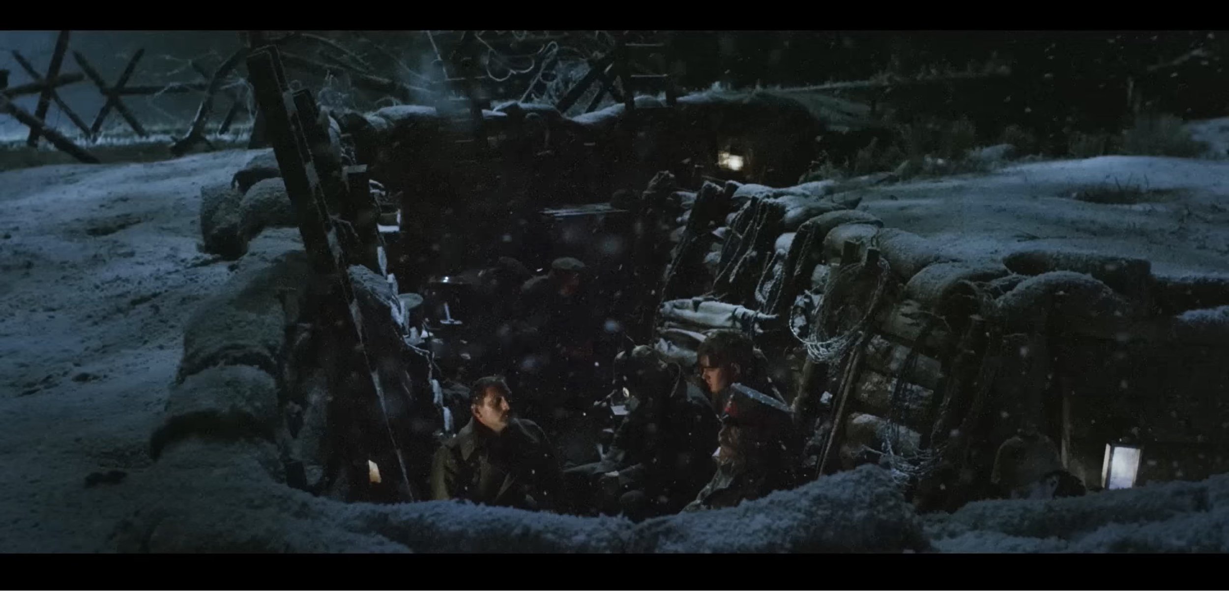
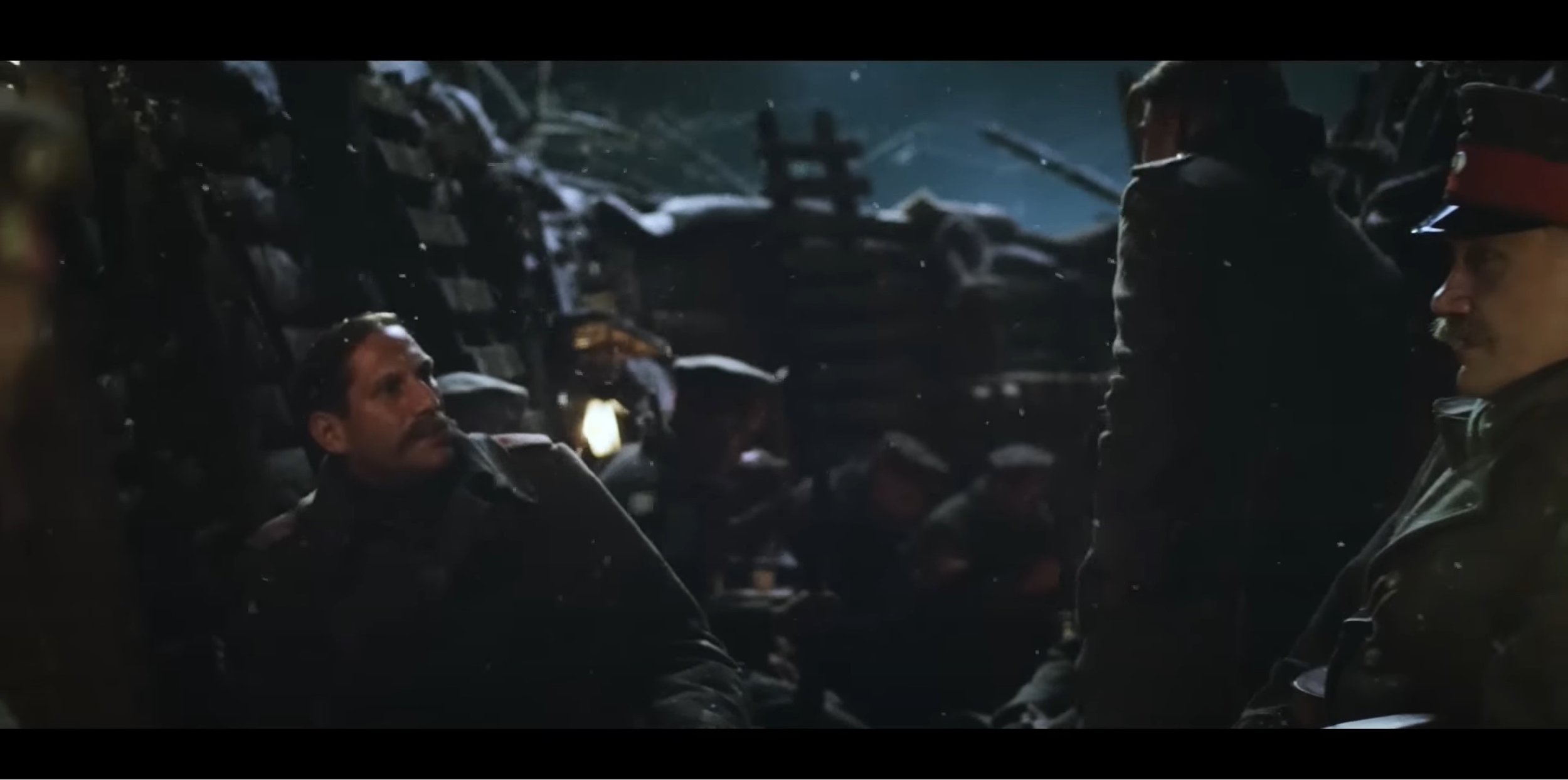
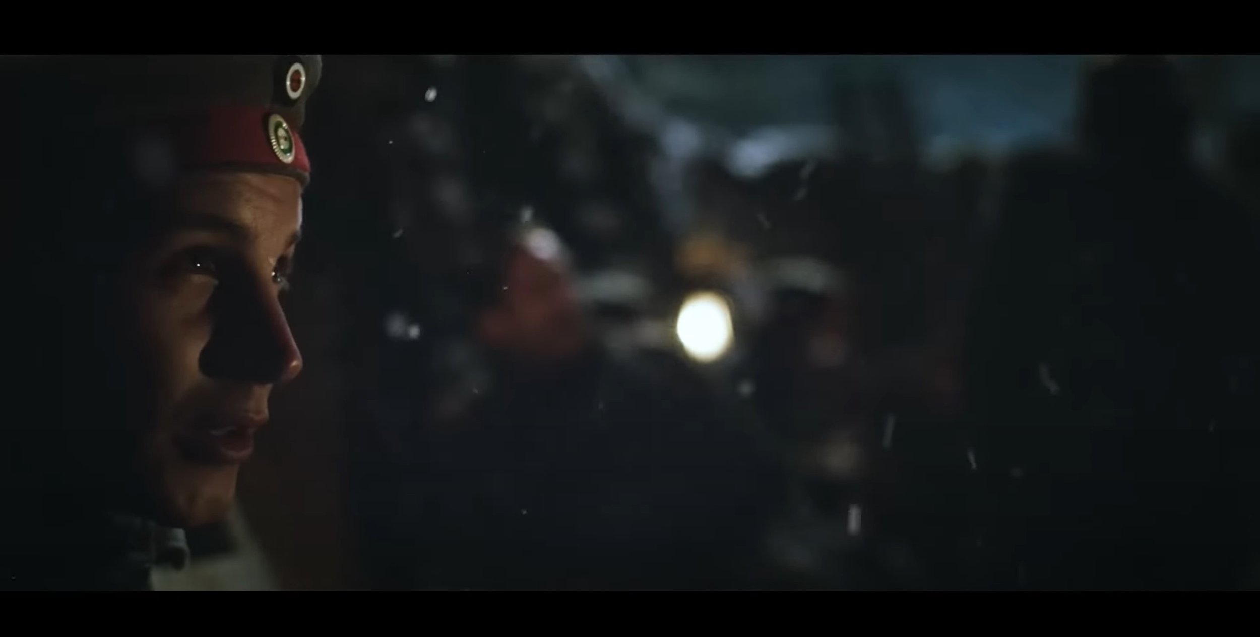
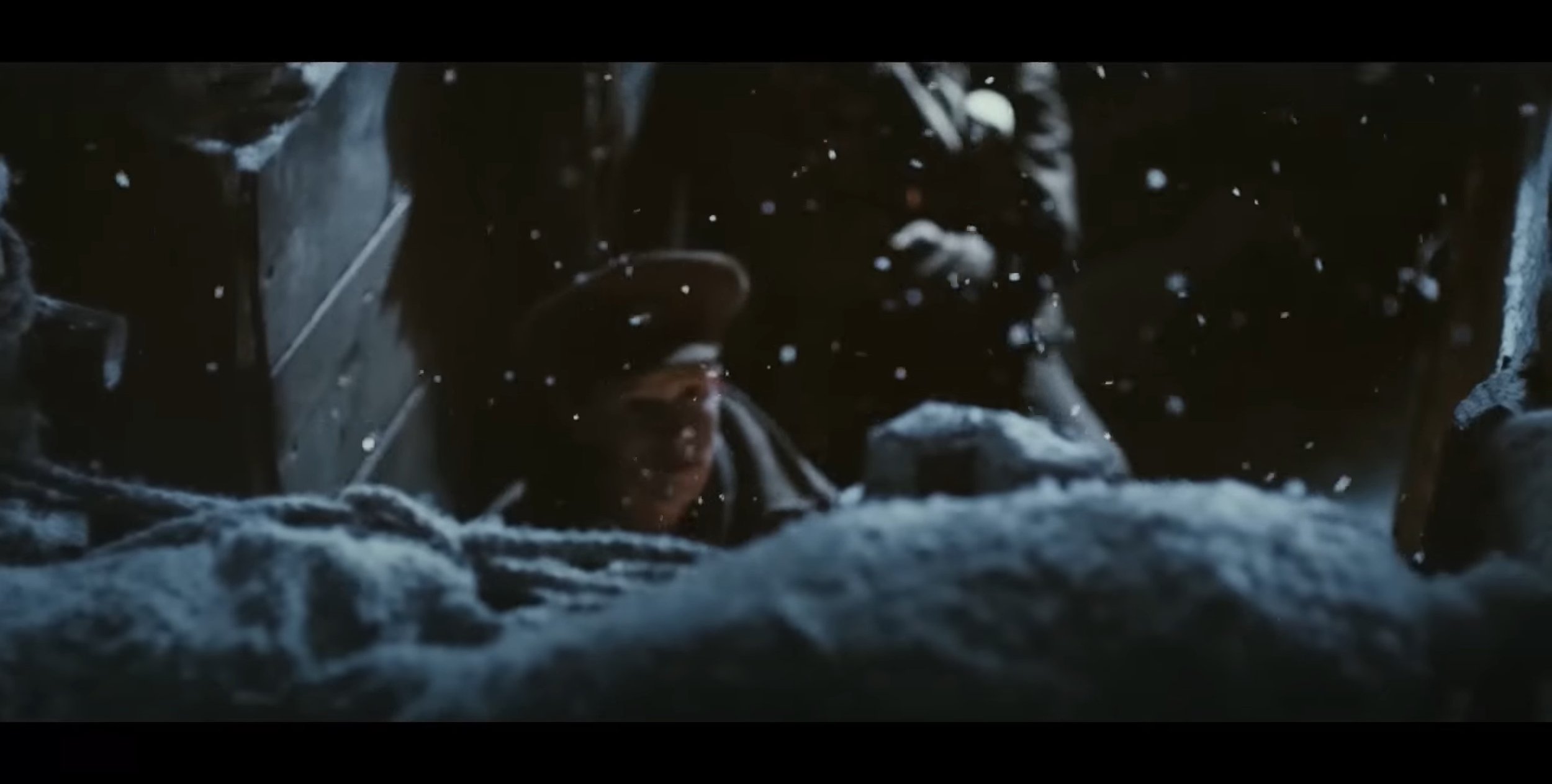
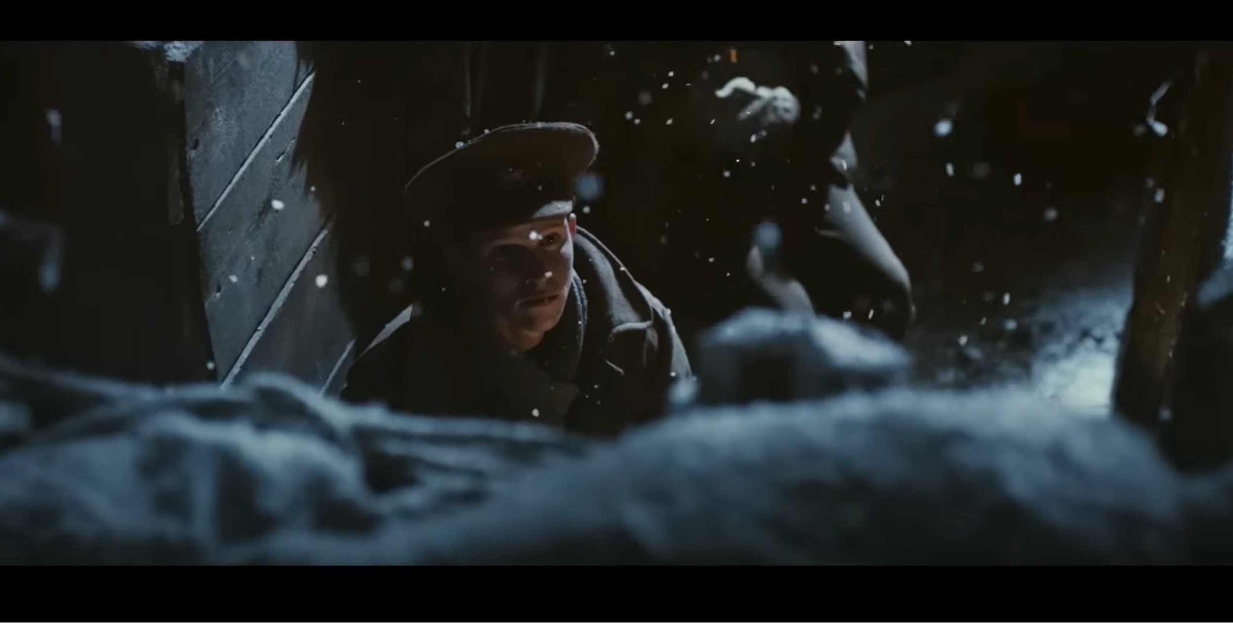
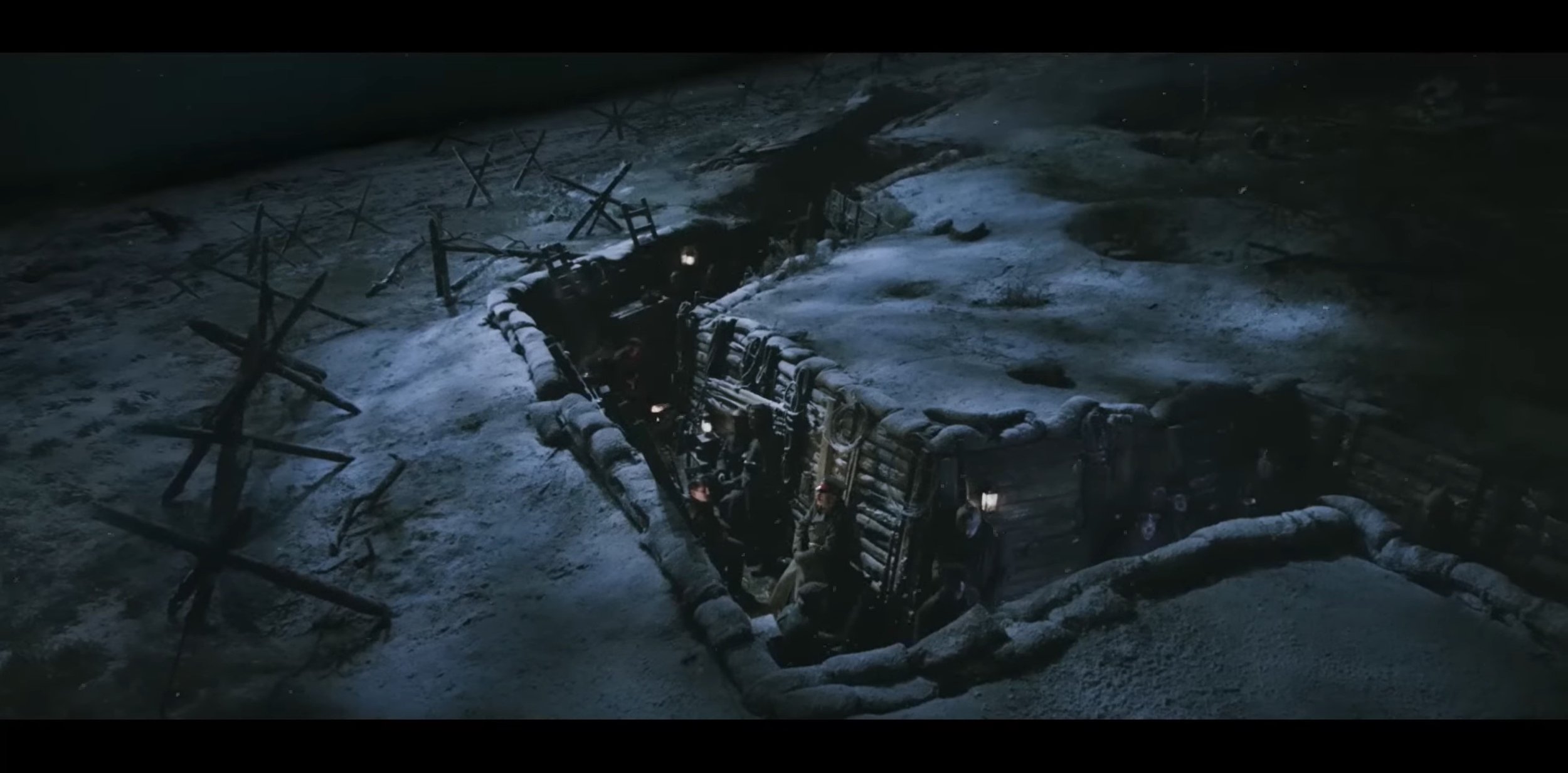
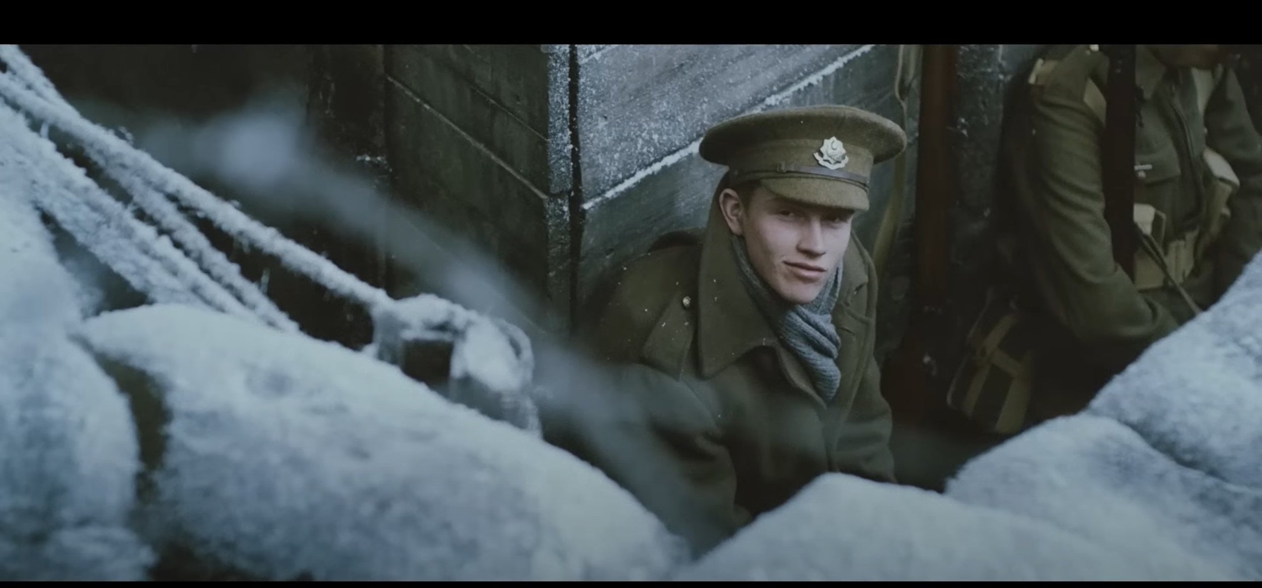
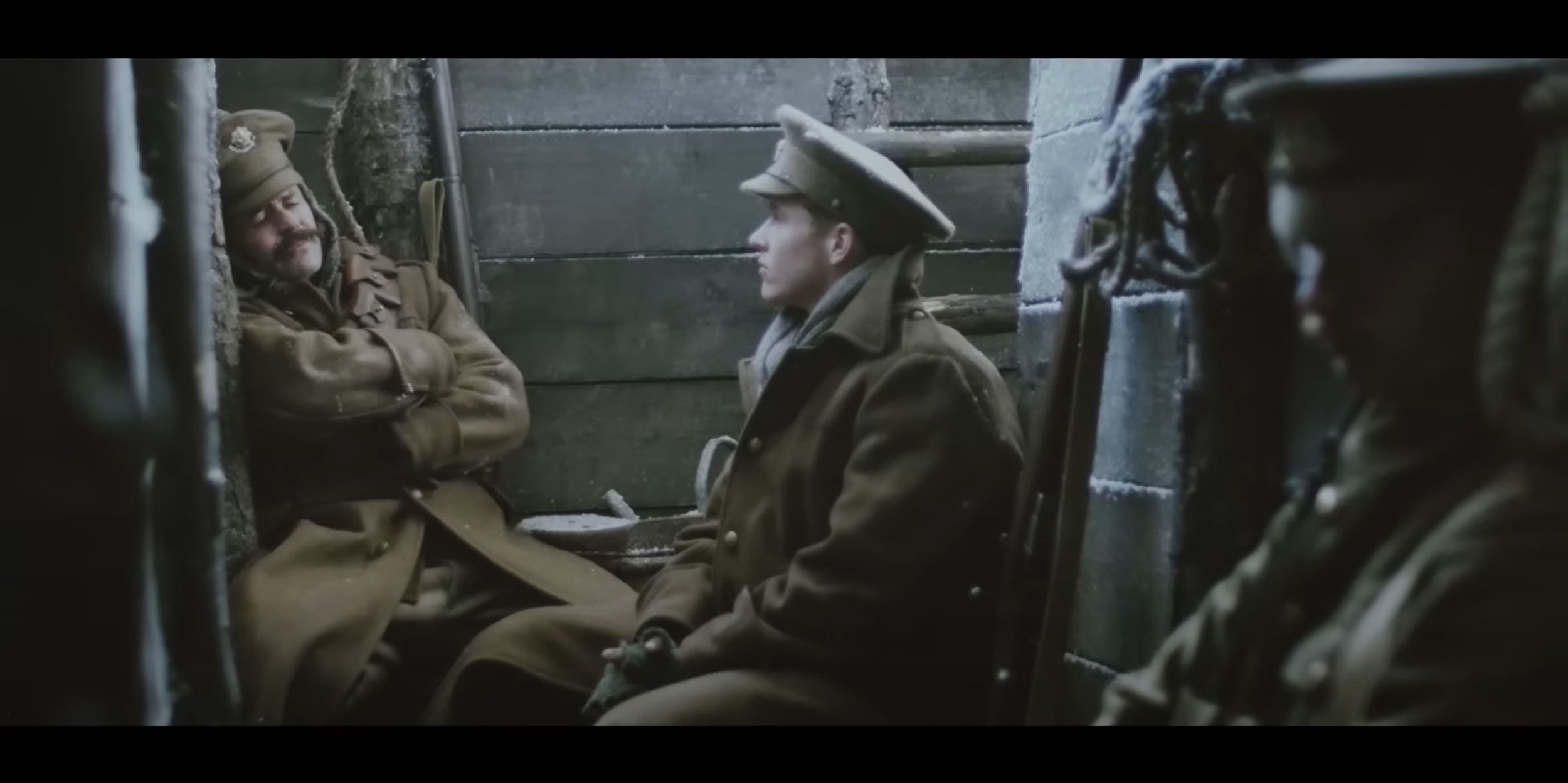
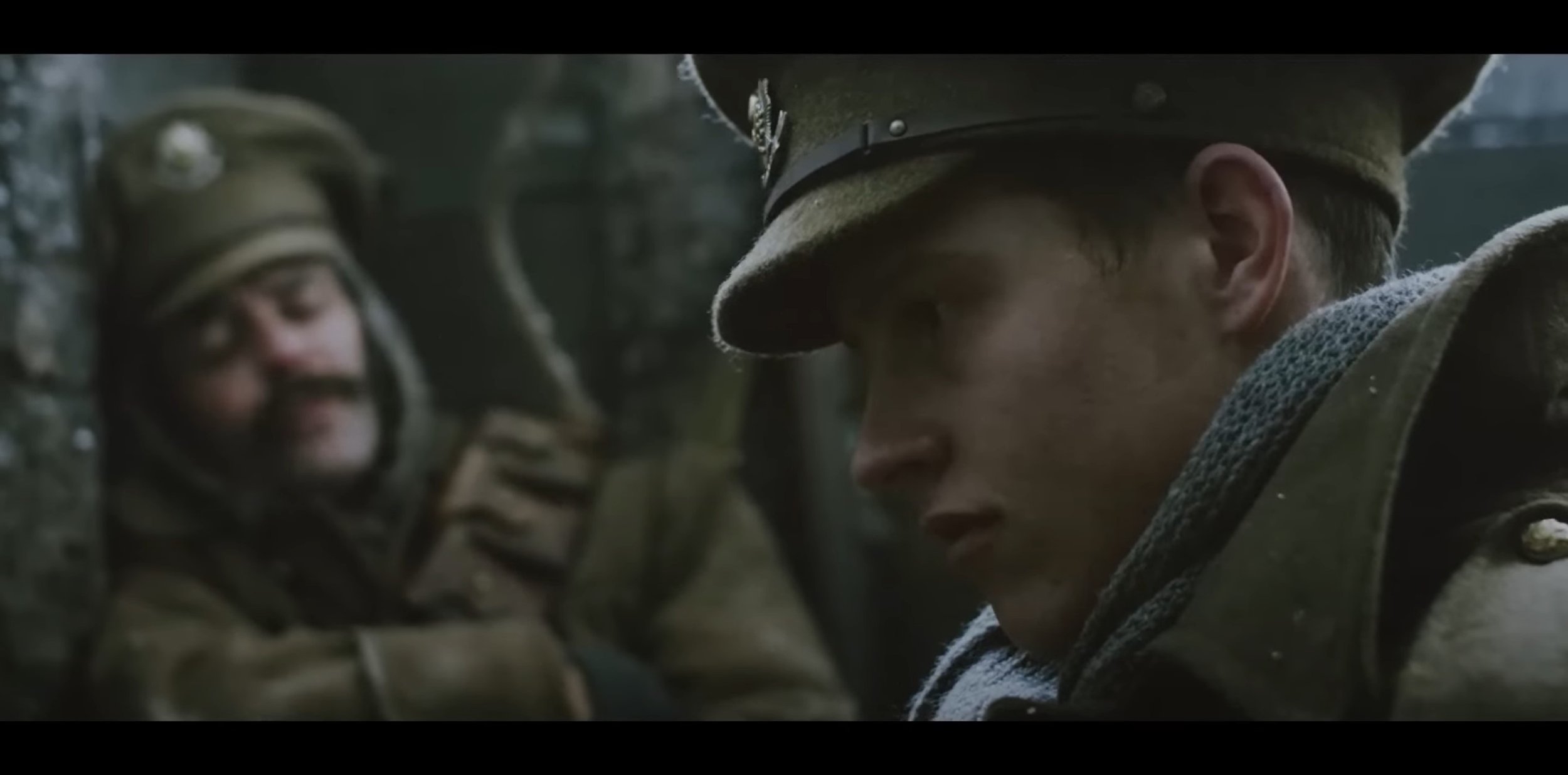
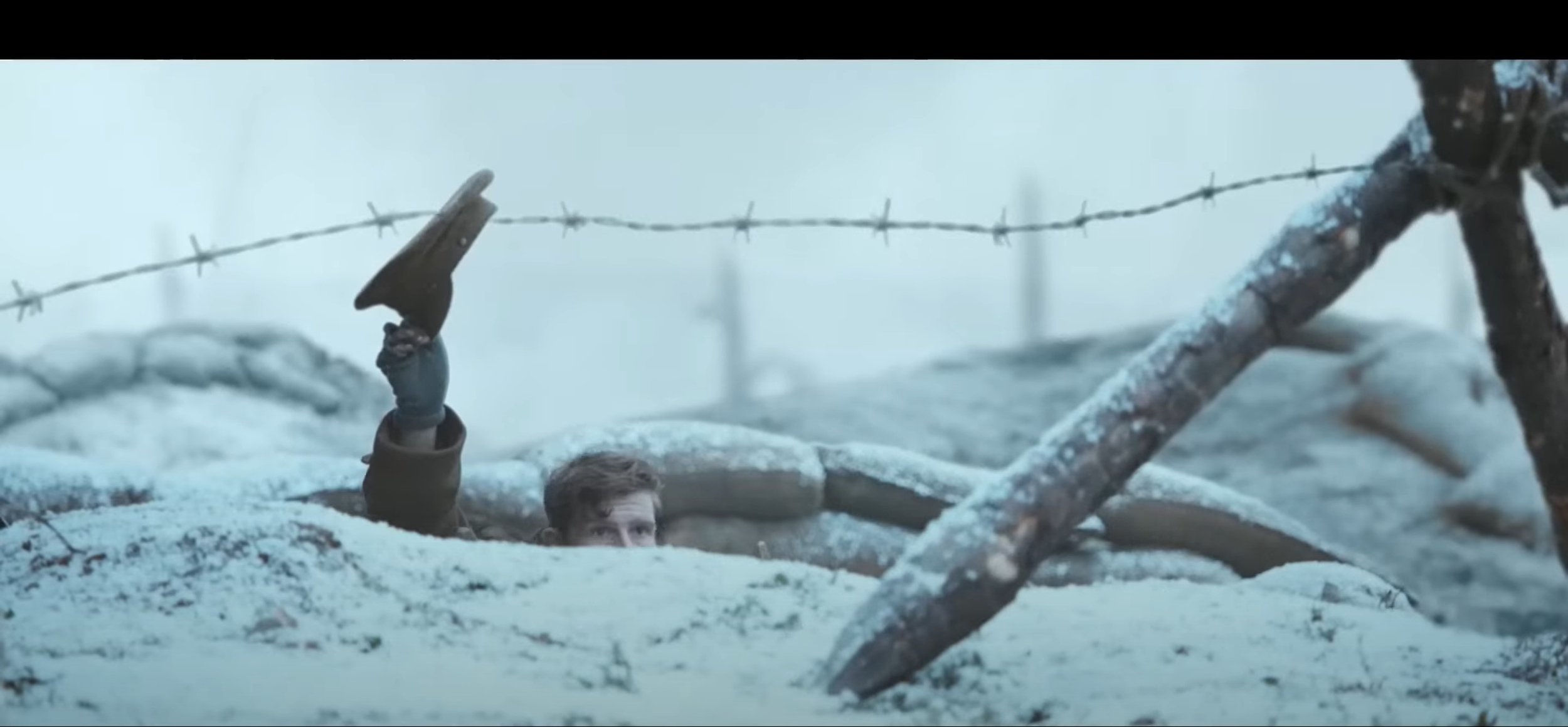
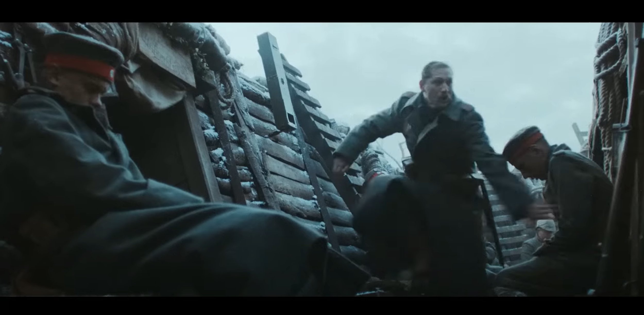
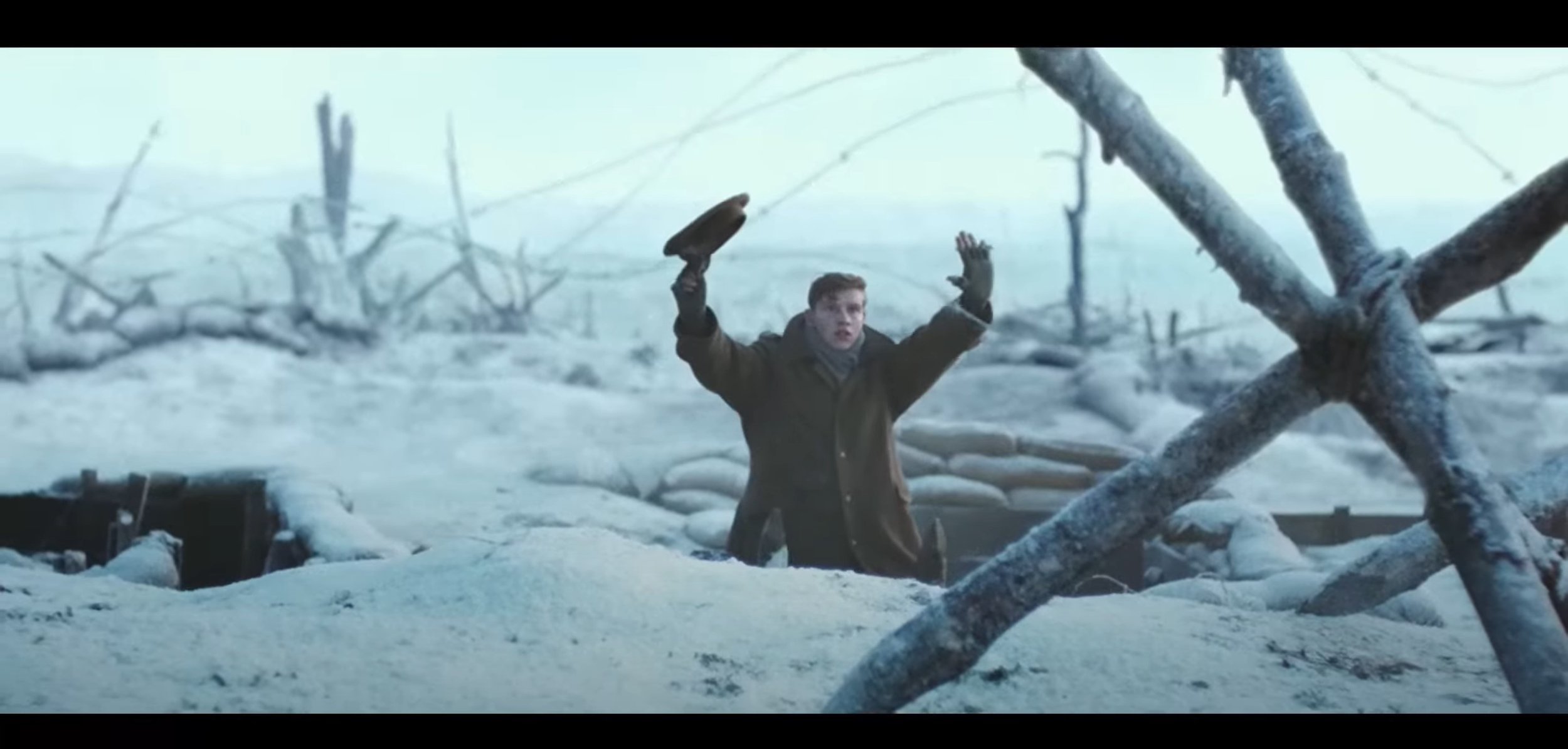
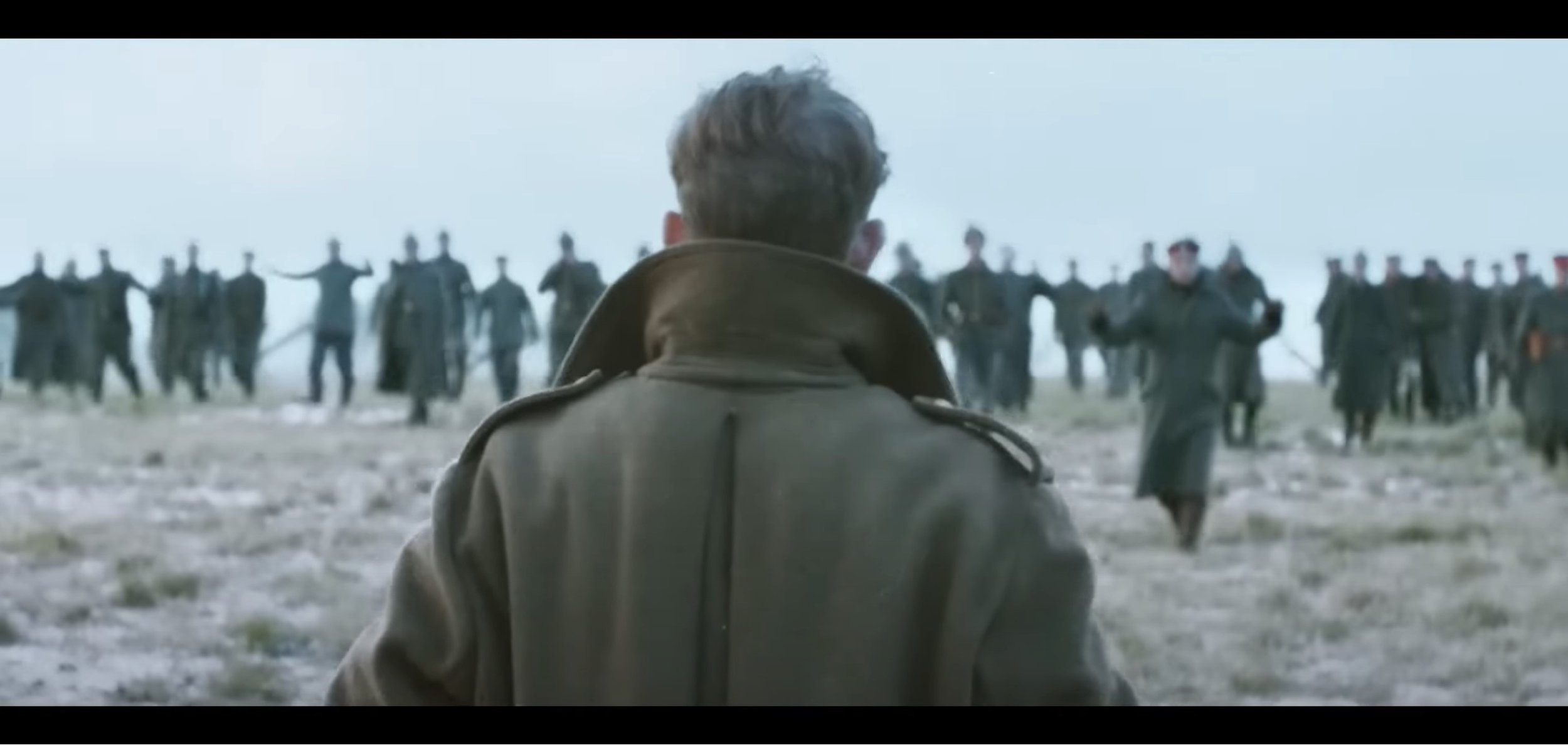
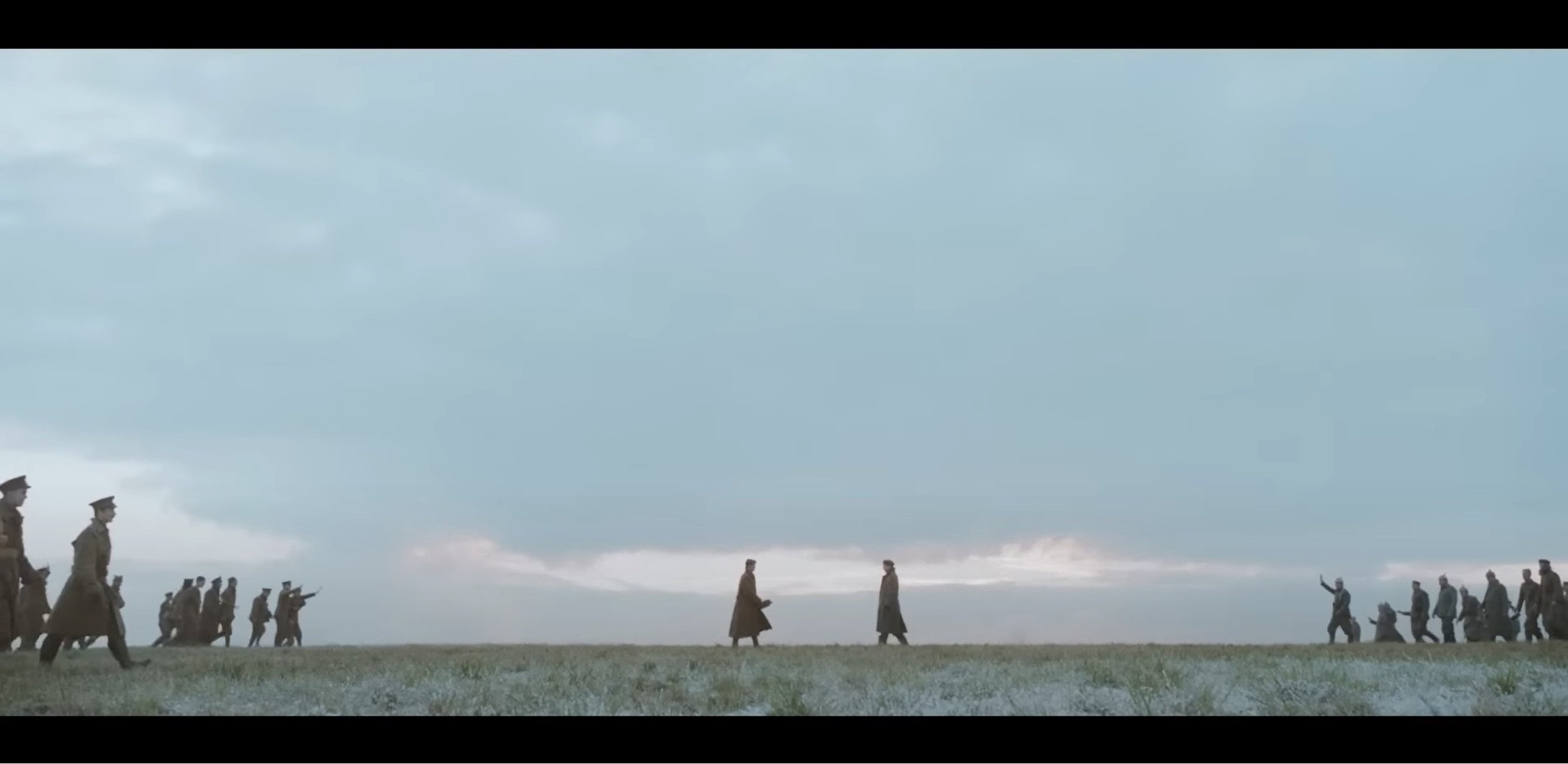
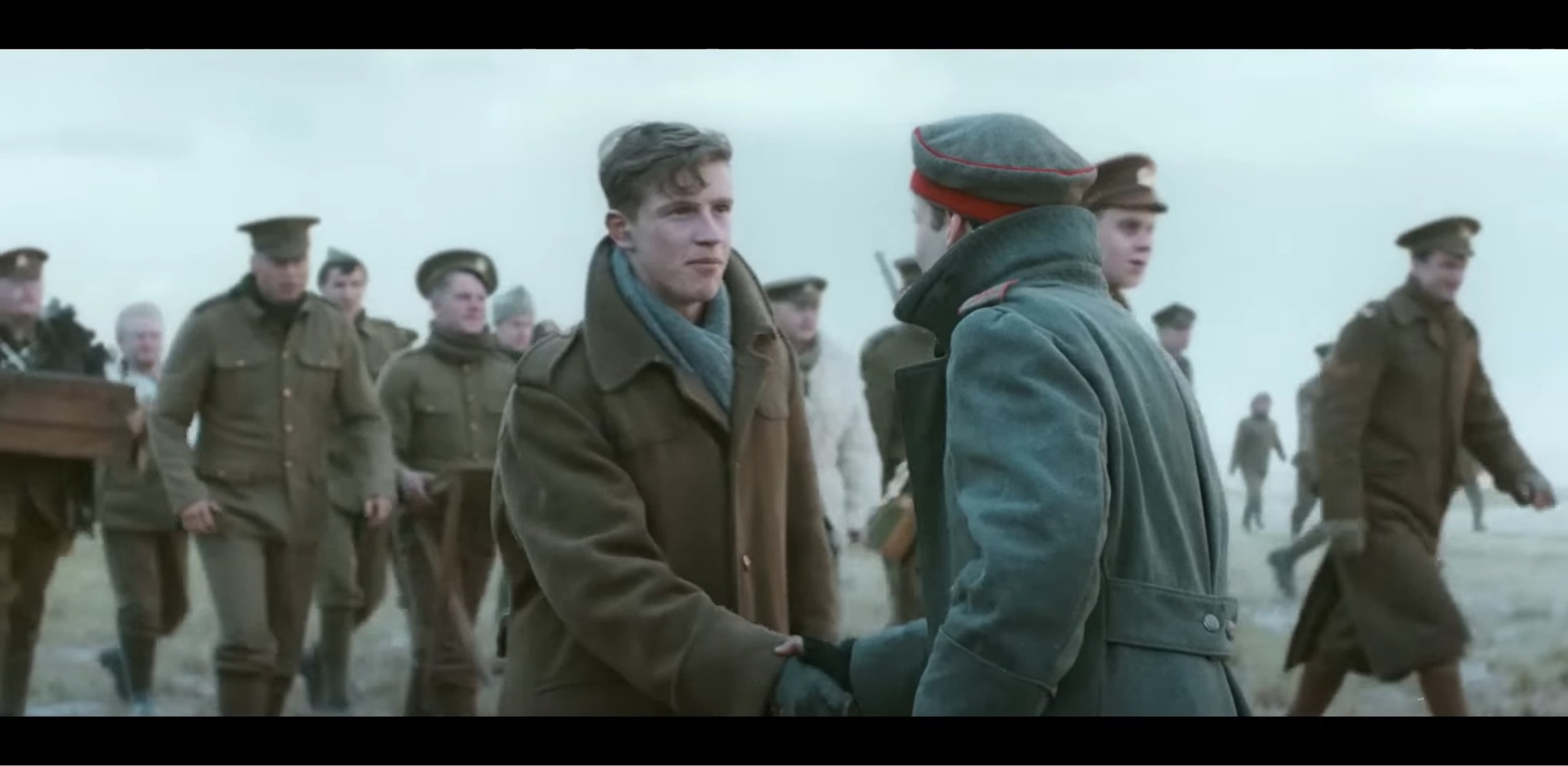
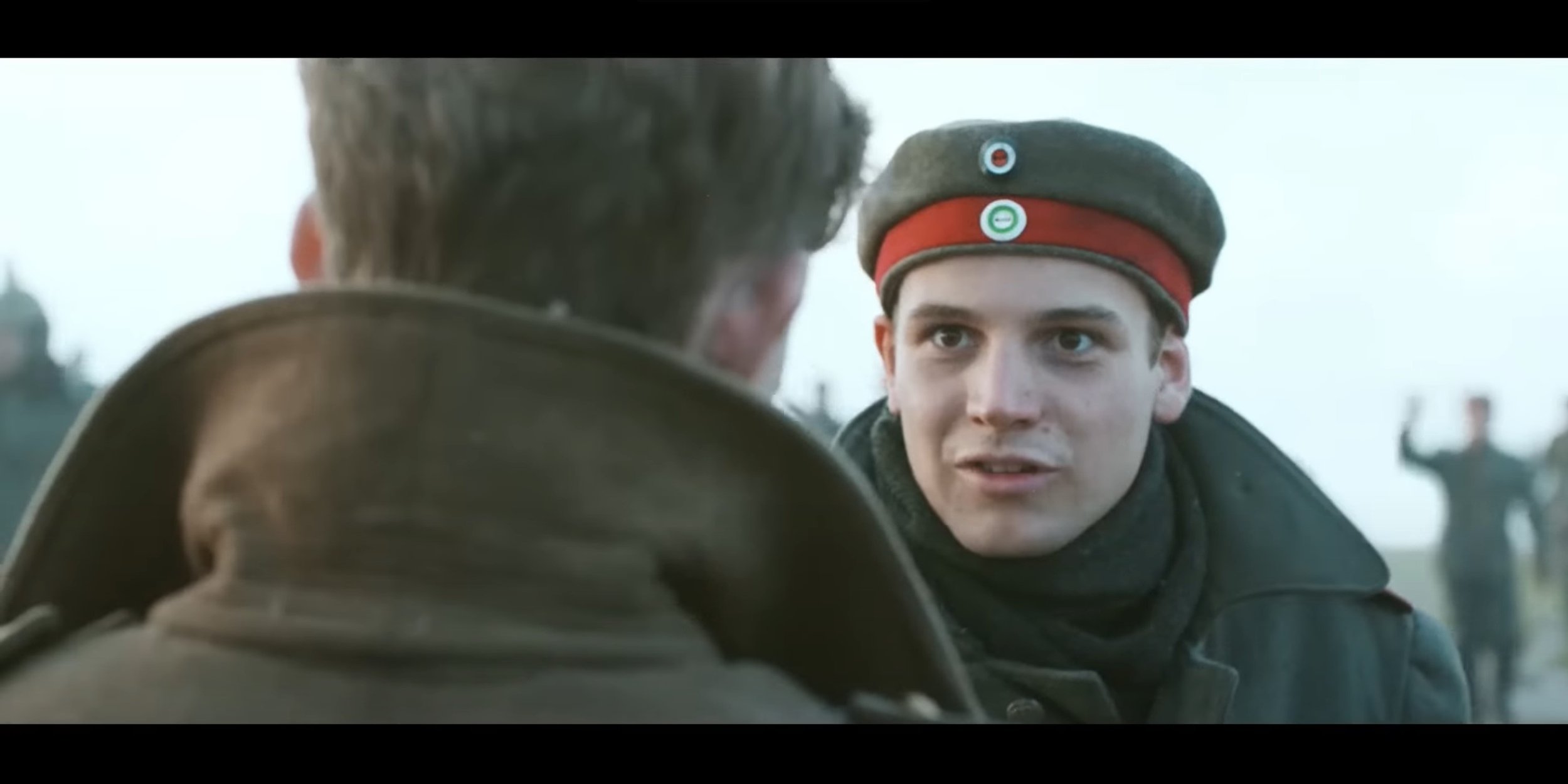
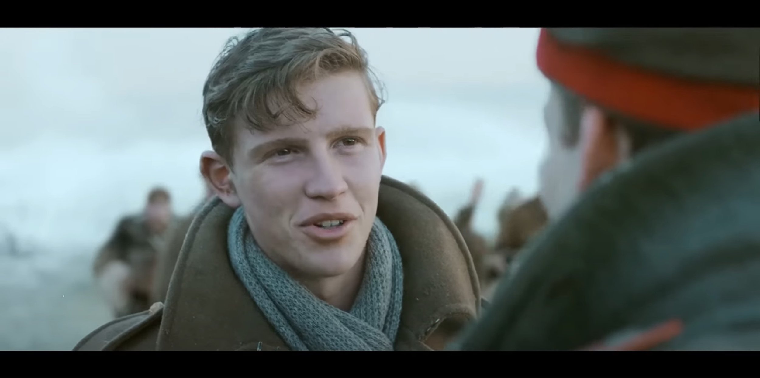
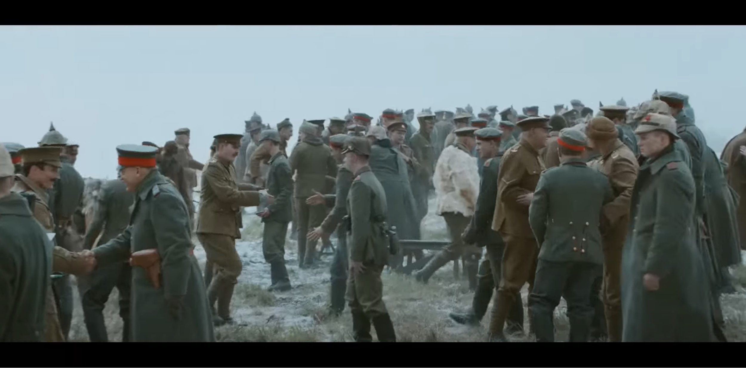
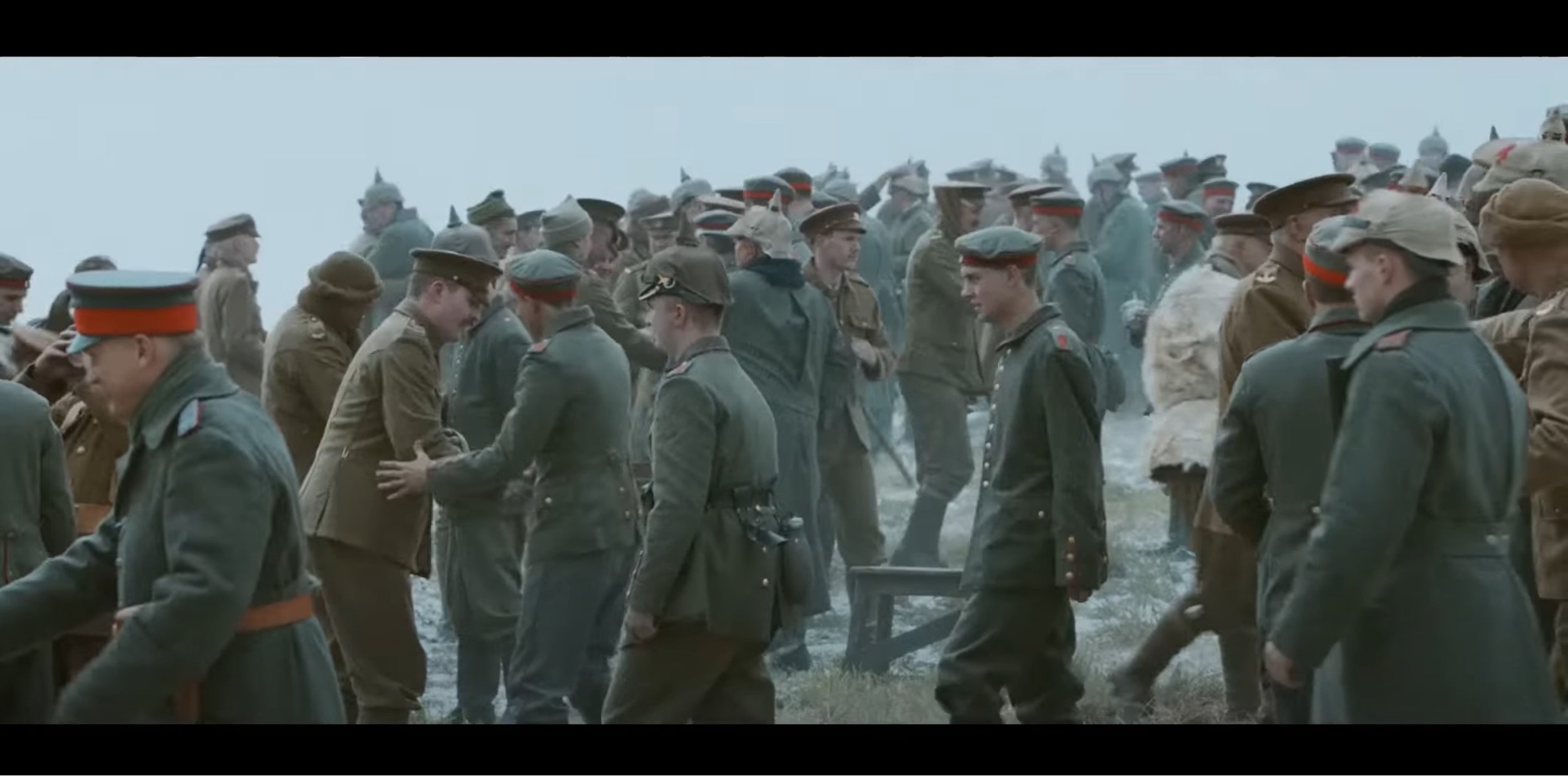
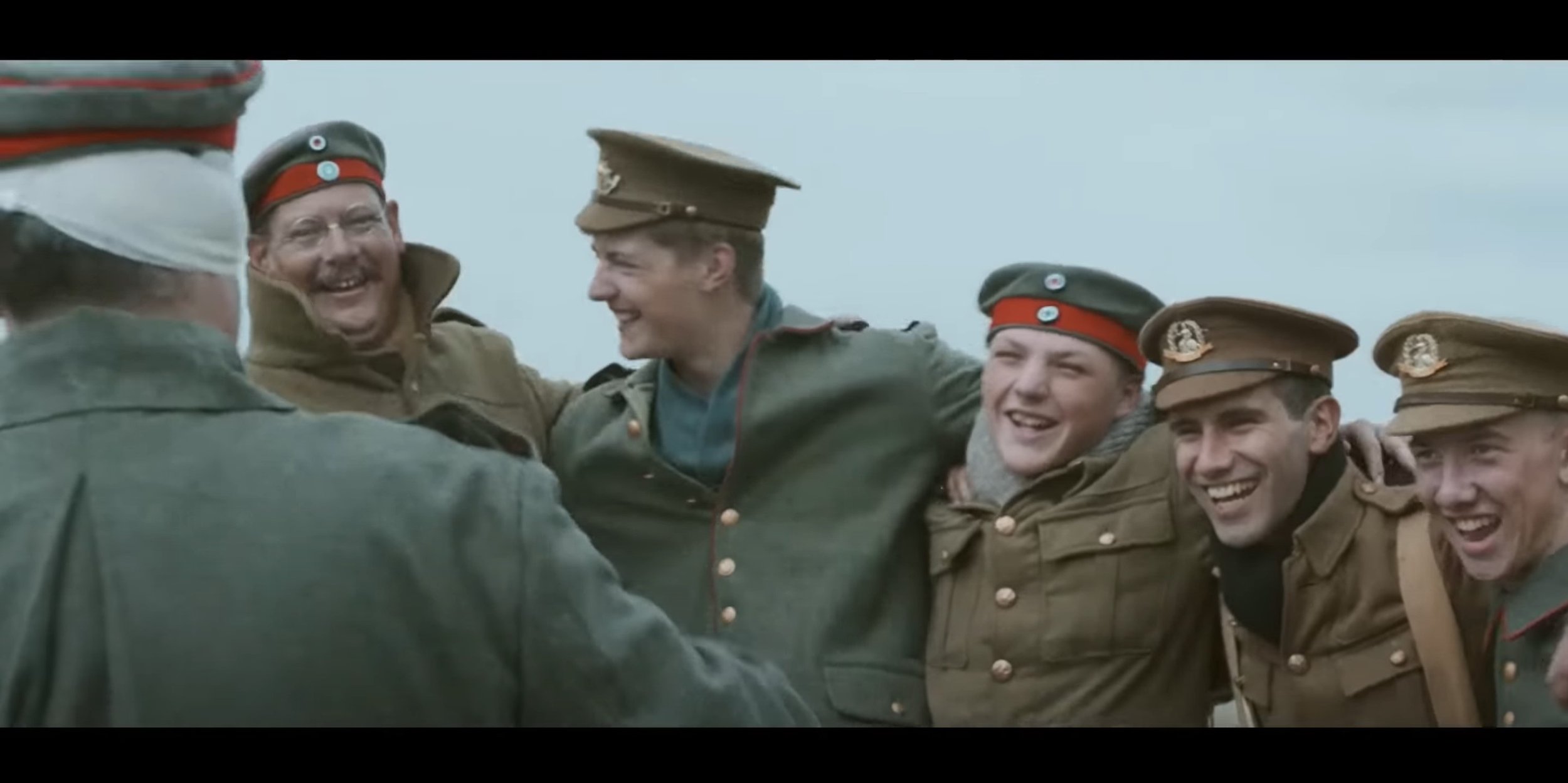
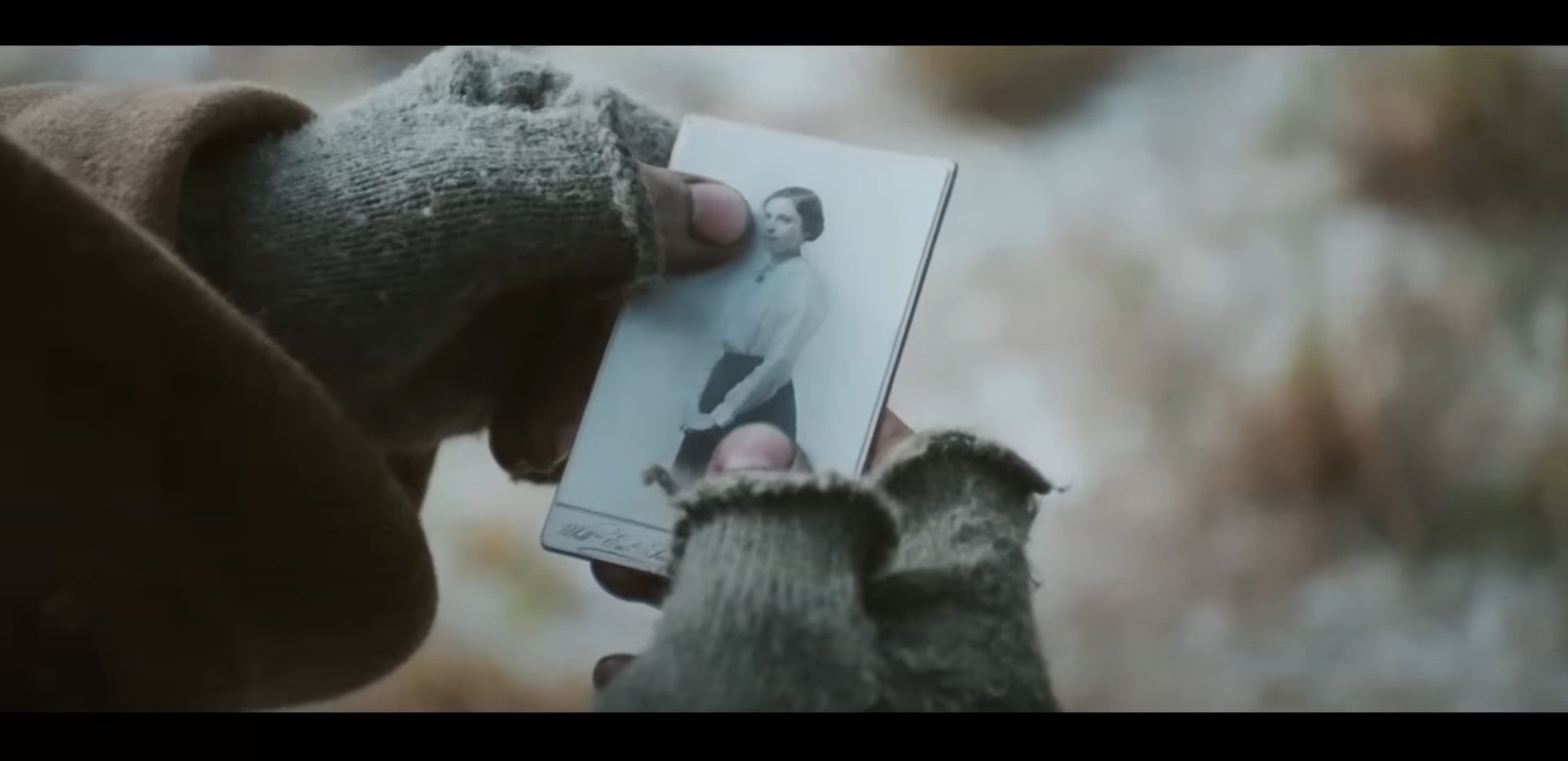
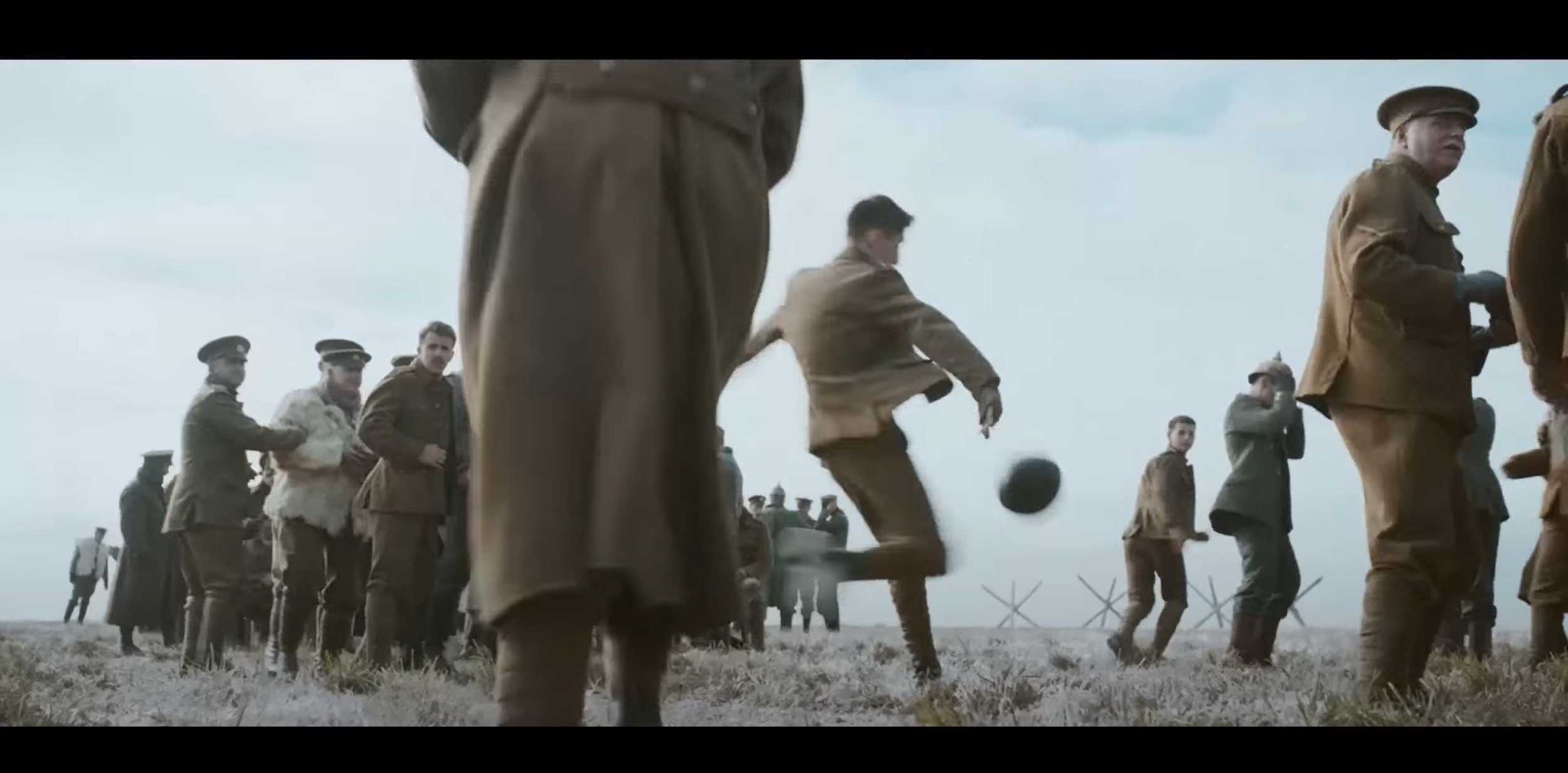
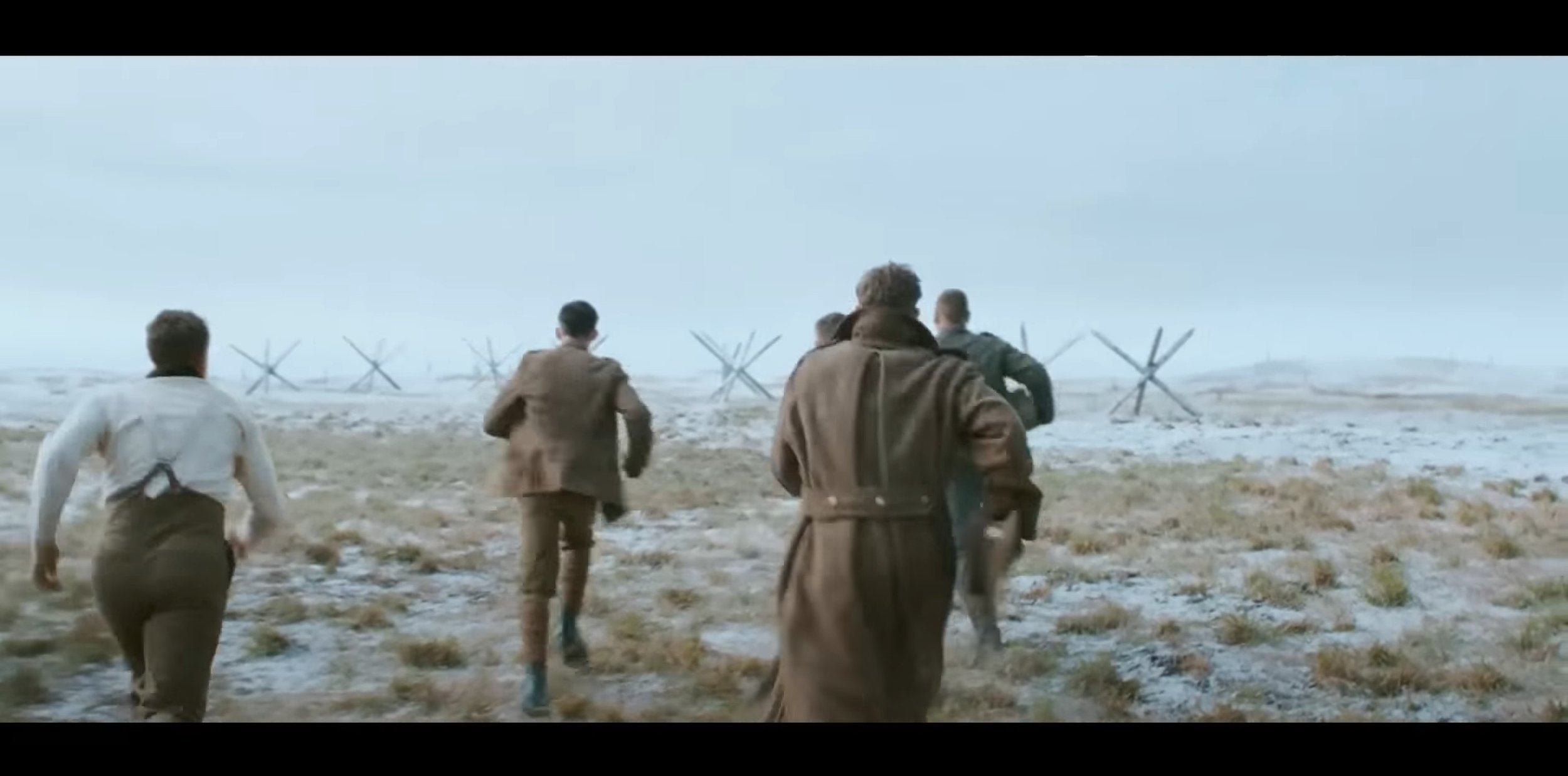
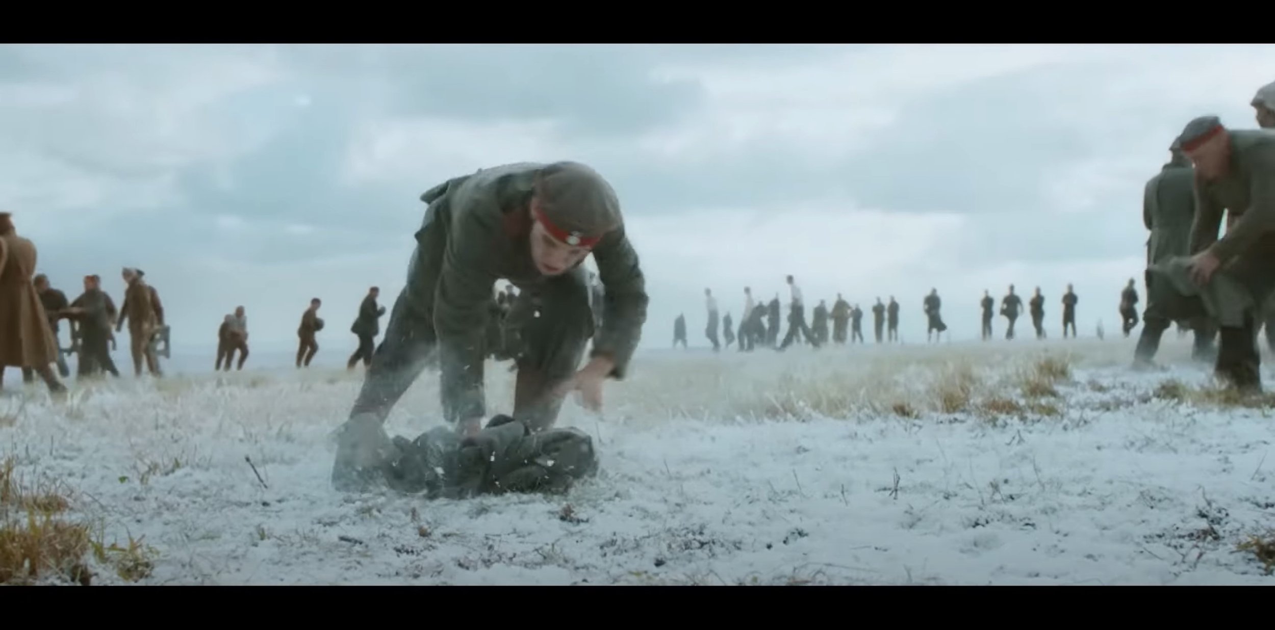
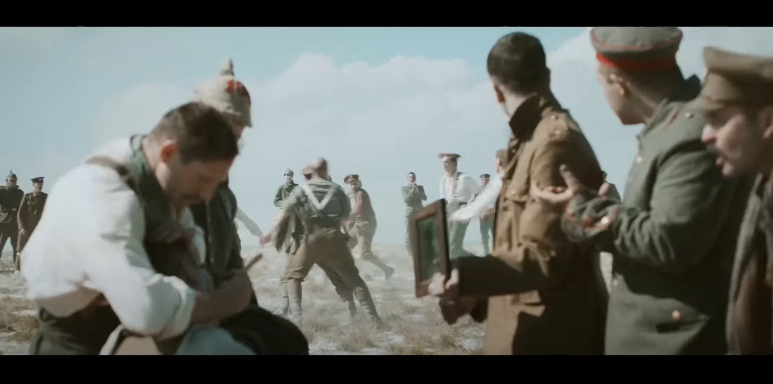
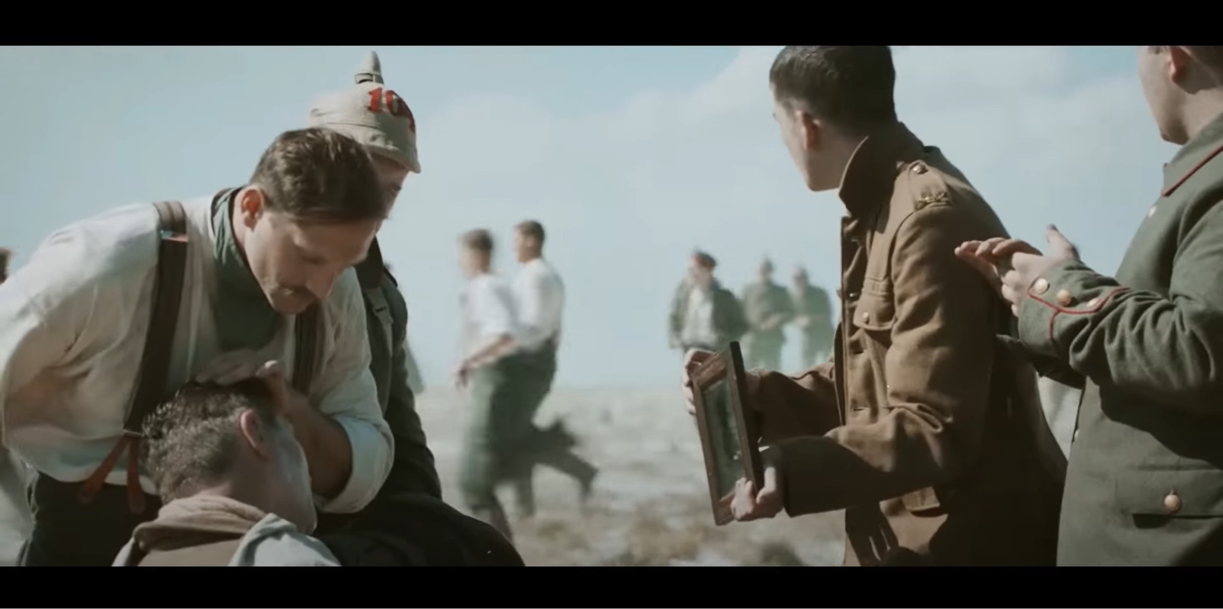
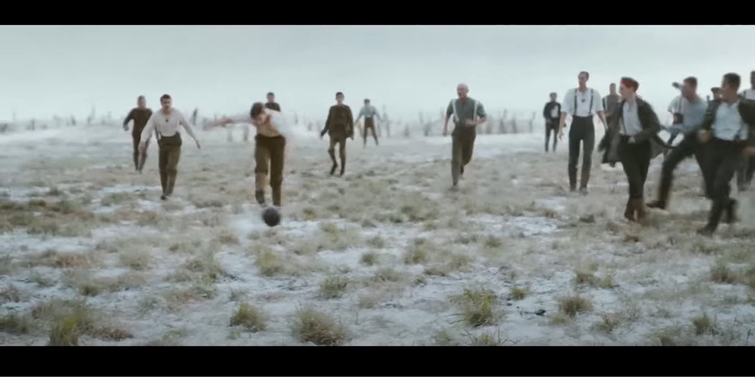
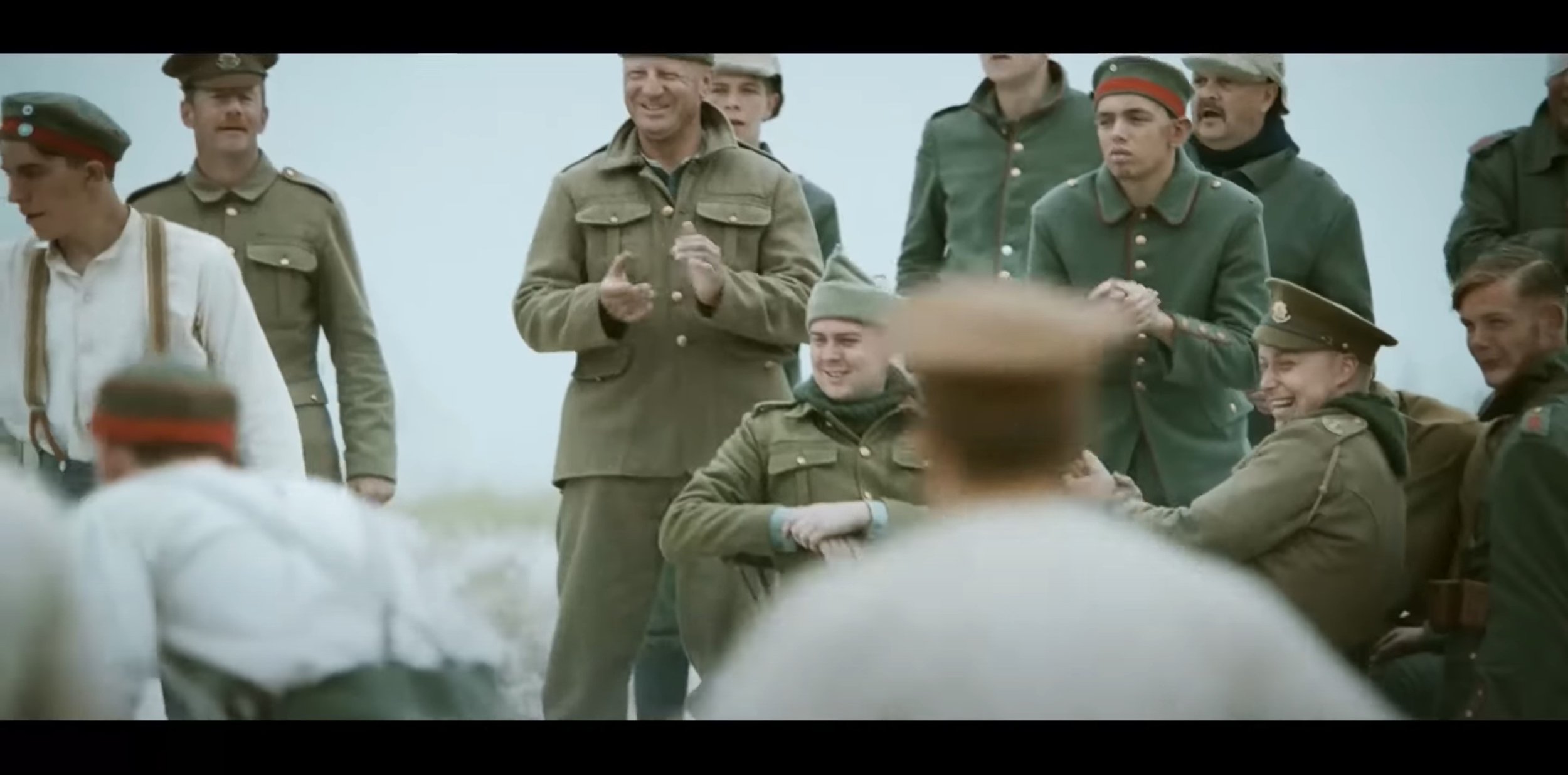
After watching this advert, it almost feels like a short film your watching but your not because it is an advert advertising for a supermarket called Sainsbury’s but at Christmas. In this commercial, Sainsbury’s has replicated the 1914 WW1 Christmas Truce between the Germans and the British on the Western Front. The target audience for this advert I think is any age because I think anyone could watch it and understand what the motto of the advert is and understand what is trying to portray. For me, this advert has been out for 9 years as of this blog was written and you can tell it has done itself justice if I can remember it for that long.
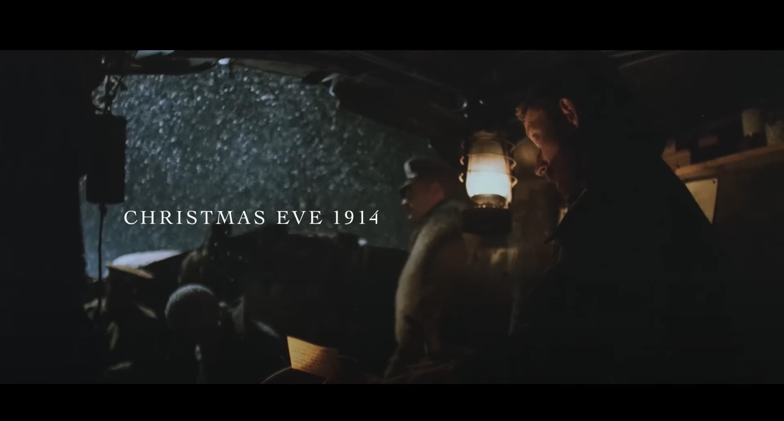
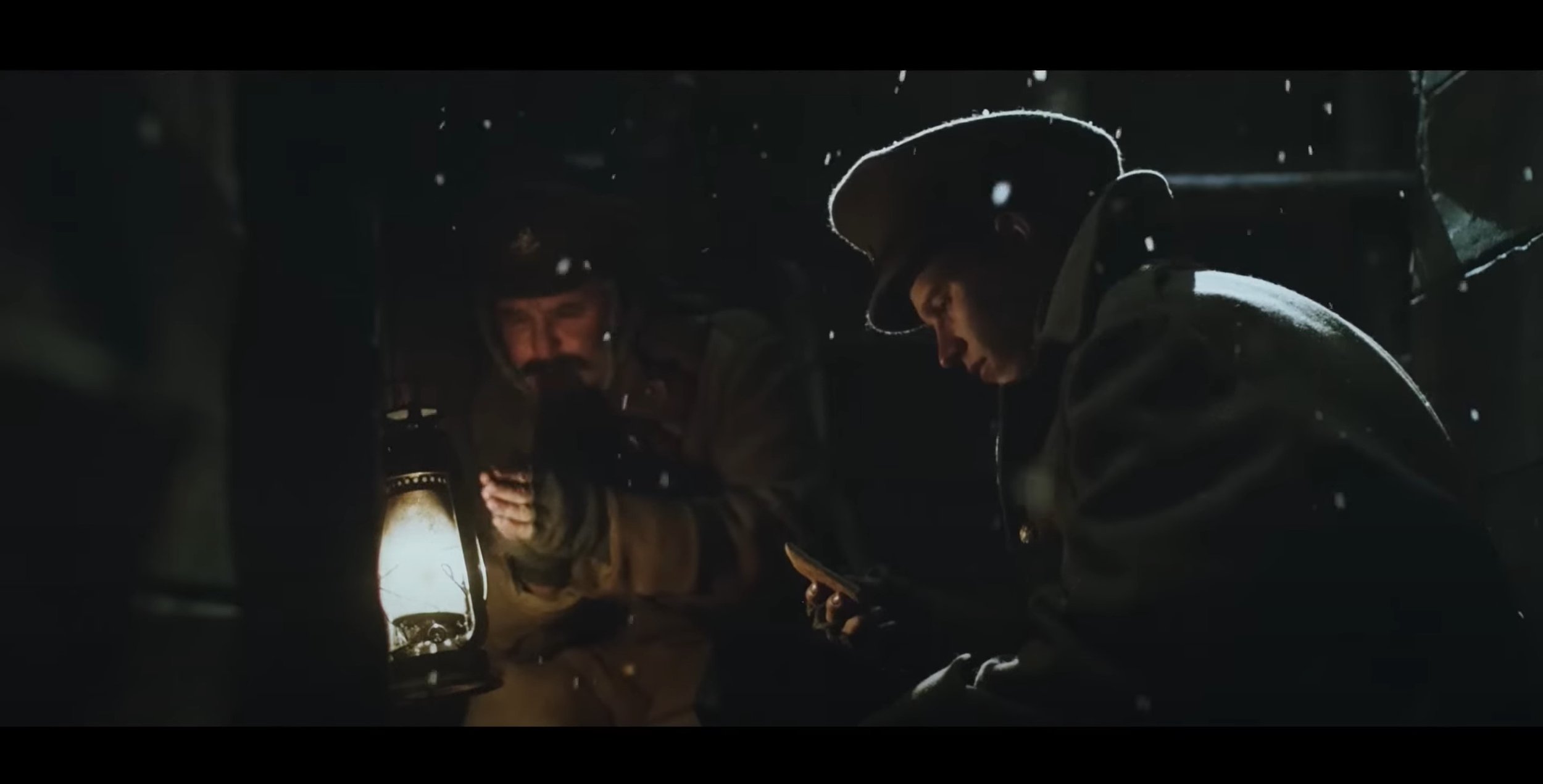
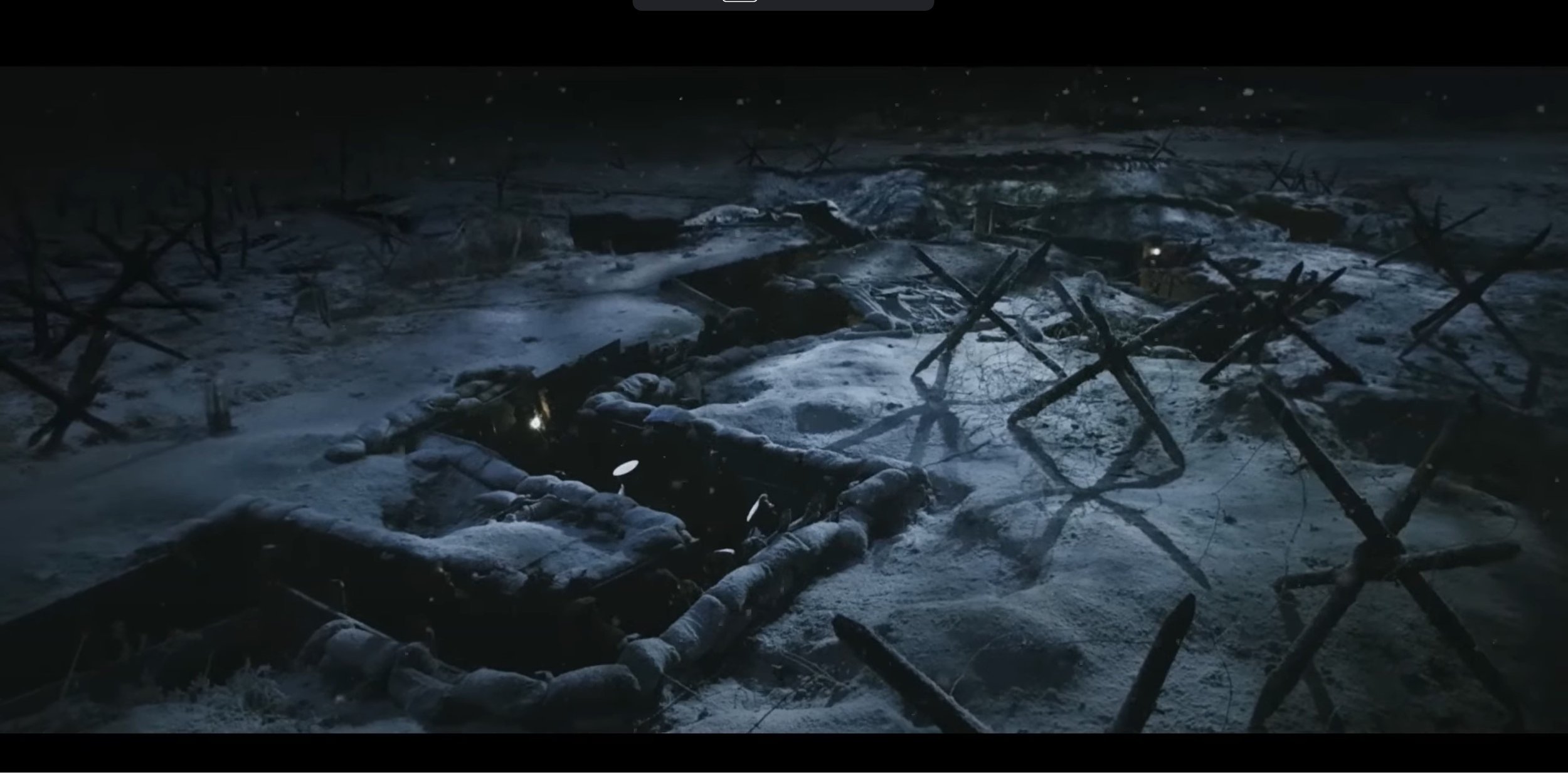
Now I’m going to talk about how artistically it has been created, firstly they have used the cinematic aspect ratio (2.4:1) to make it feel like you are watching a actual short film. As the beginning it uses the fade in transition and then at the same time some text gets shown which says “Christmas Eve 1914”. The lighting at the start is very dark as it is night time in the trenches, their is a catch light which is acting like moon light and their is a gas light used to show minimal lighting. Their is a variety of different shot types used through out in these scenes coming from over the shoulder shot, medium shot, close up shot and wide shot. The angles I see used in these scenes are high angle shots looking down into the trenches combing that with wide shot to show what it looks like from above. In terms of Camera movements, I see plenty of static shots and their is a few panning shots with some dolly zoom shots as well which is focusing on a certain subject.
For the second part of this advert, it becomes day time and the video relies on the daylight to make it bright enough for the video, the shot types used in this section vary between over the shoulder shot, medium shot, medium close up and extreme close up. The type of angles used are a mixture between low angle which is was used in this to show the presence when the soldier is slowly showing their head over the top of the trenches and of course when the two countries meet in the middle of no mans land. The camera movements used are mostly static shots but their was a few shots in this section that used a slow dolly zoom and a slight side to side movement when the soldiers start moving to pick up the weapons and their is a tracking shot following the captain in no mans land.
In the last segment, they unite in the middle of the battle field and play a bit of football in no mans land. Again for part, the video heavily relies on natural lighting from the sky to light up this video, in terms of shot types they use a mixture of over the shoulder, close up and even some medium shots. A dolly zoom movement shot is used zooming into the subjects from a medium wide type shot to a medium shot only showing from the waist and above. The angles which are used in this part are mostly eye level and low angle which shows presence of the subject and their is a few low angle medium close up shots which also focuses on what is happening in the distance as well. There is a bit of frame with in a frame action going on quite early on in the football scenes were you can see the action happening through the middle of the soldiers and then the camera re-focuses on the injured soldier and at the same time it pans left.
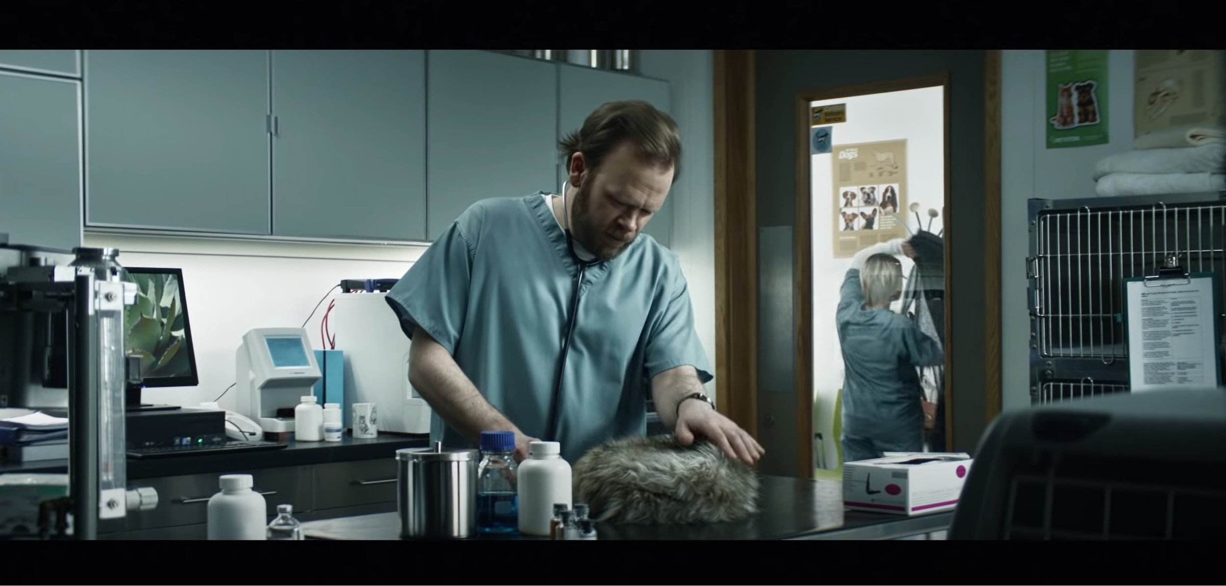
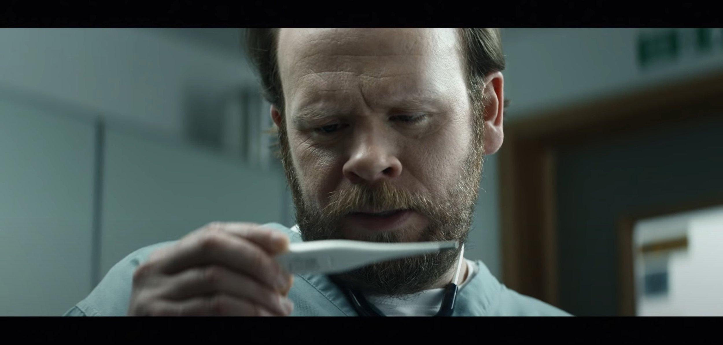
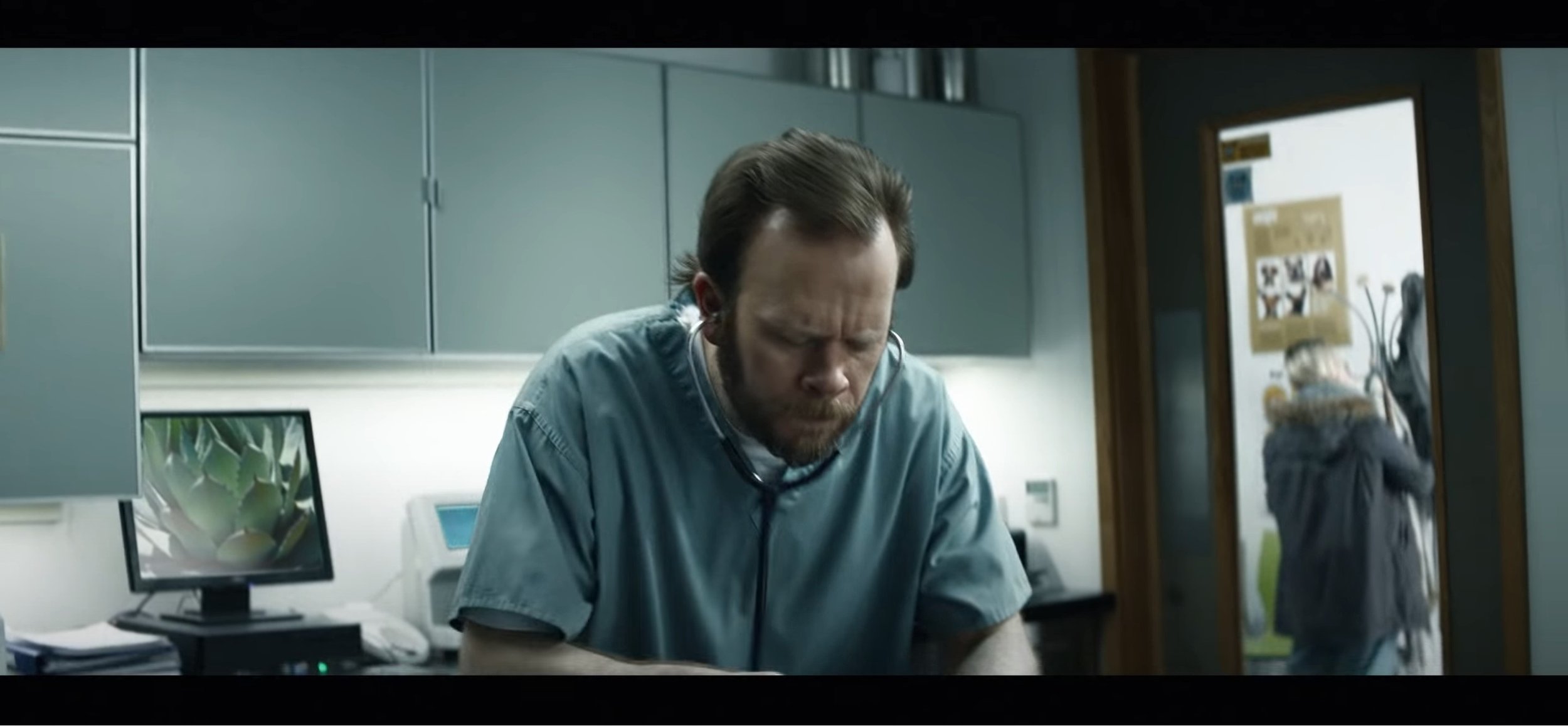
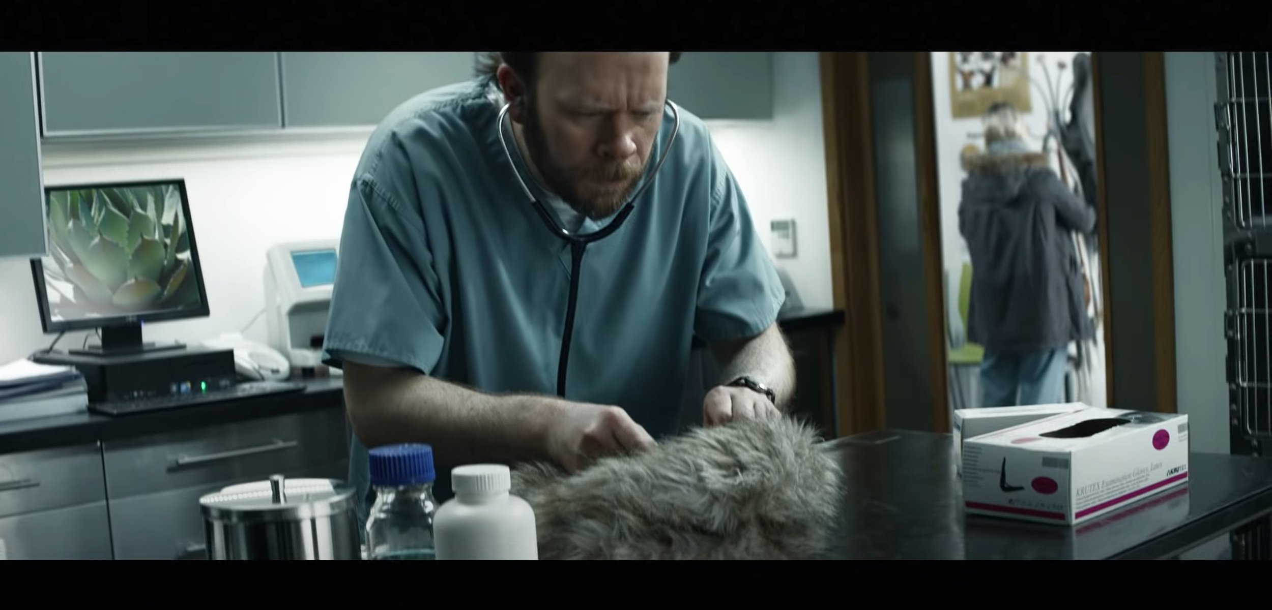
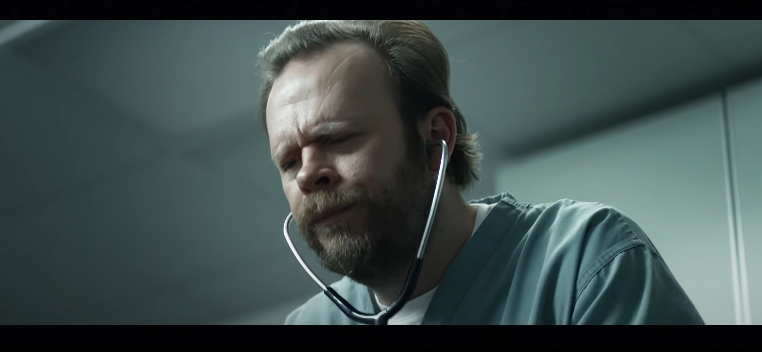
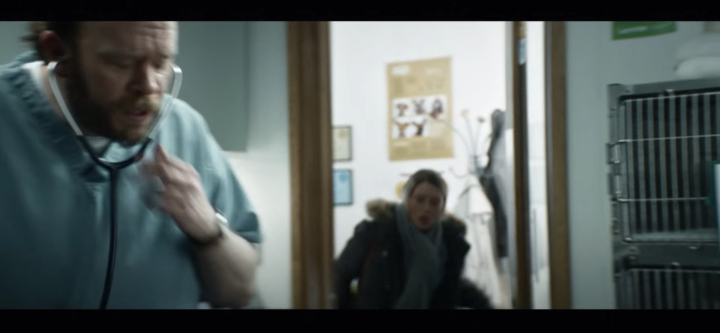
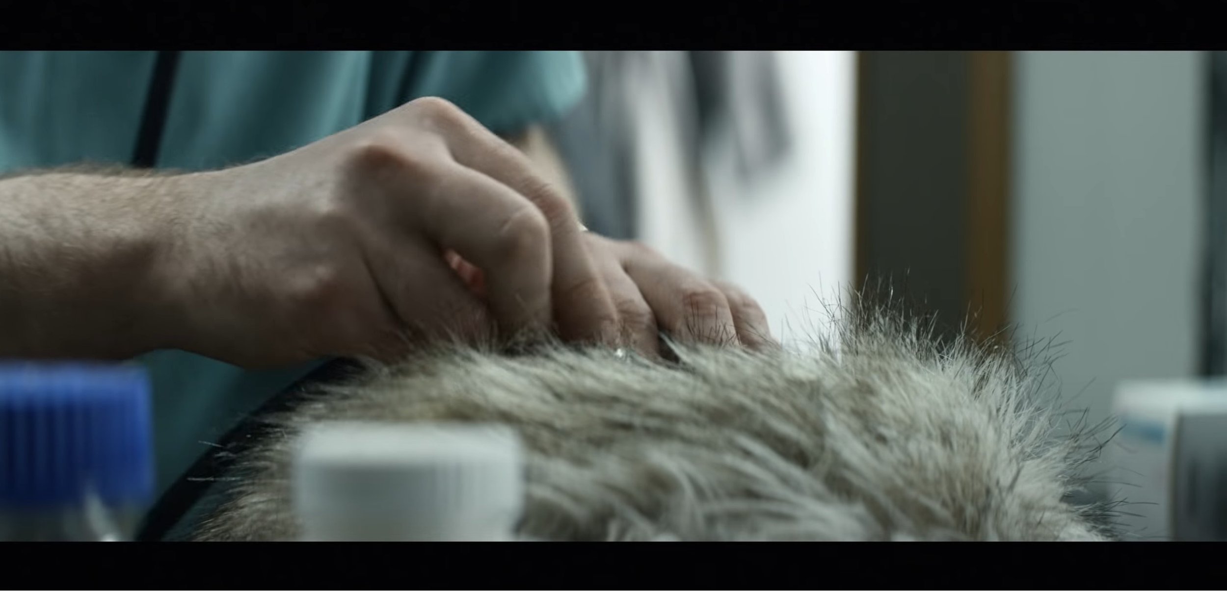
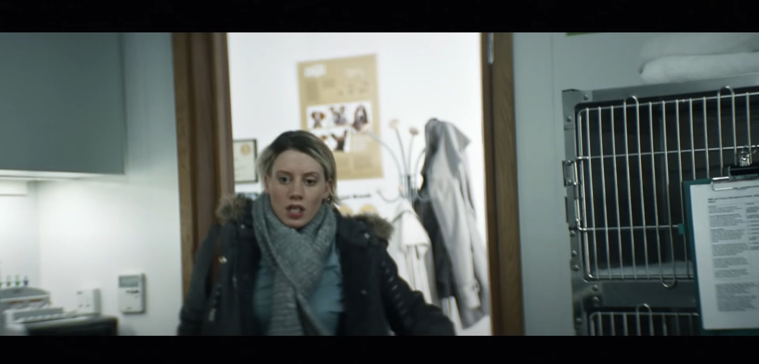
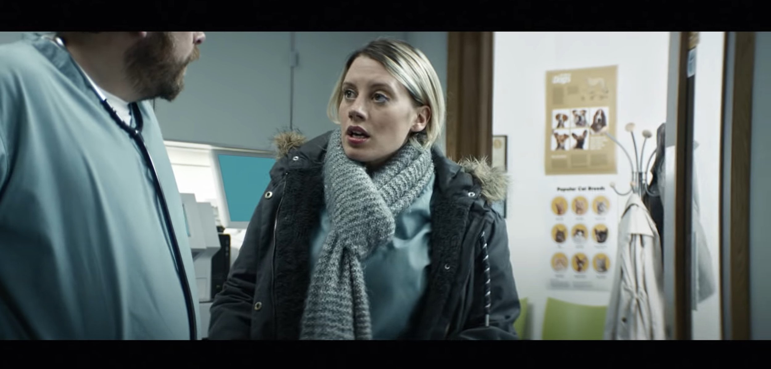
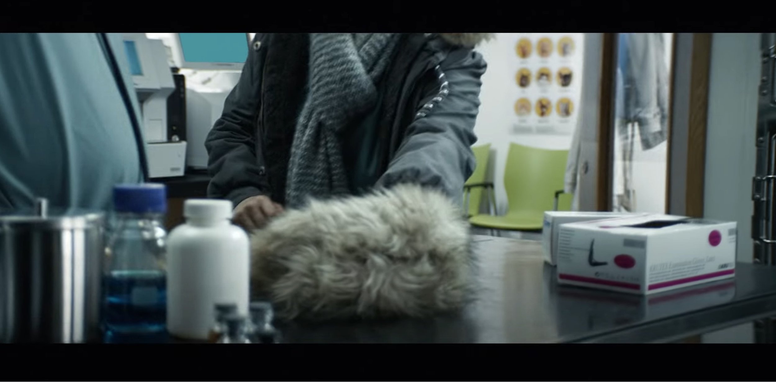
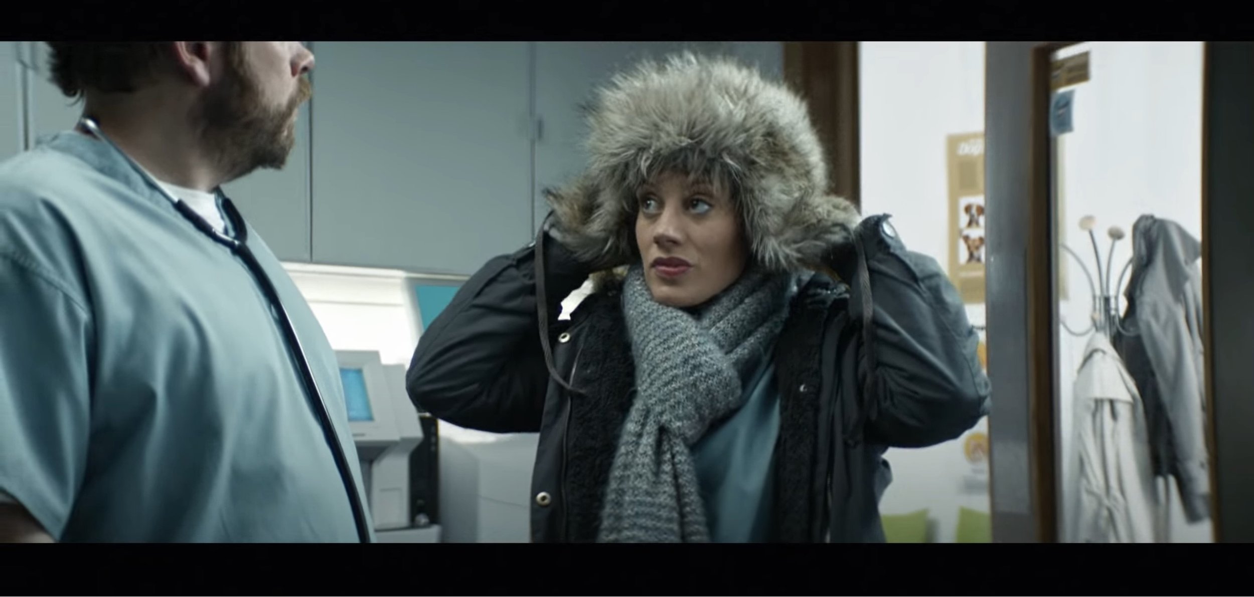
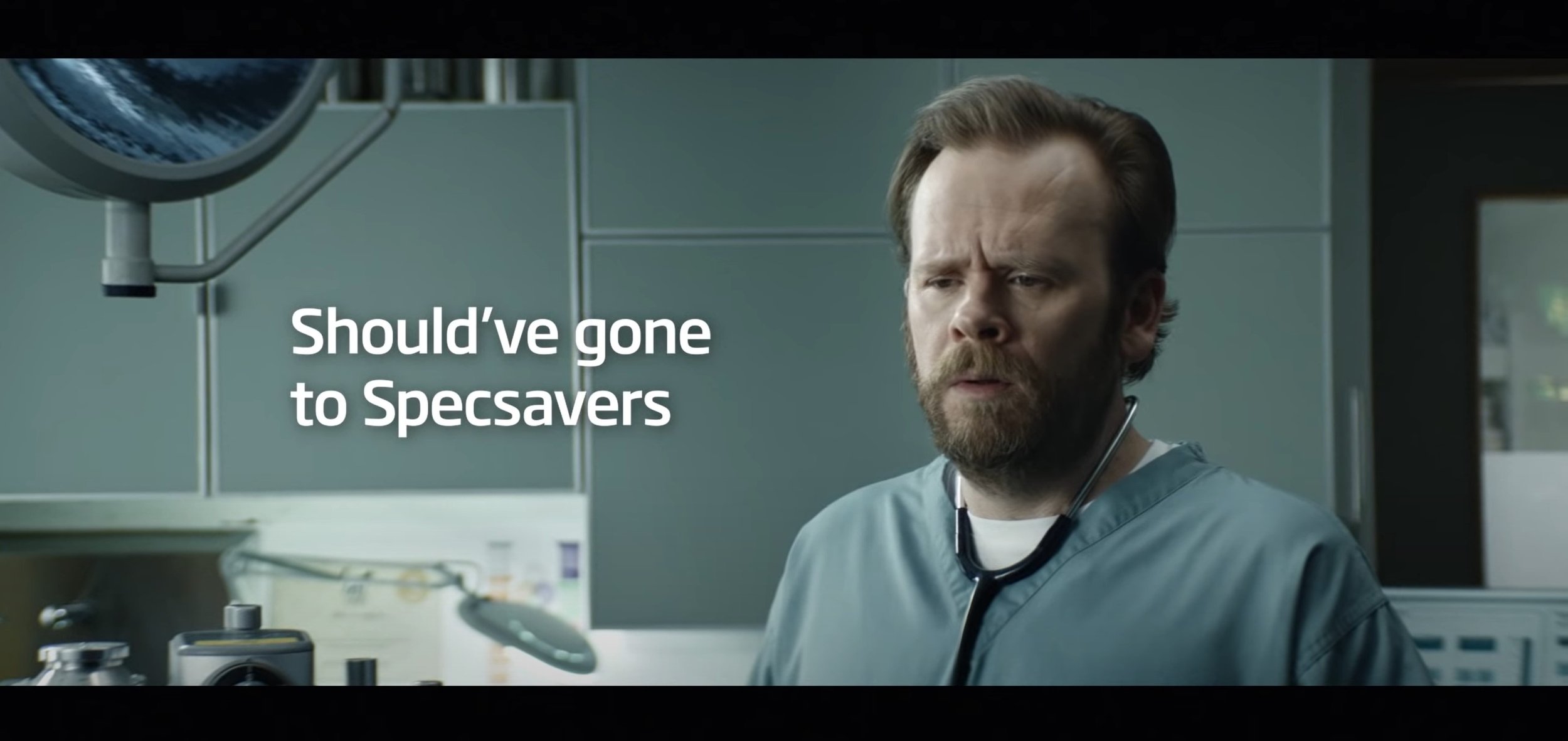
To start with, this advert has a very simple concept behind it but works really well for the type of advert it is advertising for. The target audience I think they are aiming it at is all ages as anyone who is struggling to see needs to get an eye test and with something almost obvious and staring at you. The lighting techniques used in this video are very bright and generic, their is nothing particularly special about it. The transitions that are used in this video are the simple cut to the next scene without any special effects and they are using the cinematic aspect ratio (2.4:1) in this video. The shot types which are used in this video are wide shot, close up shot and medium shot. The camera angles which are used to work with the shot types are mostly low angles and eye level. The movements are easier to analyse, the is a lot of up and down movement, for example from when looking at the doctor and then moving back down to the fluffy hat, next one is when the camera pans left and then zooms in quickly and then the camera moves down then back up. This is following the main subject in the next scenes, which is the women. Lastly at the end the advert finishes off saying “Should’ve Gone To Specsavers” with the doctor who has become the main subject in frame to the right of the frame with the text on the left, they have done this well by using a medium eye level shot.
The screengrabs are below to see what I am talking about:
Pre-Production
My Idea: - MG ZT | Commercial Ad
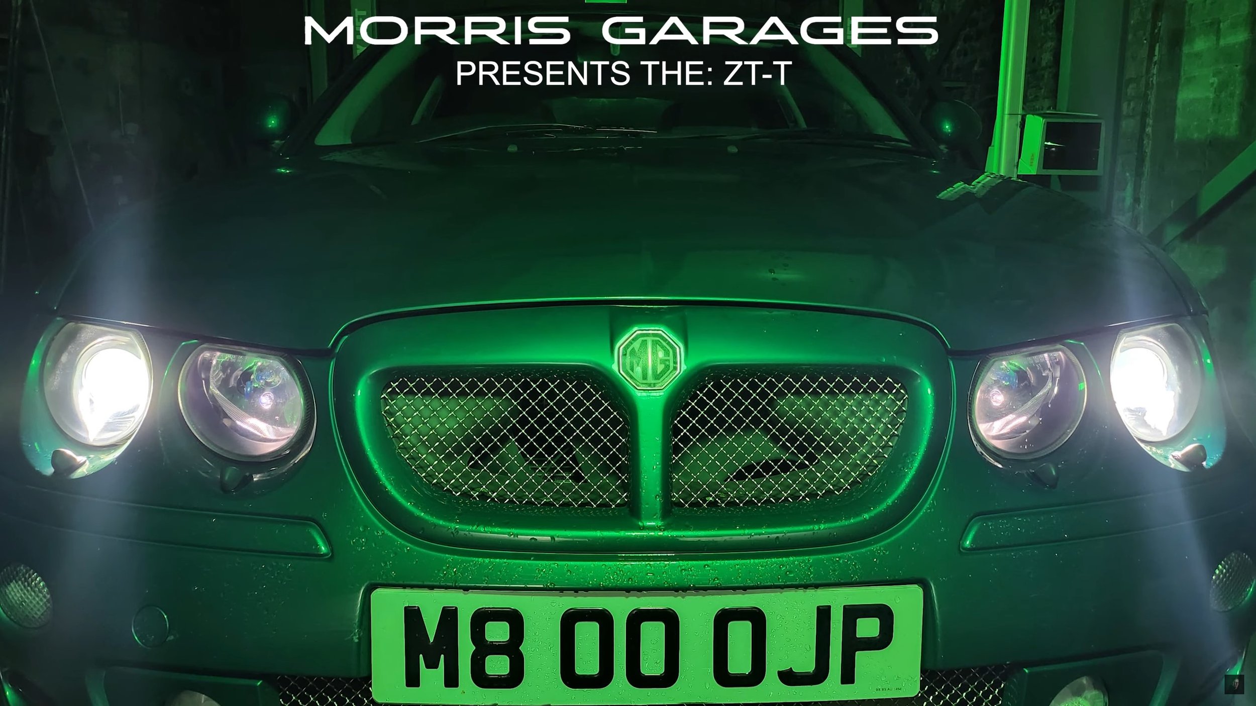
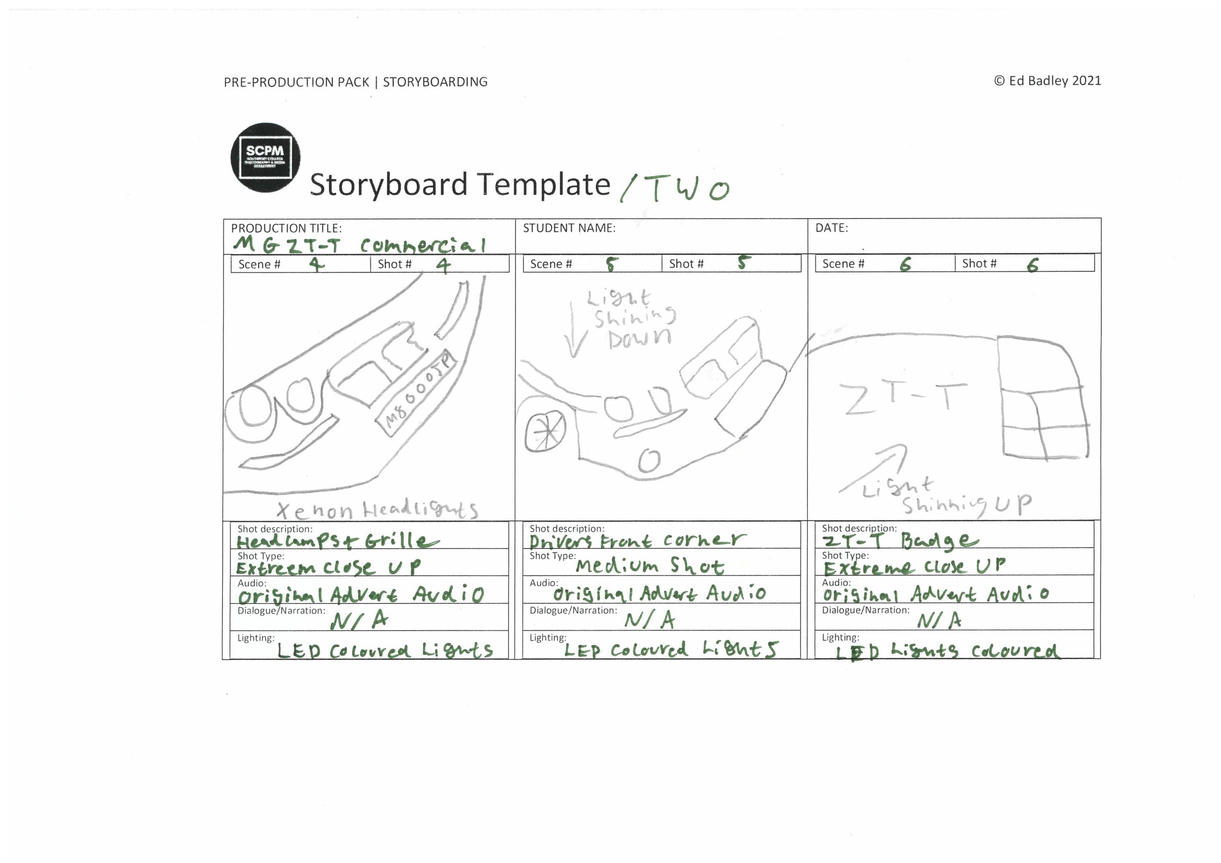
My idea is to create an advert which features my car (MG ZT-T) and use special lighting techniques. Something which isn’t too dis-similar to the one above, but I’ll do my take on the advert. I will also re-use the audio from the existing video as it fits with what I am trying to produce. The equipment I will need to produce this film is two light rigs, a light sabre for high lights. Most of what you can see is done in the post-production side, so I am heavily going to rely on the editing to bring out my final product. This is probably the hardest thing to make in the time scale set, but I am confident to make it work to the best of my ability. I will be filming inside in a garage and that is where I can set up my lighting etc.
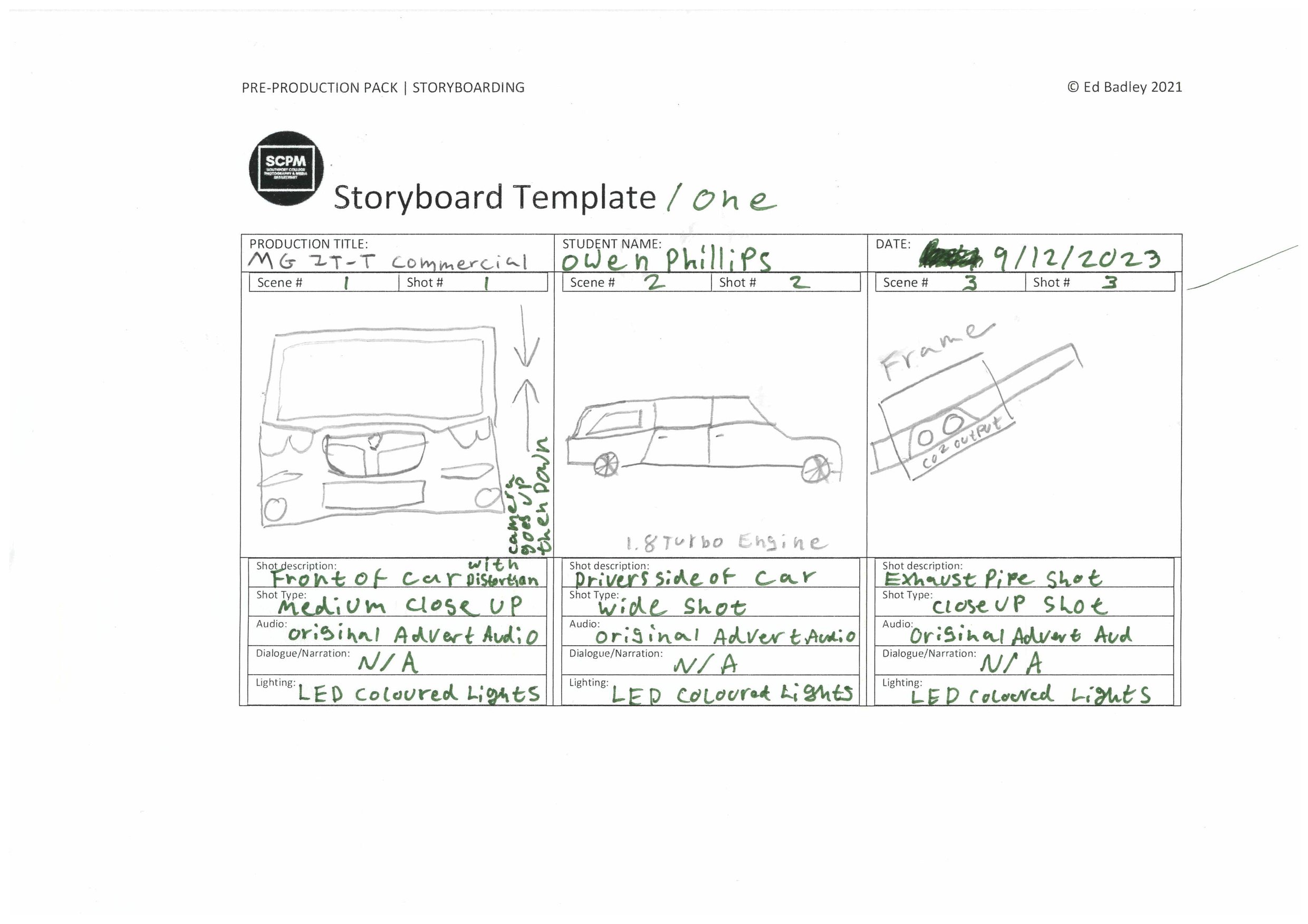
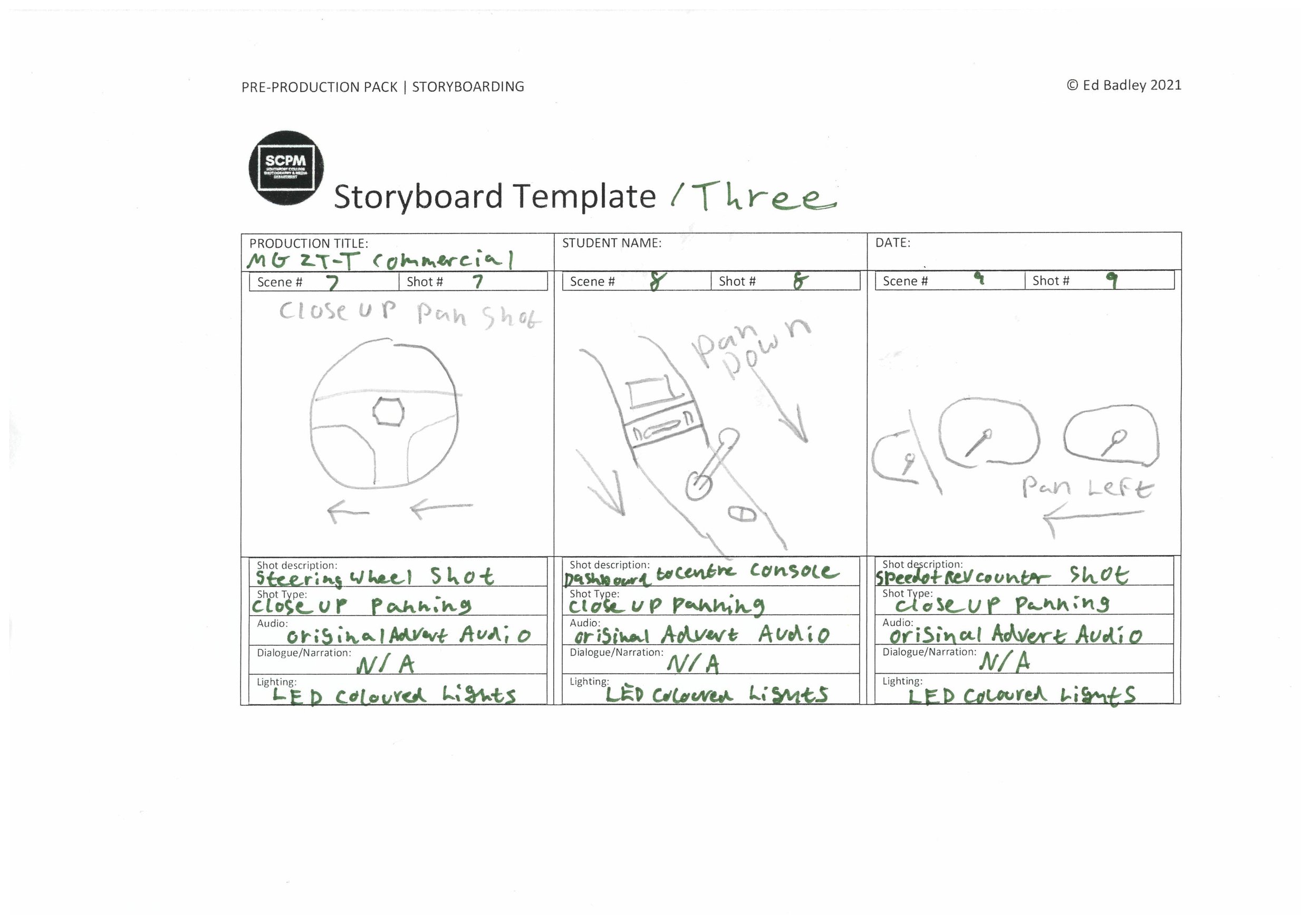
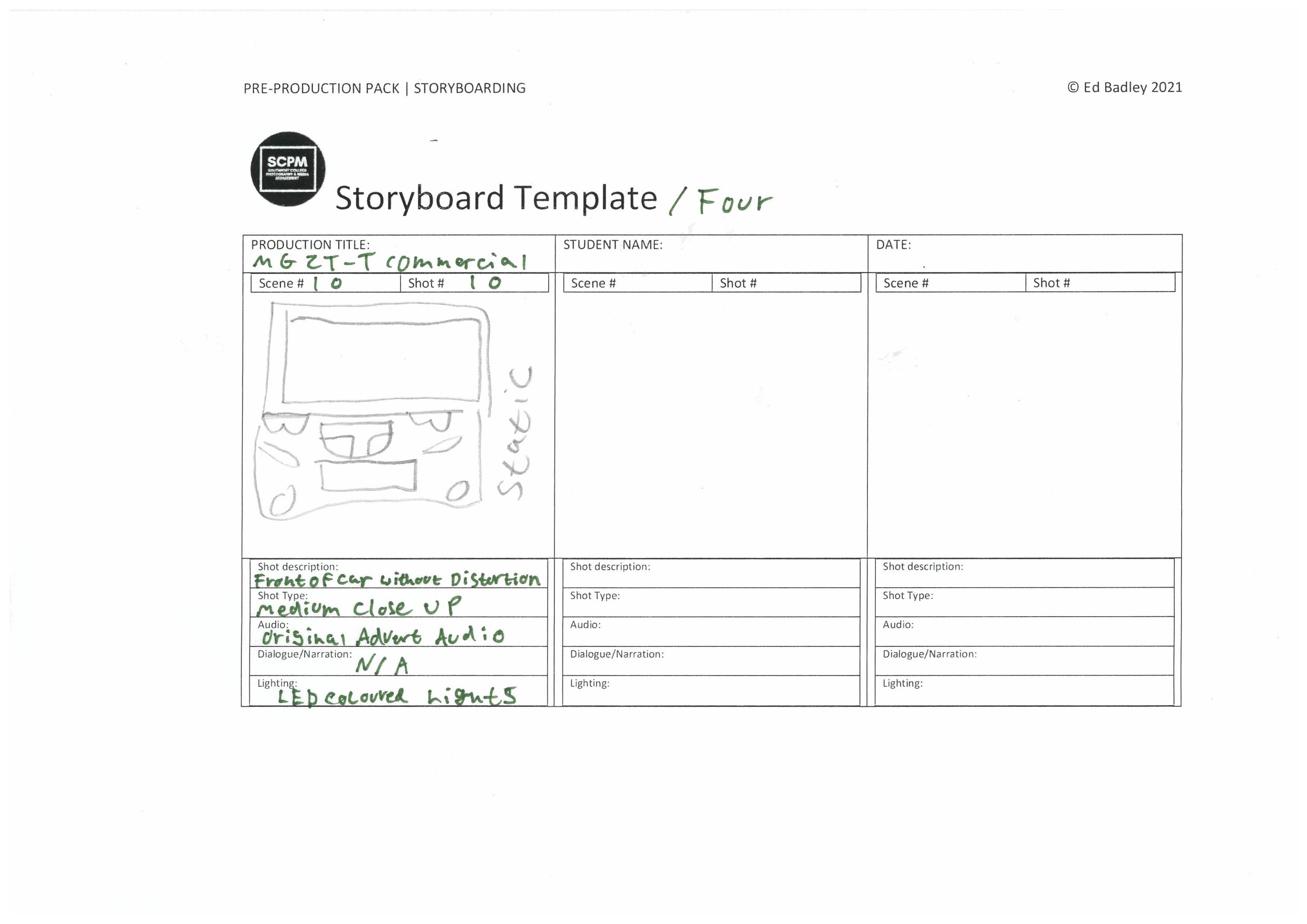
Storyboard: -
Shot List: -
Production
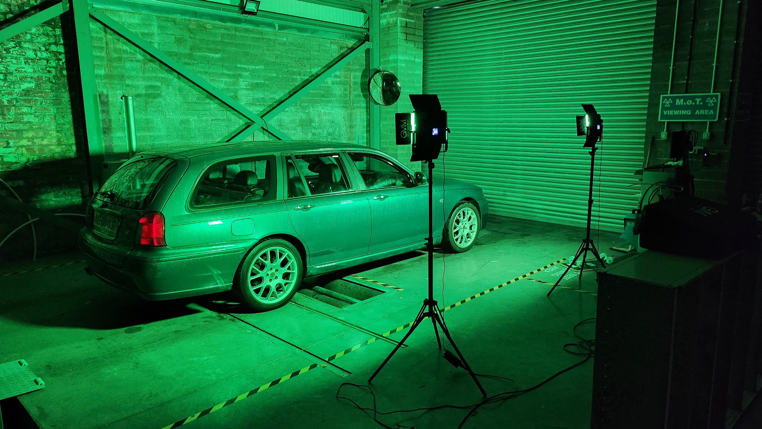
Behind the Scenes: -
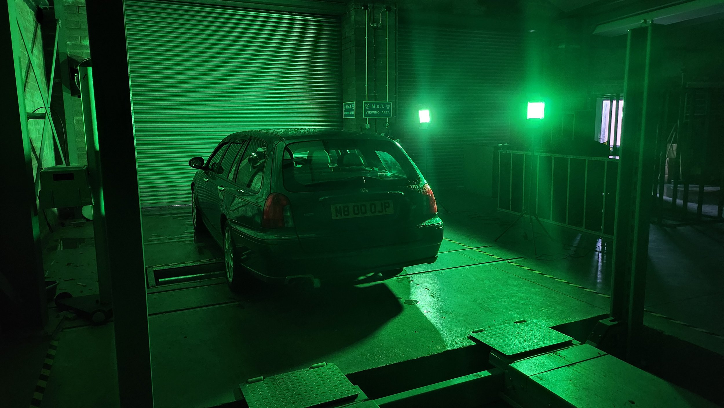
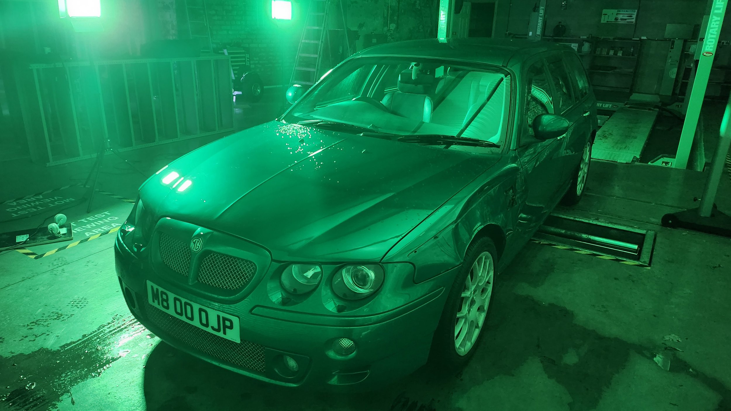
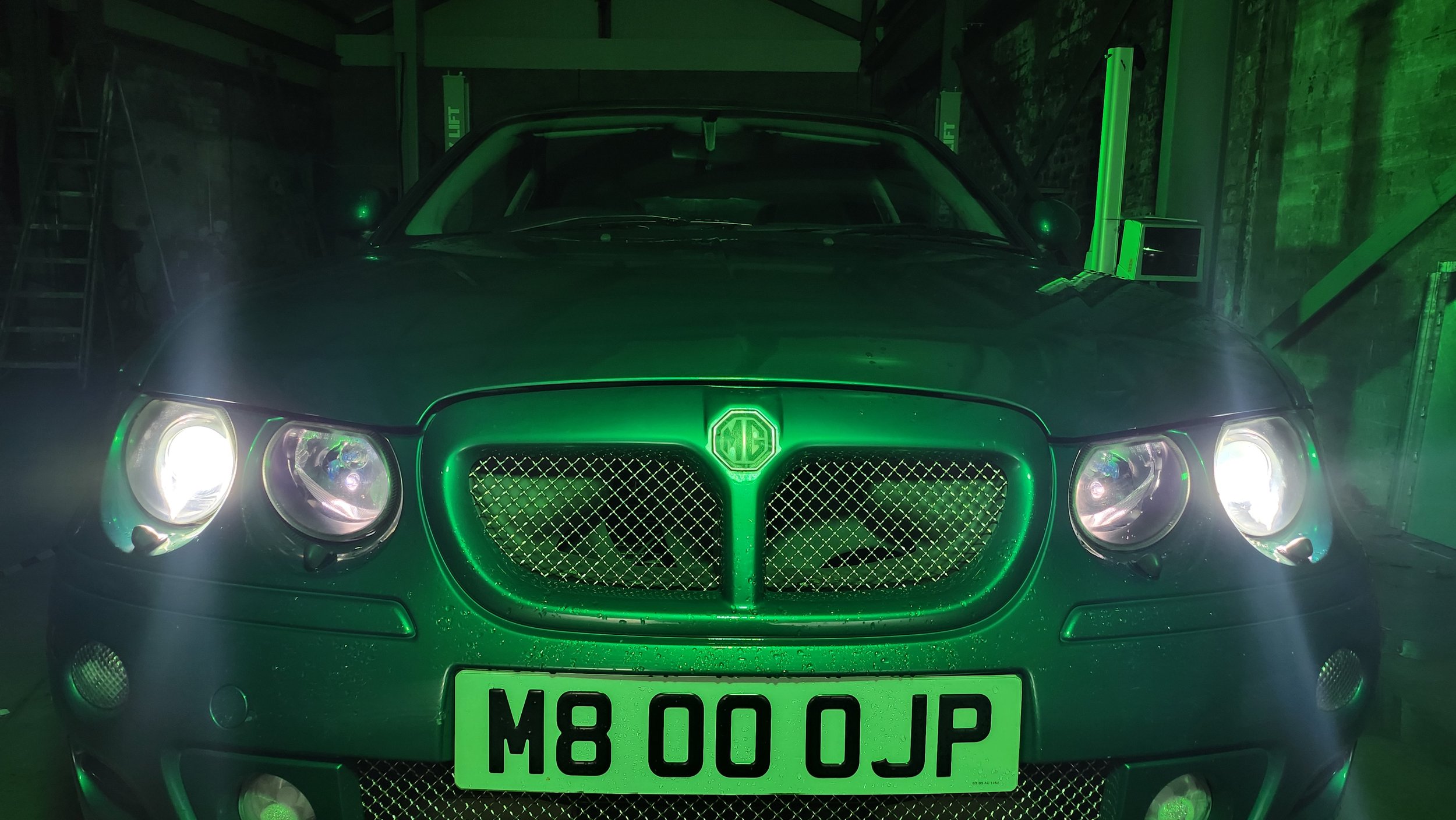
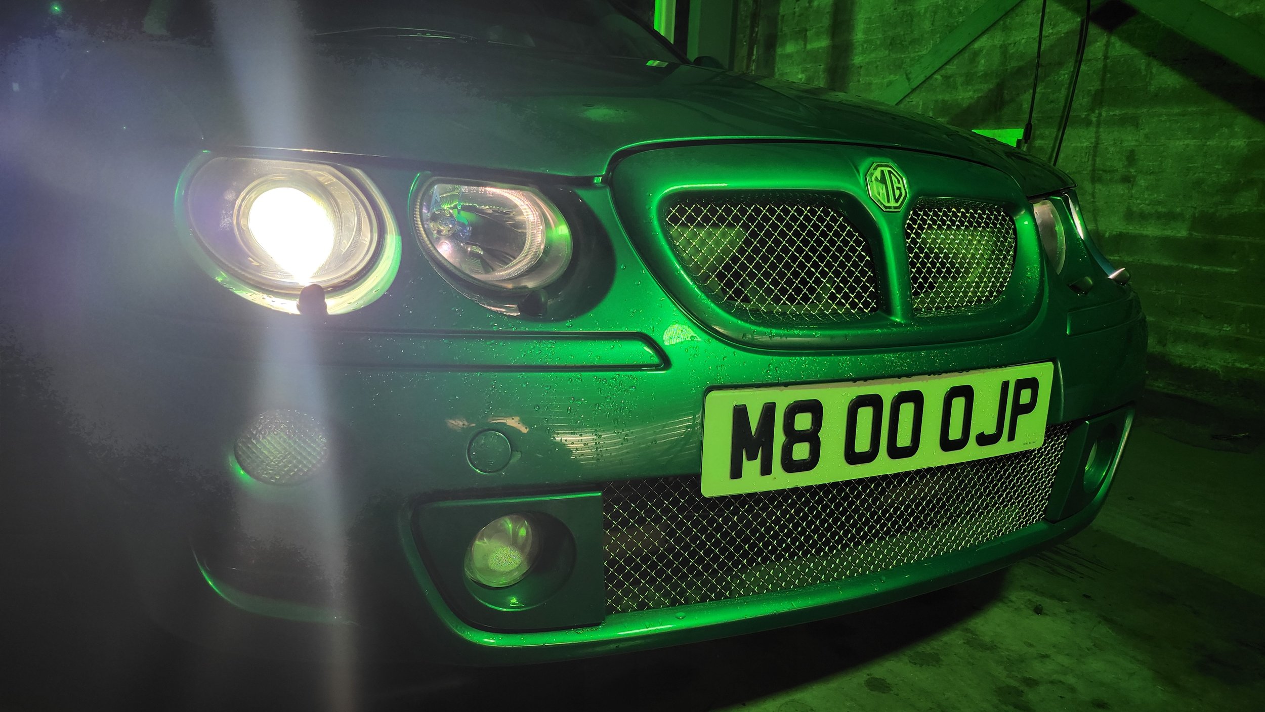
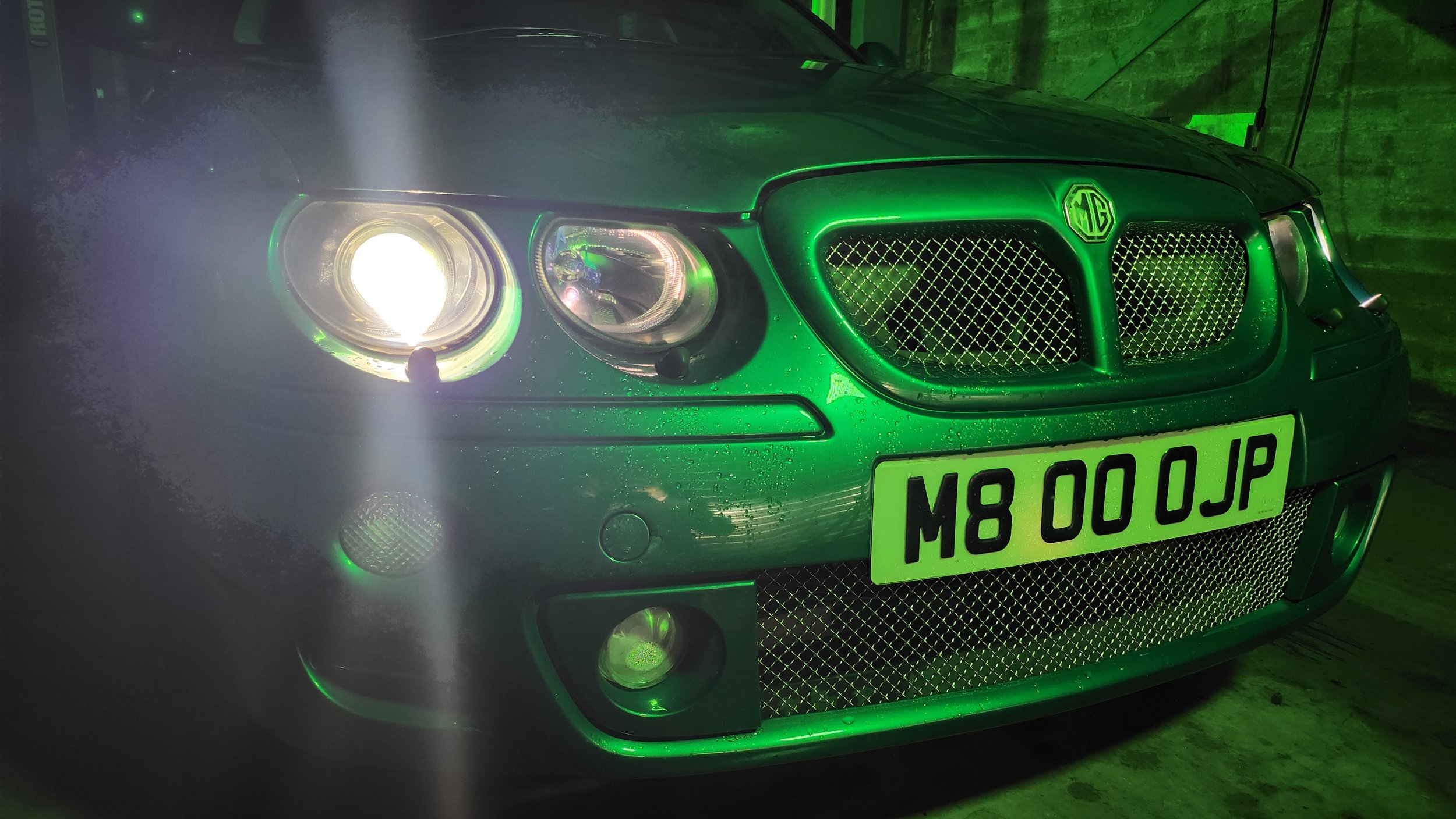
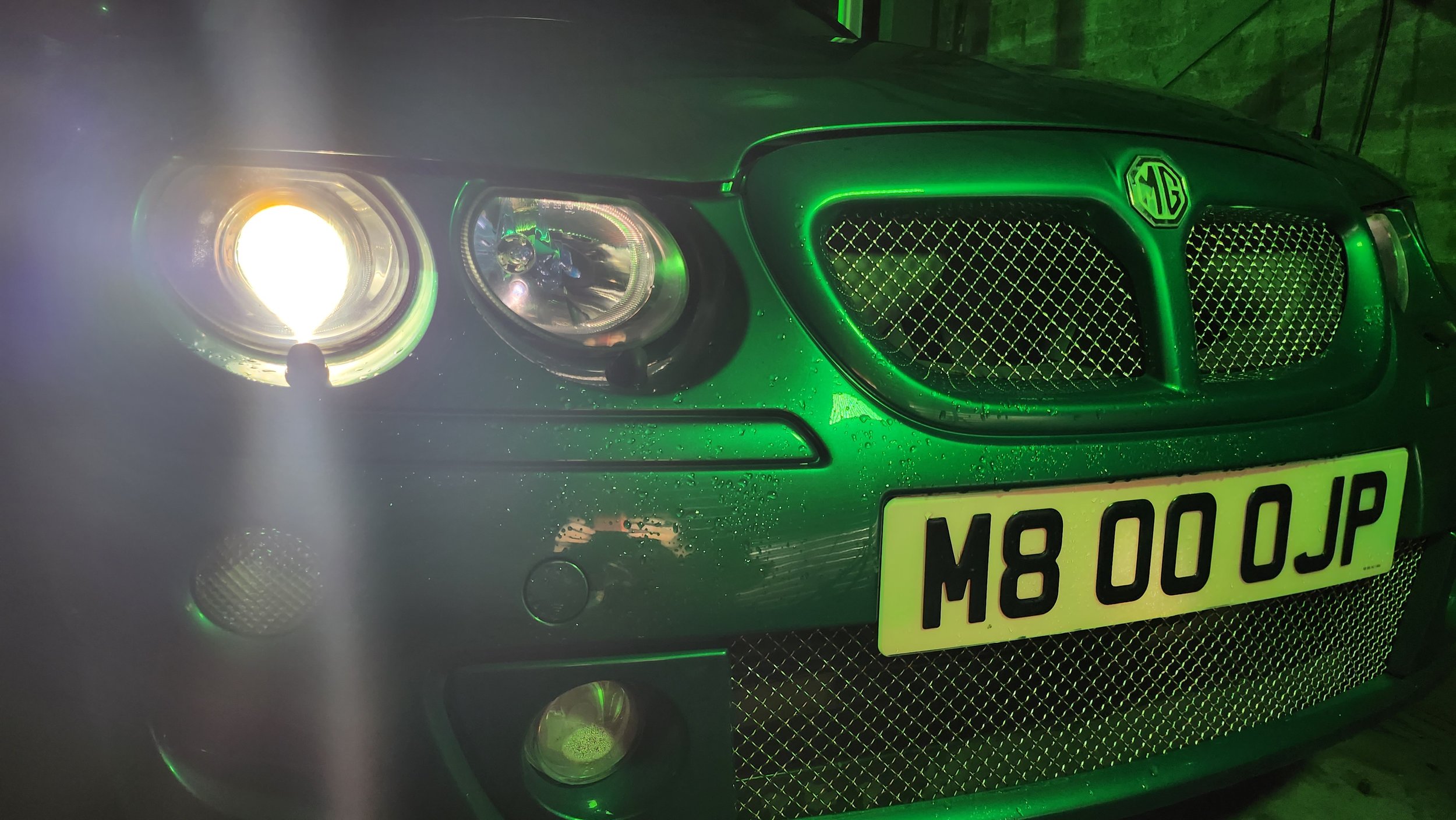
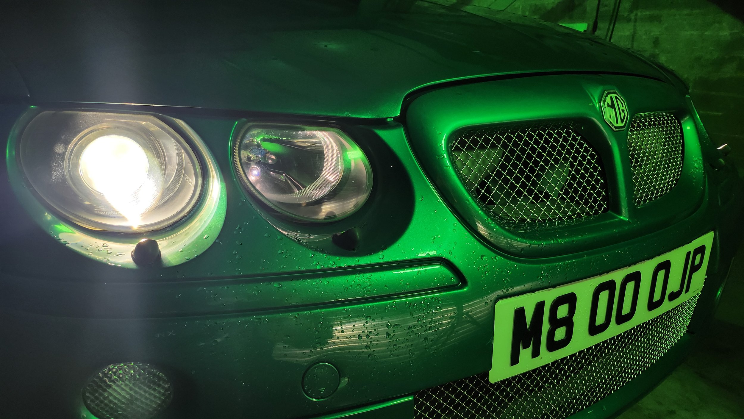
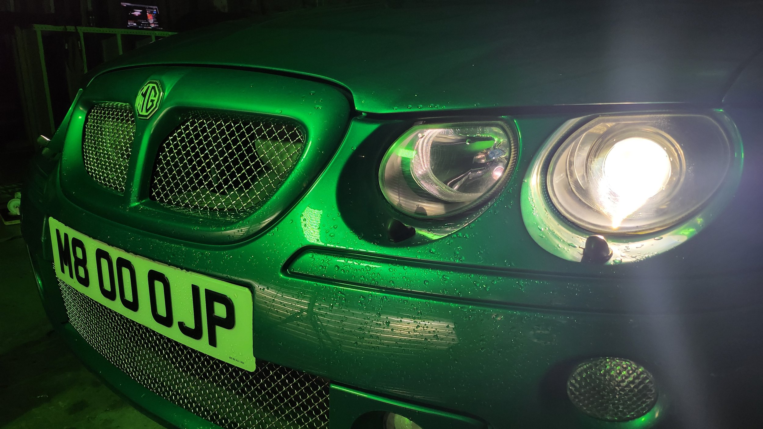
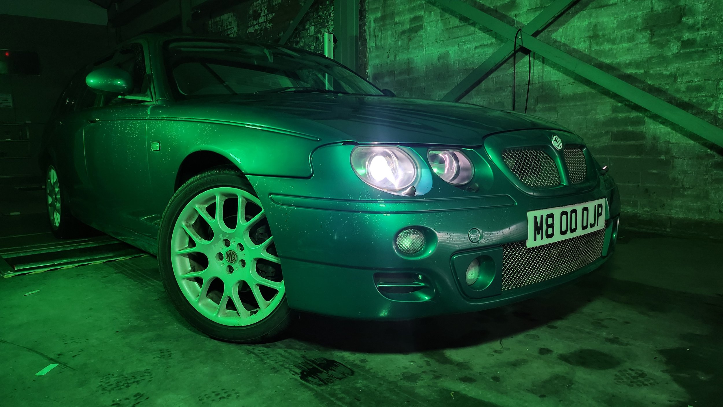
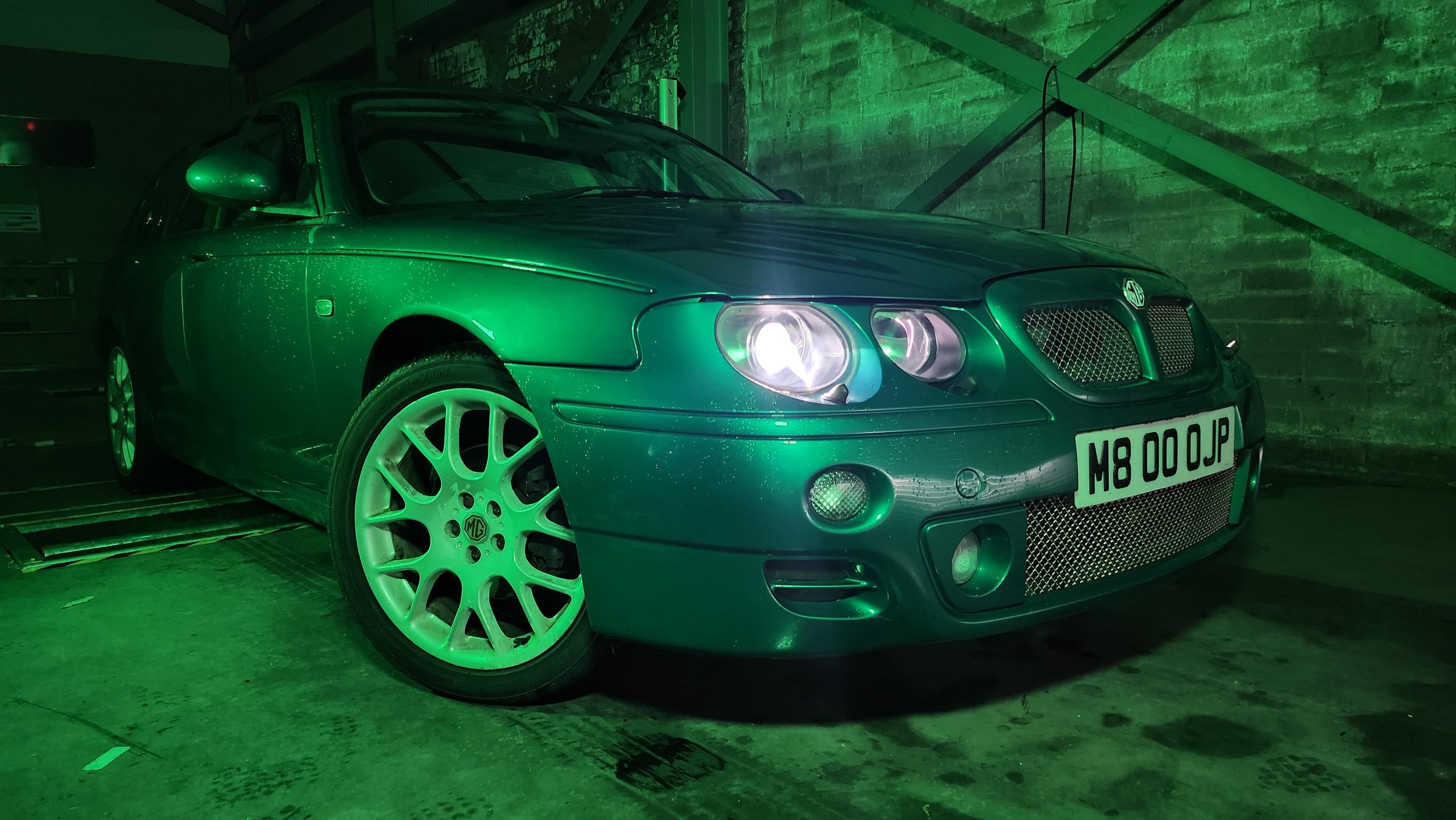
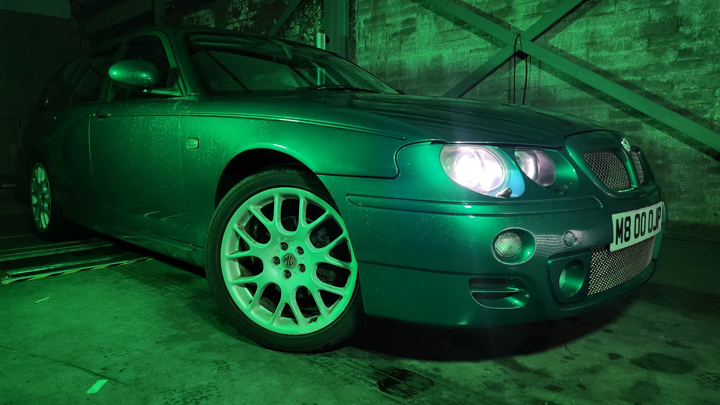
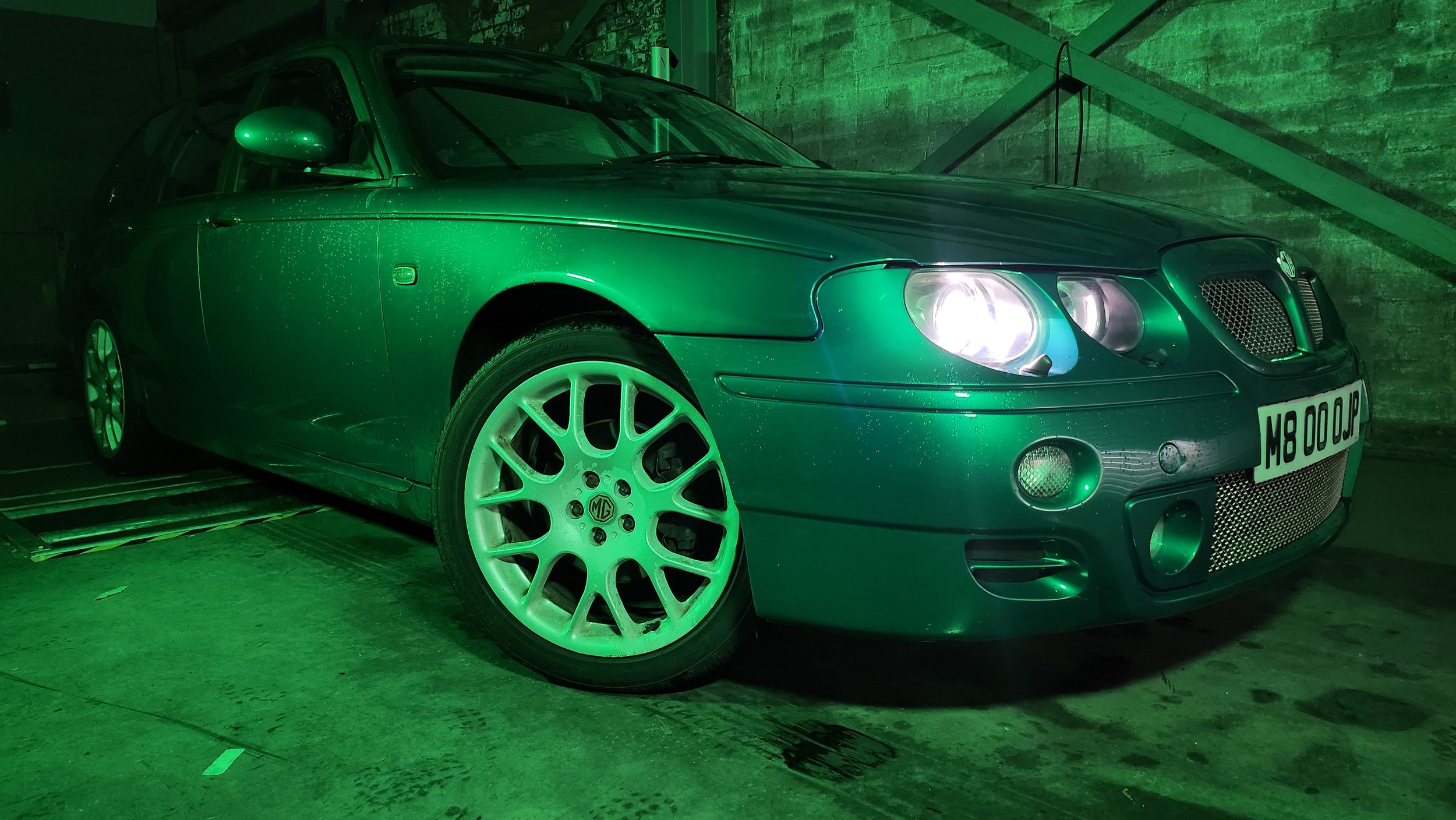
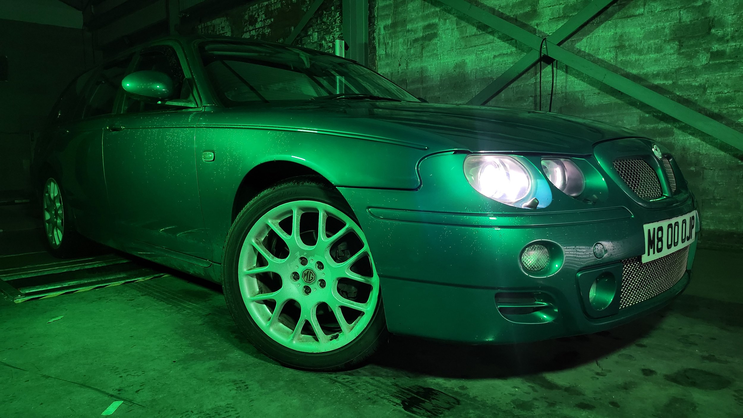
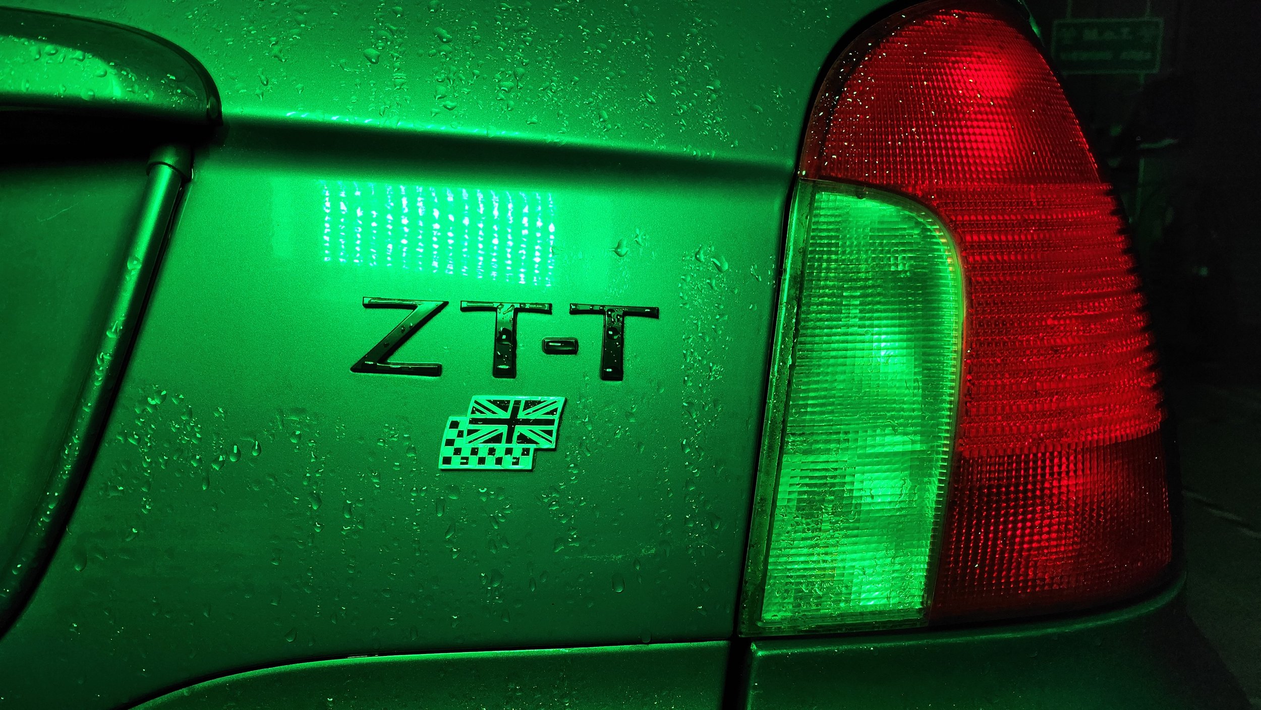
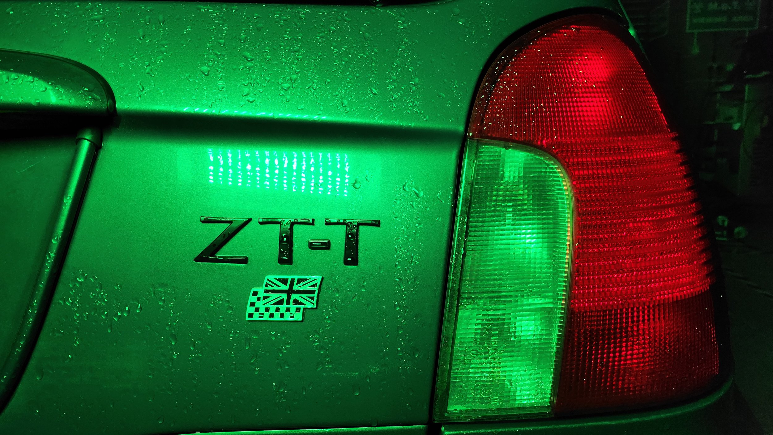
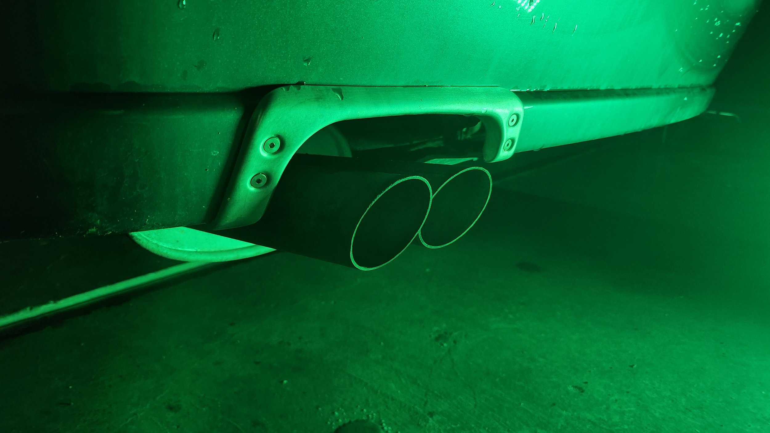
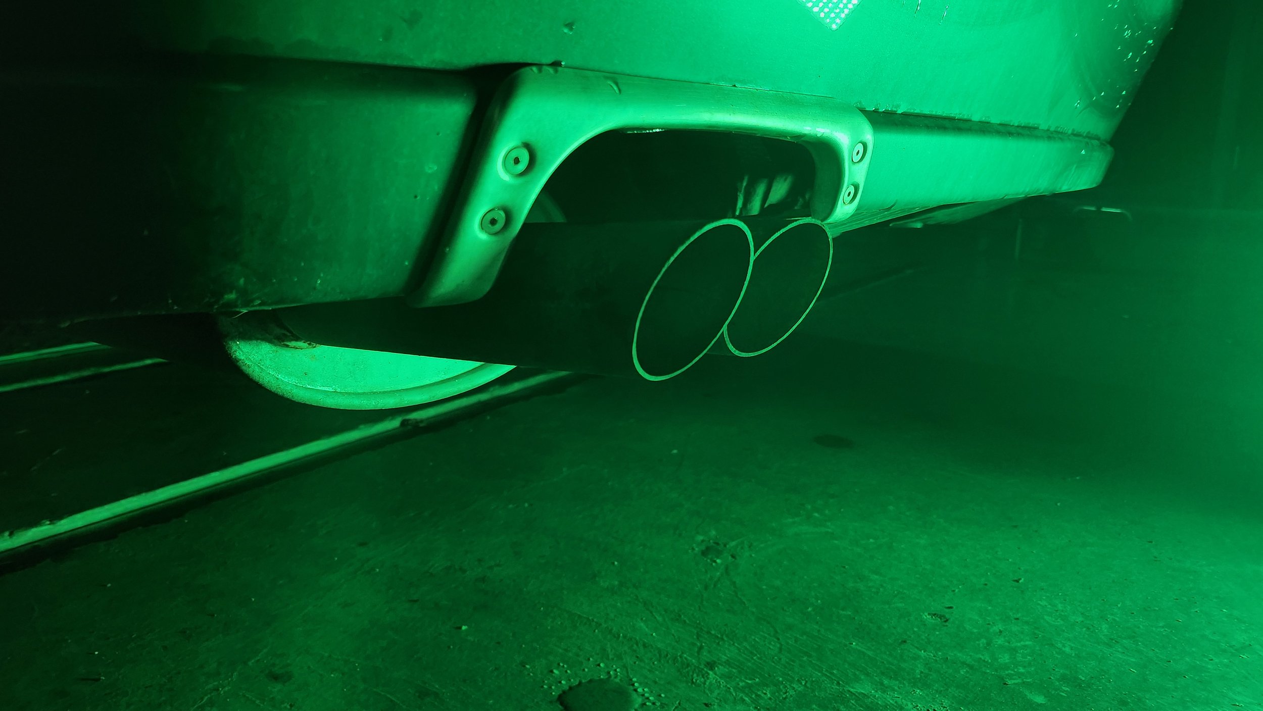
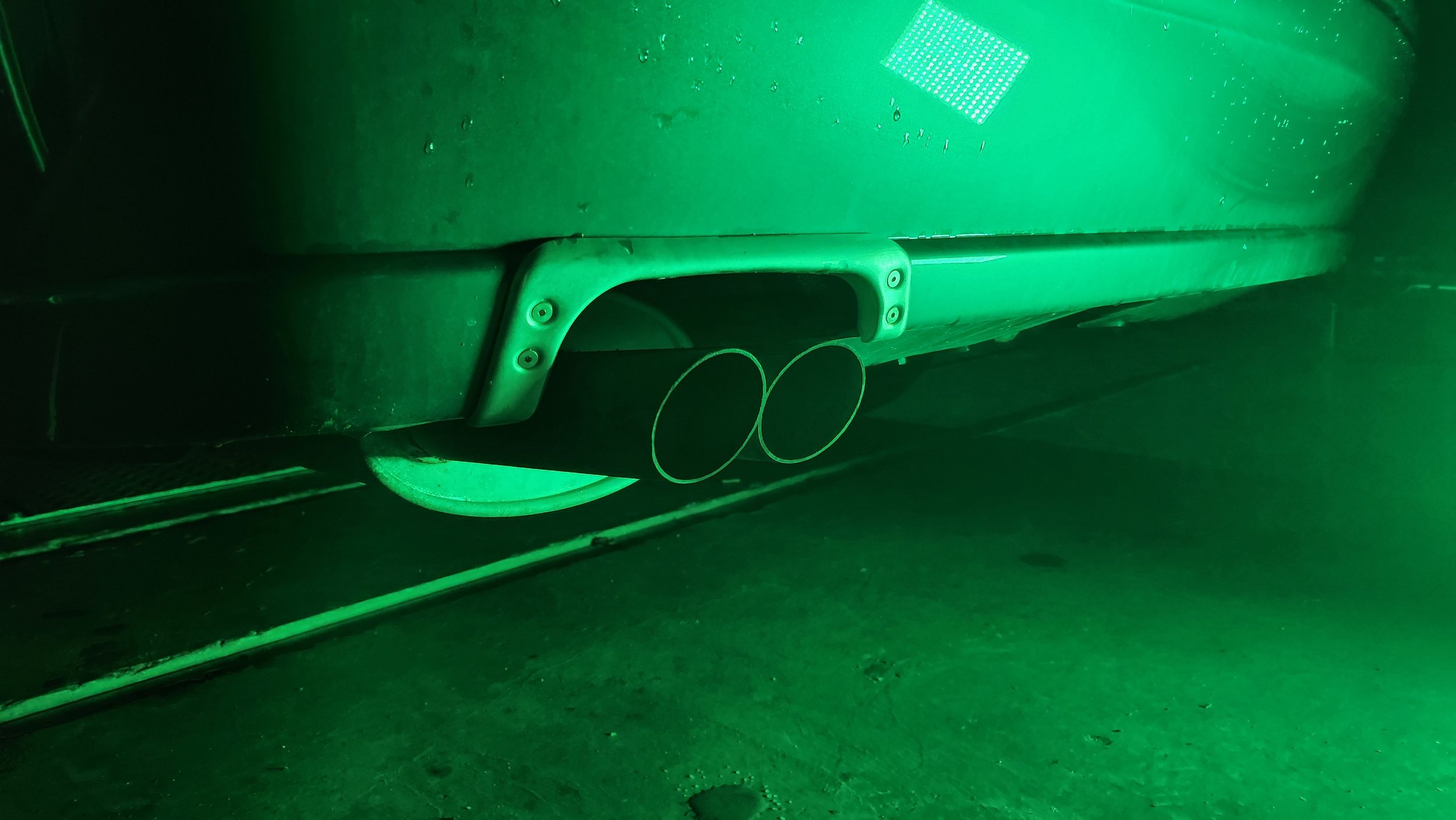
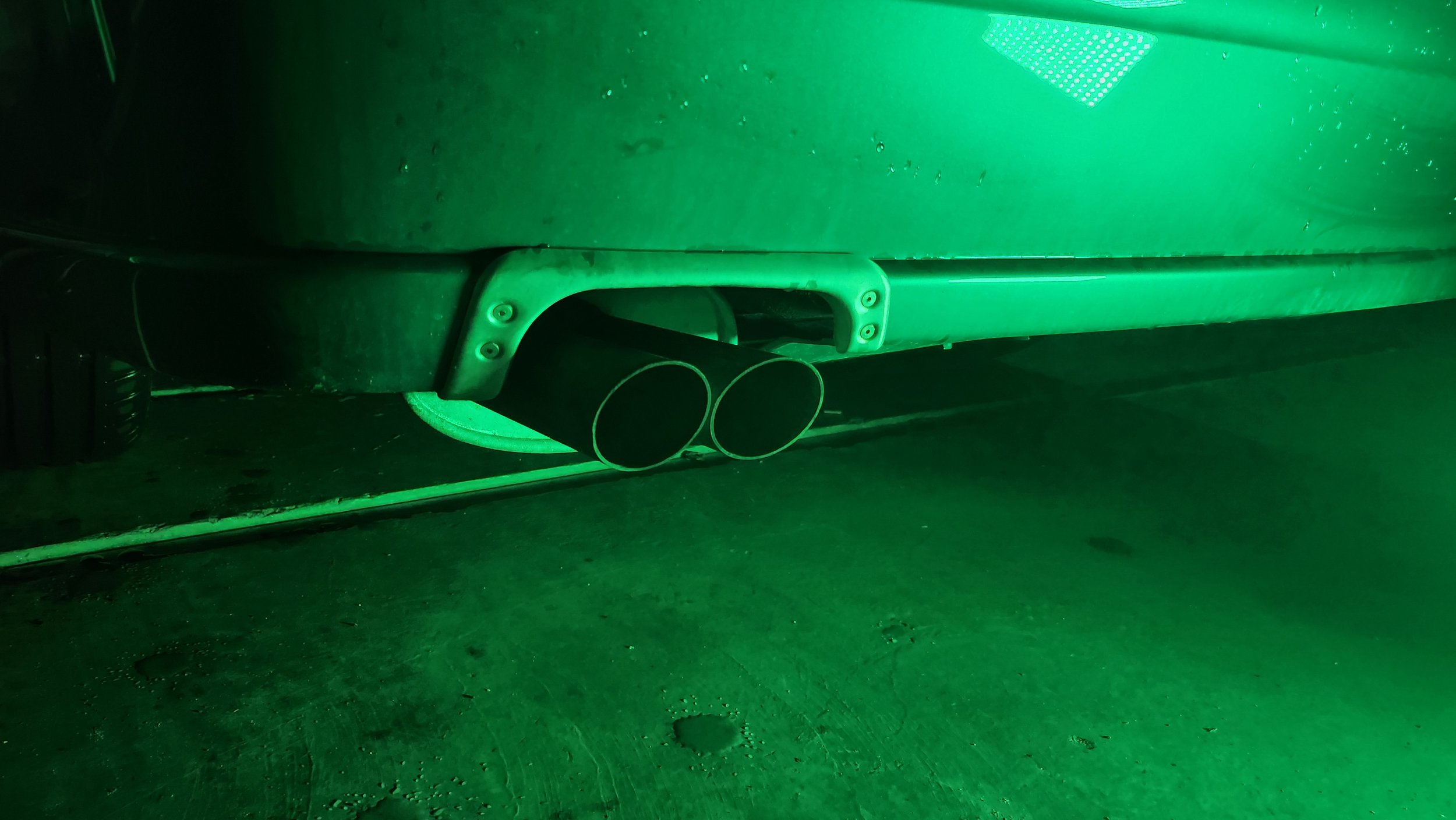
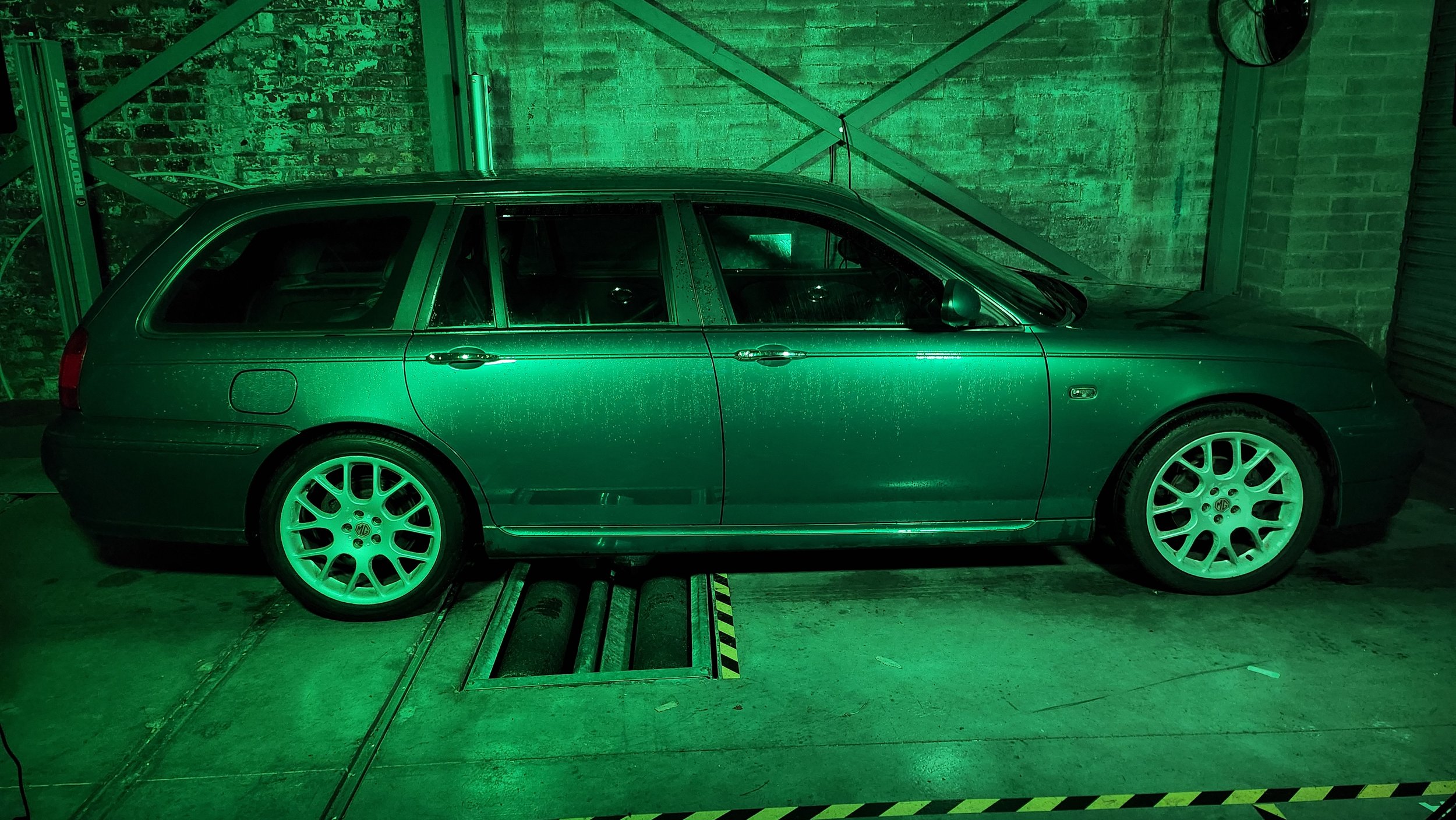
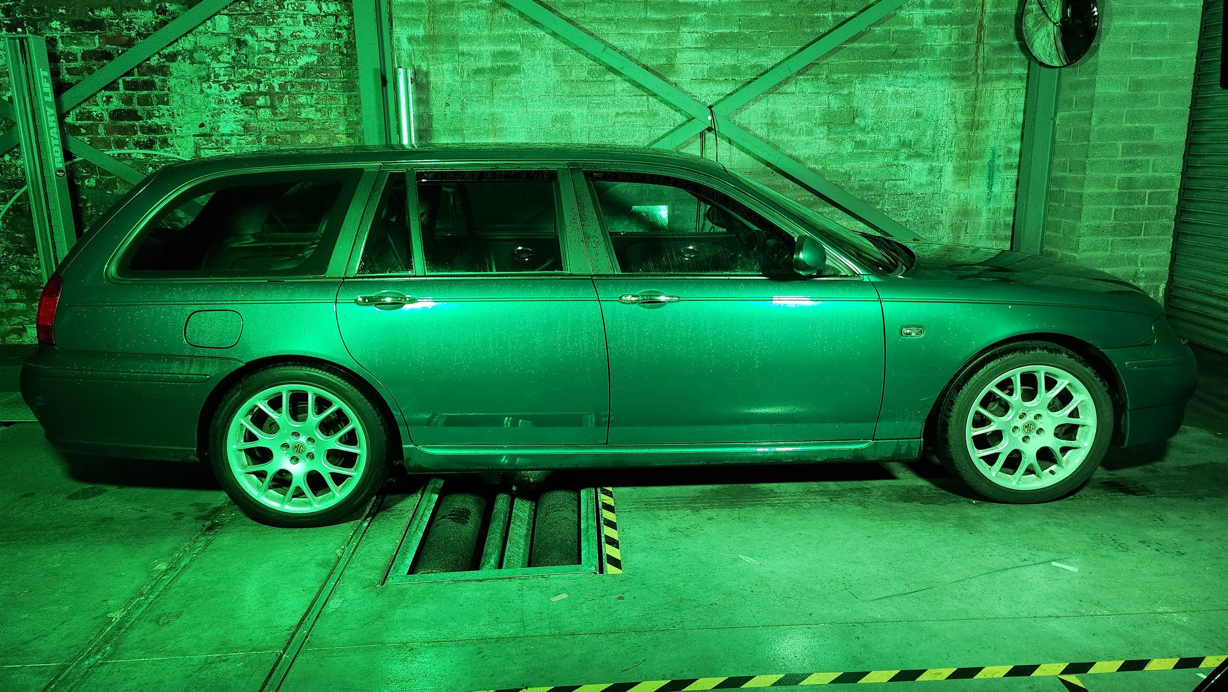
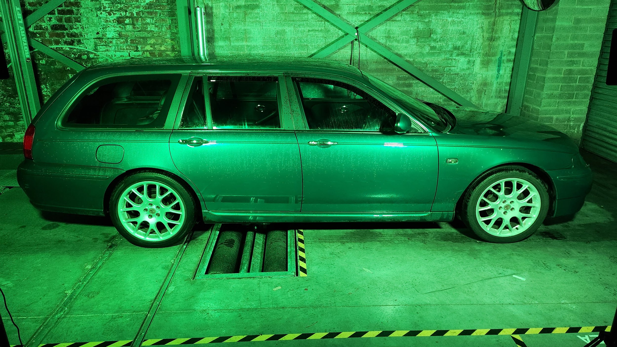
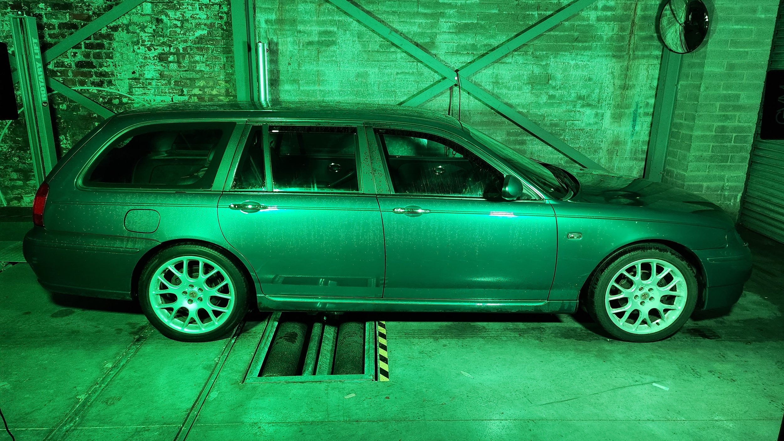
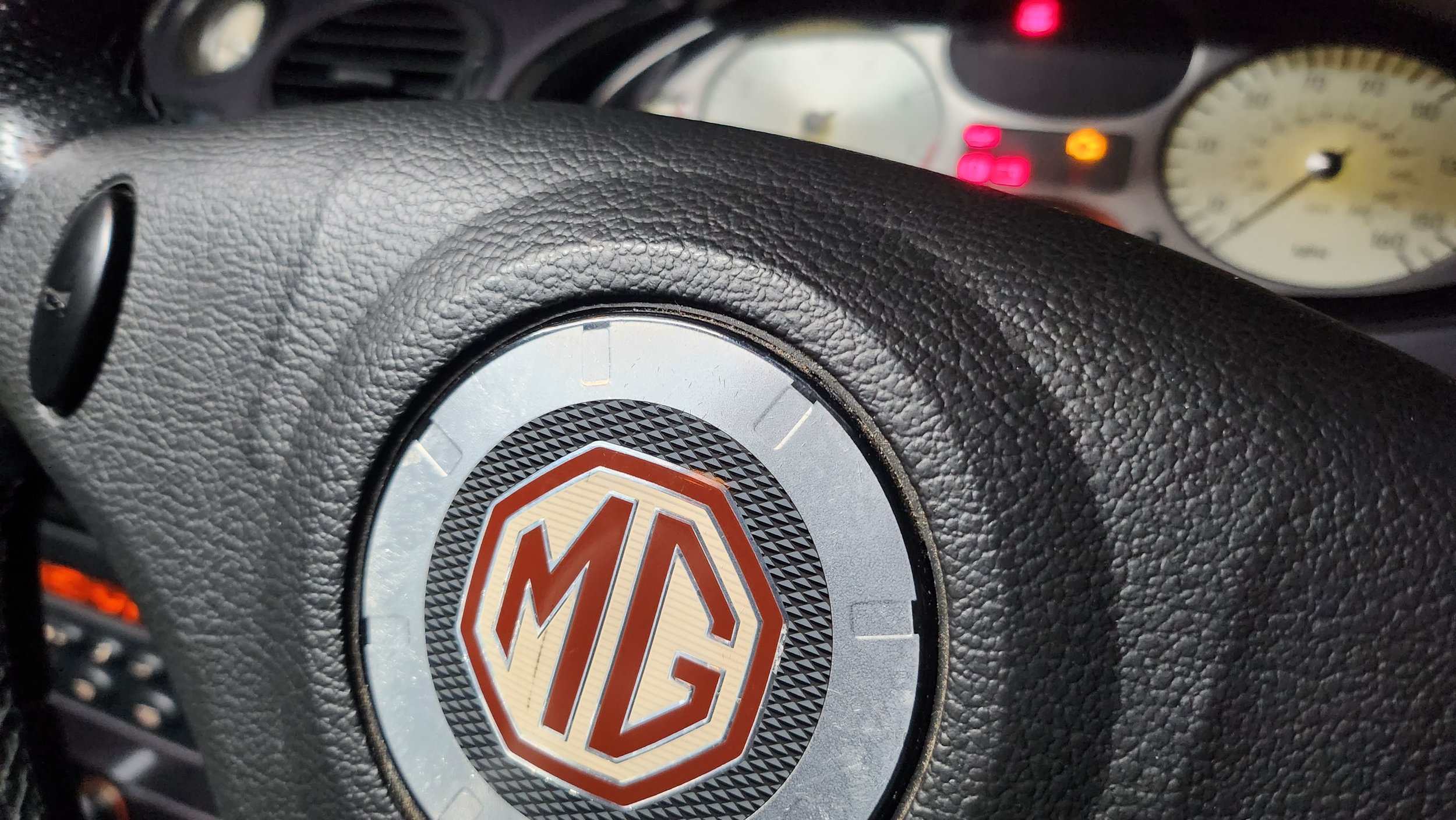
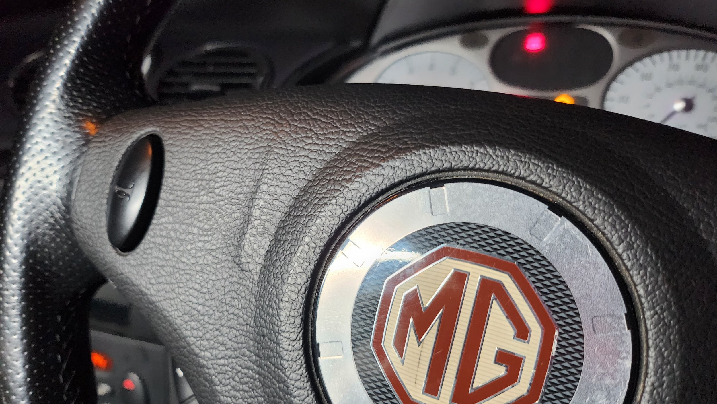
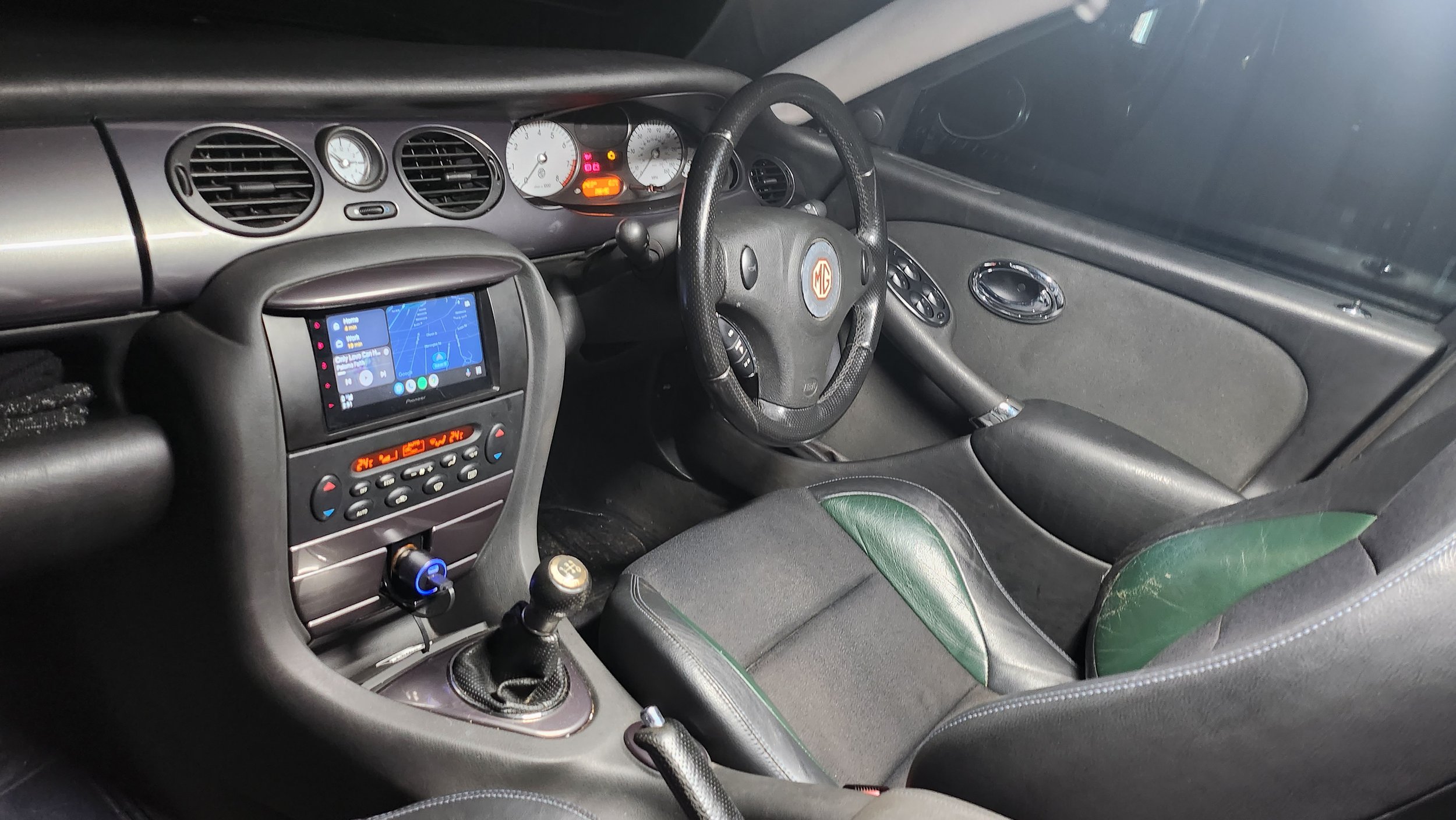
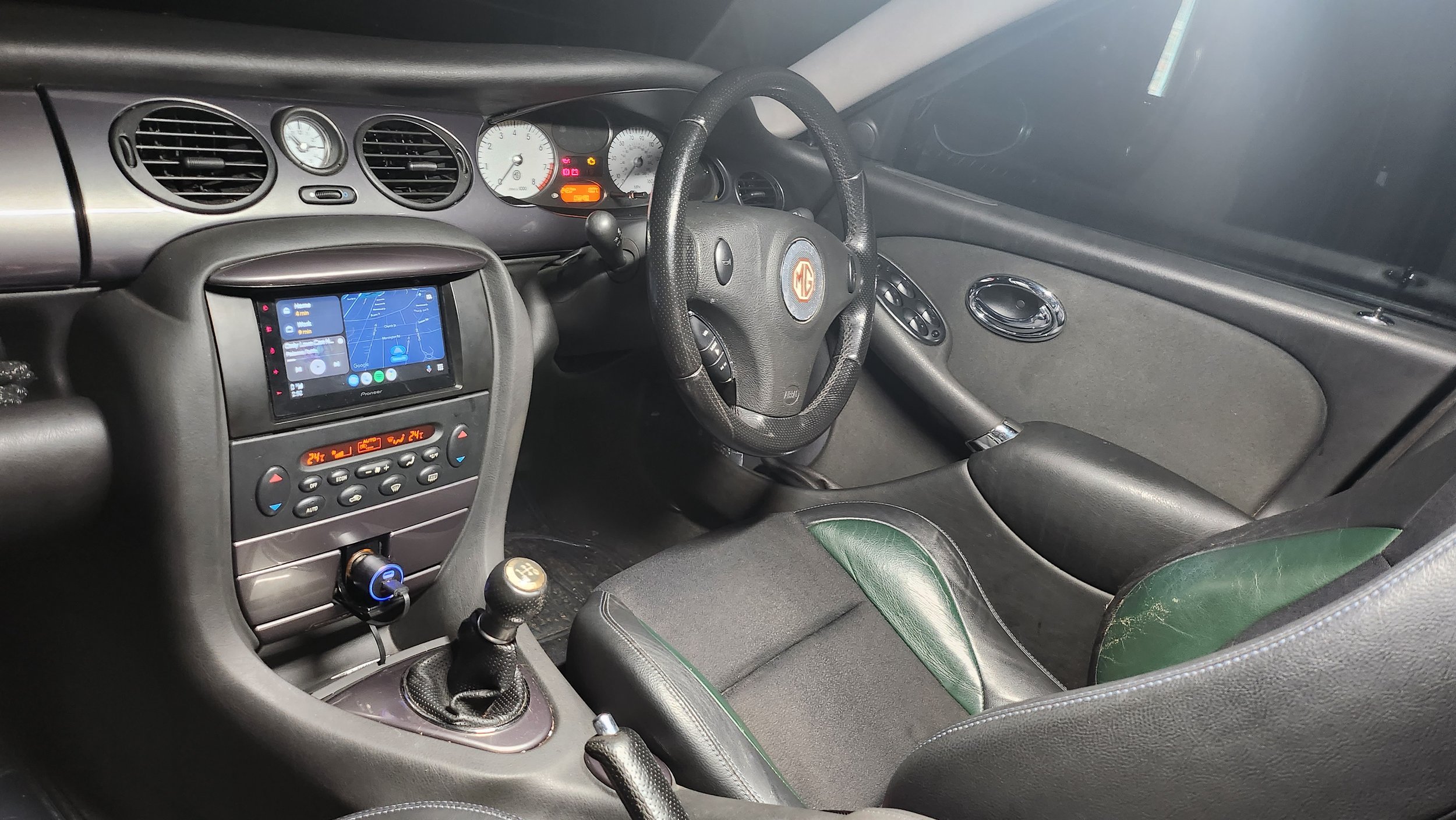
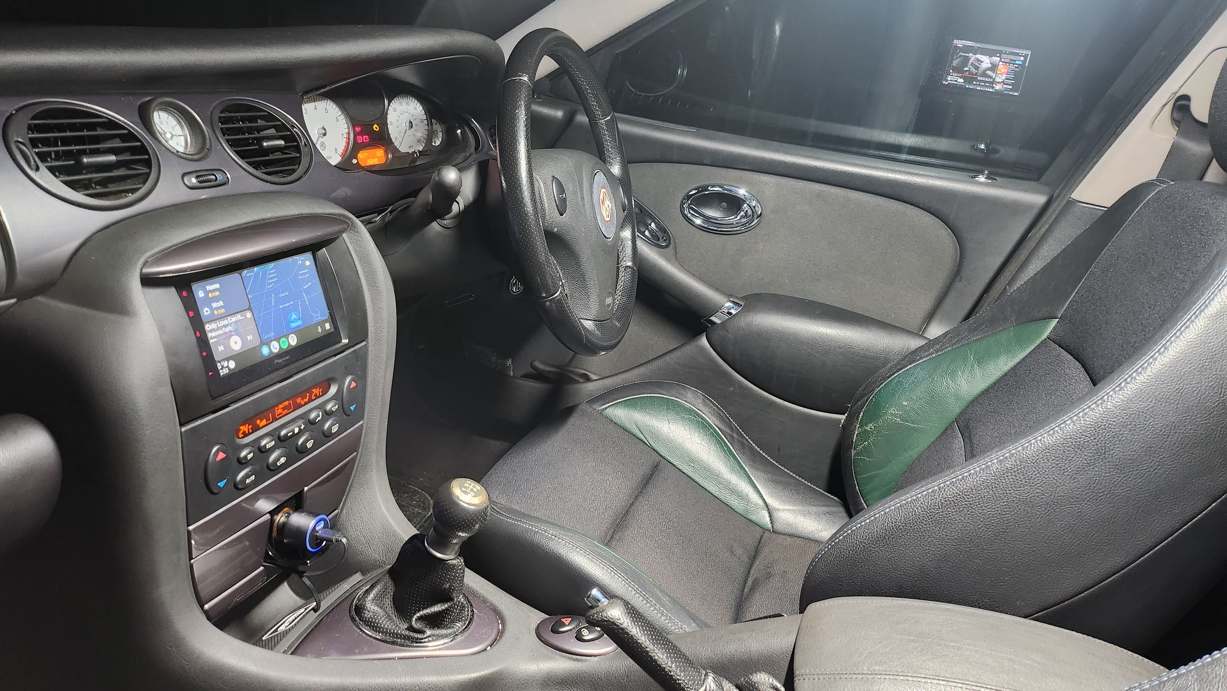
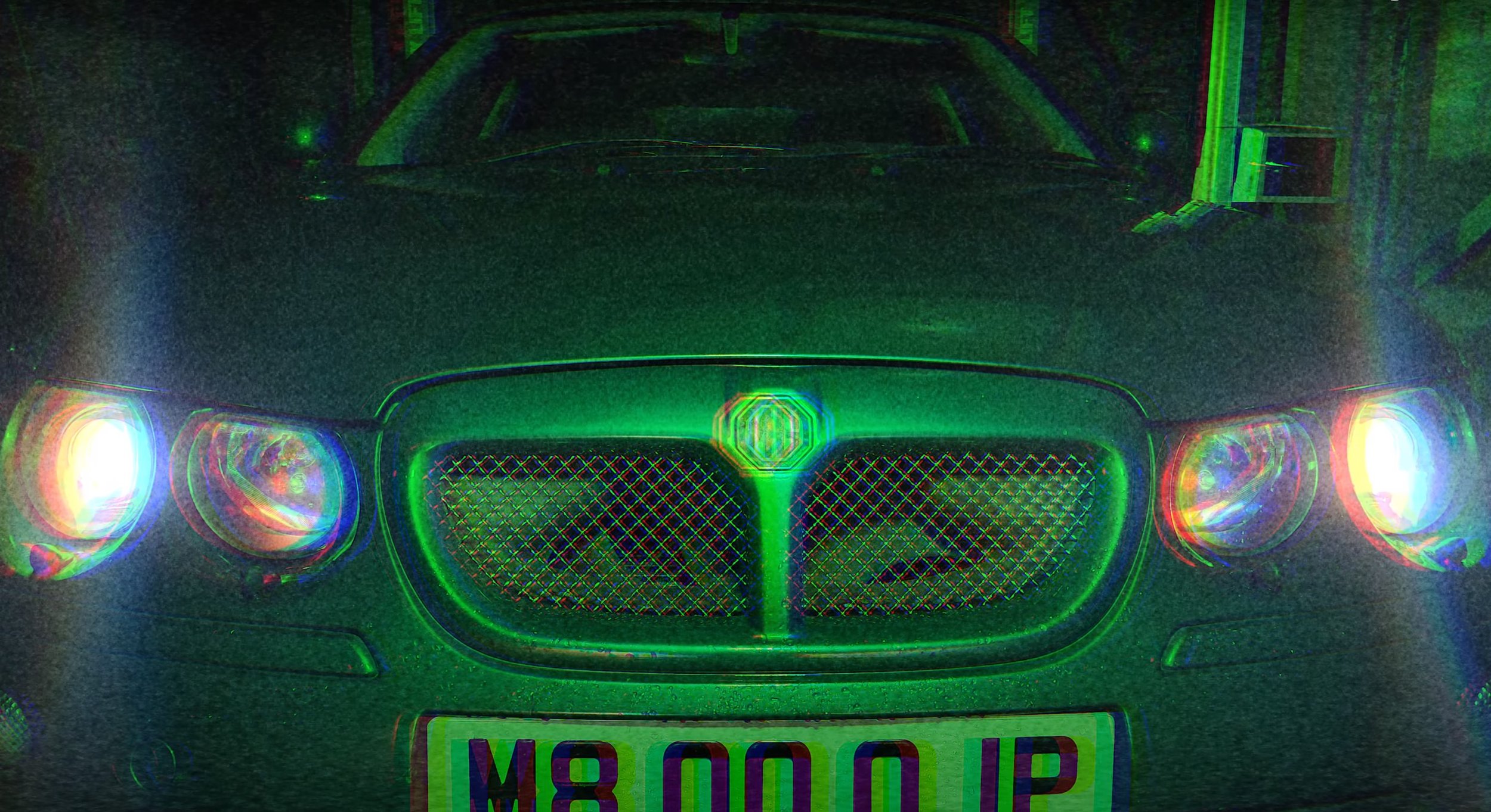
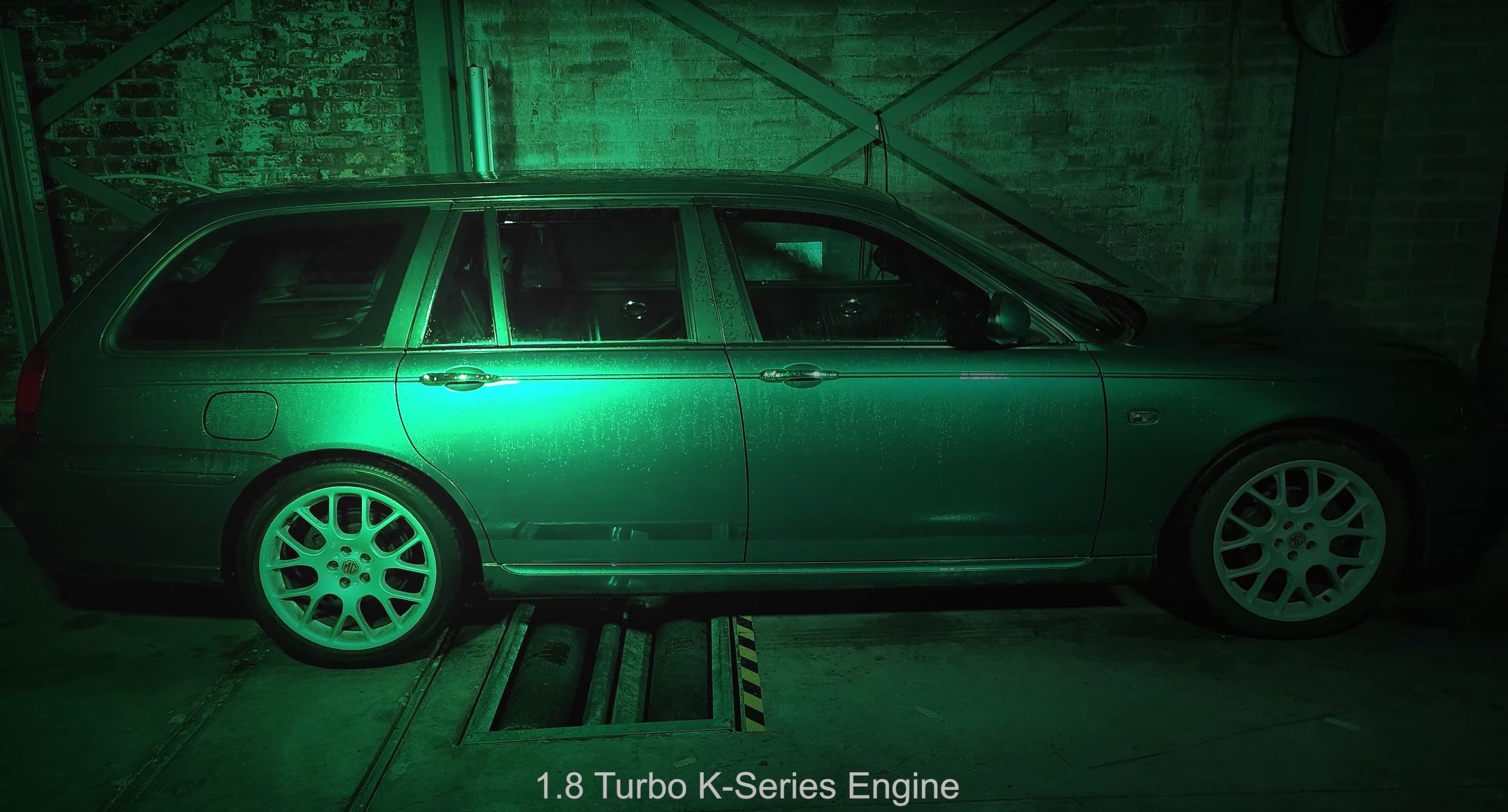
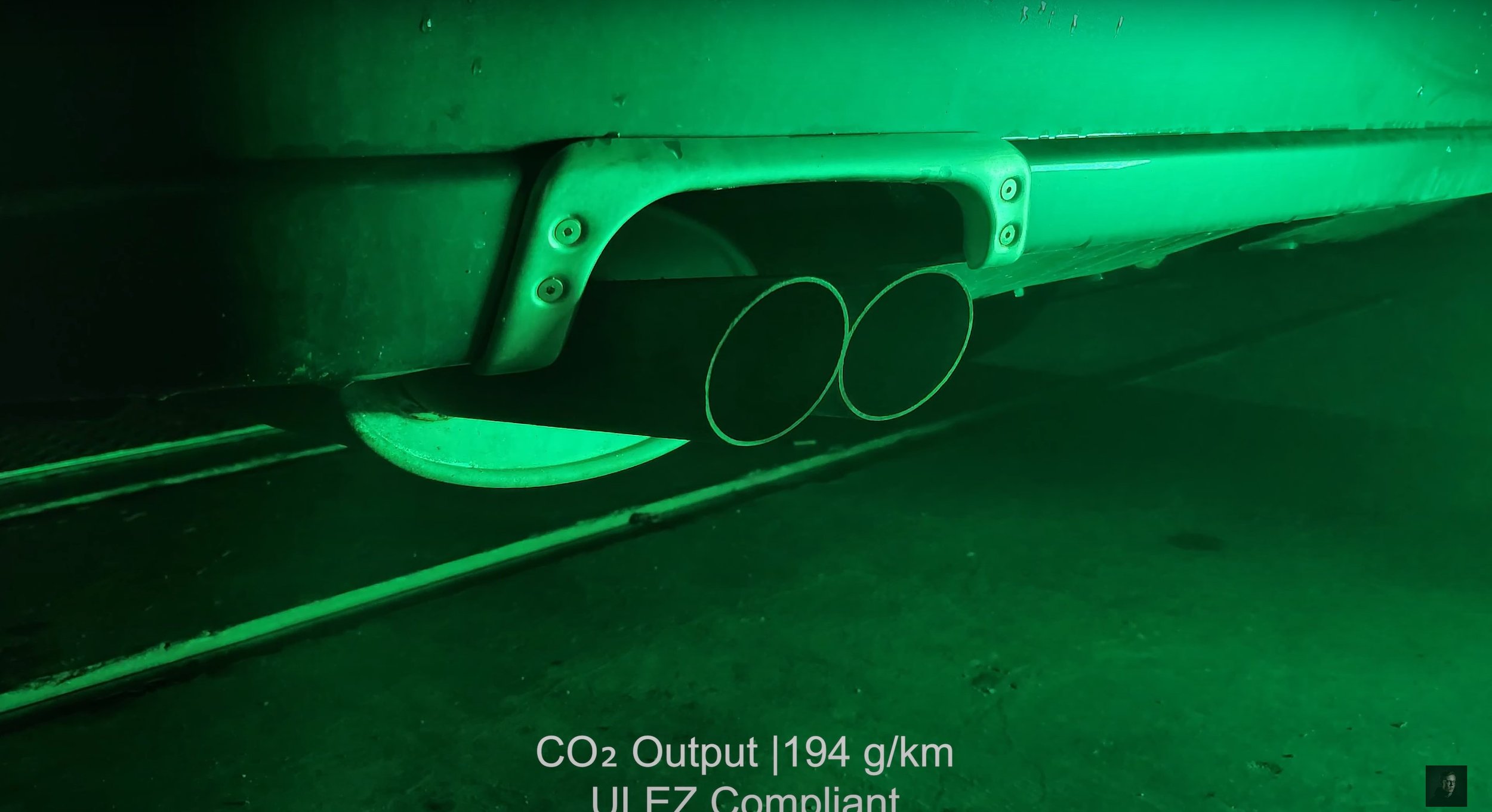
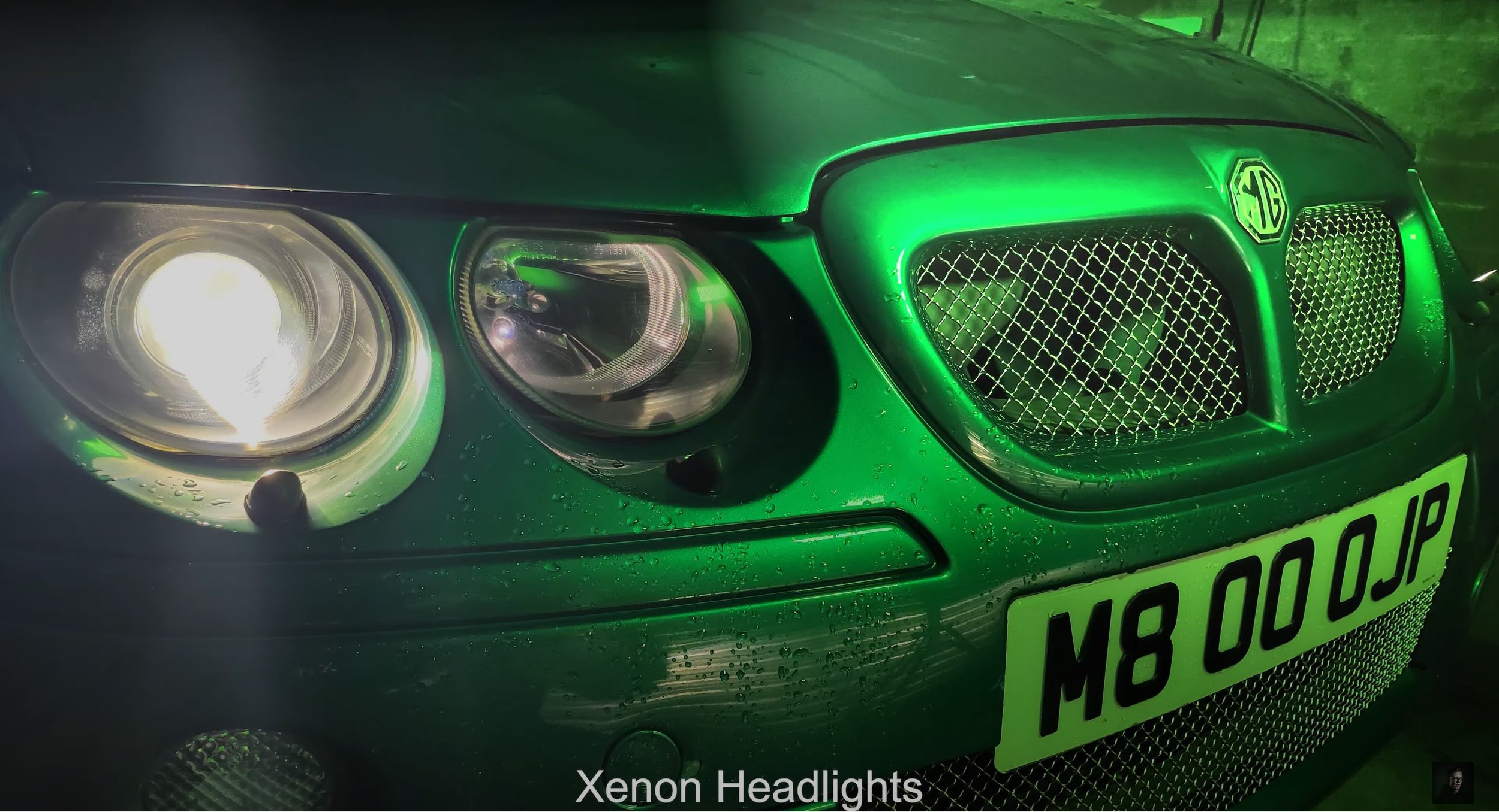
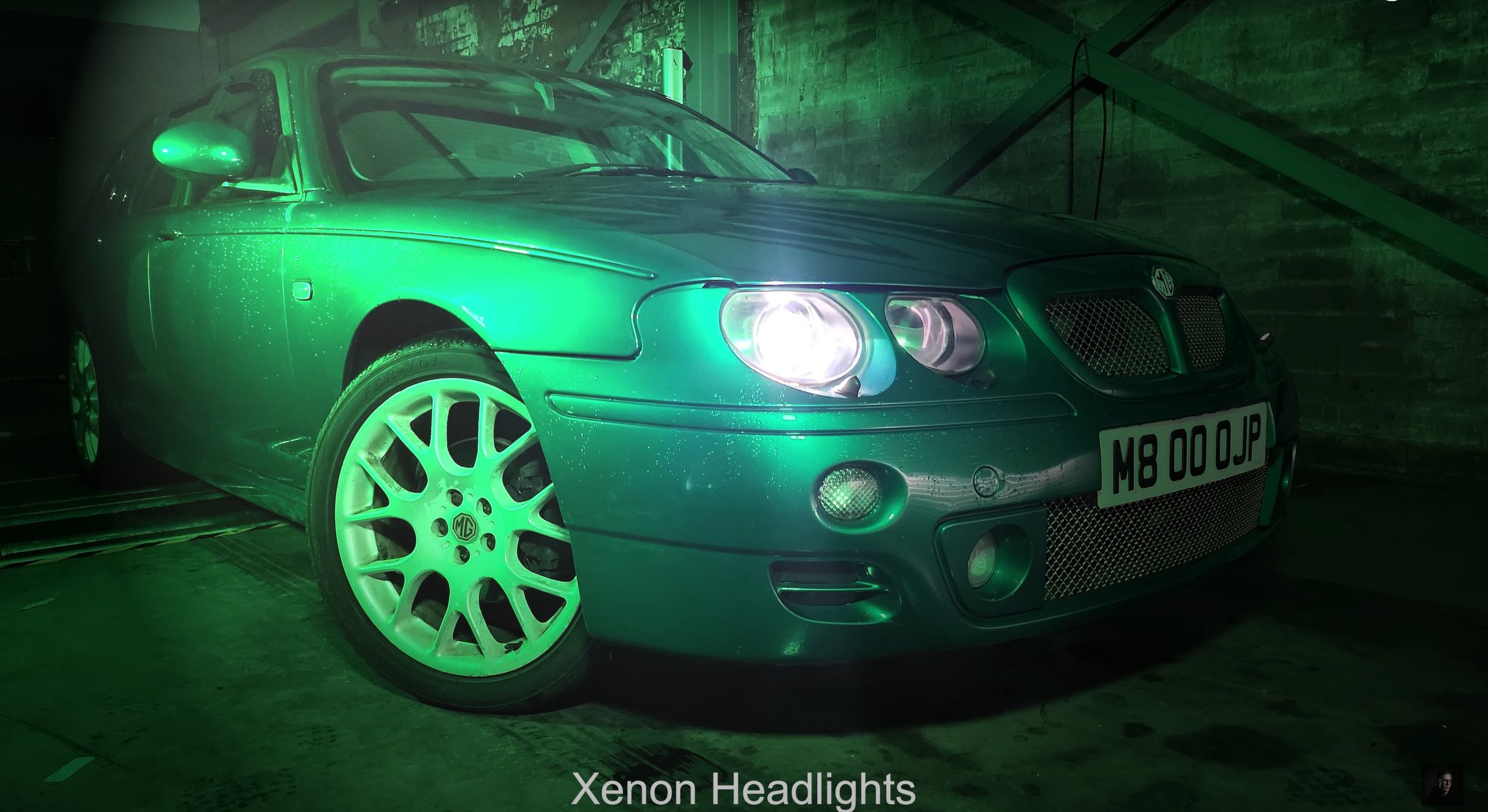
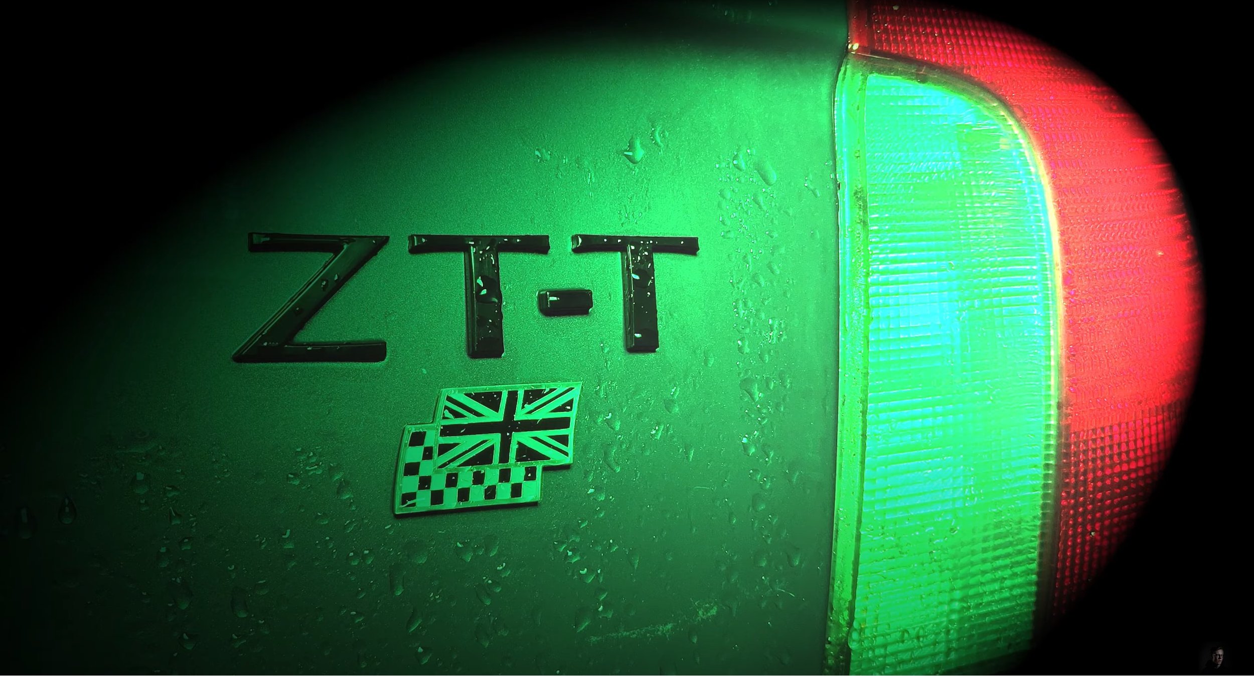
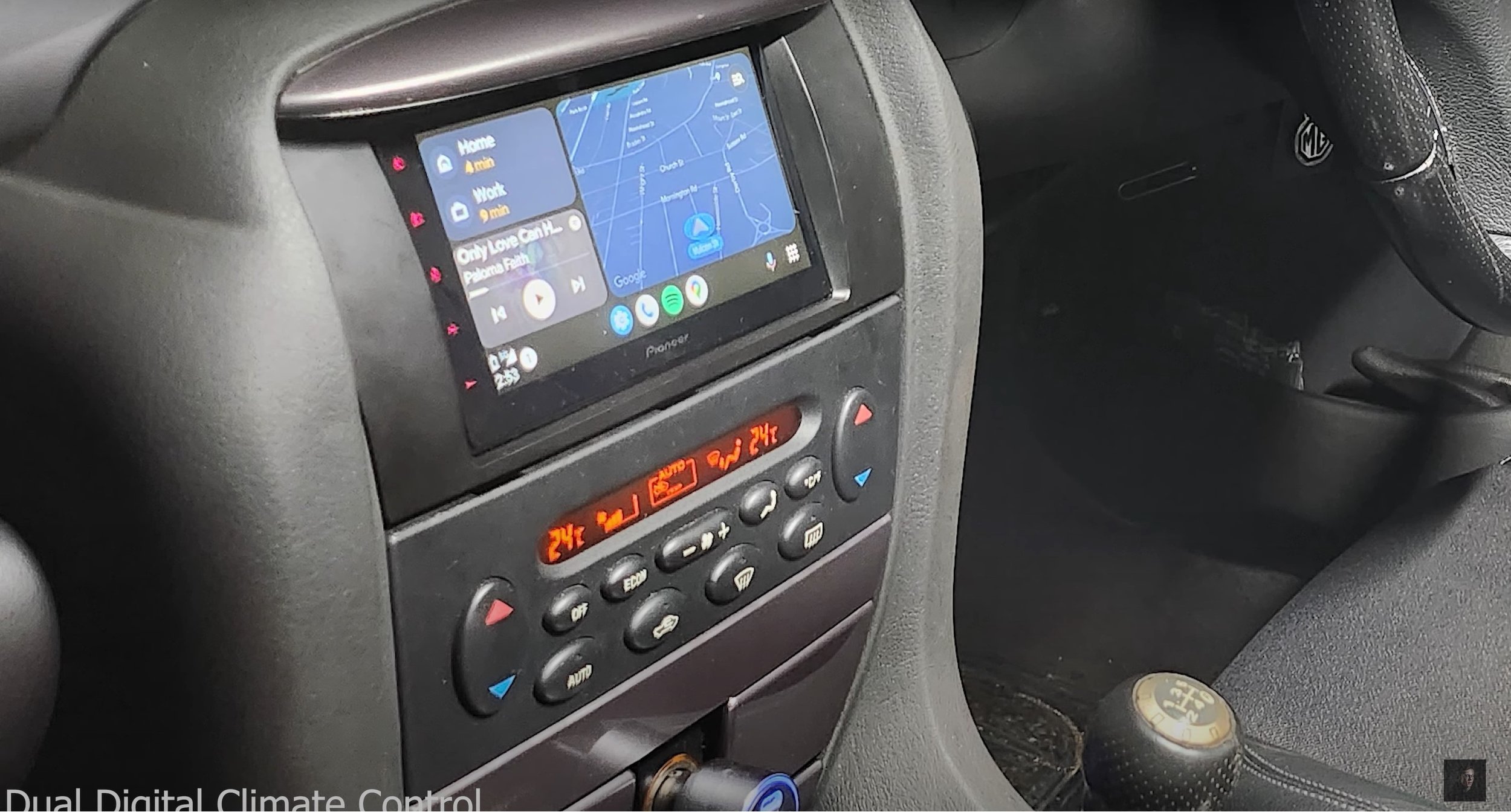
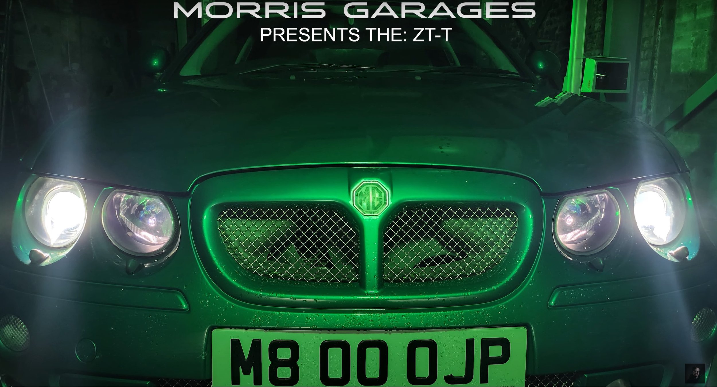
This is featuring the On Location Shots of the Television Advert Production, I have borrowed a fully functioning garage with a MOT Test Centre which happens to be down the road from Southport College. I spent one Sunday experimenting with the coloured LED lighting rigs to explore how I am going to shoot. I also was experimenting with a hand held light sabre which colour changes. After figuring out how I am going to shoot, in the afternoon on Monday I went back and photographed all the shot types and angles for the advert as I thought this was the best way to create this advert. Using bright white light or normal yellowy light didn’t do the car justice with its British Racing Green Colour, so I adopted for using a green light and it transformed the car on camera. I experimented with using a DSLR Camera and a mobile phone camera to see which one came out the best and it was my mobile which come out with the best results for this production, so I went with it. As you will be able to see, I shot from the driver side of the car because it is the best looking side compared to a dented wing and door. (which wasn’t my fault)
Production Photographs: -
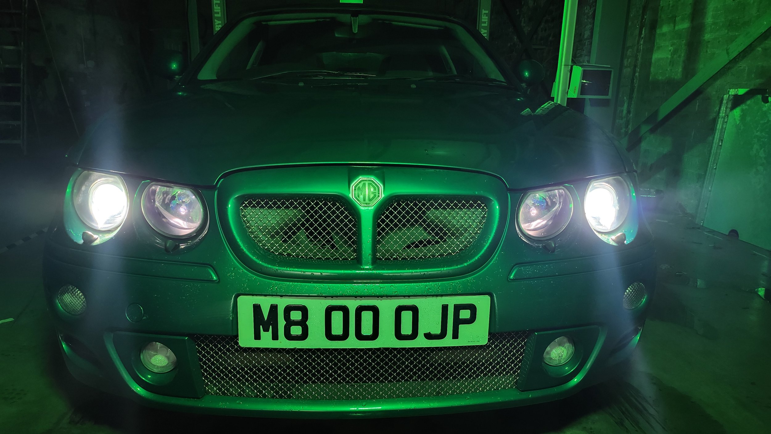
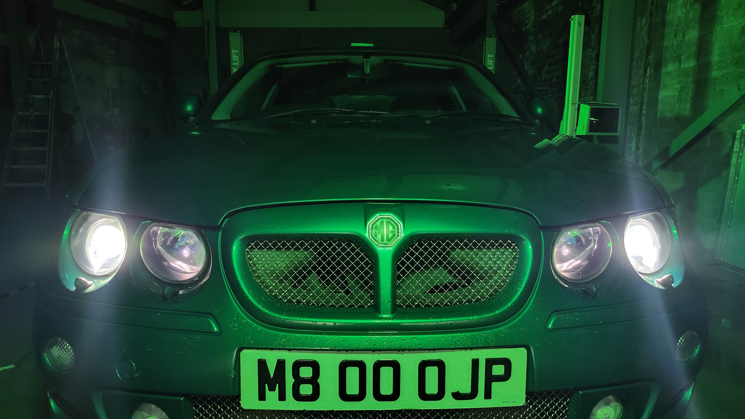
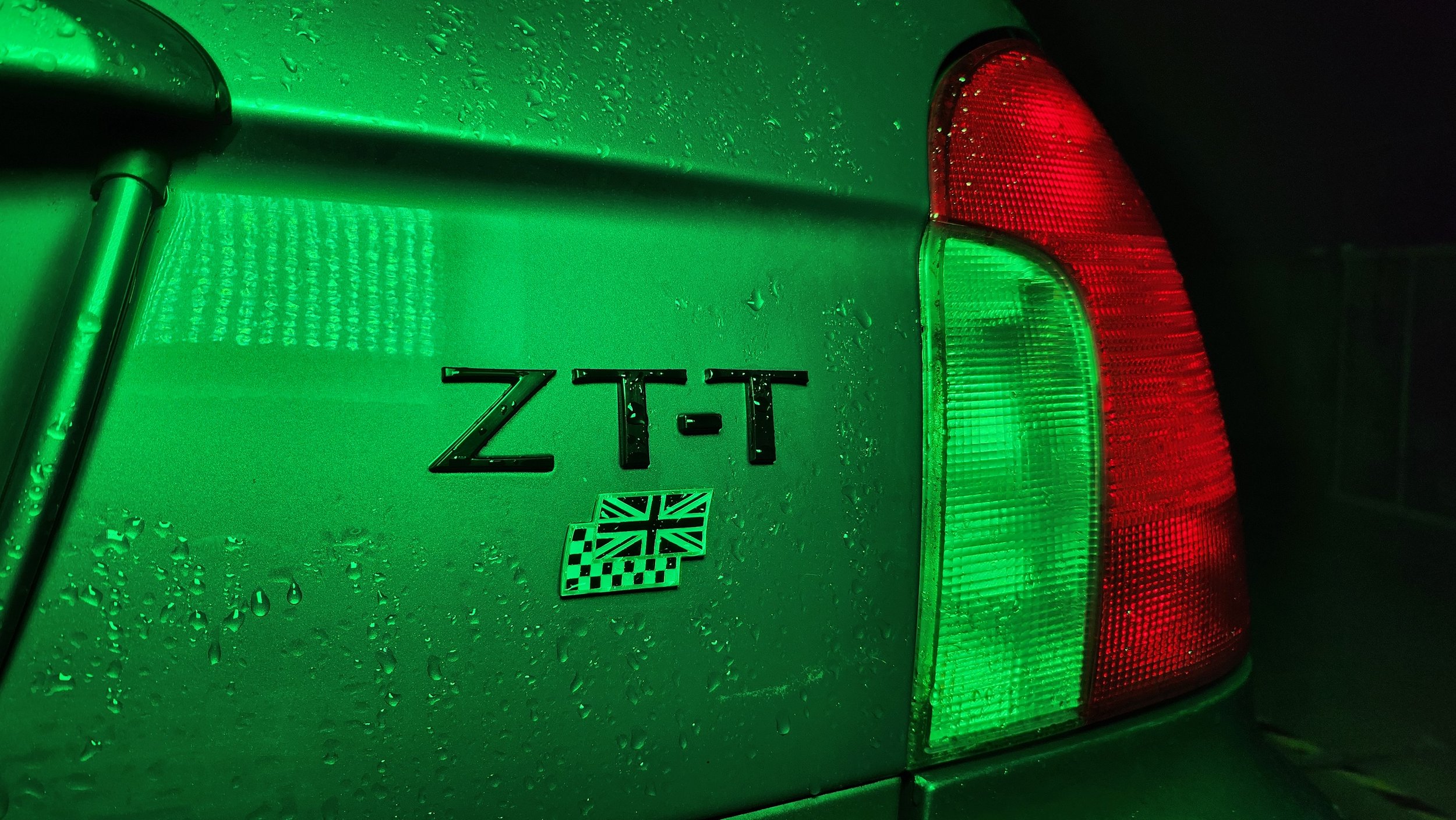
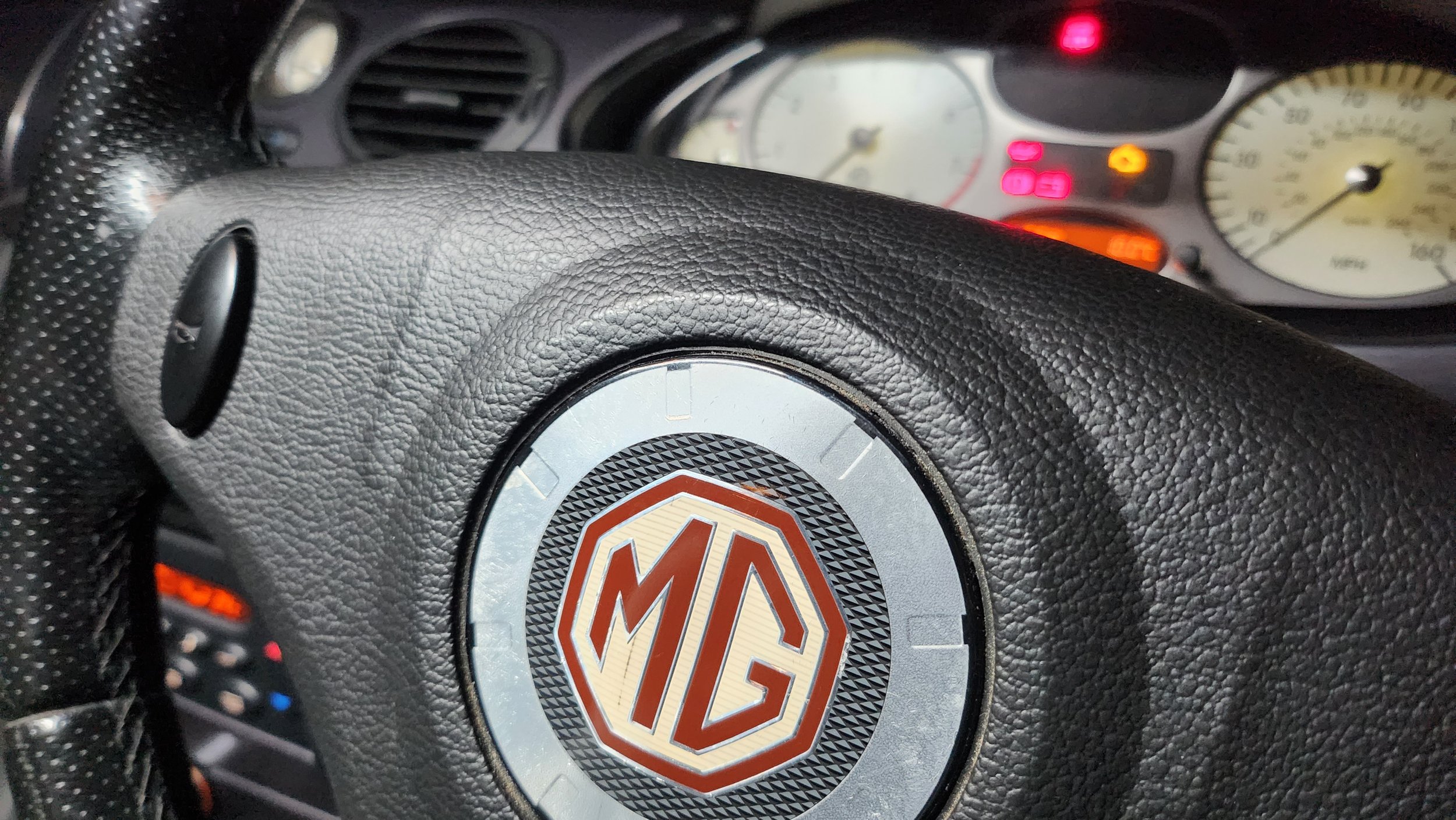
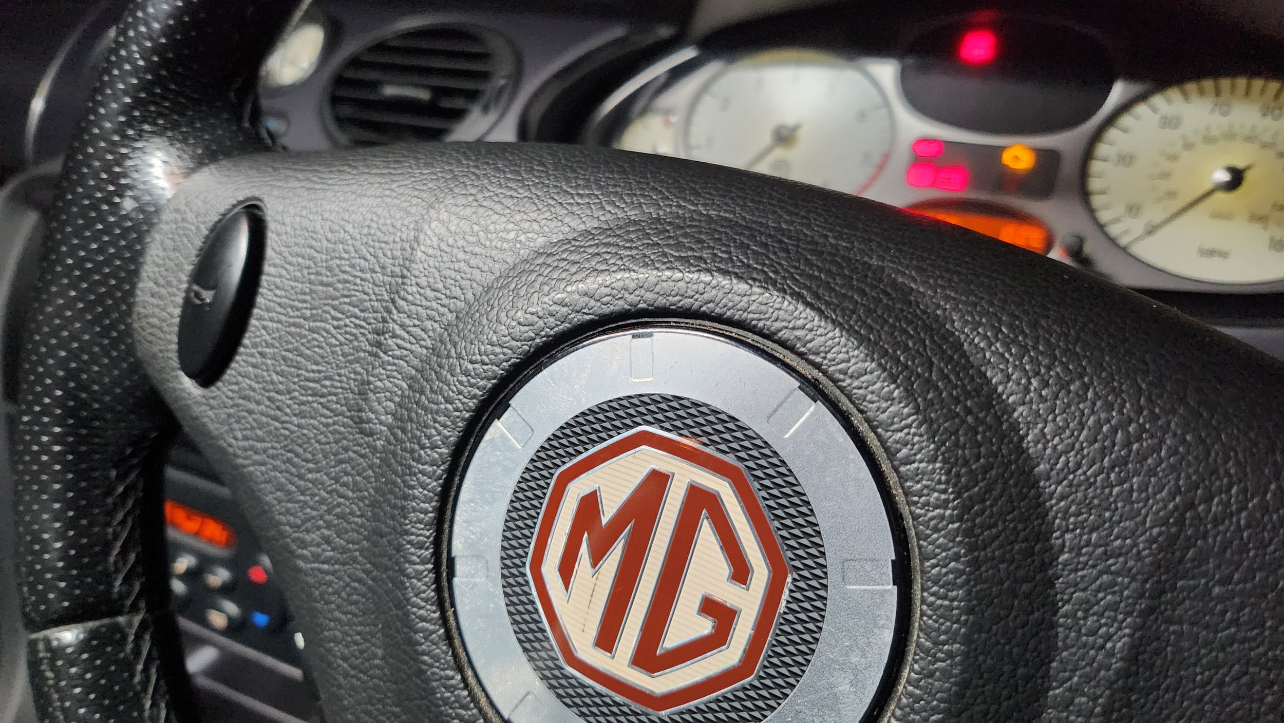
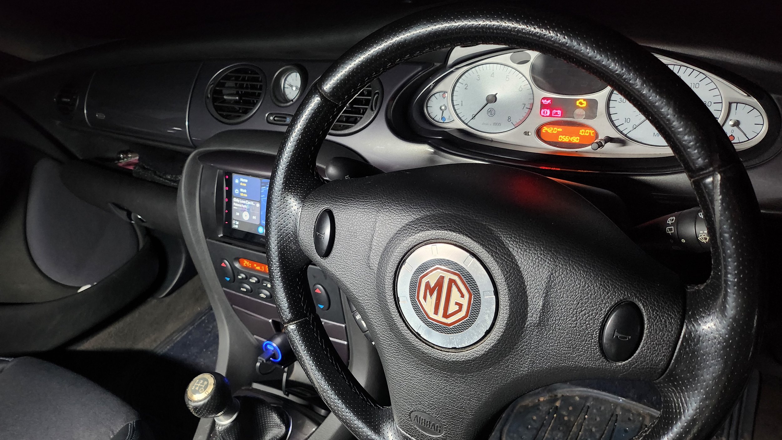
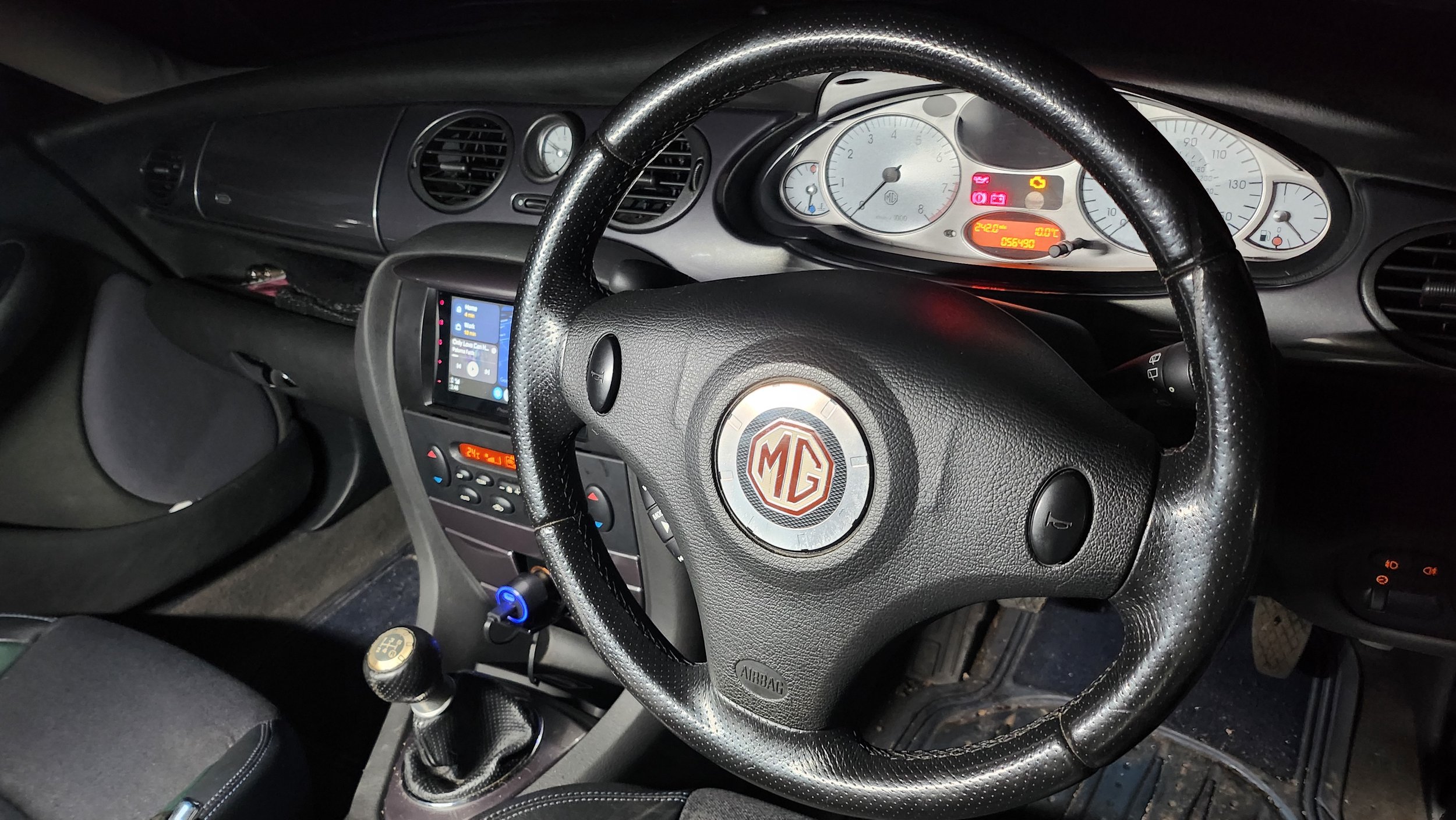
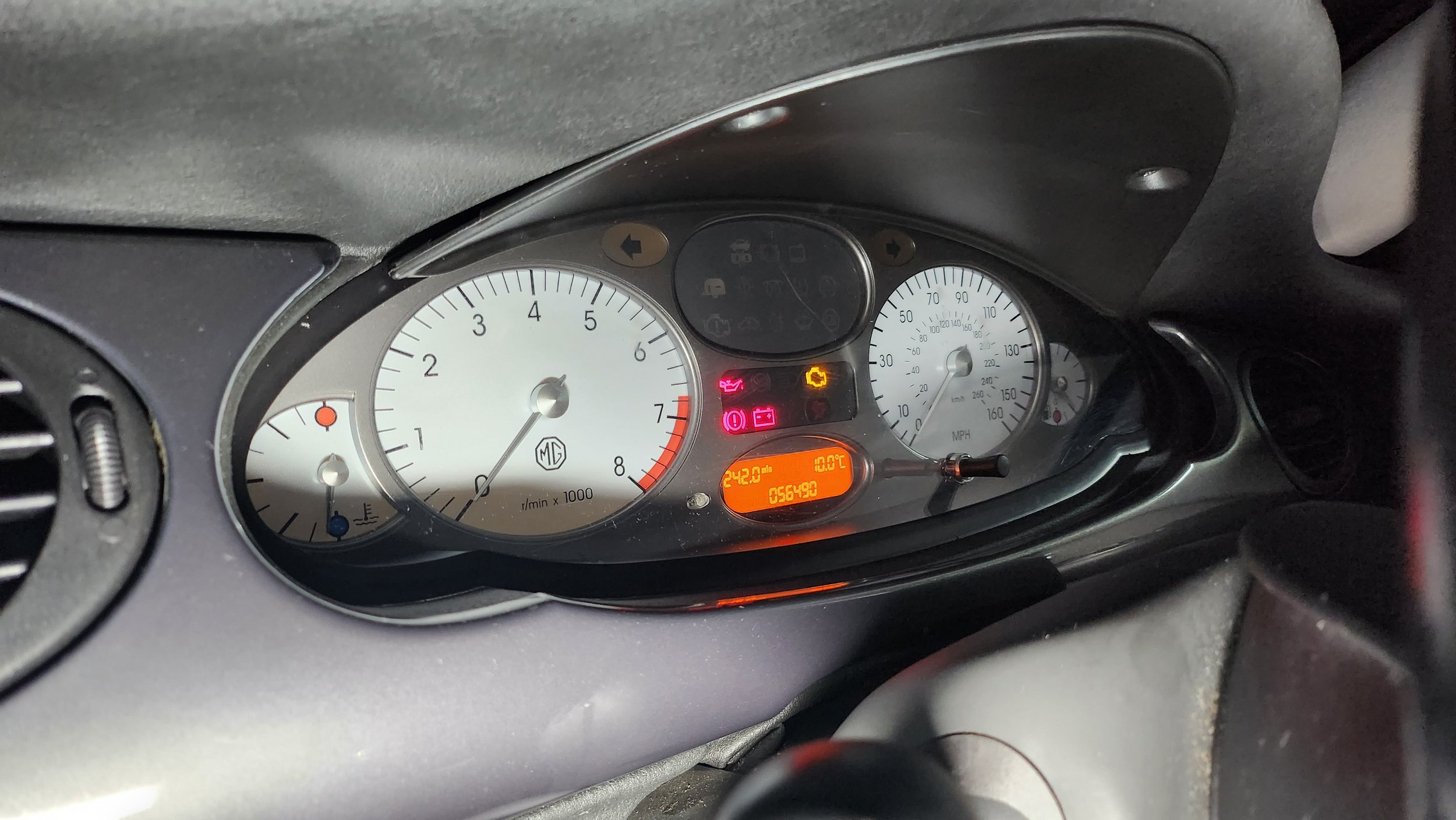
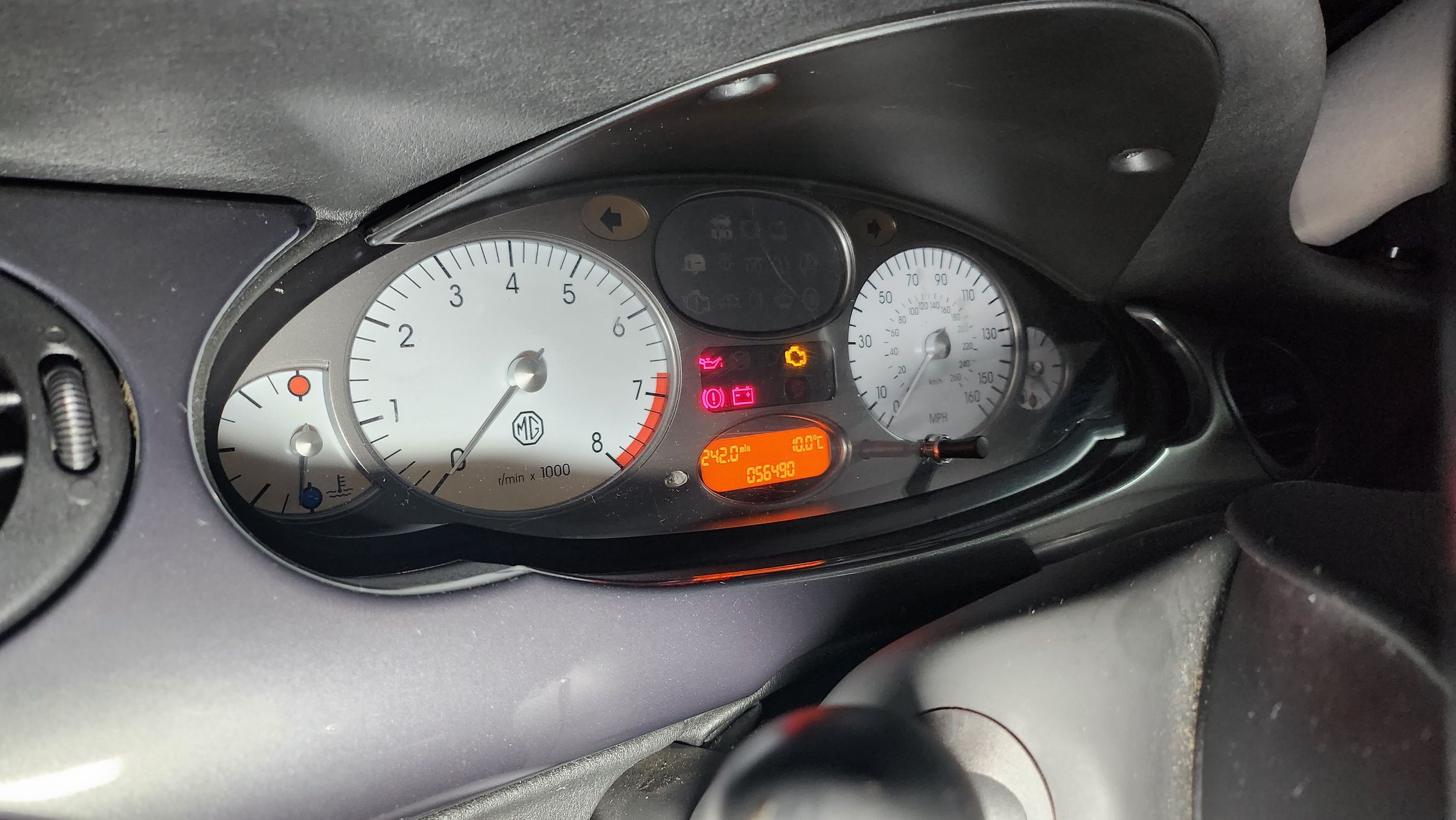
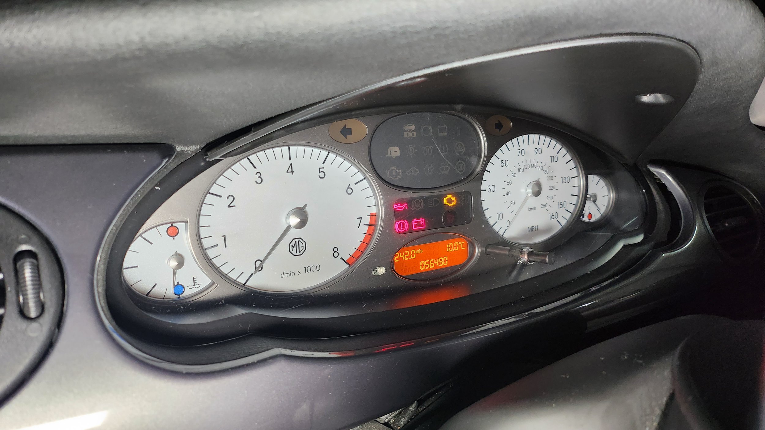
As you can see below, their is photographs which I have taken which I will be using in the advert. I have taken multiple images of the same angle or different angle from the same place so I can choose the best image to use in the final product. As you can tell the front images I have put on the Xenon headlamps and turned down the brightness of the camera on my mobile so you can clearly see the car and of course the headlights. As I said above I mostly shot the outside of the car from the drivers side of the car as it is the best looking side of the car currently. The interior images were shot by using the light saber on the brightest white setting and shot interior photos of the dashboard.
Post-Production
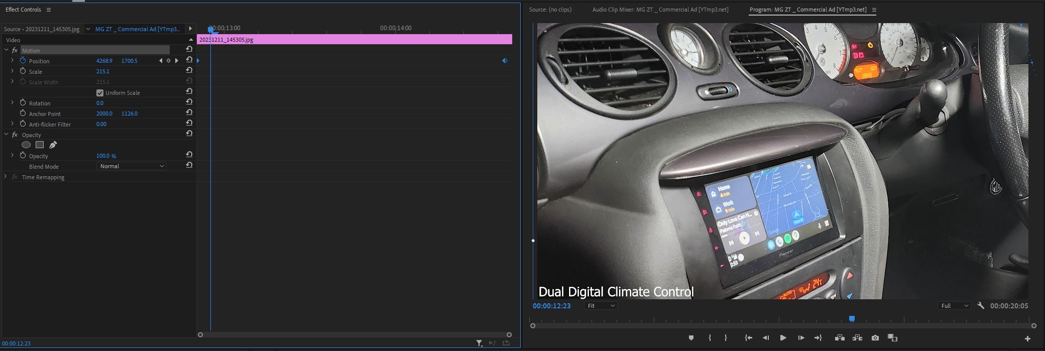
Premier Pro Timeline: -
As you can see above this is the timeline for my commercial production directly from Premier Pro. Firstly I will dissect the most obvious and easy things you can see from the timeline above, I will explain for in detail below about the glitchy transitions and lighting effects further on below.
First of all at the beginning and end I use the “film dissolve” transition which I use to show the start to finish of the video and it is very simple to use as you drag and drop it onto the image/clip. I have used a lot of “dip to white” effects to quickly transition from image to image but it was in line with the beat as it transitions. I have also added some text onto the images to show the specification of the car and what it comes with as standard. I used the standard arial font which is easy to read by anyone. Lastly in the last scene I added an image that I created using a website called myfonts.com which is where I created a font which I thought would relate and work with the words “Morris Garages” which is what “MG” stands for. I paired this png text image with the words in the arial “Presents The: ZT-T”. All this is a artistic decision made by myself.
Premier Pro In House Effects Used: -
Image One Glitch Effect
As you can see from the timeline above, this is how I created the glitch effect. As you can see their is time stamps above which represent certain aspects of the image to create this. The first set of time stamps, their is 4 at the top in row; they are in charge of the position of the image in the time frame created on the standard clip editing timeline. In this case it goes up and down then back to the default position. The next time stamps below, their are 13 in total in a row, they are in charge of the distortion and glitch effect and they decide in a timely order how and when should they happen on the image in the dedicated time frame set by the standard clip editing timeline. To actually create the effects, you have to play around with the “master amplitude” and the “colour distortion” to create the physical effects. I also used an effect called “VR Glitch Effect” which also helps create the glitch effect used above.
Image Two Lighting Effect
To create this particular lighting effect which shines a light in a straight line down the car in this case. You use a type of light which is called “Omni” and use the lighting colour as white and then what you do to animate it is create a straight line or squiggly line which shines the light in that direction, at the same time you use the centre time stamps to decide where the the light should start and finish. I also turned the brightness down around the circle to create a dark and mysterious atmosphere and make it look like it is specifically light up the car. This of course adds shadows to the background which shows the industrial aspect.
Adjustment Layer Transition to Image Three
For this transition, I created a adjustment layer which effects the clip it is encroaching and disrupts the stillness of the image. I used an effect called “Wave Warp” and this is the main thing which helps you create this effect, by altering the wave height and width makes the footage look like the footage has been disturbed or glitchy. I also set the direction of the glitch to happen at 90 degrees, I could of set it to 180 but it didn’t look as good as 90. I also set the wave speed to 5 and I also is set to effect every part of the image (all edges).
Lighting Effect For Image Four, Five & Six
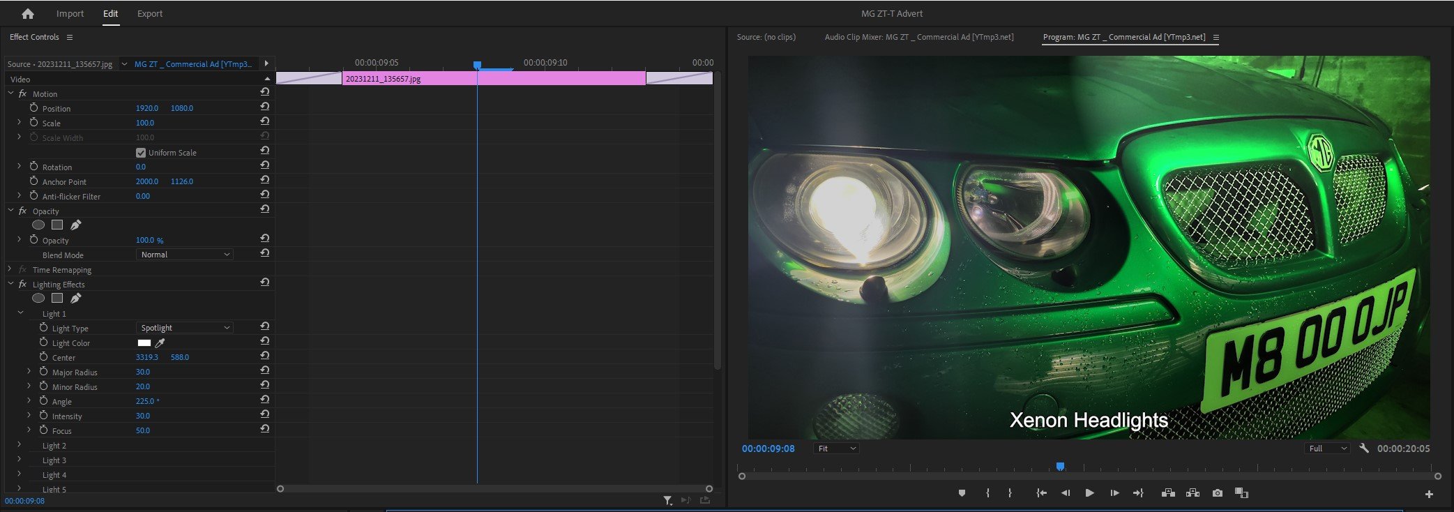
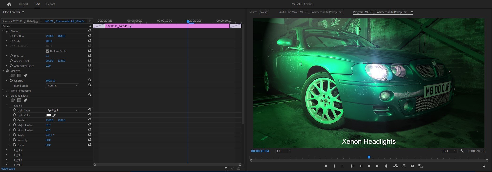
For these three images, I haven’t edited a crazy amount but what I have done is use the spotlight lighting effect overlayed onto the images in the places in which it looks good and left it. I haven’t timed them to come in using time stamps or anything like that, it is simply a overlay on top of the existing image. I have had to adjust the brightness of the background and altered the density of the lighting. As you can see above I have used the same concept through out with the images above, but altered the lighting to suit.
Animating Images For Seven, Eight & Nine
Lastly, To animate / move the images up and down the screen, a very similar concept to how I created the Omni lighting effect, I created a straight line down the image and the software simply follows the line but with a slightly zoomed in; so that the image doesn’t run off the frame when you animate it.
As you have read all of above, it looks fairly straight forward thinking about it and watching tutorials but doing it is a different thing, so I had to research to see how to do it. So below I have dropped in a little Bibliography so you can see where I learned how to do it and how I created these effects or transitions.
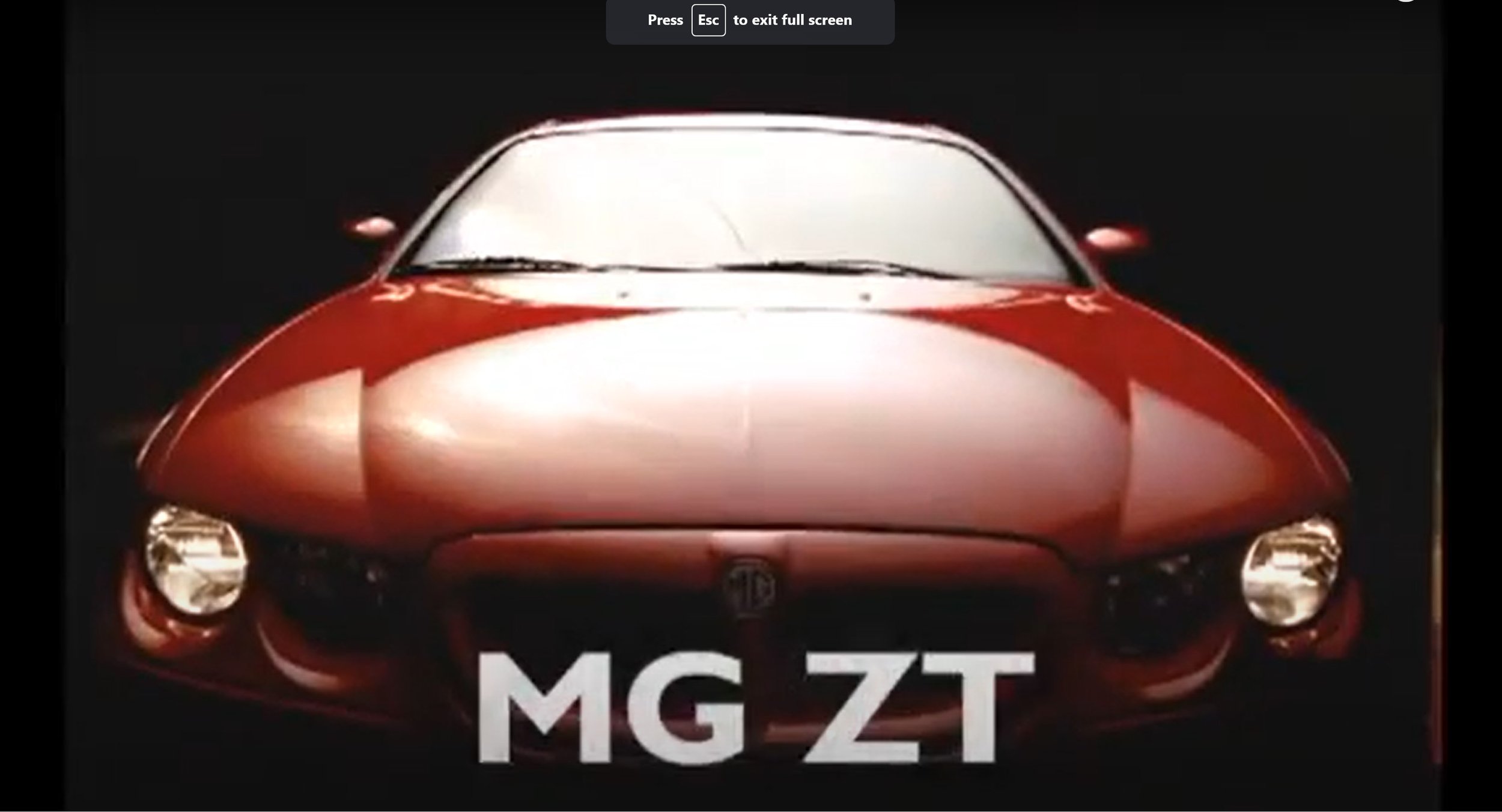
Compare & Contrast My Advert with the Original Advert: -
As you can see the obvious comparison is the angles are slightly different between the two adverts. I slightly changed them to make it look like my own film.
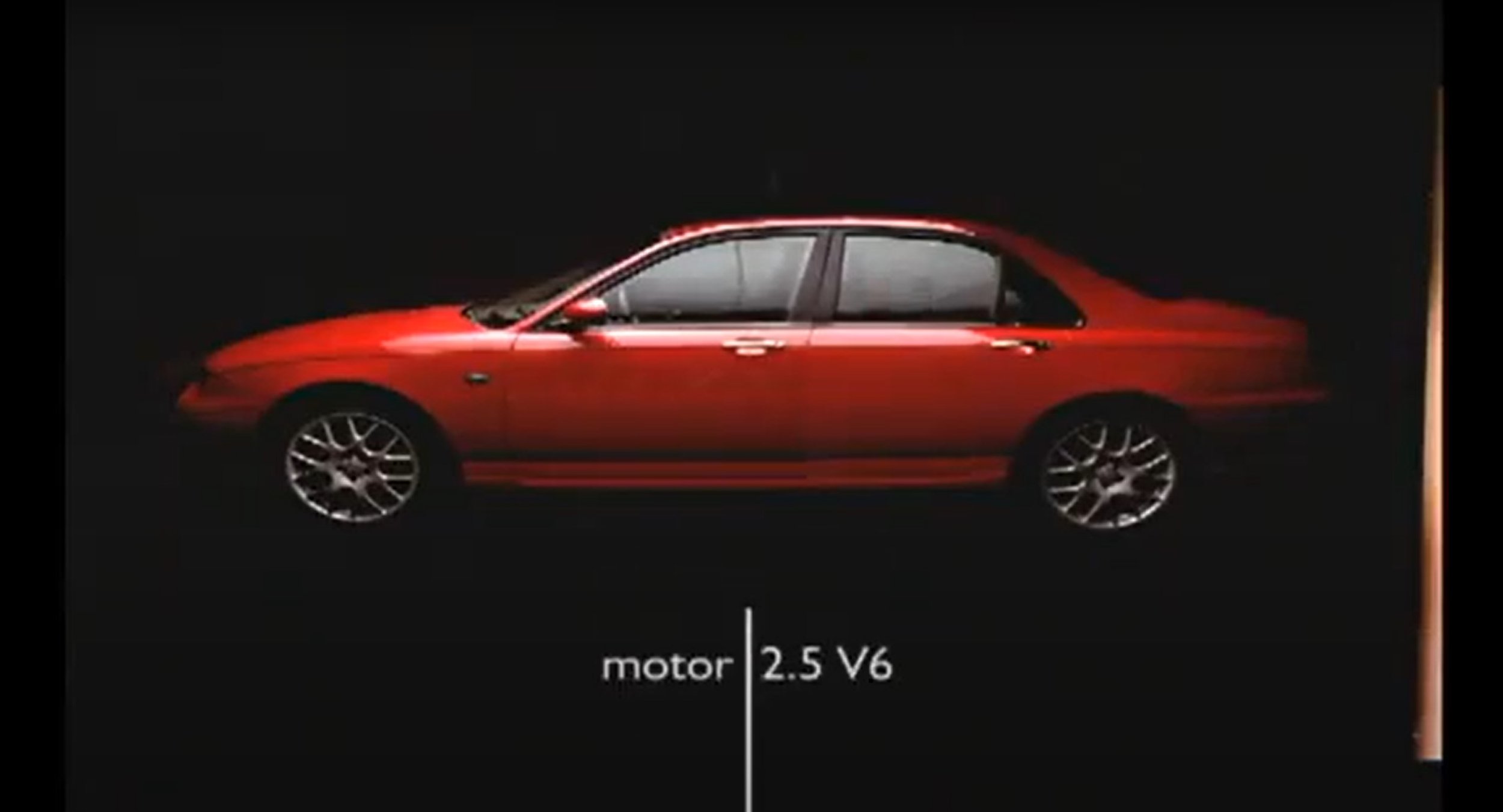
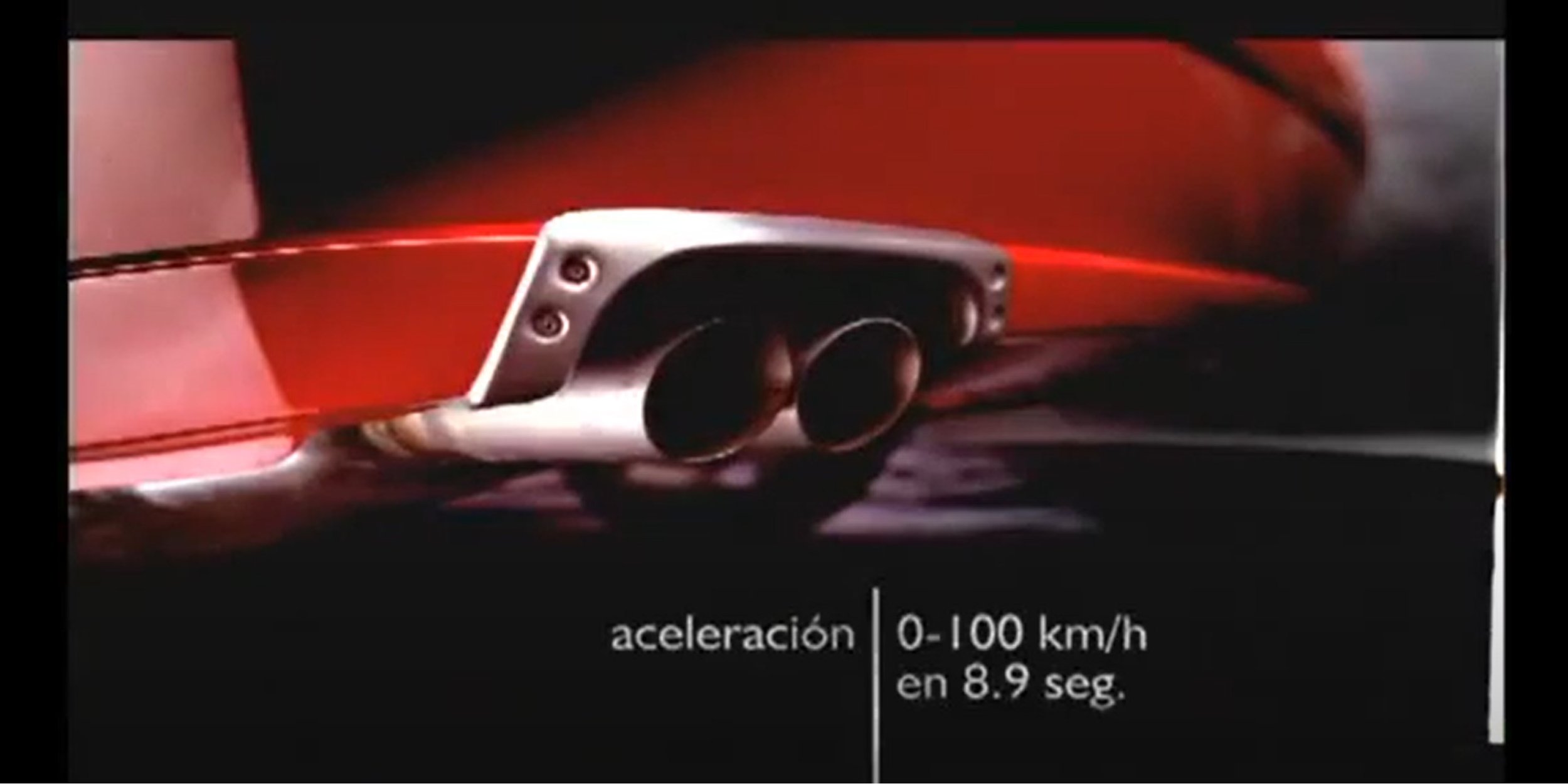
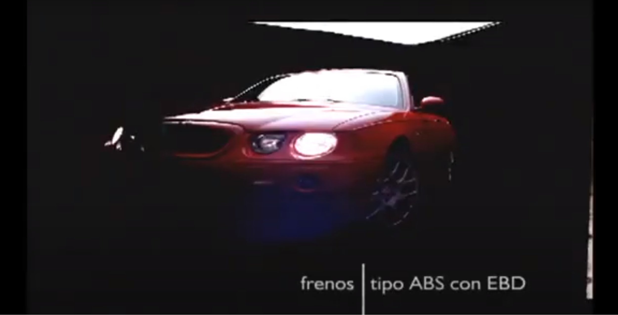
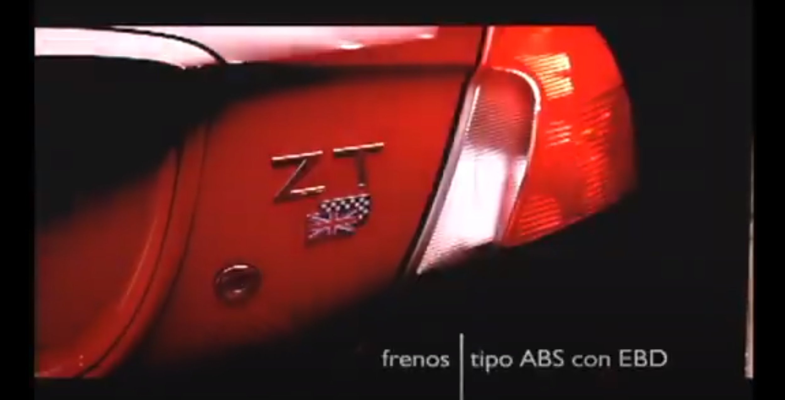
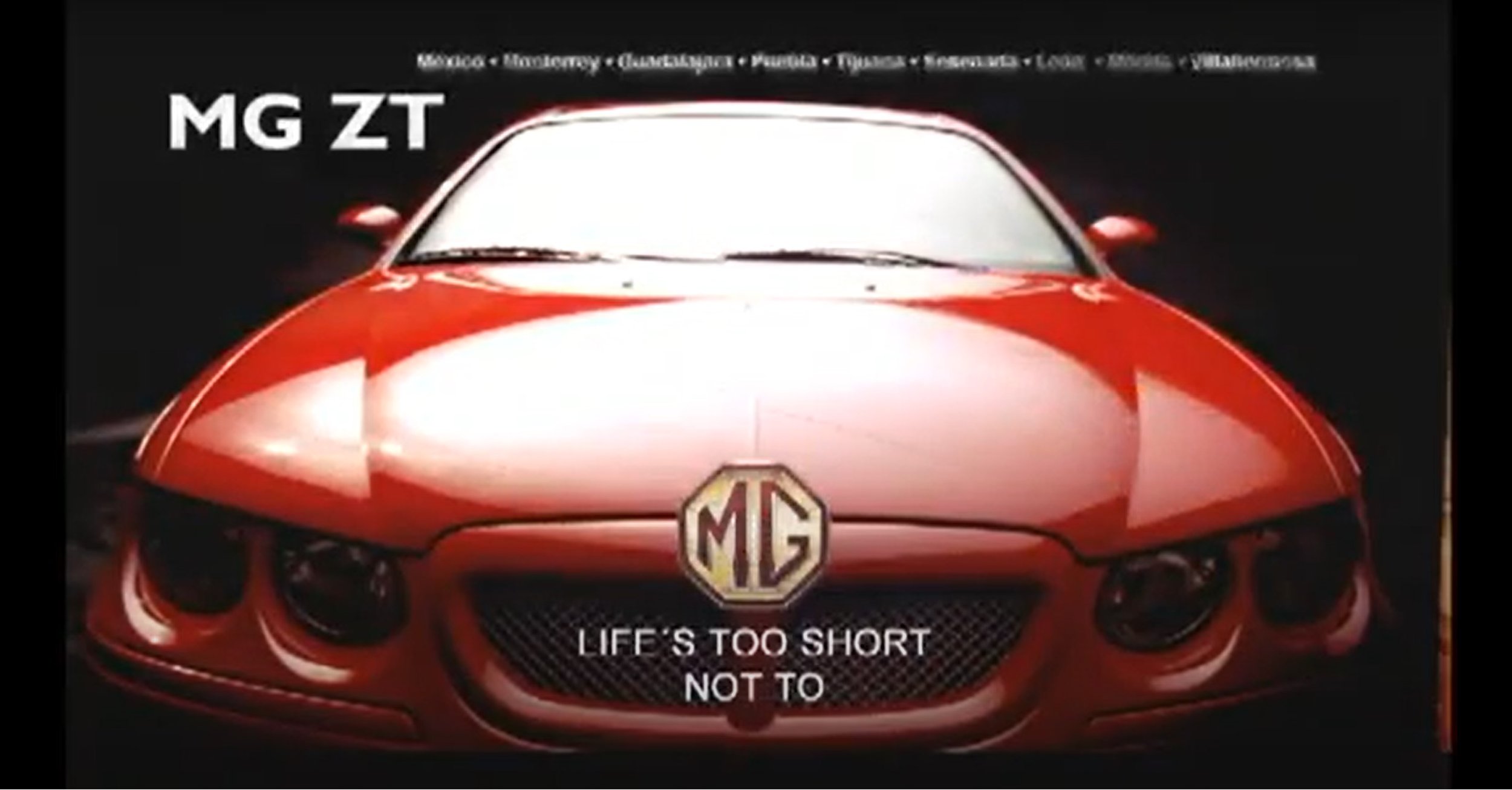
The huge different between my advert and the original one is that my video has the animated effect where the still image moves up and down and also it distorts at the same time. The original advert simply fades in and has the simple text which reads out “MG ZT” and then slide swipes up.
With both of these, I think the lighting techniques used in both mine and the original are brilliant, same wide shot used, but the cars are facing opposite direction. The techniques used are completely different as the originals uses a strong light to light the car up and mine uses what they call Omni light to simply shine a spec of light across the car.
The lighting techniques between the two adverts are different, I use a bright green light and the original advert is a standard white light which looks very glossy and shinny. The shot type is a low angle, The text is also different, they both read different things. For example mine reads about exhaust emissions and the other says performance figures.
The close up angle looks very similar between the two adverts, but angled slightly differently. The lighting is different as the original bright shinny light and my advert uses one spotlight shinning onto the car in green.
The low wide shot of the two cars is very different, the angles are slightly different as the original advert is angled more around the front of the car where as my advert is shot directly from the corner and shows depth to the car. The lighting techniques again are very different as in my advert I am using a green spot light coming down onto the wide of the car and the original advert shows the light directly coming from above lighting up the bonnet, roof and windscreen.
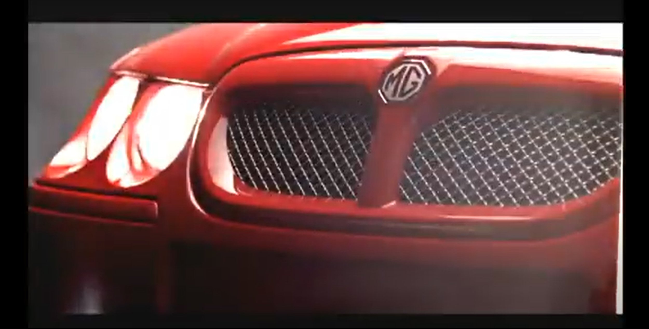
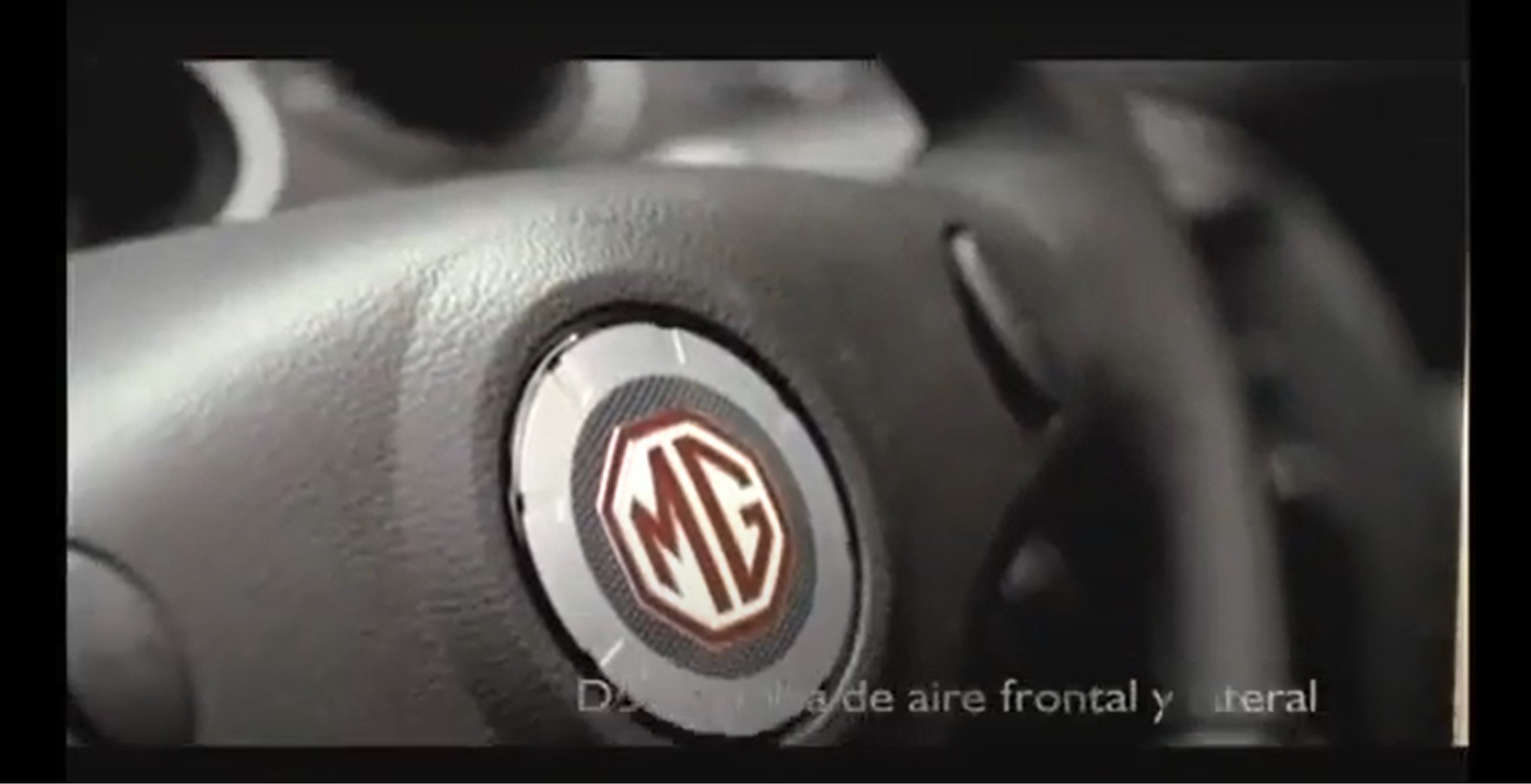
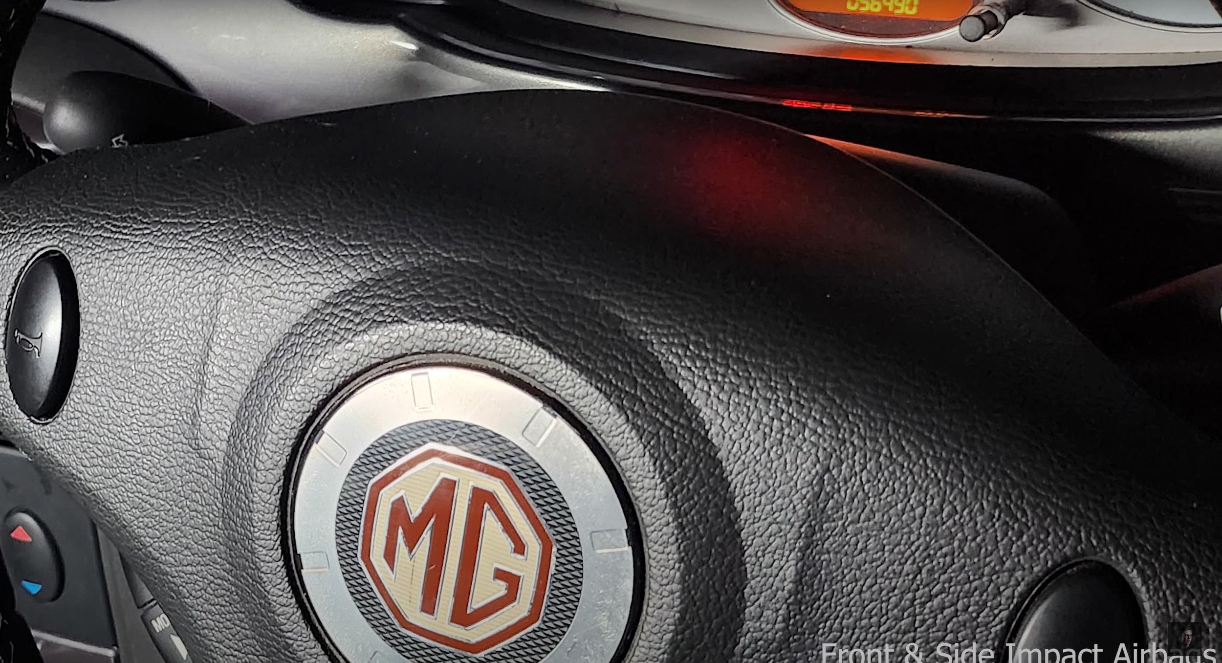
The original advert uses a slight Dutch angle and my advert uses a more straight on close up shot, the lighting techniques are very similar again with it on angle shinning onto the badge. Again my advert uses a green light and the original uses a bright white light.
The lighting techniques are very generic in these next three images, but the camera shot type is still a close up and the angle between the two adverts are different as my advert is slightly angled more at the steering wheel where as the original advert is angled more on a angle.
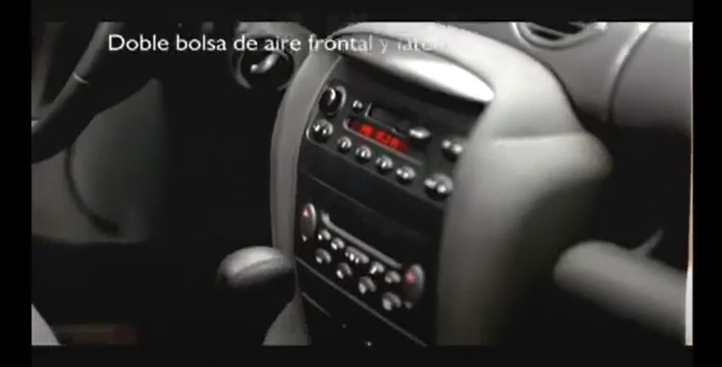
The shot types used are a close up, and the angles are very similar when comparing them to each other.
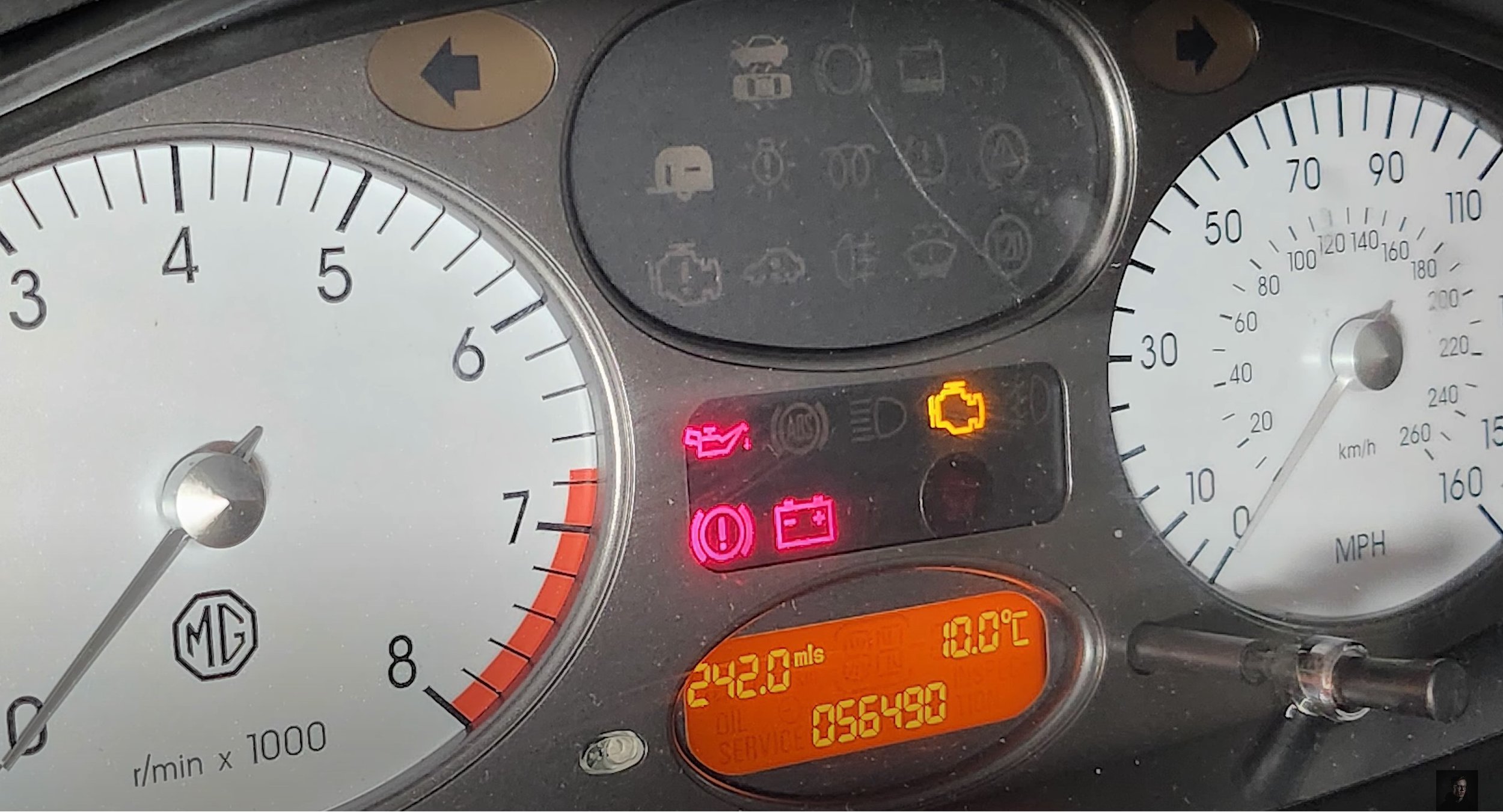
The huge difference between the two images is that my advert is more zoomed in onto the dials and gauges. The camera angles are different with these because the original is set at an angle when it pans across and my advert is less on angle and more head on at it as it pans across.
Compared to the beginning there is nothing really going on in this part of the original advert apart from the flickering text and logo and the headlamps are off, with my advert it is the same image used at the beginning but without any distortion or glitchy effects, I have only added special text which I created and I have left the headlamps on as I think that looked the best.
Bibliography: -
https://youtu.be/_MYBC4Yy7kk?si=ErkGPmNqolCPJIMH - Glitch Effect Tutorial
https://youtu.be/hx3jD6ngWLU?si=nOVzR8D2Fpz2wCjz - Lighting Effect Tutorial
https://youtu.be/pCvWwIetM1g?si=r0kOLw8D1Y4CSEDD - Still Image Animating Tutorial
https://youtu.be/cdEwVWF-4Lc?si=L27uYq65tGAkQ4vm - Glitch Transition Tutorial
Presentation
Evaluation & Reflection
Annotate three strengths & three weaknesses of the final TV commercial?
To start with the obvious thing, the post-production editing of this advert was good, coming from the glitchy effects at the beginning to the light effects. I spent a good half an hour experimenting with all the different options of how to do it and picked my favourite that looked the best for this production. Animating the still images was another thing which worked well and looked good. Secondly the camera angles and shot types which I shot looked good, I took multiple of the same shot so I could pick the best looking one, bearing in mind I didn’t use a tripod, so I thought I did well with that. Lastly, the production lighting techniques used were another thing I thought I was happy with because I experimented a lot to make sure there were hardly any catchlight shown in the still images, it wasn’t perfect, but it all worked how I intended it too.
Moving onto my weaknesses, I could have switched up the type of shot types and angles which I used then replicating the ones in the original advert from MG Rover. Secondly, I wish the lighting rigs were little bit better because they weren’t as good as I’d hoped. I think the white light would have looked far better, but it didn’t seem bright enough for my production, hence why I stuck with green light as I had a green car, so it worked well from that point of view. Lastly, some of the lighting effects used, for example on the low wide shot of the car, the post-production spotlight looked odd in that place and didn’t fit in with the video.
Who was the intended target audience for the TV Commercial?
The intended target audience for this car is 25 years and plus because of the type of car it is, it is an estate car. The age group it is mainly targeting is people who want family car which comfortably fits 4 people and plenty of luggage space, but they also want a sporty type of car. This car will not attract a younger generation from 17 years and up because of how expensive stereotypically it is and, they would not want to be seen driving an old person’s car.
What were the key areas of development during this unit work?
Experimenting with lighting techniques was a huge factor through out with this assignment because I wanted to create my advert with my car and fancy lighting techniques. As you saw throughout my advert, the main lighting used in the production was green and the reason why it was is because the cameras that I used wouldn’t pick up normal white light, even experimenting with camera settings didn’t work either. The best results that came out was using my phone camera and that really bought out the right kind of light for this production, but already knew that most of this would be altered in the editing stage.
Aside from that, I learned a lot about how to distort and glitch the camera in the editing stage, using video tutorials to help me, they shown me how to do it. Secondly, I learned how to create more lighting effects is another thing I learnt and how to move it like a spotlight. Lastly, I also learnt how to animate images, this made normal still images move and it sets the whole off the whole production when done correctly.
Authentication Document
E-Commerce Multi-Media Campaign
In this brief we have been asked to create a 45 second fashion clothing or footwear promotional video and a fashion magazine.
We have been asked to create this as if we were employed by a fashion/footwear company, for this project it is a fictious company called HIP.
We are commissioned to create their first campaign video which will be published in a form of a magazine and video footage across social media platforms.
The company’s target audience demographic is between 18-25 year old with the backdrop for the campaign having a urban vibe.
Context & Research
Outcomes
Three Logos for “HIP”: -
For creating these logos, I used a free graphic design site called Canva, I used three different mock-up designs on the site to create the logos. I will also use “Google Forms” to ask people which logo is the best looking and that will be the one that I will use for this project.
Photography Shoot for “HIP”: -
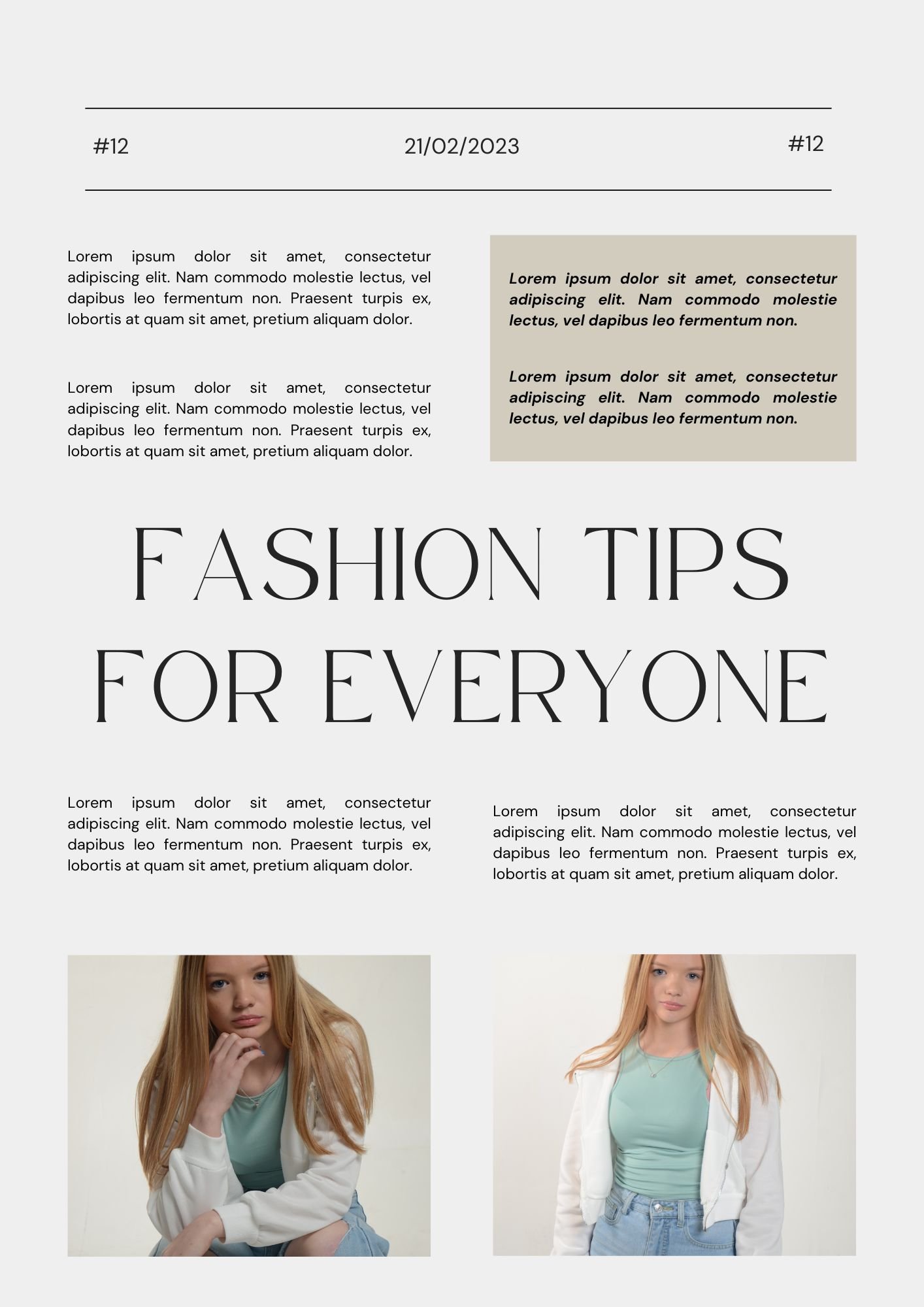
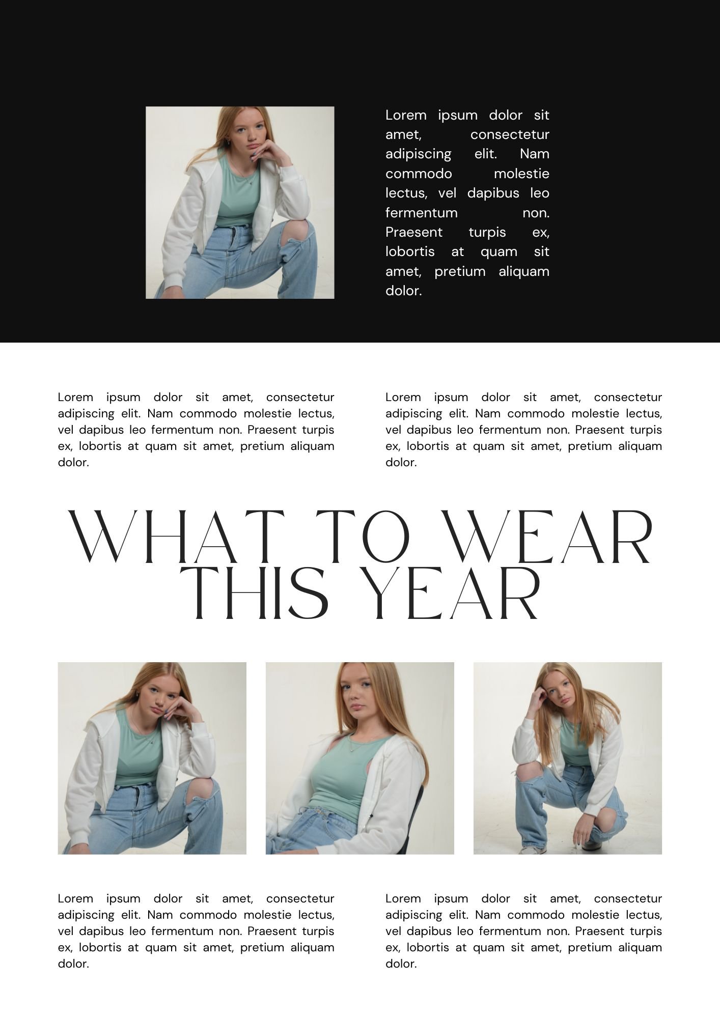
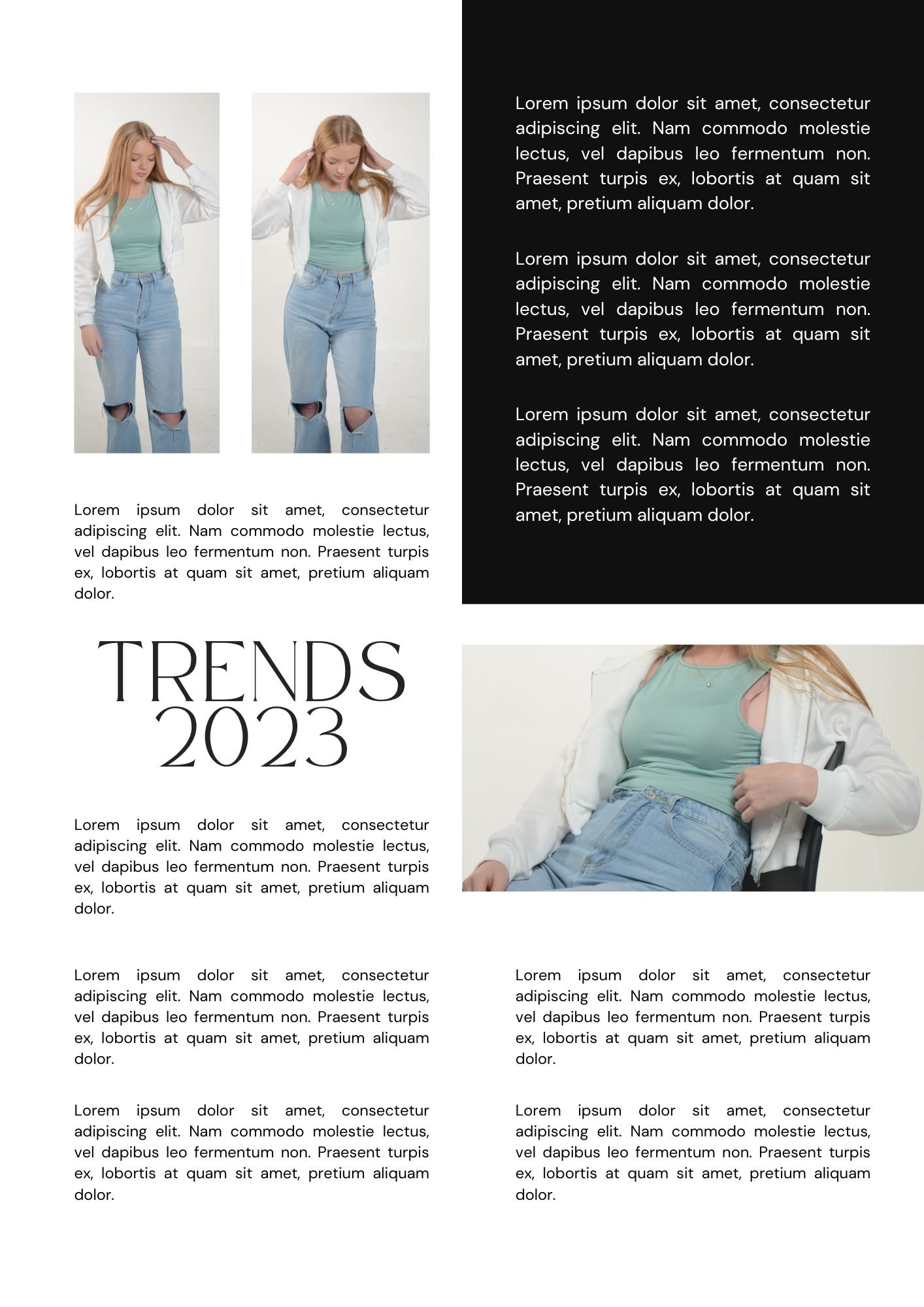
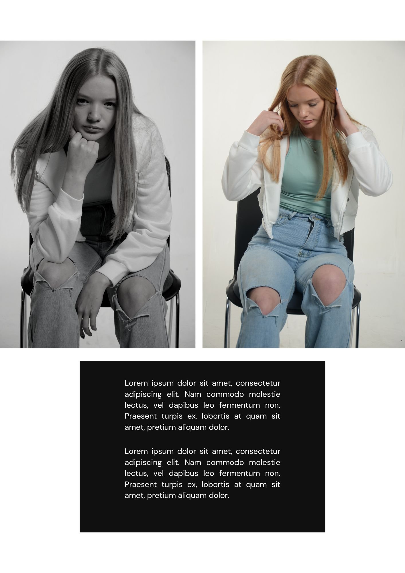
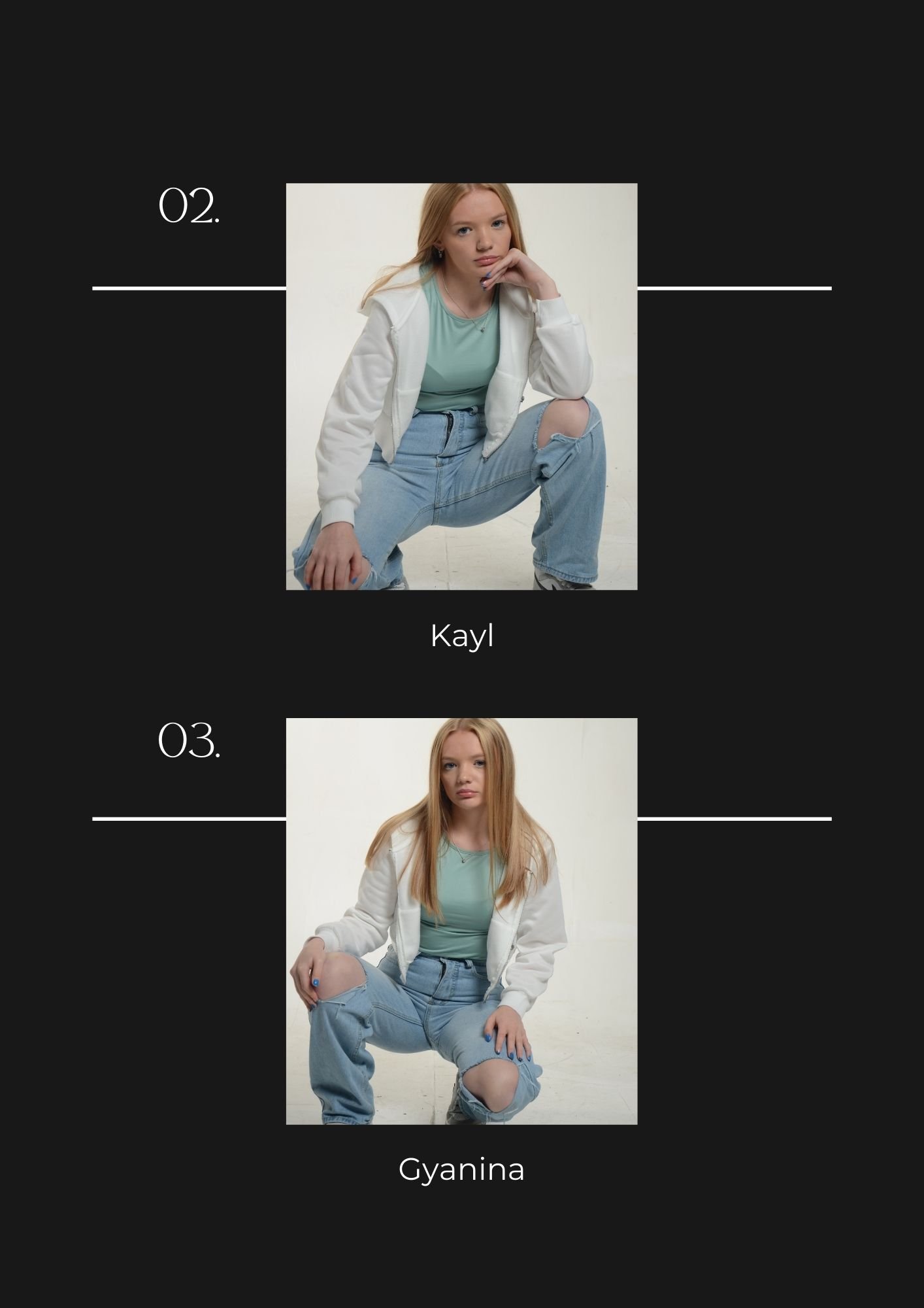
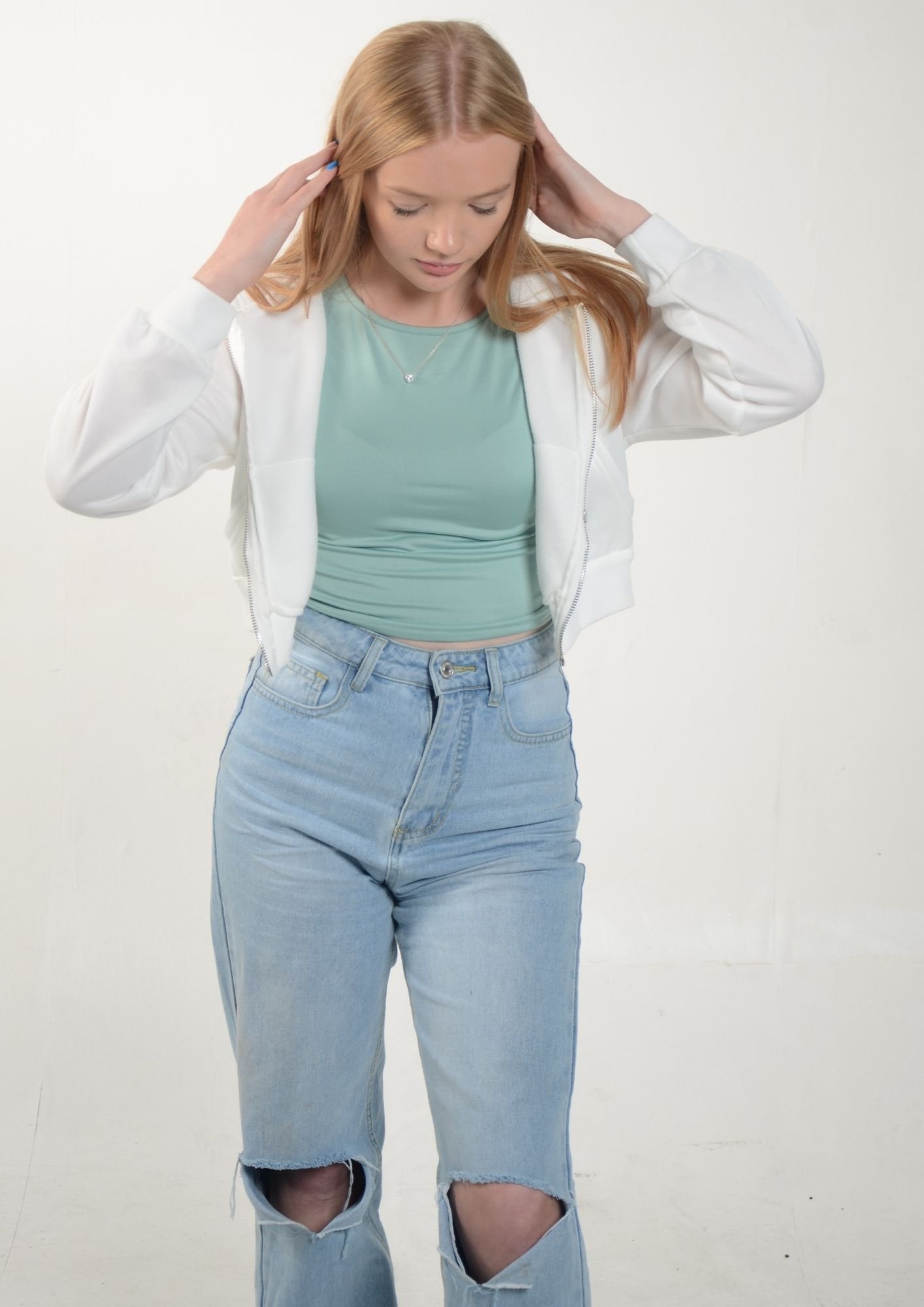
In the photography studio I taken about 77 images, But I have selected 12 photos as my favourites for this assignment. The lighting technique which was used in the studio is called “High Key Lighting” which makes the frame of the image really bright with soft lighting, minimal shadows and with low contrast. In other words the technique uses minimal shadows with the majority of the image composed of highlights. The idea to use is lighting style isn’t just because it is popular in the fashion industry, but it a very pleasant and attractive style which is one of the reasons why it is used in film as well like, sitcoms or comedies.
Generally speaking, how to setup “High Key Lights”. This type generally reduces the amount of shadows in the image, a forth key light may be added as shown in the diagram. In order to maintain the correct exposure levels for the shoot you can move the key light further from the subject.
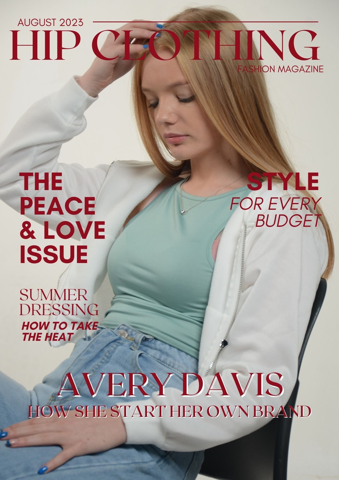
x2 Mock Up Magazine Designs + Supporting Pages: -
Context & Subject Research
Primary Research: -
I made a survey on Google forms after I created three logos for project “HIP” and I received 8 responses with them being in favour of Option 2 (5 votes @ 62.5%) out of Option 3 (3 votes @ 37.5%). Nobody liked Option 1. This was a brilliant option for me to do because it’s a simple way to see what the public opinion is on the logos which I have created. In this case it is class mates who casted votes on the survey.
Group Mock-Up Video - A Potential Outcome
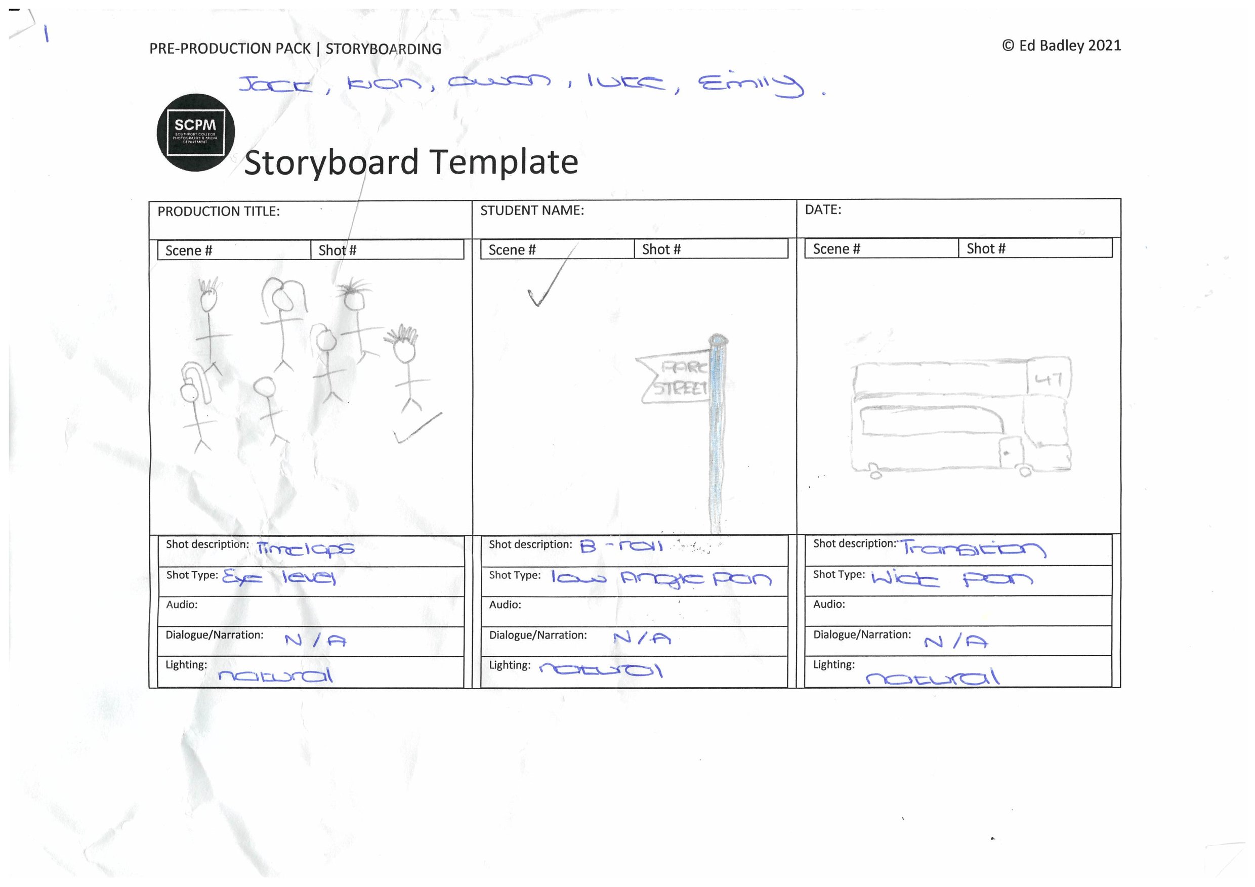
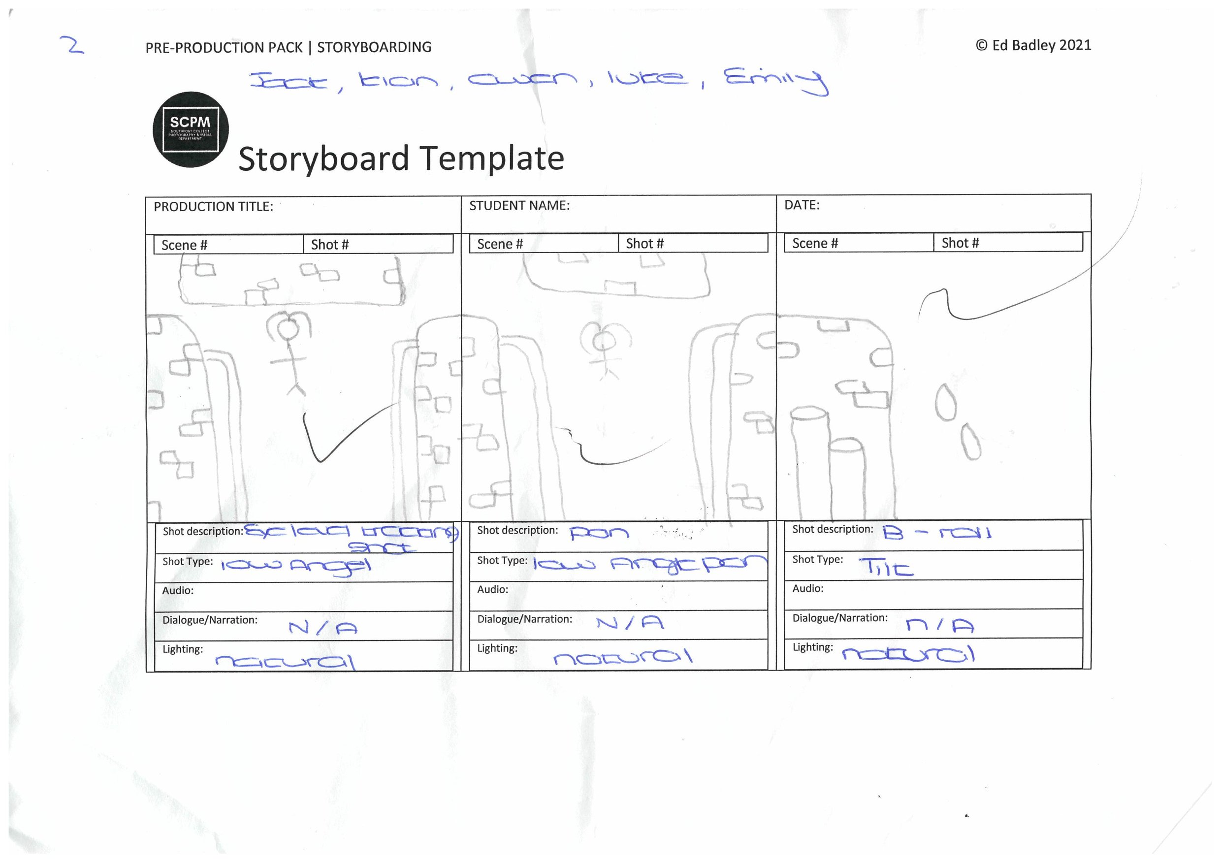
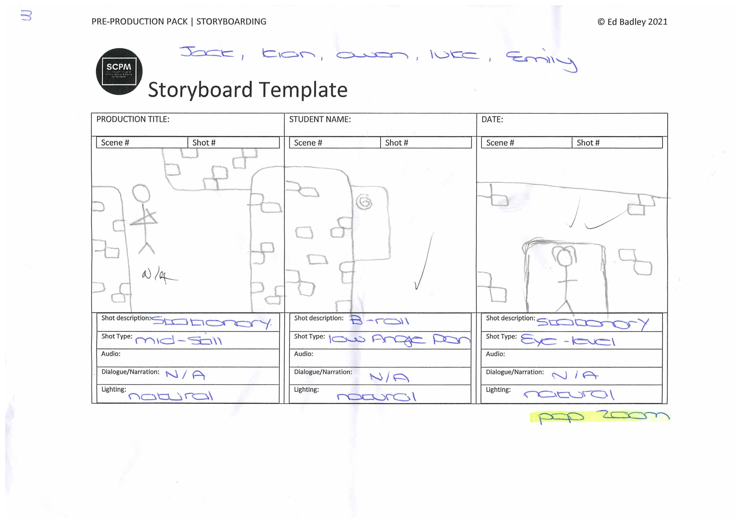
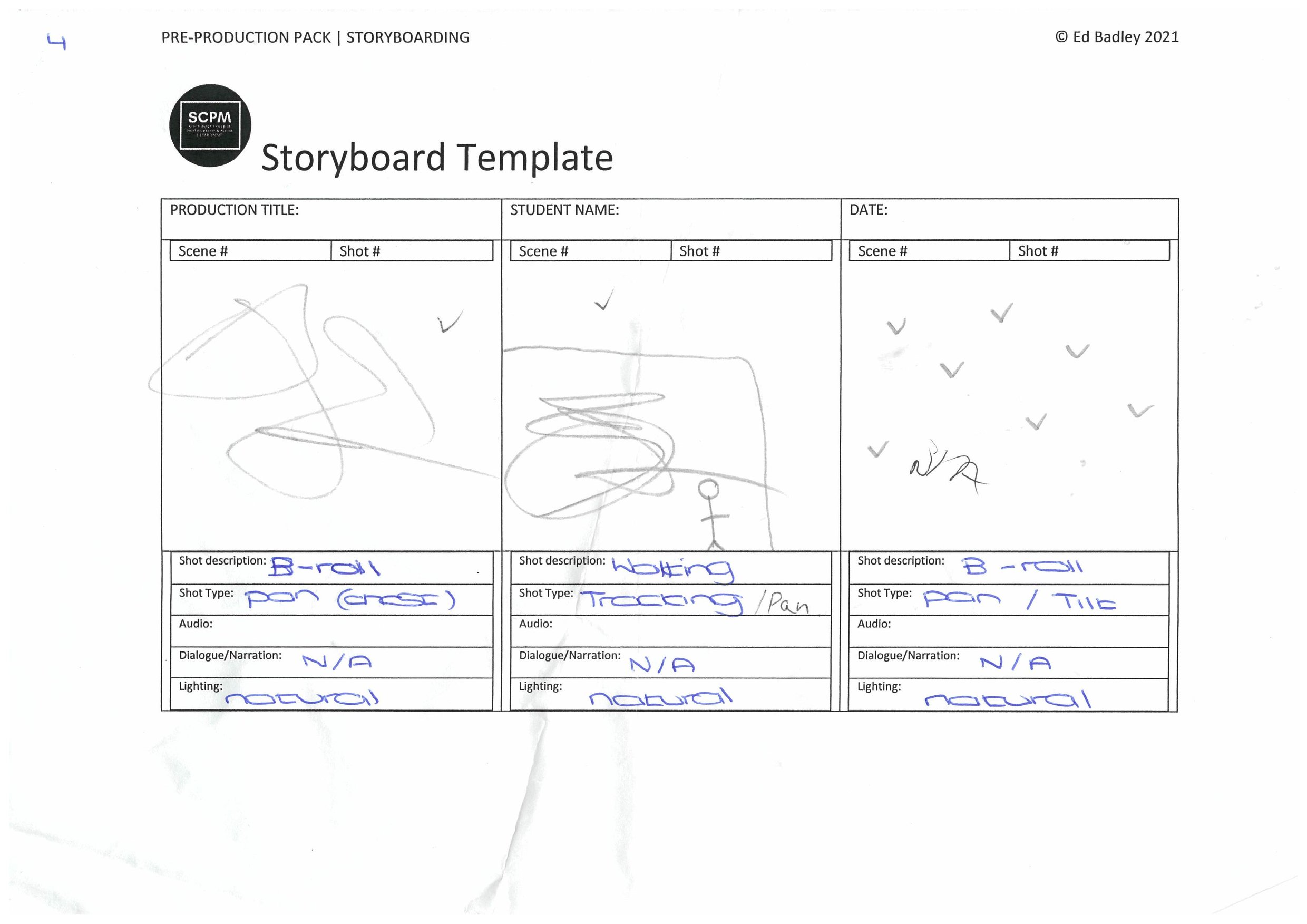
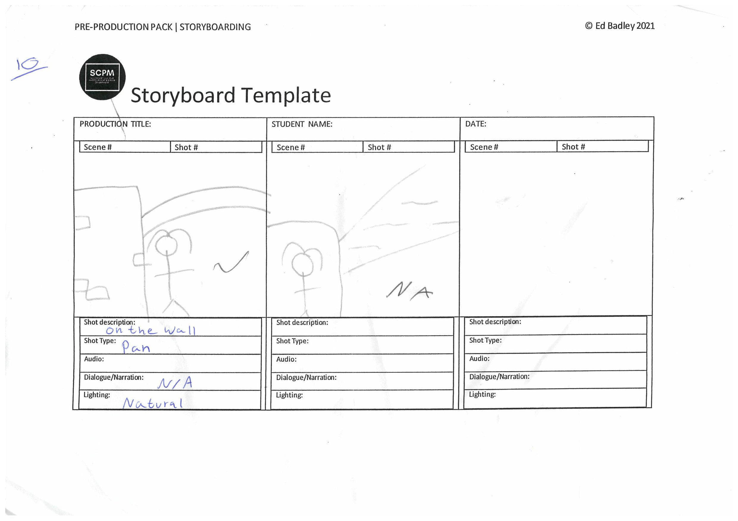
Storyboard: -
To help us get back into producing again, we were commissioned to create a fashion video in groups. In my group especially we had jobs in the team to create the film. Jack was Chief Cameraman, Owen (me) assistant cameraman, Kian was storyboard manager/video framing, Luke was video editor and Emily was the model.
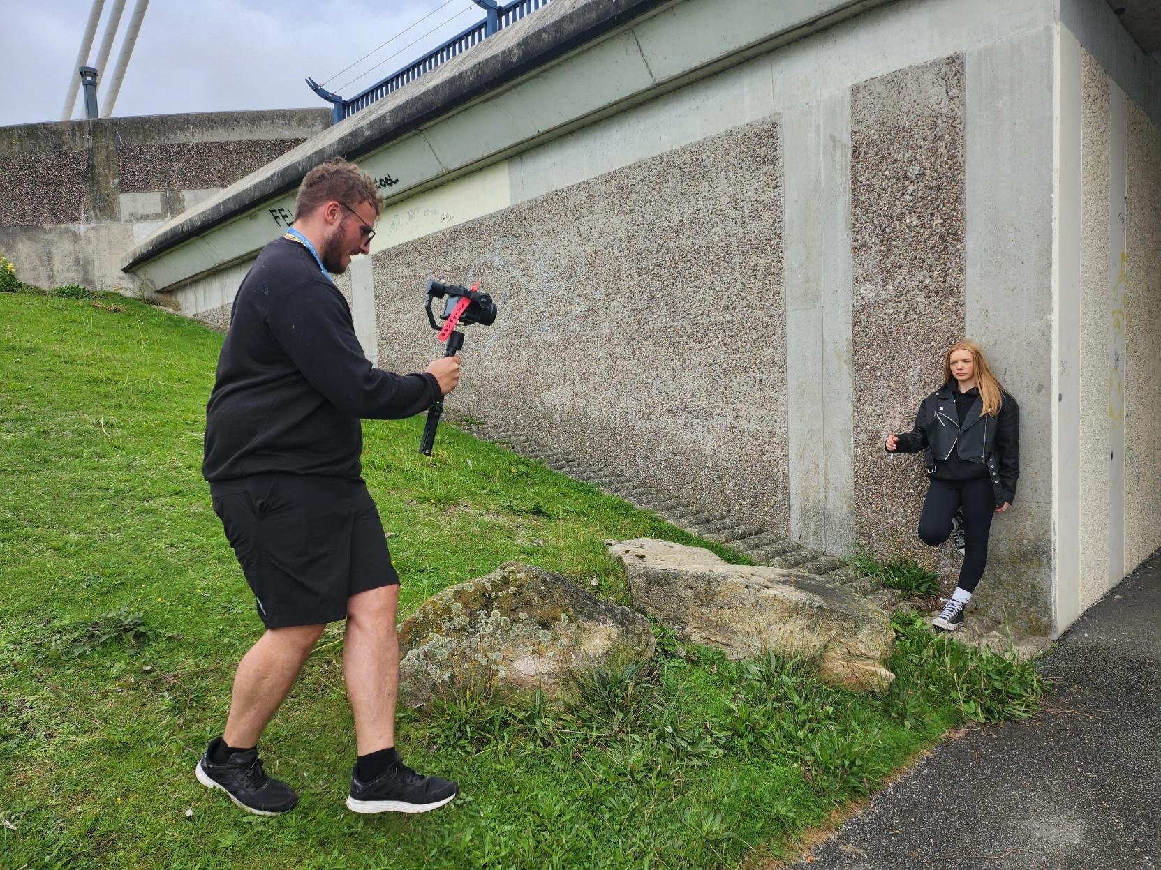
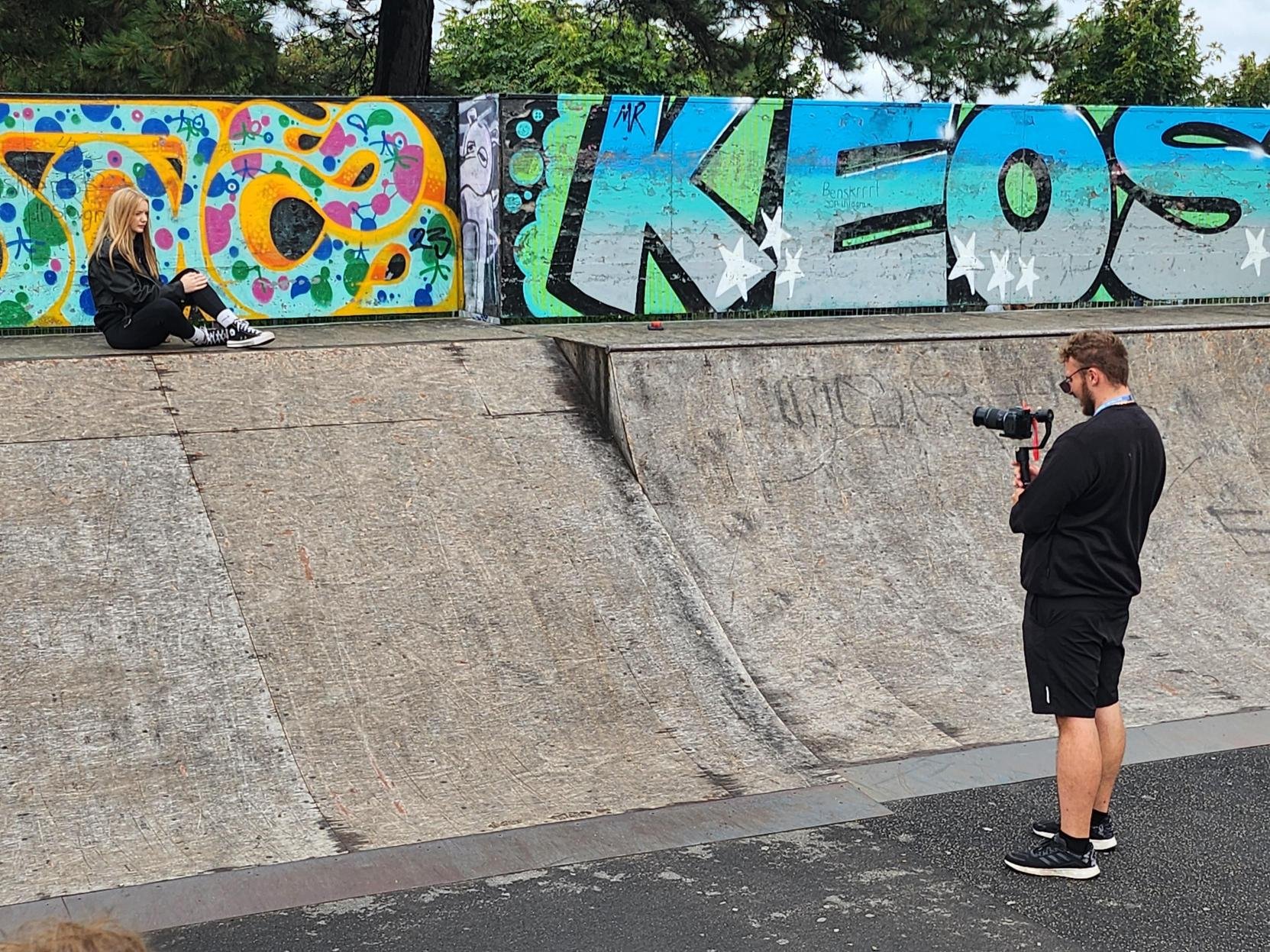
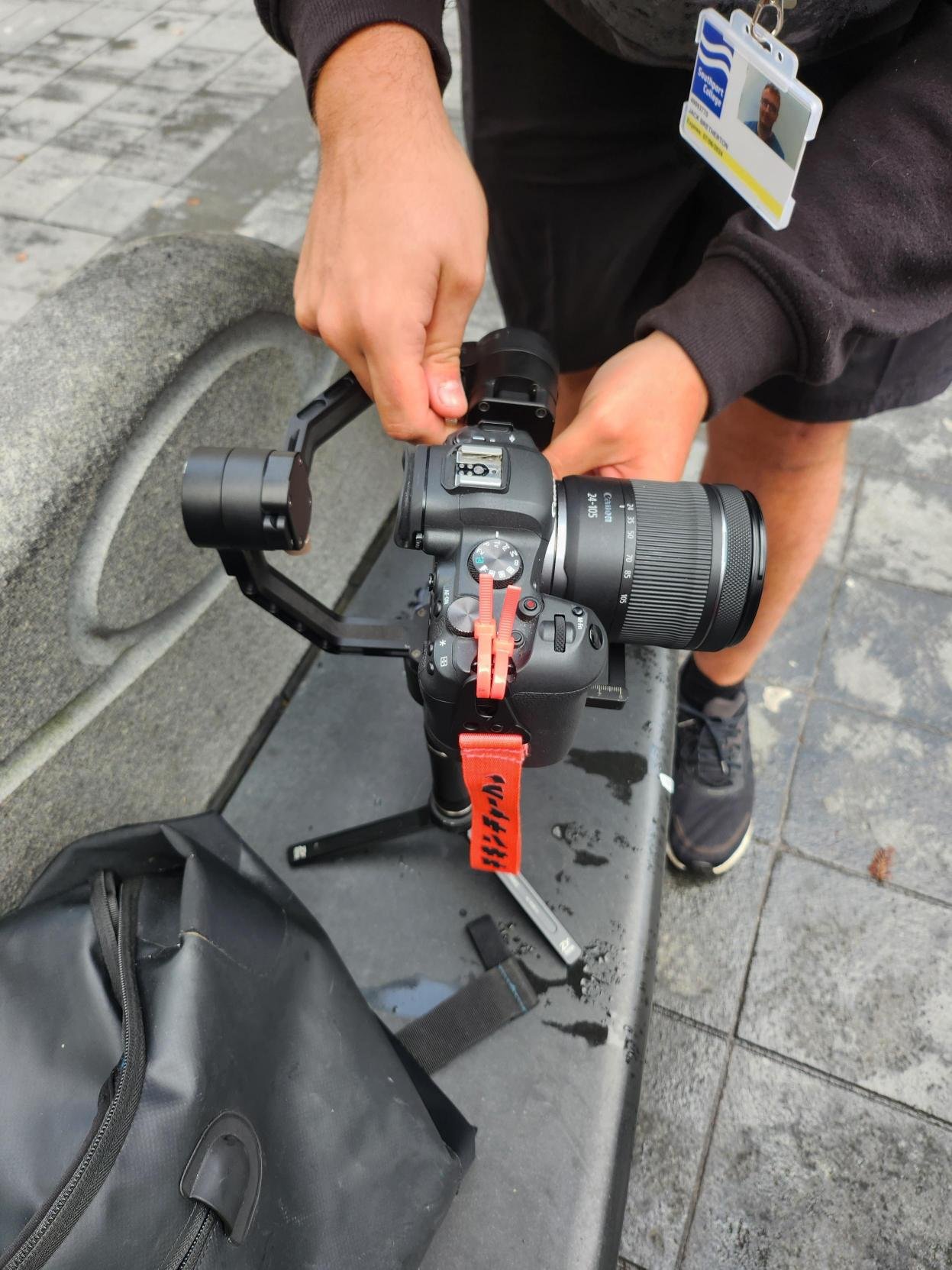
Behind the Scenes: -
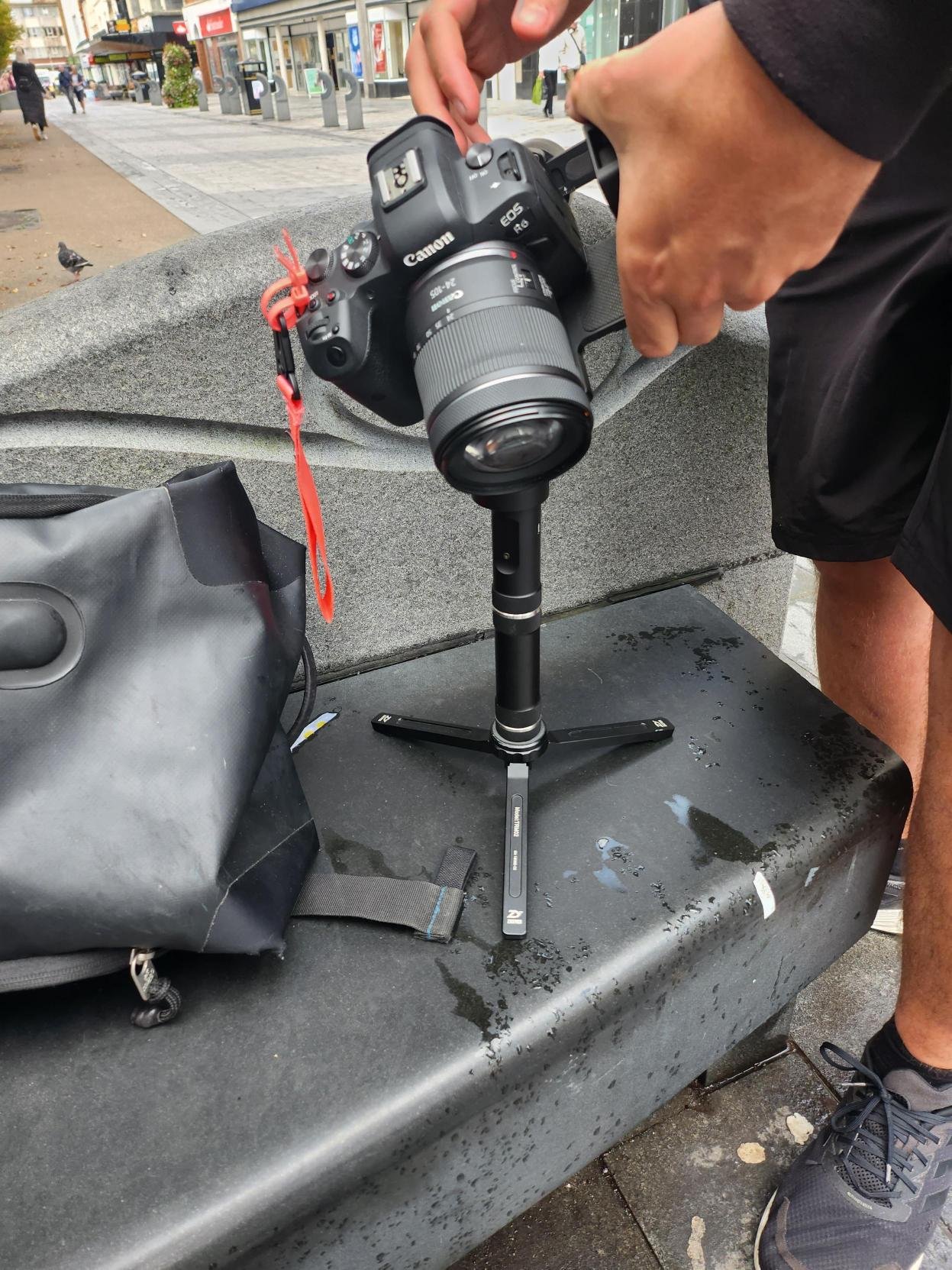
As the behind the scenes footage shows for the Mock-Up video, We used our own equipment, we used Jack’s Canon EOS R6 and my motorised gimbal called Zhiyun Crane Plus.
The Group Final Production: -
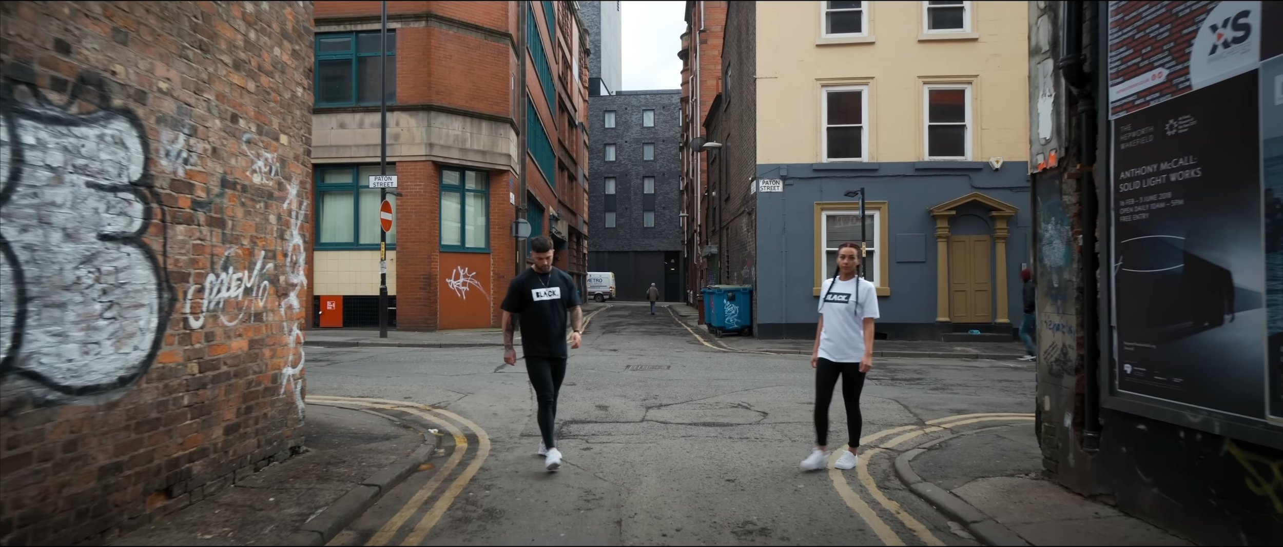
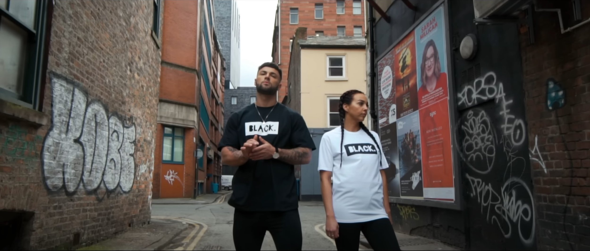
In this video we tried to emulate the “BLACK. promotional video” but the locations we used were based in and around Southport Town Centre.
Secondary Research: -
E-Commerce has become huge due to the rise of the internet, with the functionality of buying and selling goods or services. This also enables a wide variety of systems for both buyers and sellers such as a secure online payment encryption and the functionality of being able to use your mobile for shopping.
Most businesses use this medium to check their online presence to conduct marketing strategies and to oversee logistics and fulfilment. According eMarketer, in 2022 the whole sector will surpass $5 trillion for the first time with more then a fifth of sales, but they say by 2025 even with the slowing of growth the sector could exceed $7 trillion total spending.
Pretty Little Things
One of the biggest E-Commerce websites is “Pretty Little Thing” with their aim is to sell the latest fashion for women. Like most online shops, their aim is to sell clothes, shoes etc, so their latest marketing strategy is to find the latest upcoming influencer to boost their sales and model their clothes for them, for “Pretty Little Things” it is somebody called “Molly-Mae”.
With some of the online stores they tend to display the in studio shots first as they are trying to sell that item of clothing rather then the main focal point being the model in question, but on this occasion they are showcasing the model “Molly-Mae” because people are going to buy that particular clothing because of the person modelling it.
Usually for most companies, when you click on the listing it displays the model in a studio wearing that item of clothing, but Pretty Little Thing” are going for a urban vibe with mainly the focal point again being the model, they are still taking close up shots of the clothing with the last image on the listing being the item not being worn on its own in a studio environment.
Analyse a Promotional Video: -
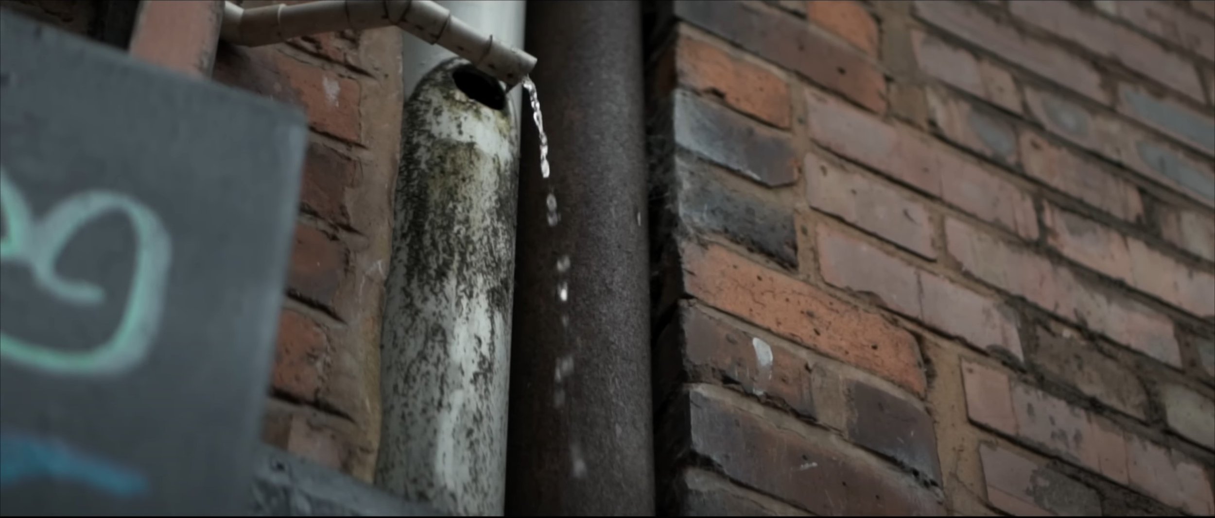
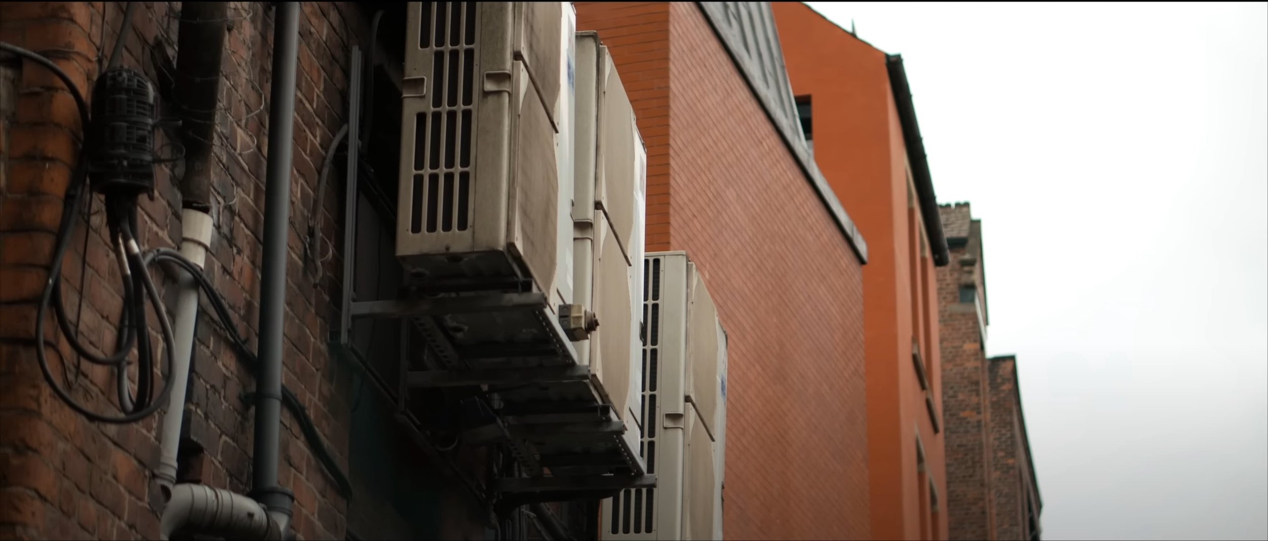
After watching this video a few times I can analyse this video; to start with the video heavily relies on the beat to transition from scene to scene or clip to clip. The video also relies on plenty of B-Roll shots which are filler shots to fit in between the main shots of the two models modelling that item of clothing. The setting of the video is in a urban type atmosphere, which works really well with the shot types and angles used throughout the video. For example the eye level dolly shot used at the beginning, low angle pan, medium close up, tilt down close up, medium wide dolly. There is so much more in the video, their is a simple title at the beginning and end saying “BLACK” which symbolises the clothing brand in question. The video isn’t following much of a storyline, but is definitely following a well planned out storyboard or shot list to create something really good filmography wise at a low budget. The lighting used is natural lighting from daylight, from what I can tell no extra lighting has been used in this production, they seem to be heavily relying on the camera and of course the daylight. The screen grabs for the video are below: -
Production Planning
The Background Of My Production: -
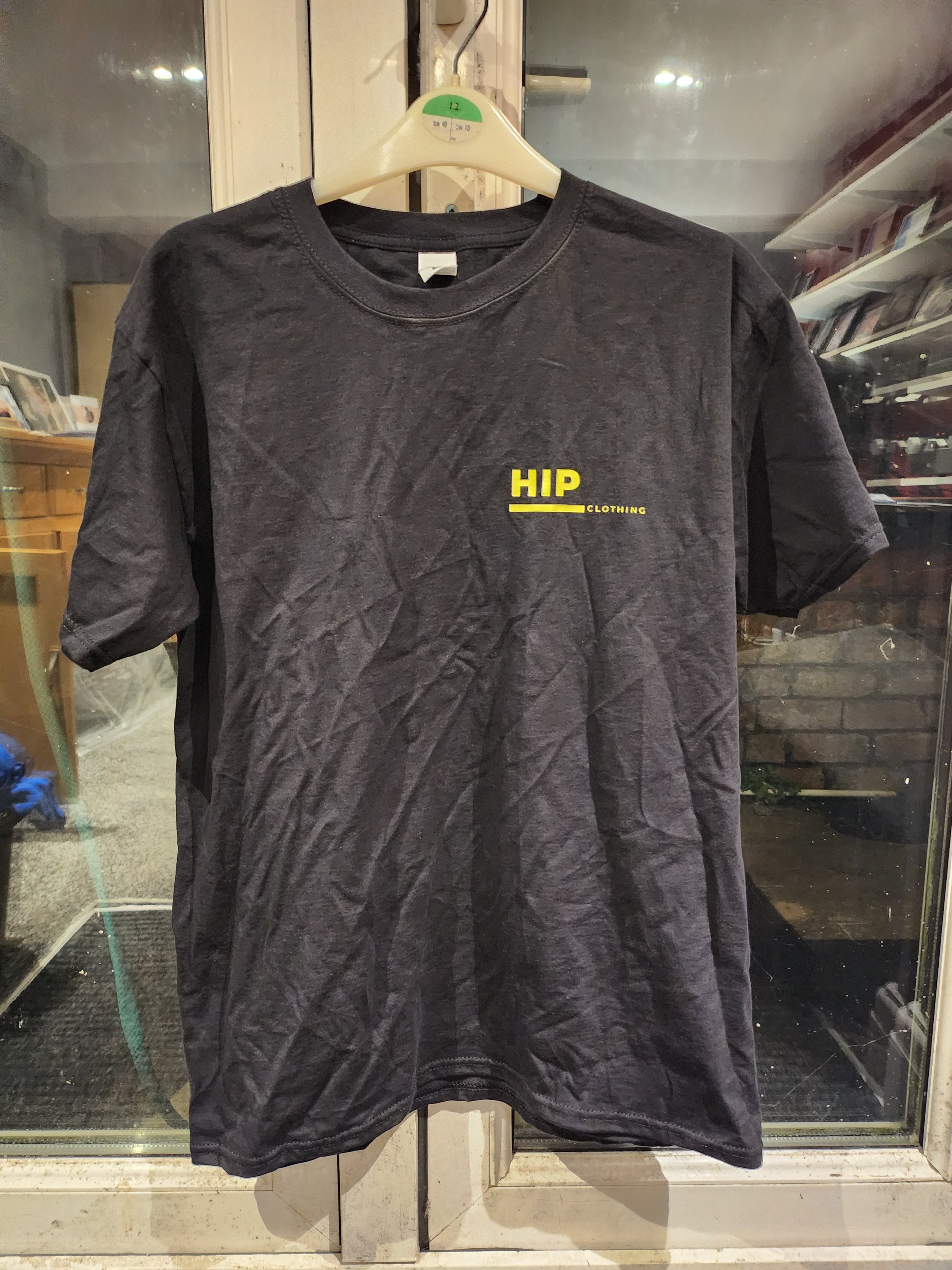
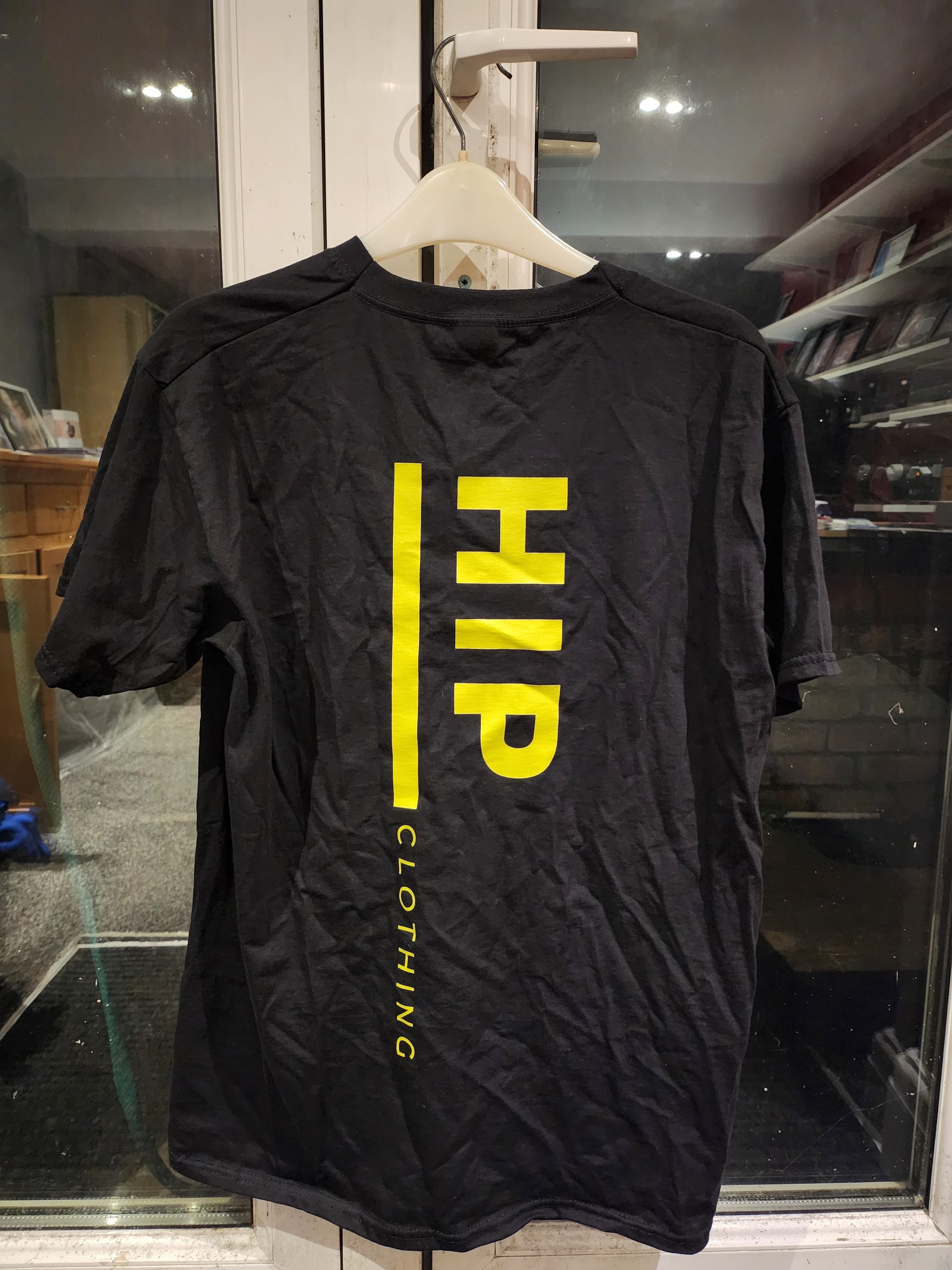
In groups at the start of year we created a Mock-Up clothing promotional video and when we were shooting, I wasn’t personally happy with the shot types, angles and movements used in the original video, especially the editing. So I thought I’d re-record the idea again, but have my own take on it with my own music which I have picked and my take on the filming. I am using the same model again as I thought that initially worked with what we were doing. This time I have had a t shirt printed for the production as well which will give this production some context and purpose.
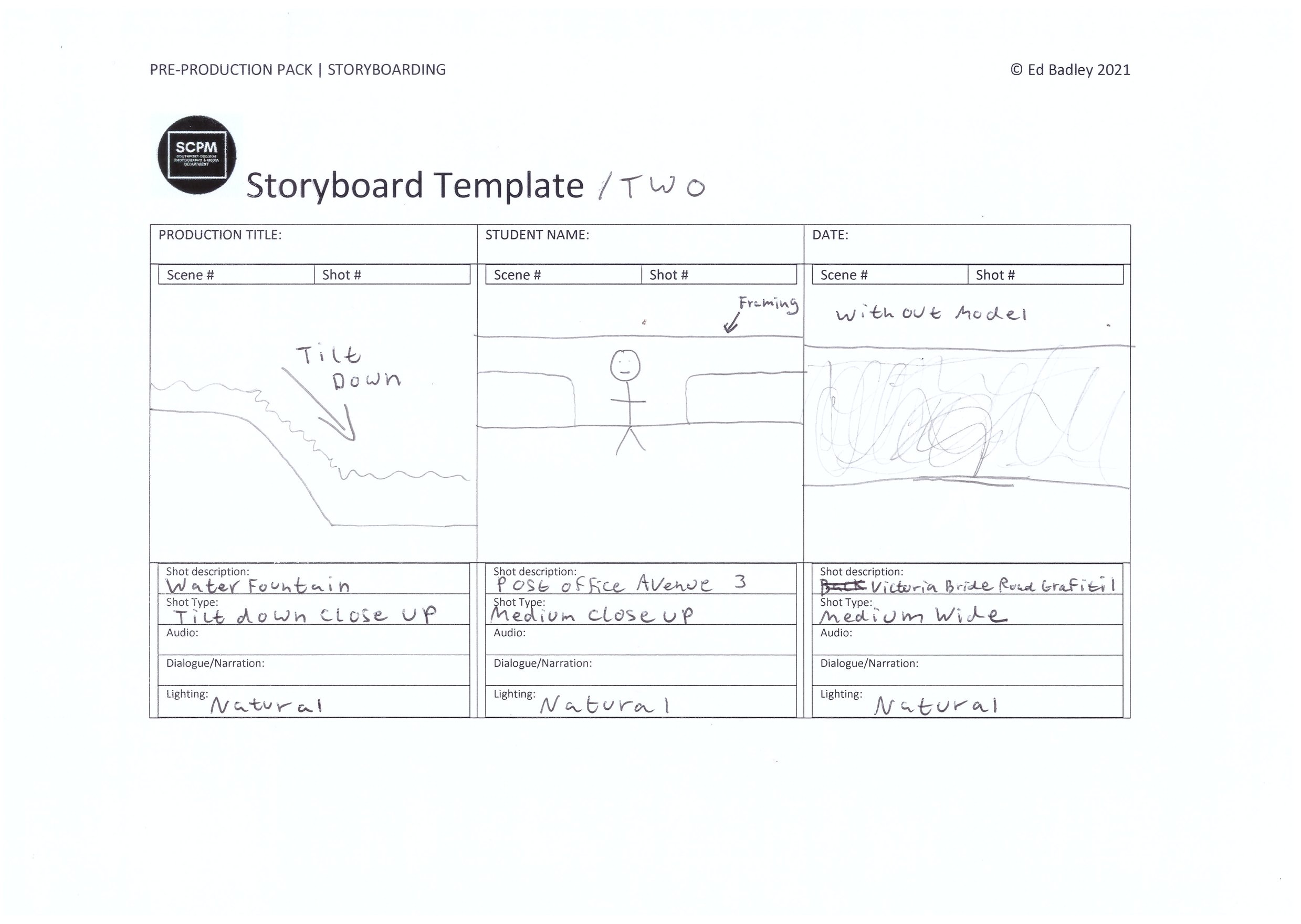
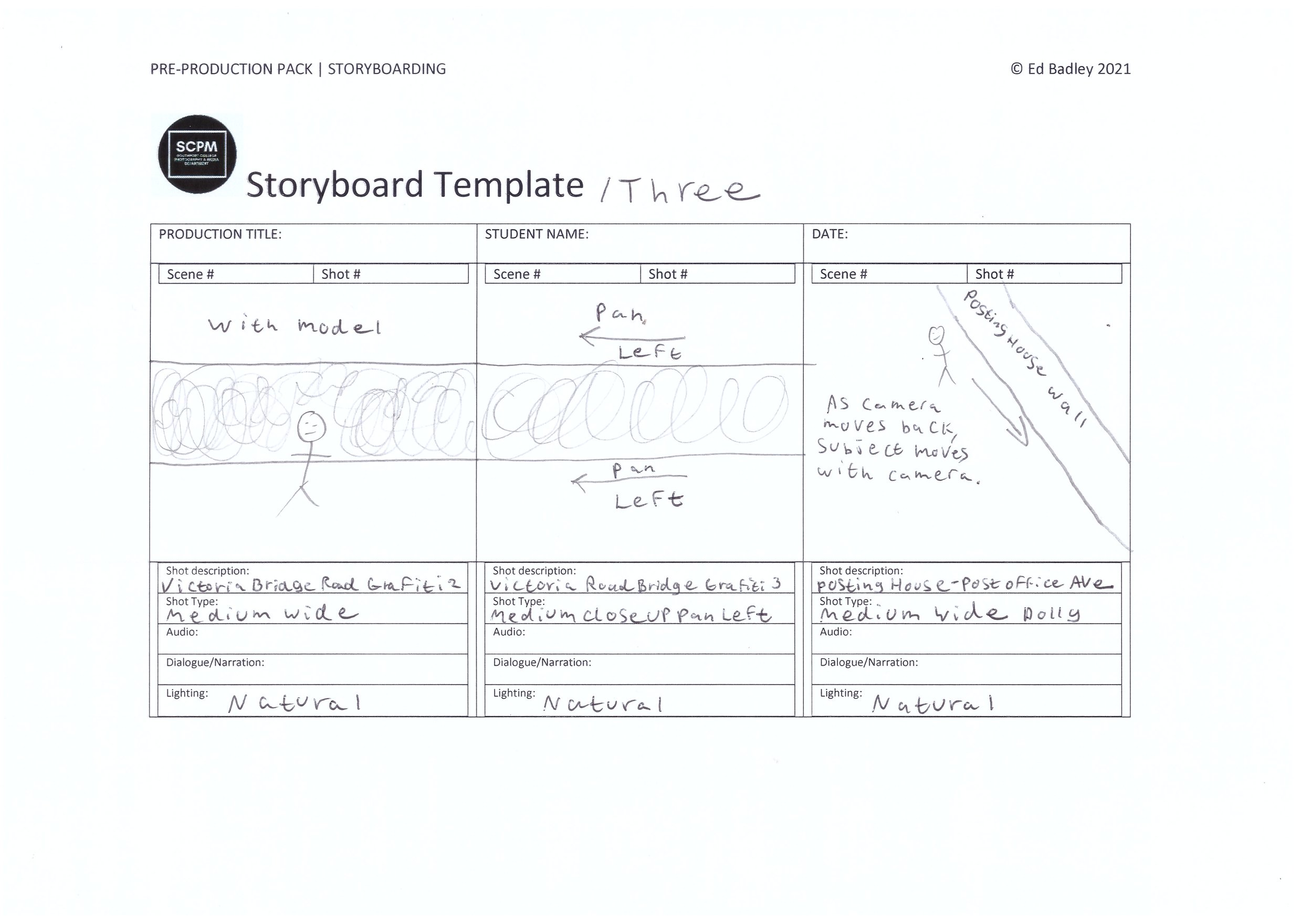
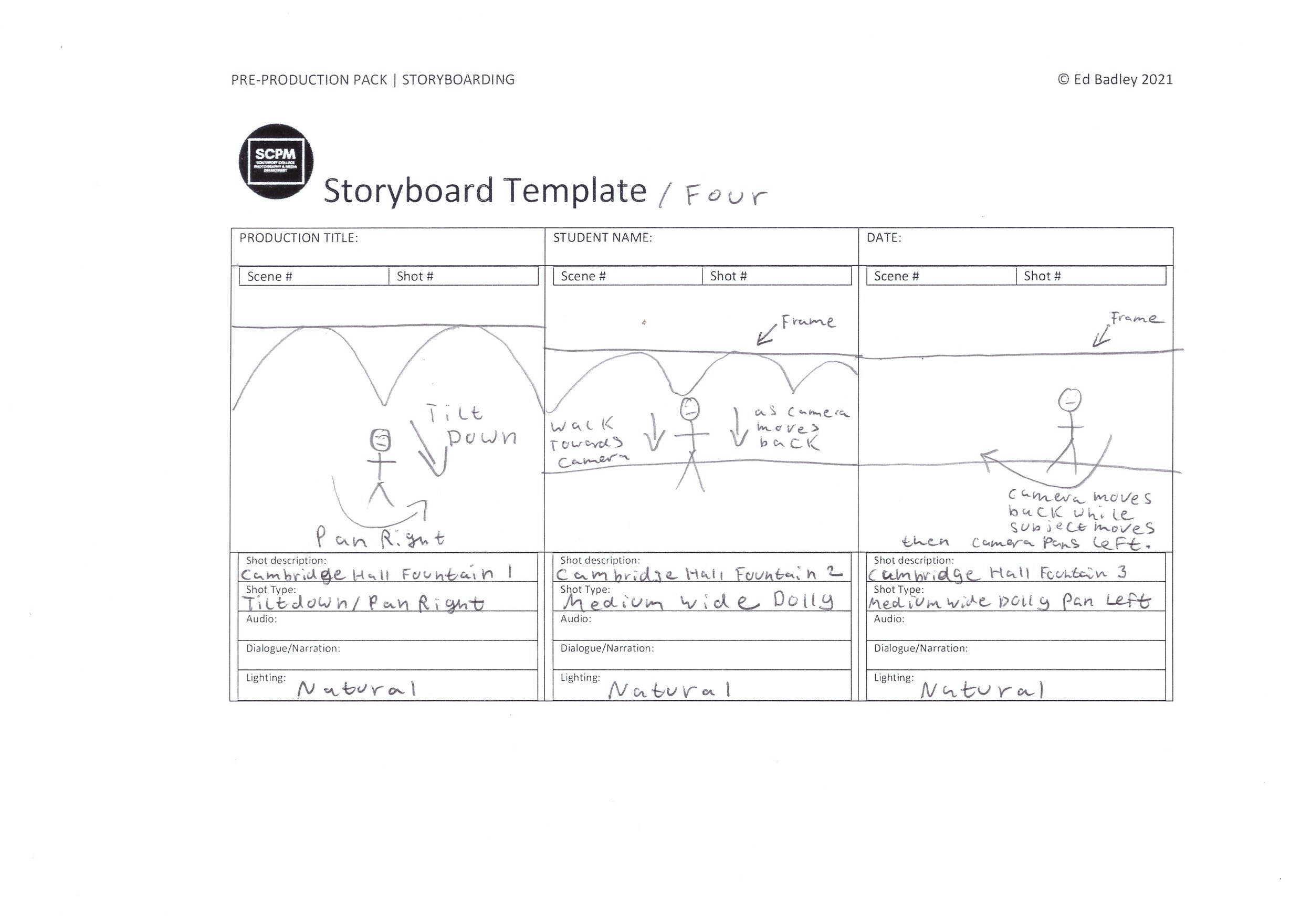
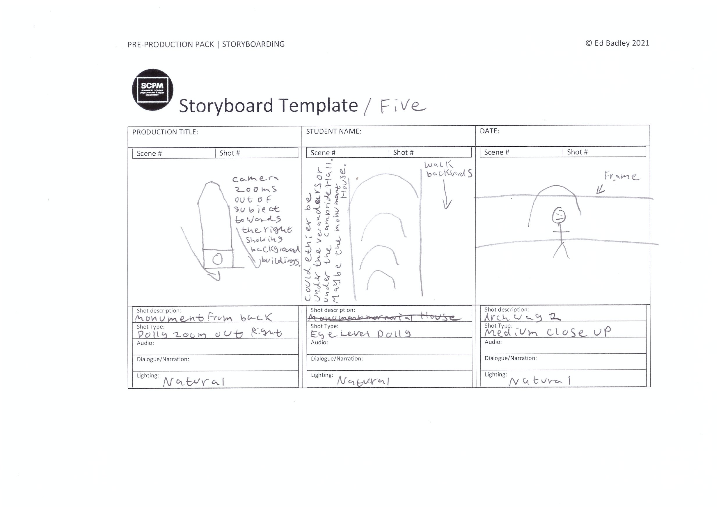
Storyboard
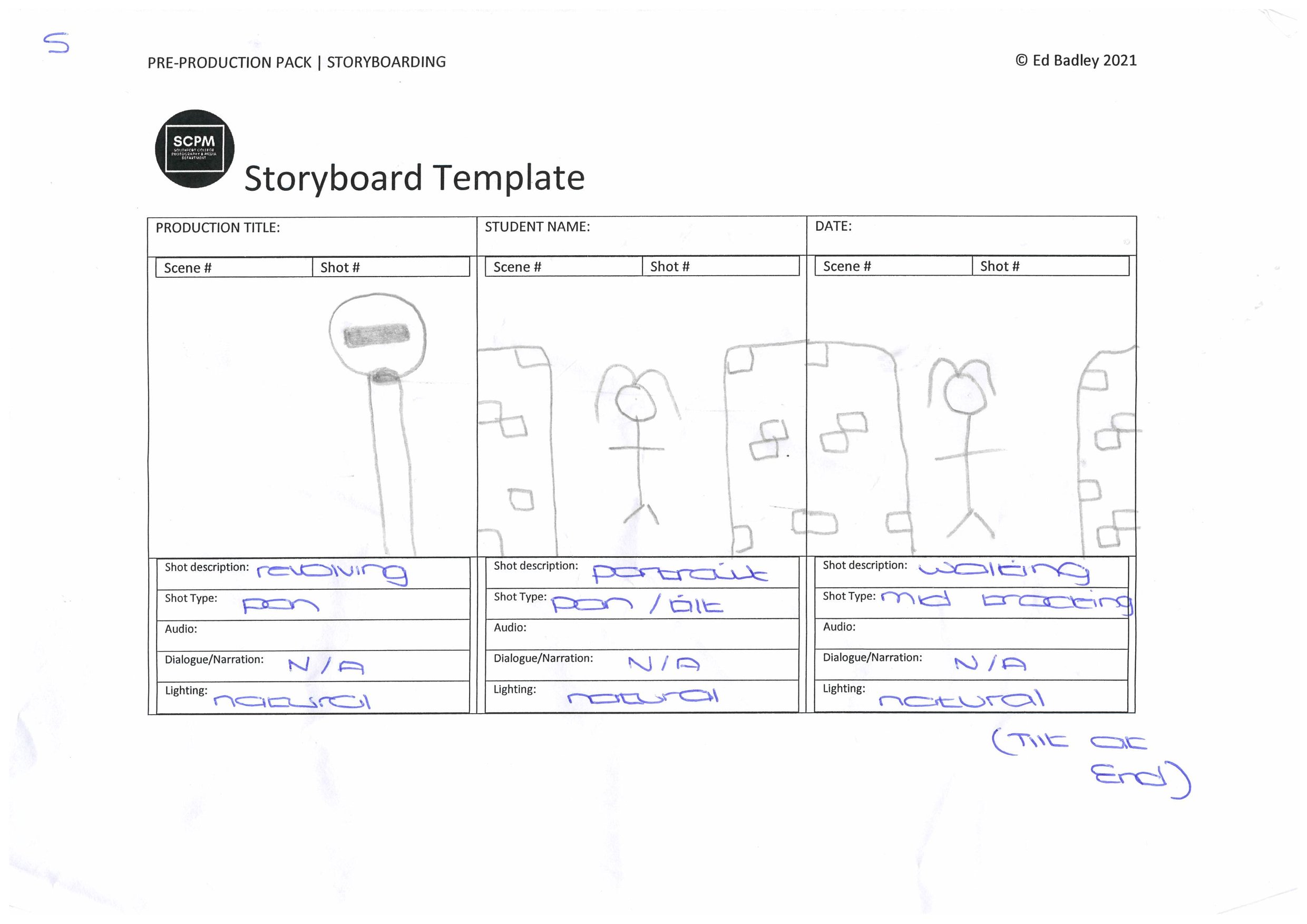
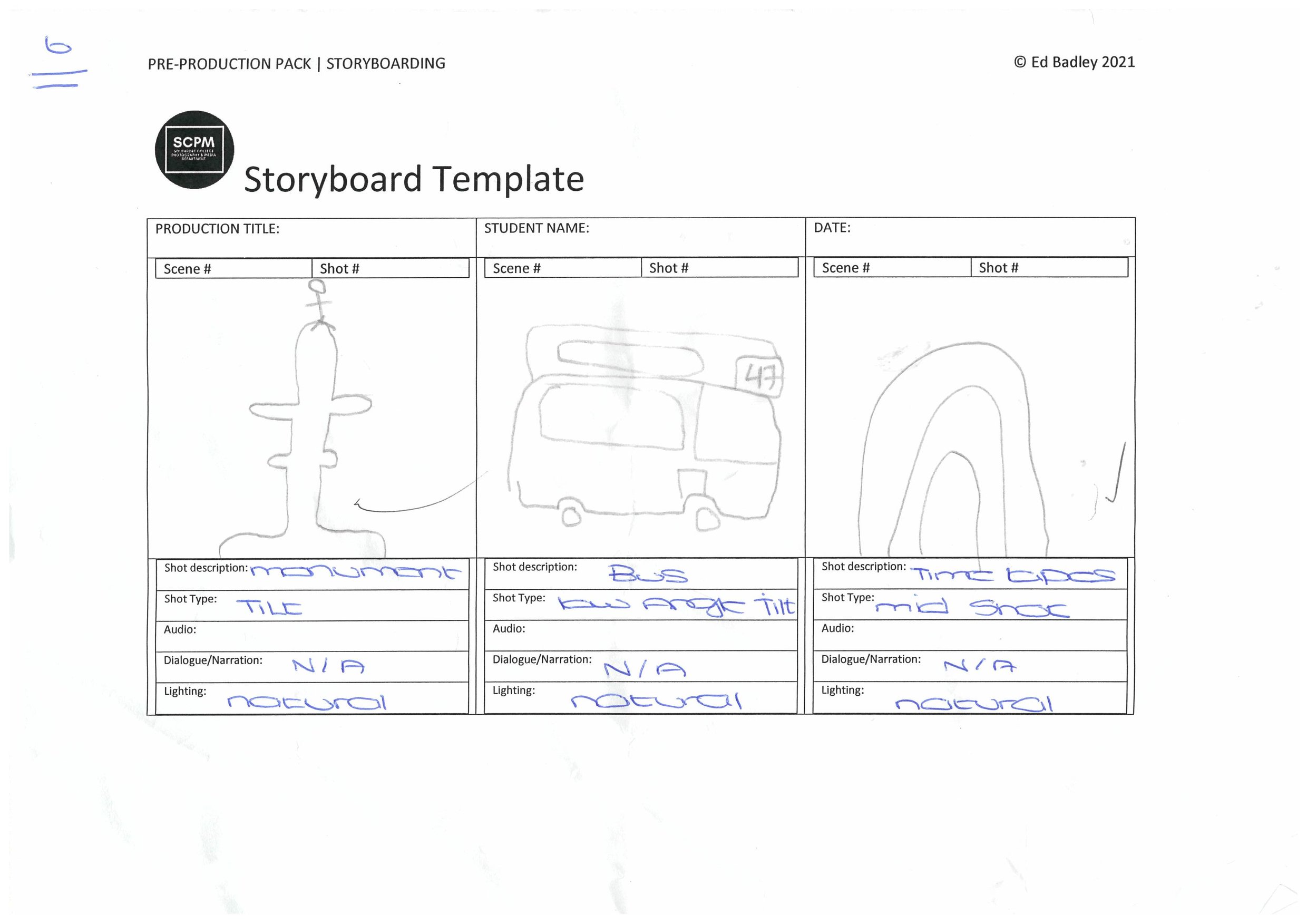
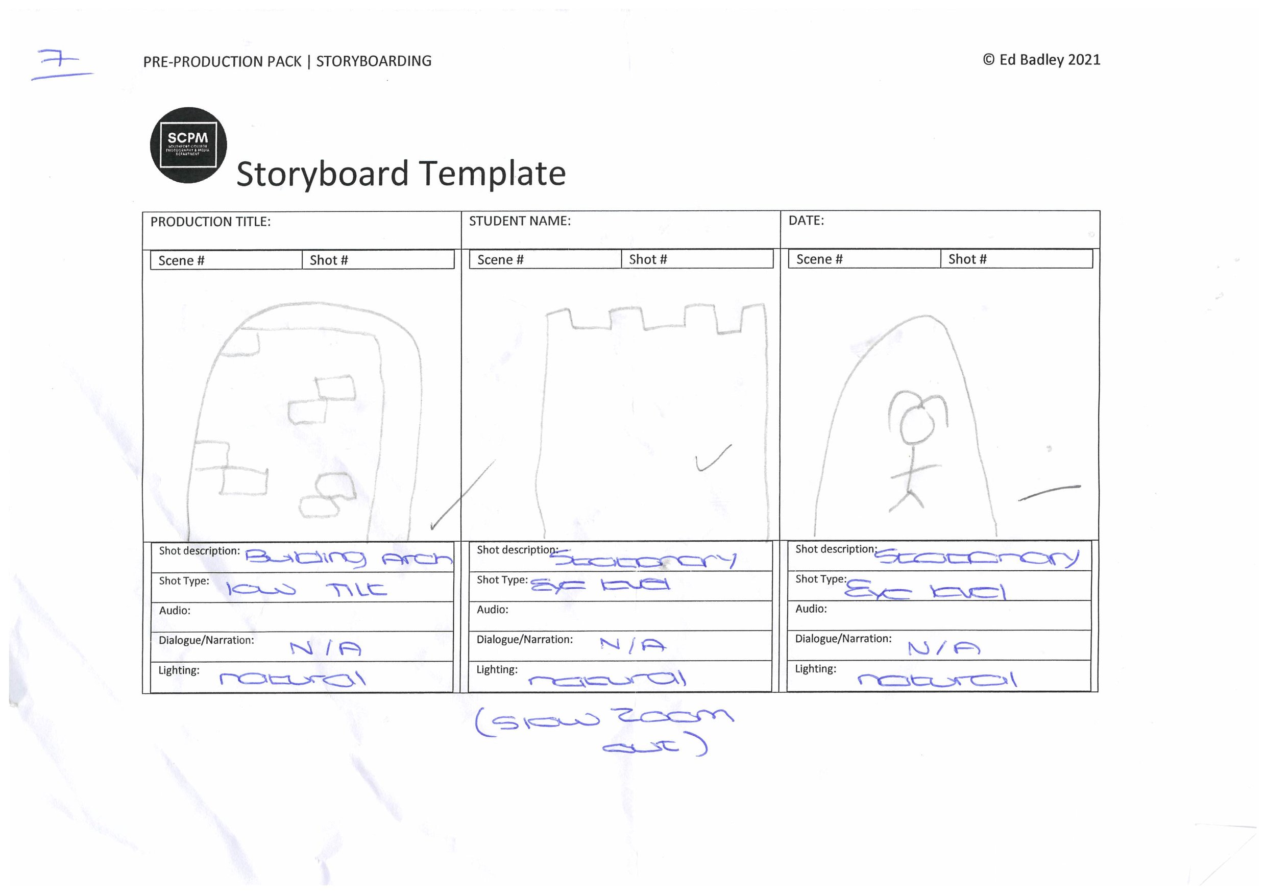
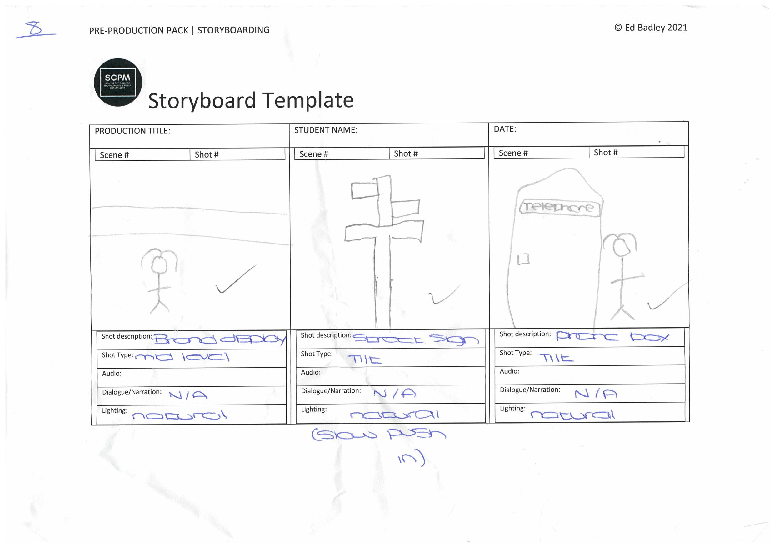
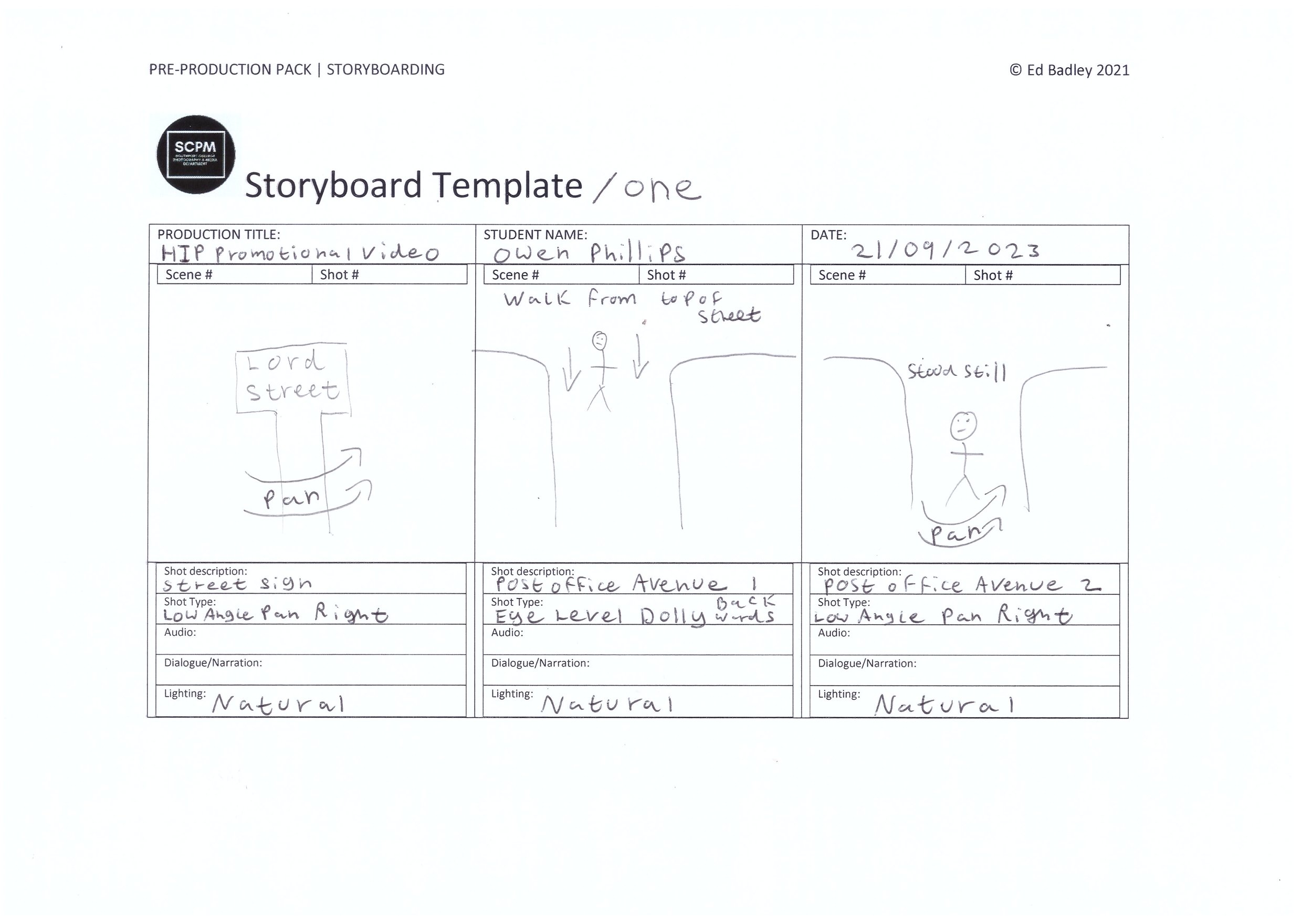
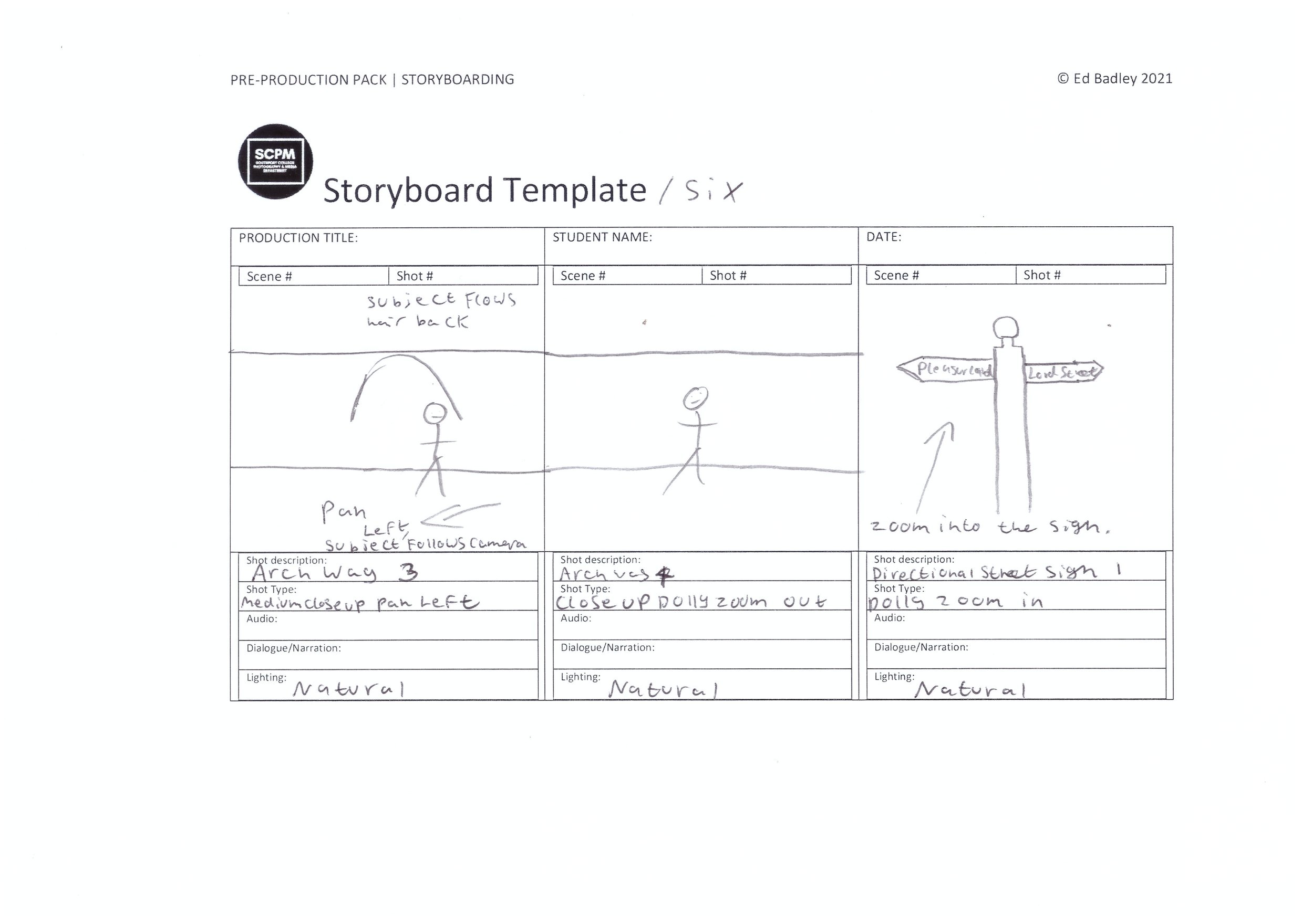
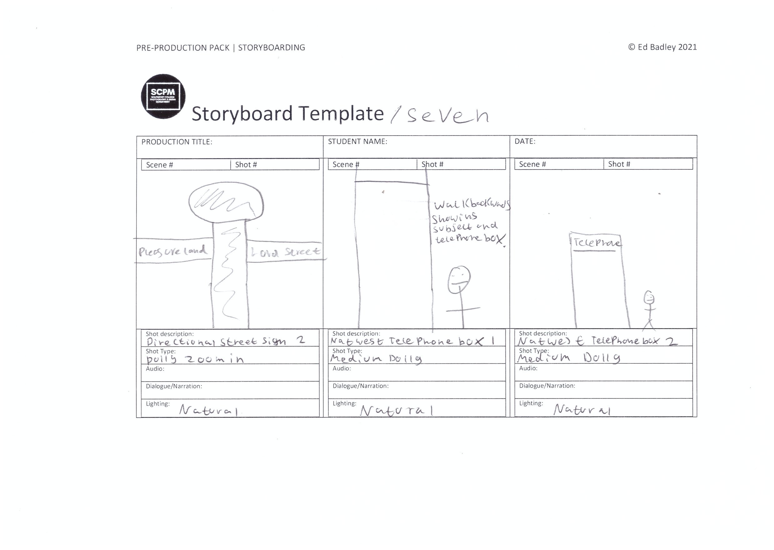
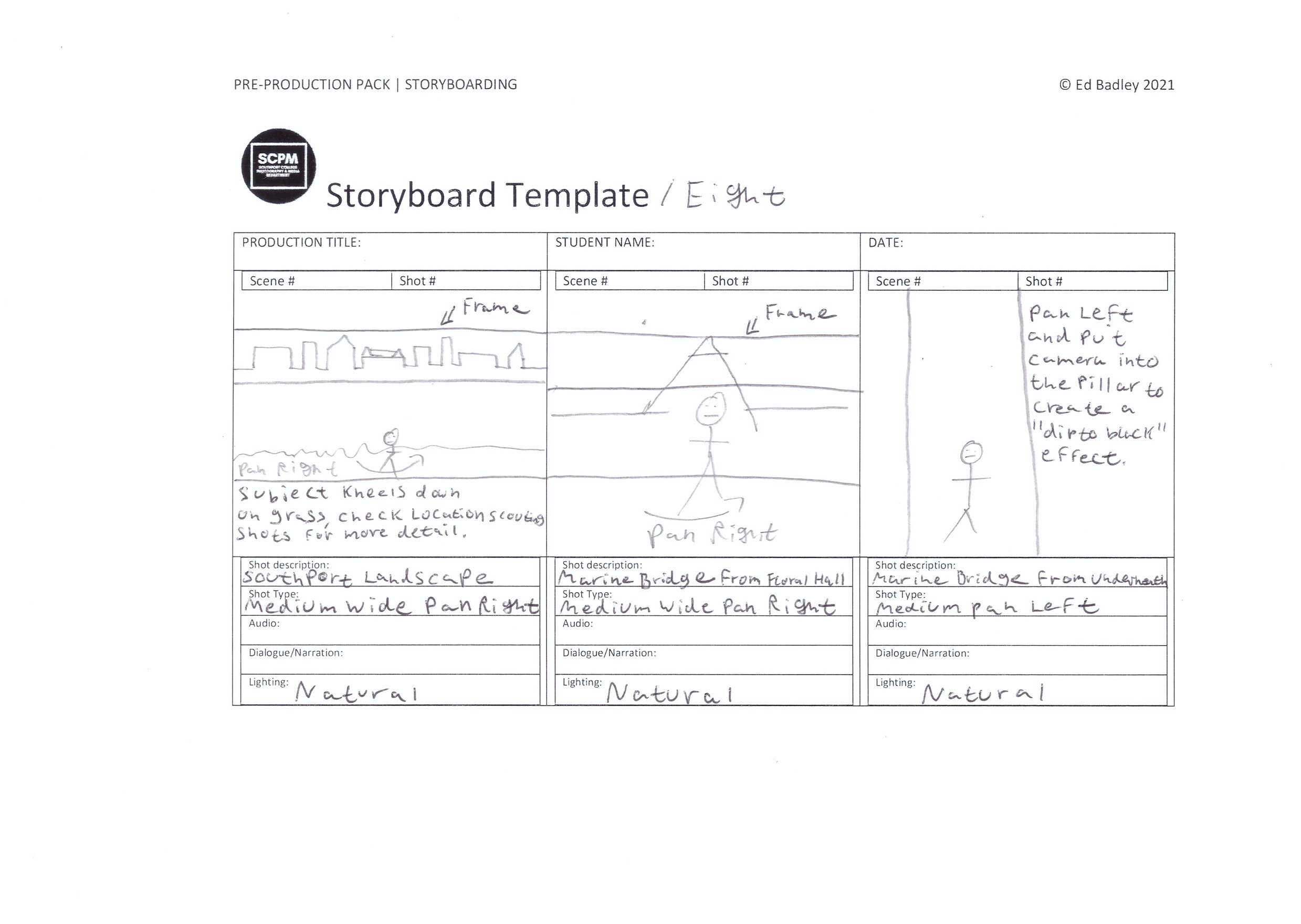
For this project, I have used the storyboard boxes as a drawn shot list to help me with the kind of shots I want to film in this production, If I film loads then I can pick out the best shots I want to use and this means I have plenty enough shots to cut down to the 45 seconds of footage which is required by the brief, nothing longer.
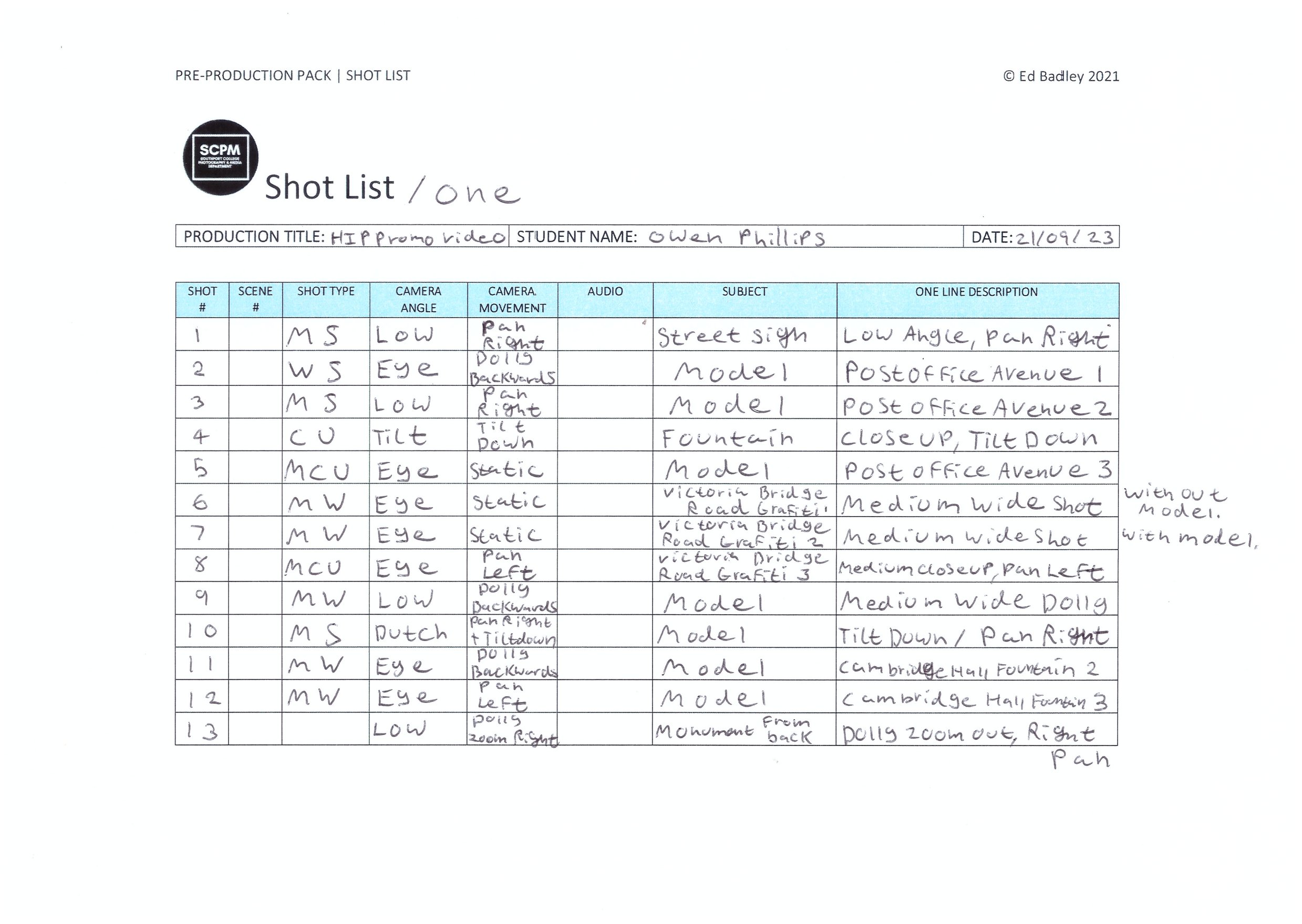
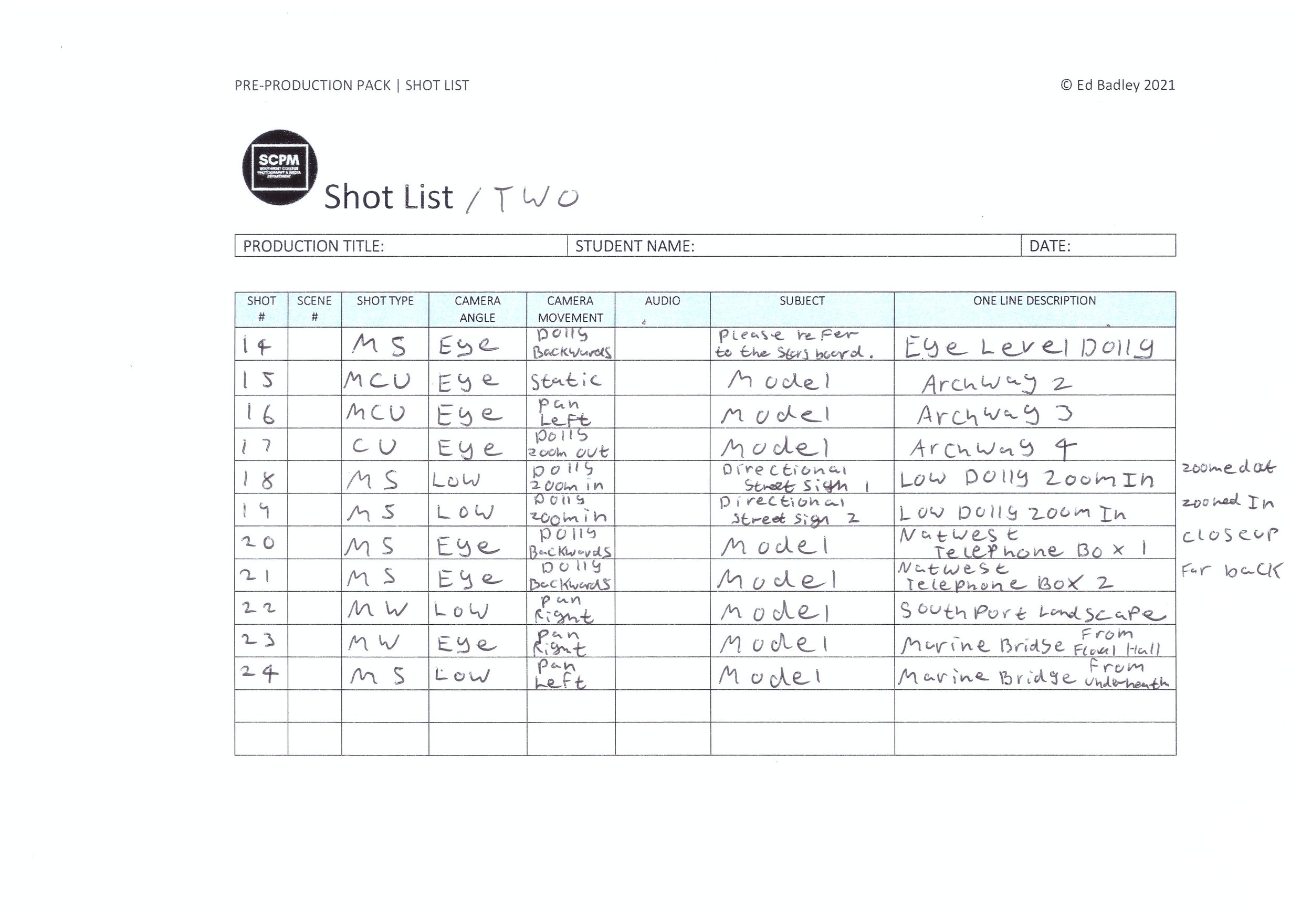
Shot List
Location Scouting
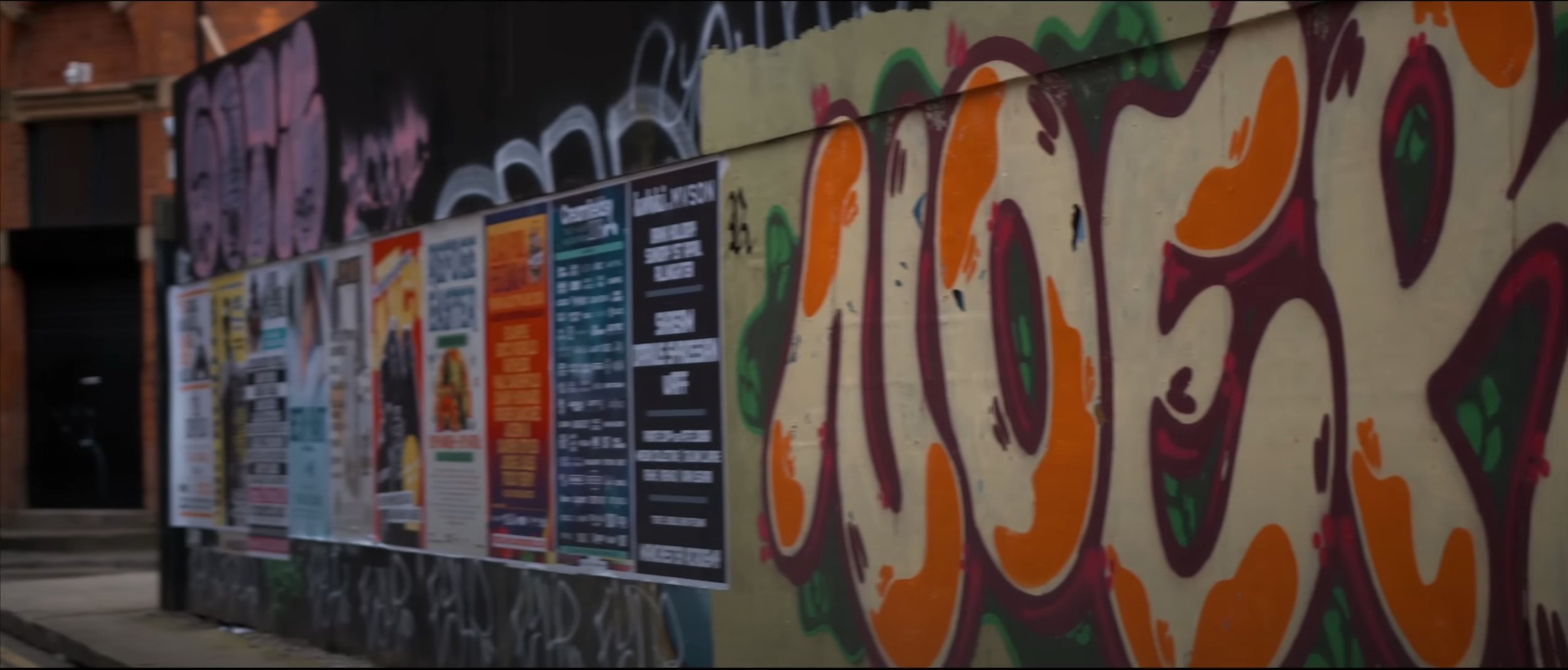
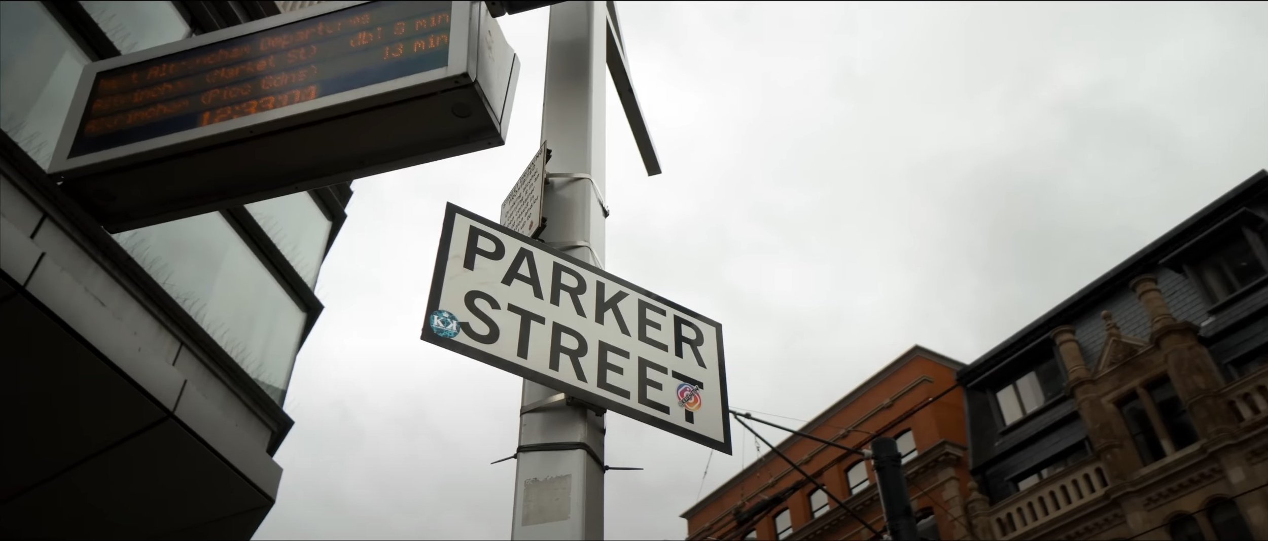
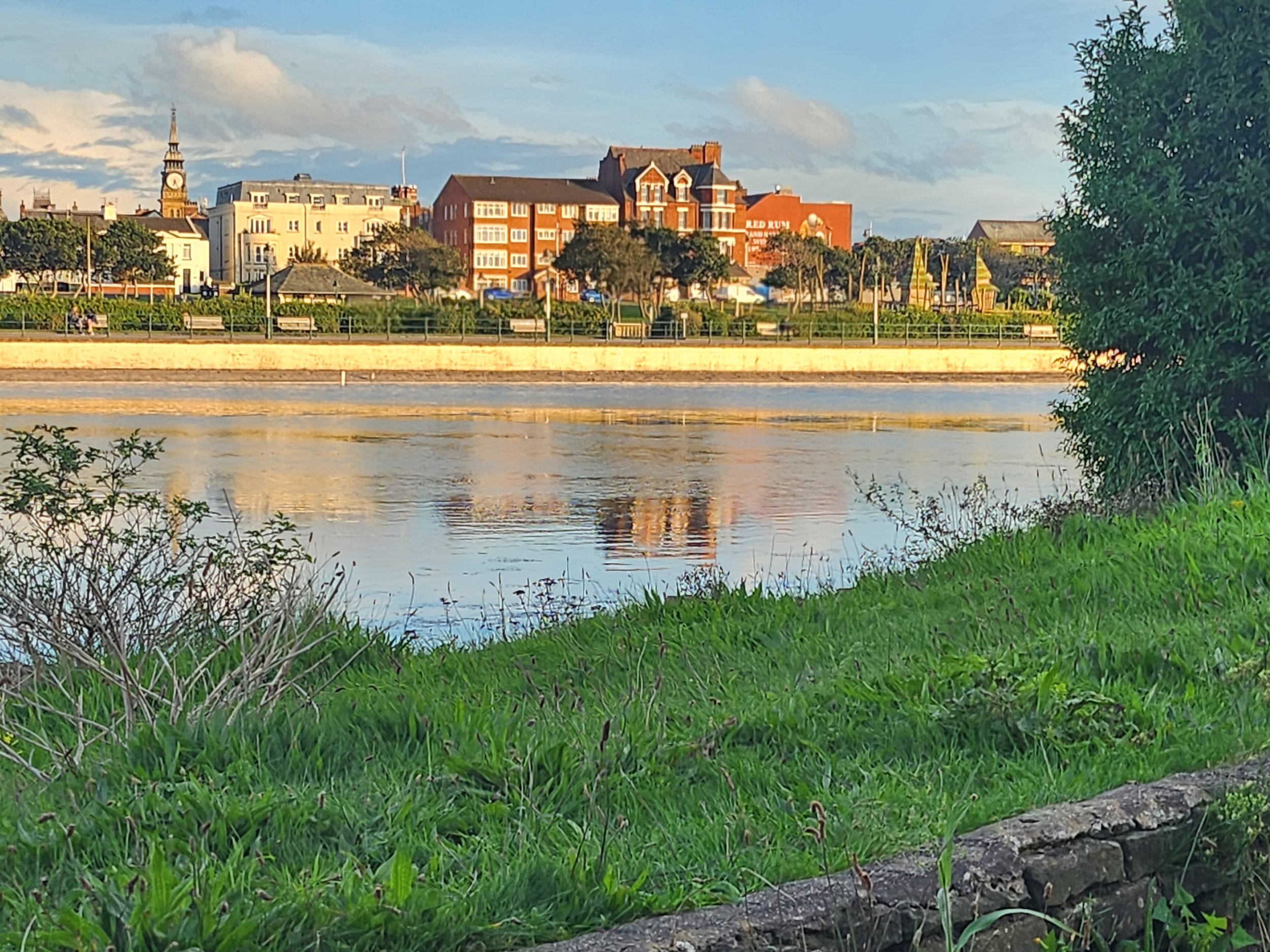
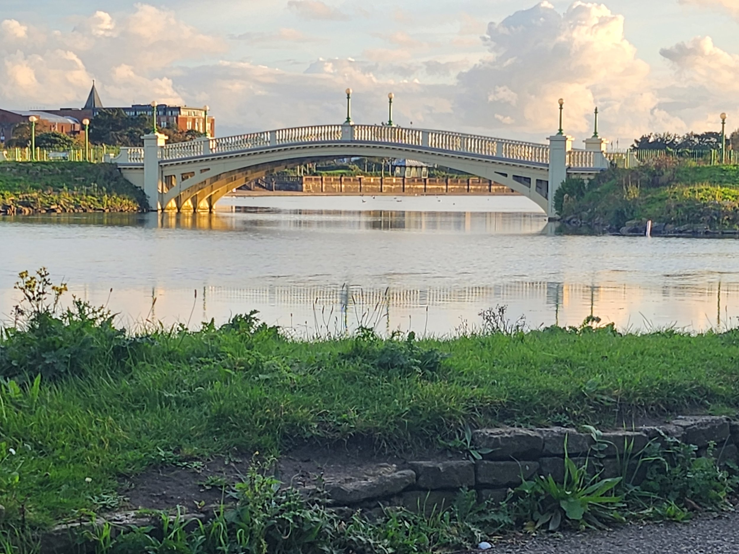
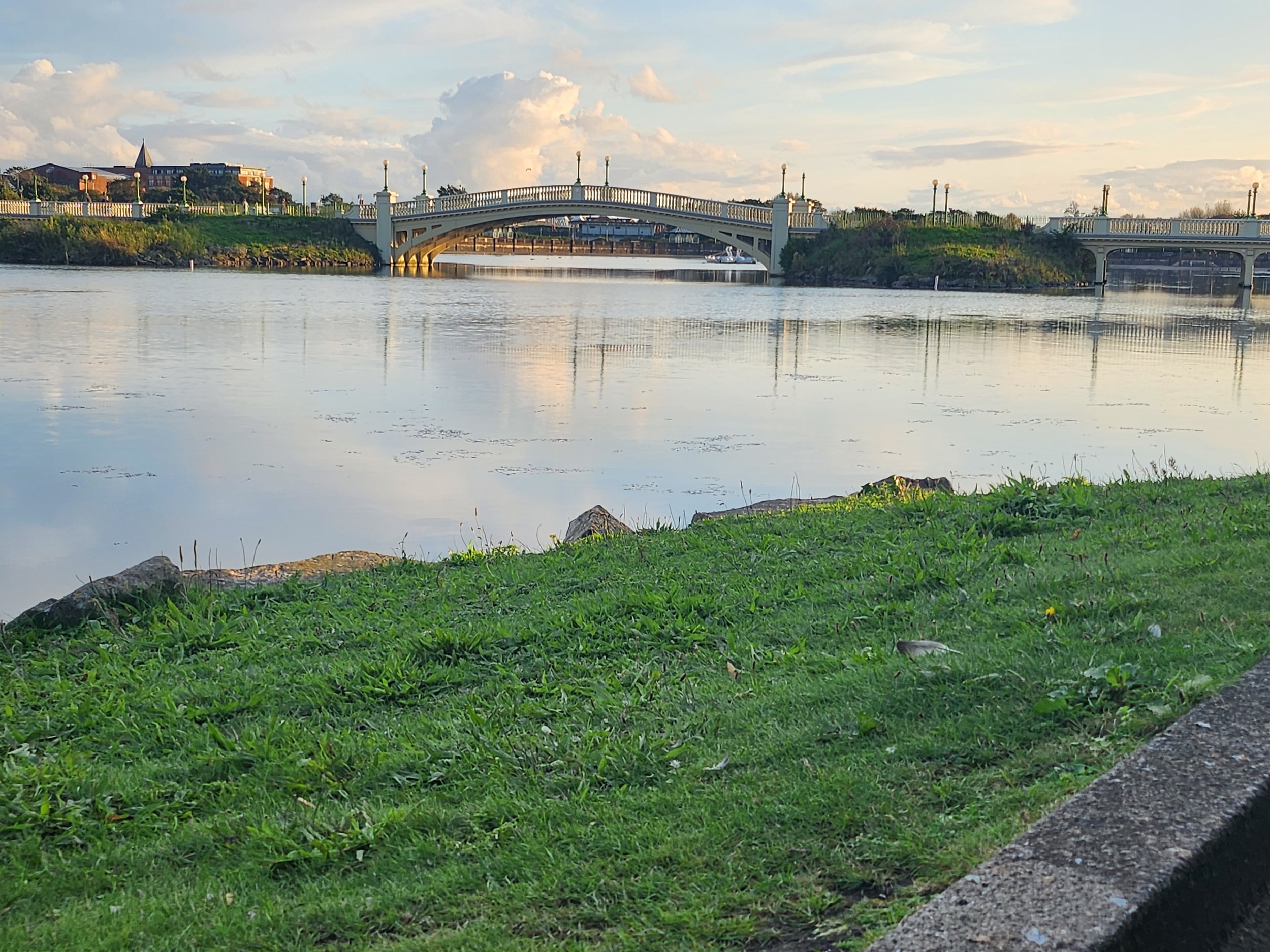
These are all the locations for shooting this promotional video. I have labelled all the images corresponding to the storyboard and shot list to show the locations in which I will be filming. I have also doubled up on some of the shots just in case one location doesn’t fit in with what I am wanting to make. For context, “Shot 11 - Storyboard 3”, the archways in the background, especially underneath them maybe used for “Shot 15 - Storyboard 5“
Practical Considerations
Weekly Production Schedule: -
 Weekly Production Schedule - 2nd
to 8th October 2023
|
|
MONDAY |
TUESDAY |
WEDNESDAY |
THURSDAY |
FRIDAY |
SATURDAY |
SUNDAY |
|
TIME(S) |
9:00am - 12:05pm |
9:00am -12:05pm |
2:25pm – 3:55pm |
12:50pm – 3:55pm |
6pm – 9pm |
3pm – 6pm |
N/A |
|
LOCATION(S) |
Southport Town Centre |
Home |
College – Photography Studio |
Home |
Home |
Home |
N/A |
|
SCENE(S) |
All Scenes |
N/A |
Magazine Scenes |
N/A |
N/A |
N/A |
N/A |
|
EQUIPMENT NEEDED |
Lumix GH5 Zihyun Crane Plus Tripod |
Computer Premier Pro |
Nikon DT700 |
Computer Premier Pro |
Computer |
Computer |
N/A |
|
PEOPLE NEEDED |
Emily Morris |
N/A |
Emily Morris |
N/A |
N/A |
N/A |
N/A |
|
COSTUME/ PROPS/MAKE-UP |
HIP Clothing T-Shirt |
N/A |
HIP Clothing T-Shirt |
N/A |
N/A |
N/A |
N/A |
|
SPECIFIC CONSIDERATIONS |
Film Day |
Editing Stage – First Cut |
Photography Shoot |
Editing Stage – Final Cut |
Blog Work |
Blog Work |
Completion Day |
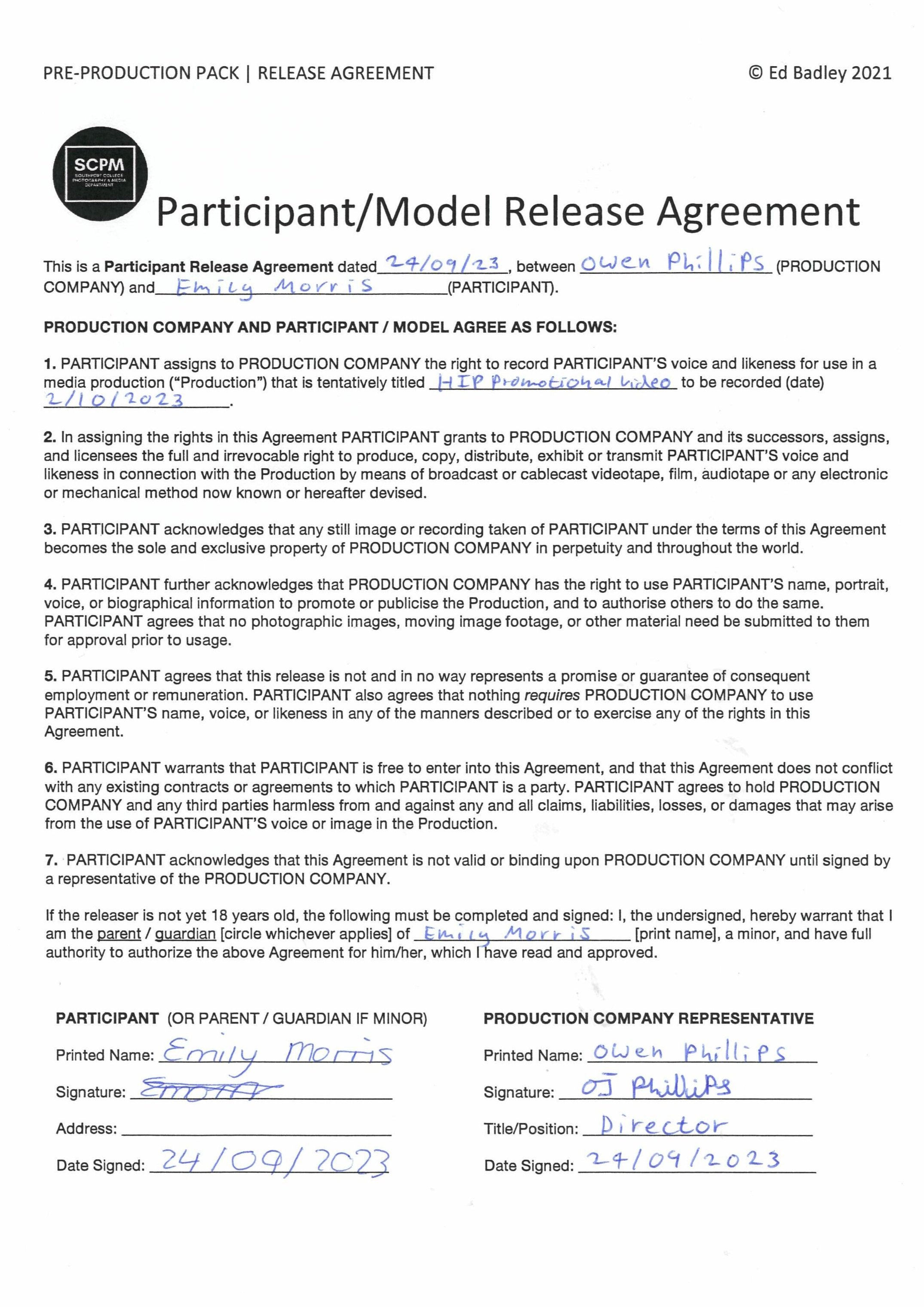
Model Release Agreement: -
The change of colour of the logo in Canva: -
For the T-Shirt which I was getting made for the shoot, I wanted to change the colours for the logo, something a little bit less boring them a black logo on a white background, So I changed the colour to a black background with a yellow background. I’ve always loved this type of colour scheme since I digitalised my Dad’s garage logo (which is now a trade mark I registered) So I thought it would work for this logo and it did.
The HIP T-Shirt
What issues and problems did I encounter during filming and how did I resolve them?
One of the biggest issues I encountered during filming was the weather on the day of filming. It was borderline in terms of if it was going to rain and it did for a few minutes but we managed to push through and get all the clips I wanted. Another problem I encountered with it raining was that I couldn’t do all the location shots I wanted to do, for example the Southport Landscape on the Marine Lake; it would of been too wet to sit down on the grass hence why I didn’t do that part. So I instead filmed some filler shots outside of Christ Church.
Post-Production & Presentation - Video Stills & Editing
Premier Pro Timeline: -
As you can see in the timeline below, the clips that I have used below with no special effects used, so it is purely clips cut in line with the beat to create a sense of pace throughout the video. I have only added a “film dissolve” transition at the beginning and end for a fade in and out effects rather then a “cut to black” transition. I have added at the end of the video my final magazine cover and the logo of the fashion company as well, that was specified in the brief to do. Catchy copyright free background music was added, I have made my own cut by shortening the track by cutting it and dragging it together using the audio transition “constant power” to transfer from one cut of the track to the other without the audio dipping in and out when transferring from track to track. I have also used the audio transition “exponential fade” at the end of the video which fades out the audio, it is also inline with the fade out of the video.
The audio used in the fashion promotional video: -
Presentation
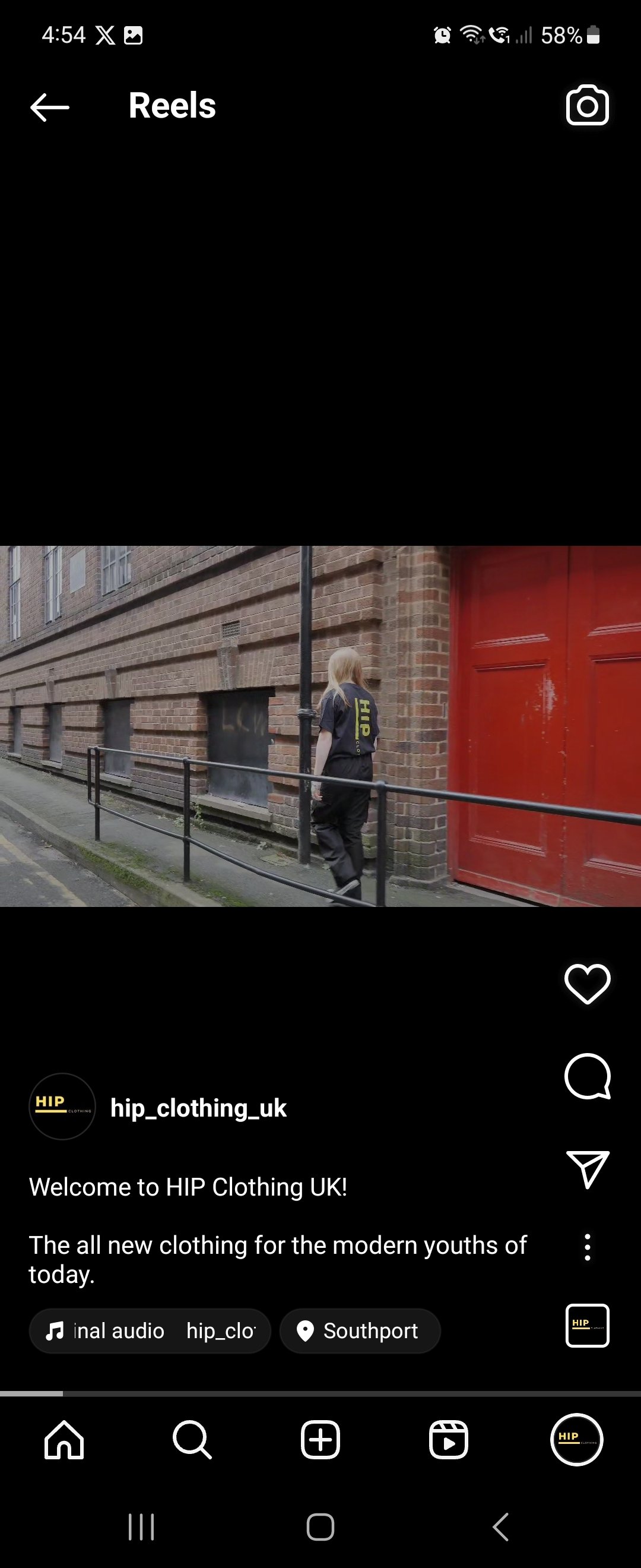
HIP Promotional Video: -
The Final Selection of My Favourite Photographs: -
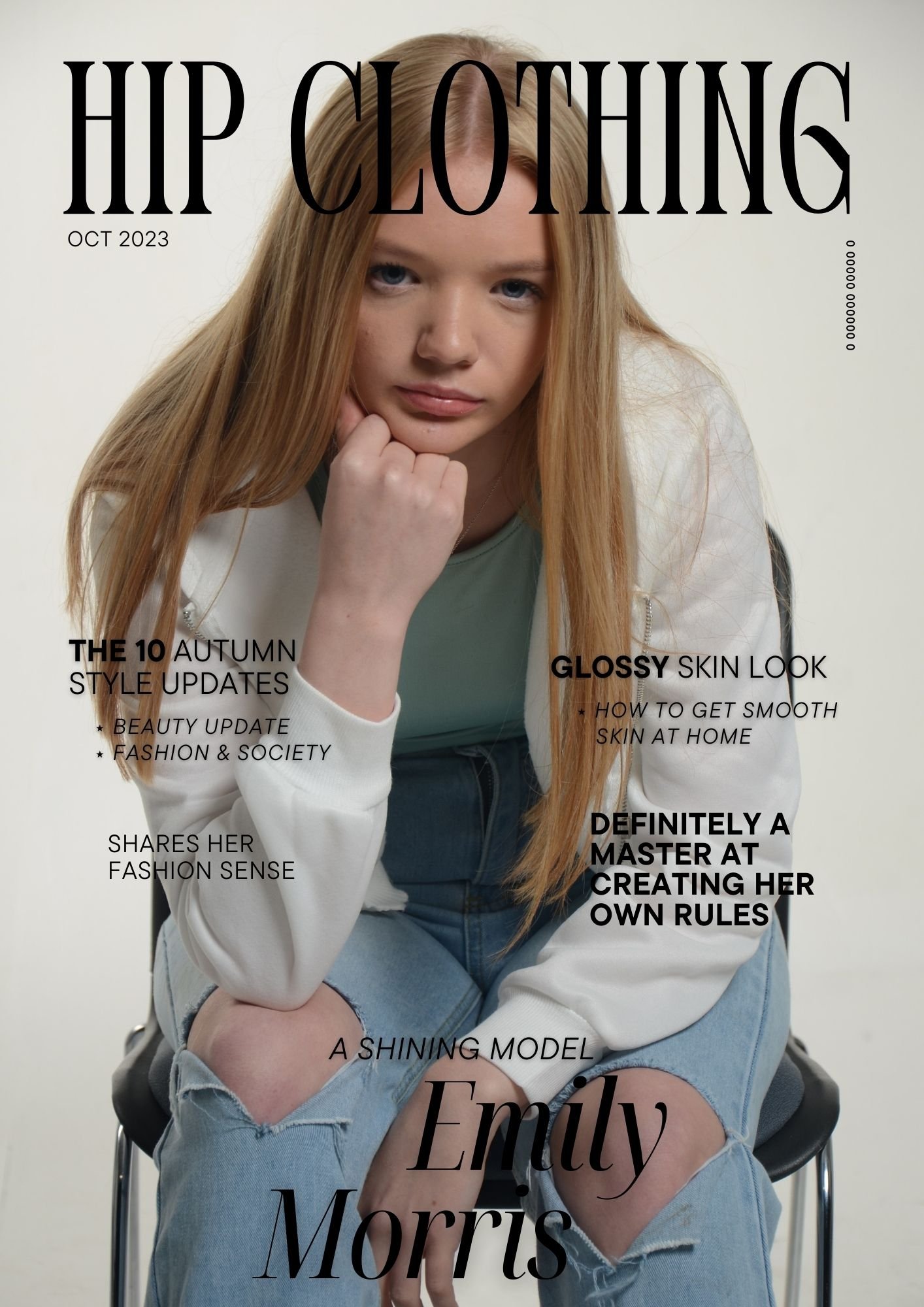
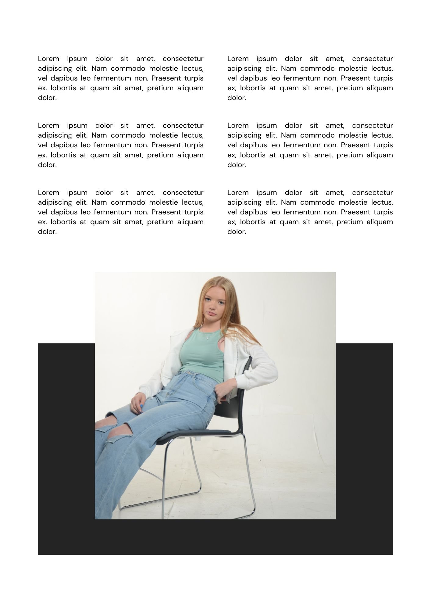
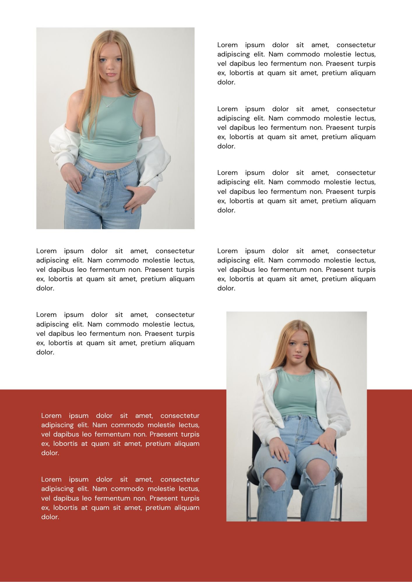
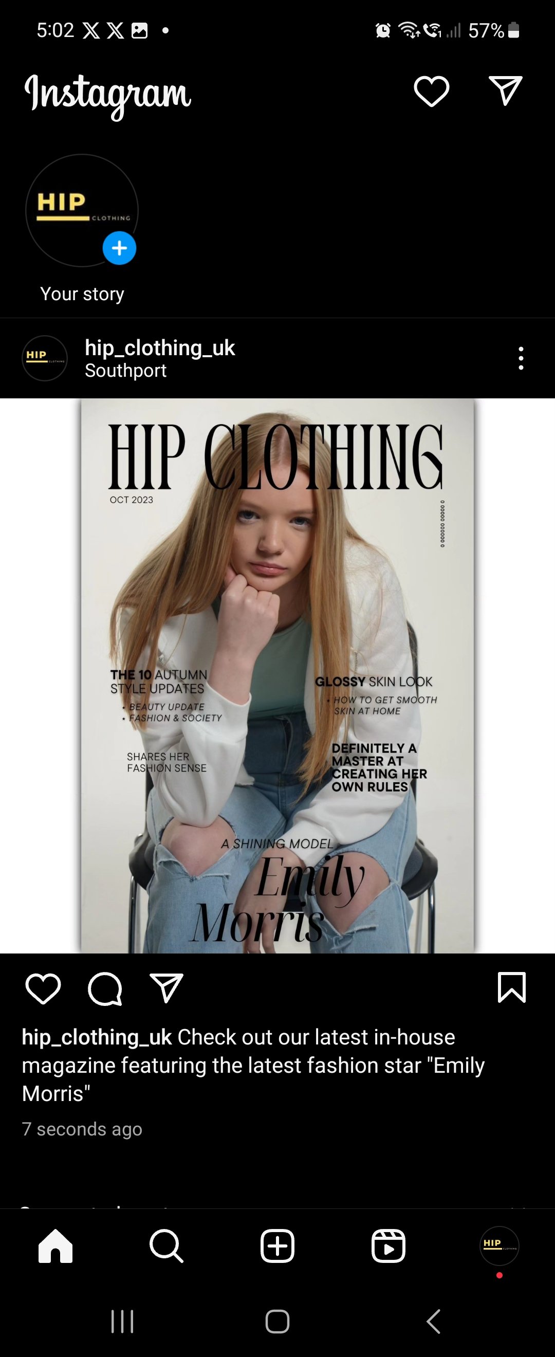
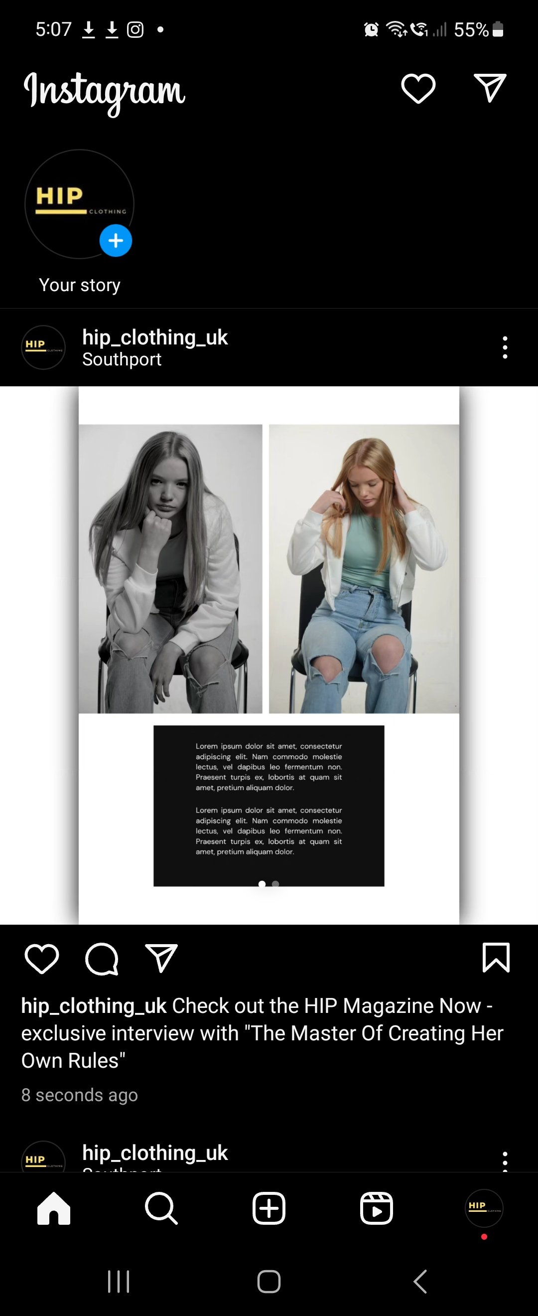
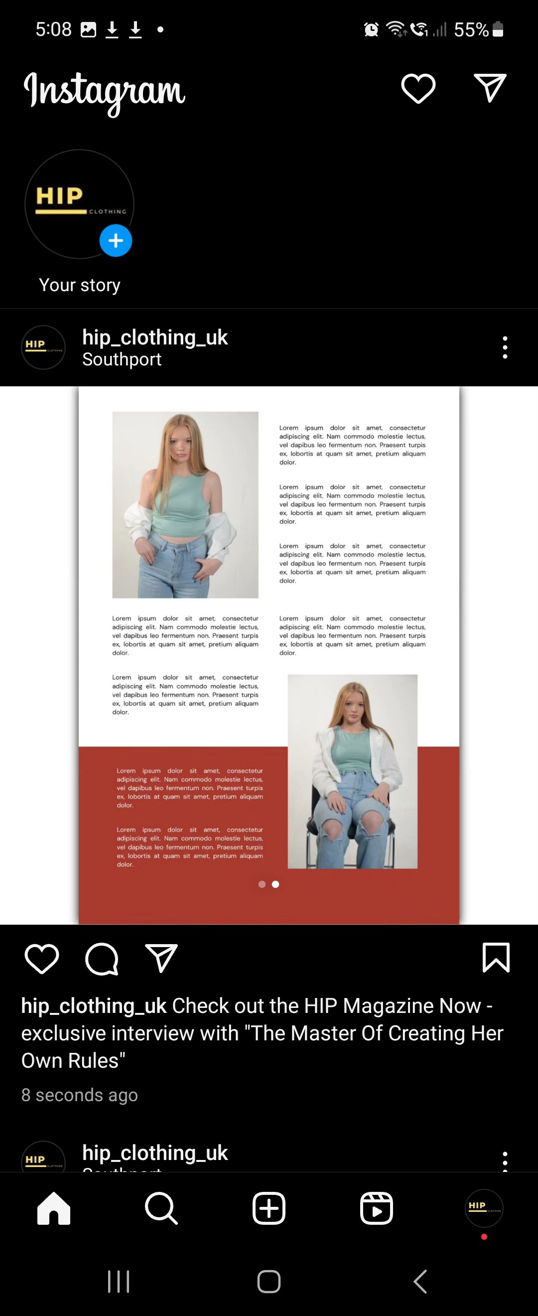
HIP Promotional Magazine: -
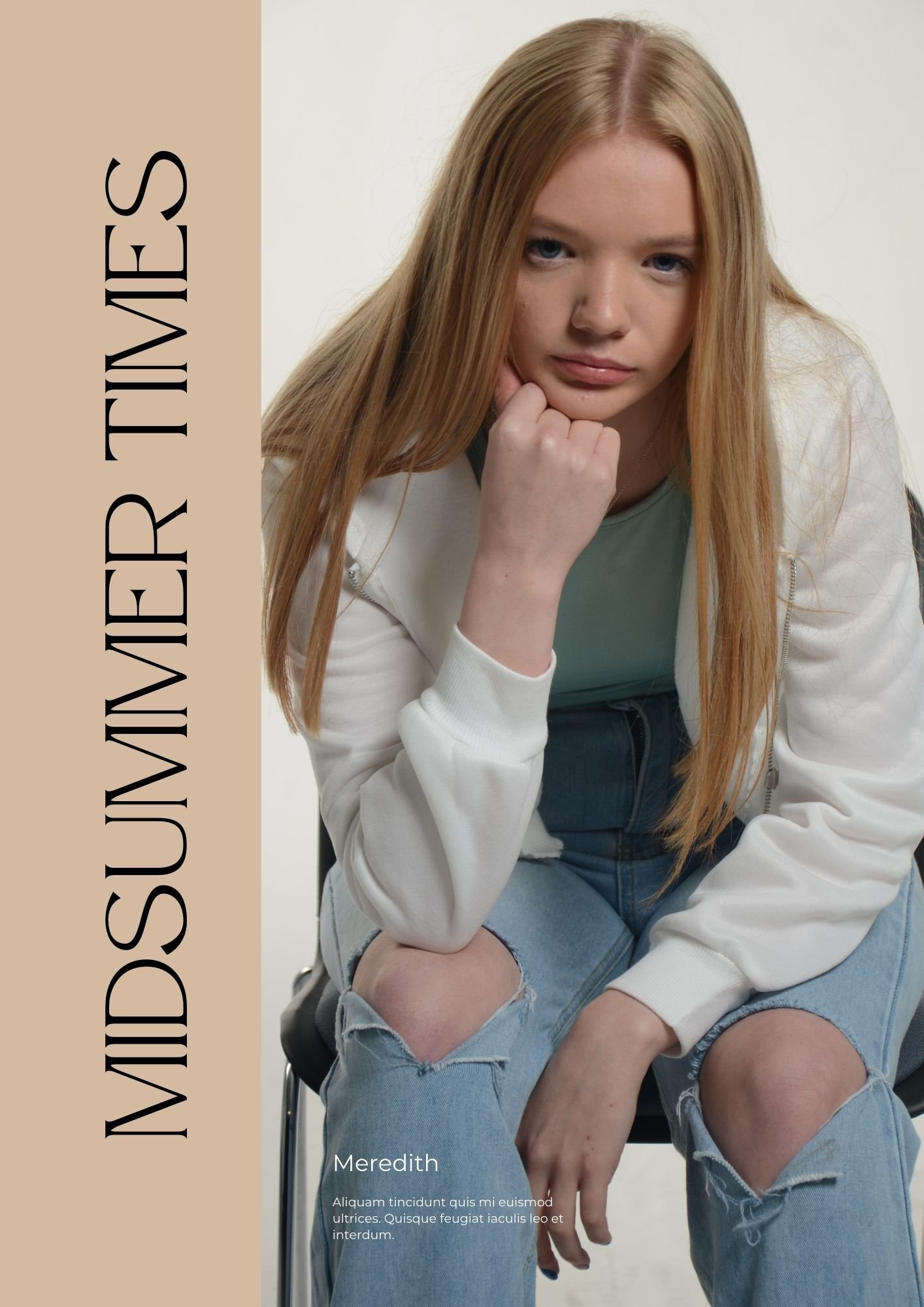
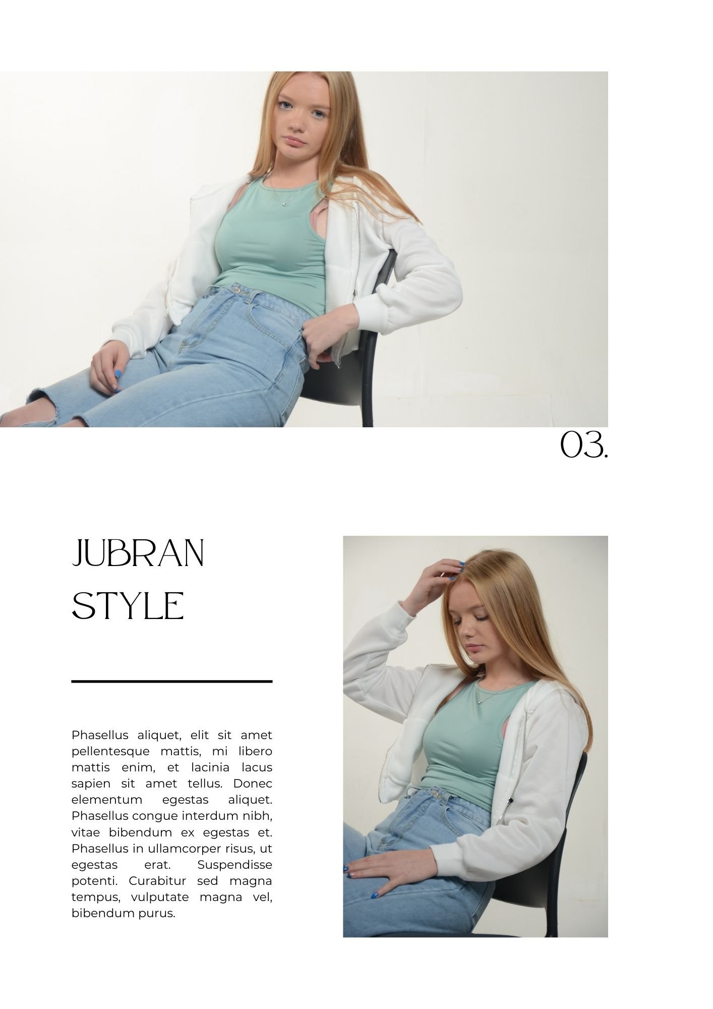
“This is a Virtual Magazine in the Form of a Slideshow”
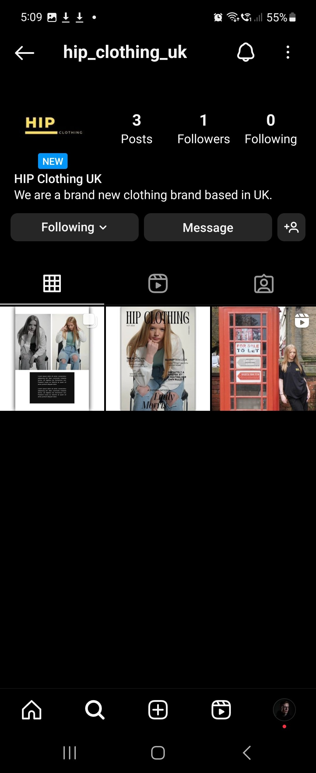
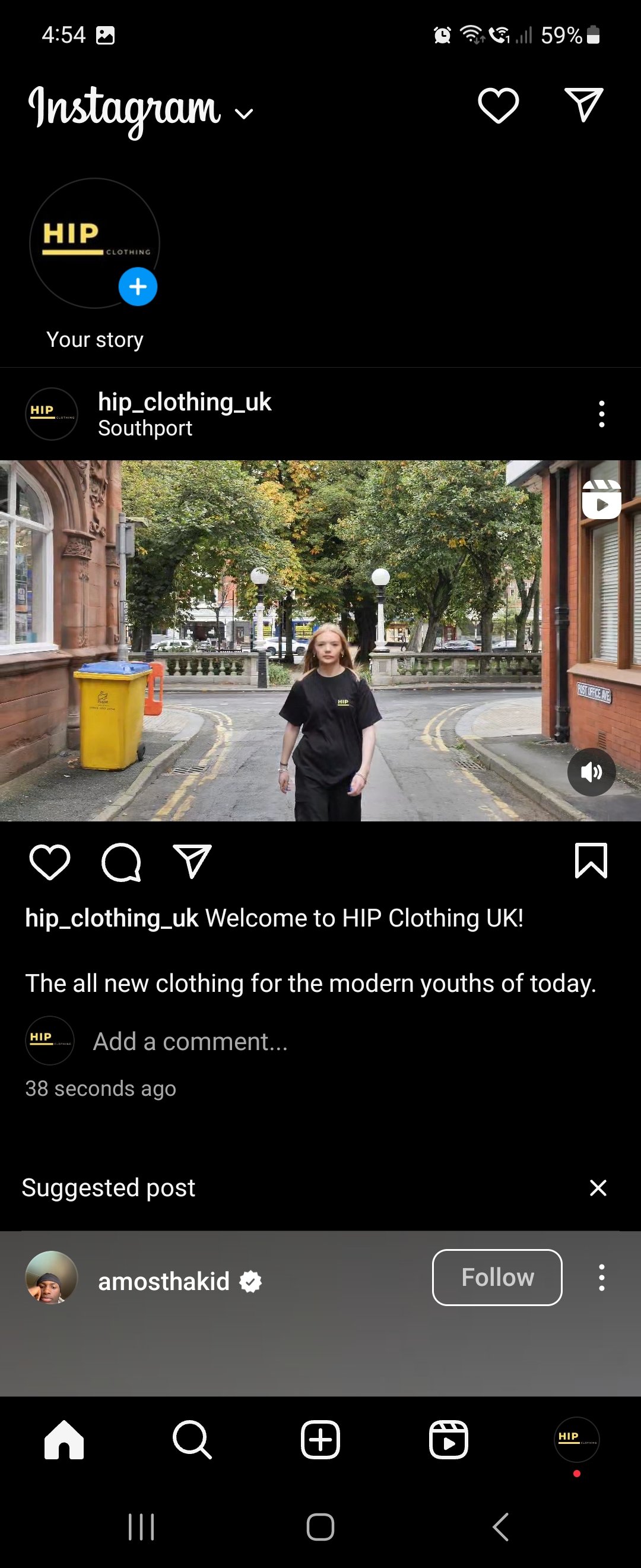
HIP Instagram Page: -
Evaluation & Reflection
Annotate three strengths and three weaknesses of your final images / video promotion assignment. What went well and what could you do to adapt the work produced to improve and develop it?
For the film side, I thought the planning is probably the strongest part of this production as I knew what I was going to film, and it was alterable if necessary. The choice of locations in Southport is a strength because I wanted an urban type of atmosphere for the shoot that worked with the type of video I wanted to create. The editing style I went for with cut the video to the track while the model walks was something I was experimenting with throughout and it took me a few tries to make it work and this leads me onto my weaknesses for this production, some of the cuts in my final production were miss timed by a few seconds. The next weakness is that the sped-up parts went on for far too long and should have been cut and put some more B-Roll in there from different locations and as I never filmed lots of B-Roll shots, I should have pulled the film back into editing for another final cut and re-recorded some more B-Roll shots. But in an ideal world with another week or so I would have done that but due to the project needed to be handed tomorrow as I am writing this, I don’t have the time to pull it back and re-edit.
For the photography side, the strongest point was the lighting in the studio was set up correctly, it was High Key lighting used which creates minimal shadows with low contrast but makes the frame bright using soft lighting. The next strength is the poses used and this improved my communication skills for directing the model as well because it was poor before, and this has gained my confidence to talk more often in the studio. This leads me onto my weaknesses, one of them was we should have had a chance of outfit for the model as it was the same outfit used throughout the shoot and magazine. I also think different camera angles should have been used as it seemed to be the same medium shot or close shots used throughout the shoot.
What experiments and exploration did you do? How did it affect the development of your project?
For the film side, I was experimenting with the editing side of the film because I tried editing the video to the music, for example I cut the video to the track while my model was walking. As I have reflected as a weakness in the production, I missed timed cuts in the video.
For the photography side, I was learning how to direct my model in the studio for the type of pose I wanted them to do, and I found that as one of the hardest things as I didn’t know what to say. But now as I have experimented in the studio with somebody, I am comfortable to be around, which means my communication skills should have improved for next time.
What do you now understand about the e-commerce fashion media industry? What did you find out?
I understand that a lot of different factors go into the making of the fashion media industry with the rise of online shop and the fact that a lot of marketing goes into creating the online shop with out they are advertising a specific type of product or how they use a famous person as a focal point to sell their clothes which is another huge thing in this industry currently. In the photography terms I found out that they use mostly studio work to sell their clothes as on location shots is really distracting, this leads me onto the most common lighting technique they use is High Key lighting.
Authentication Document


